
This is an interesting way of seeing rental housing rents (national scale). And there’s a lot that you can glean from a mapping like this. But it’s also interesting in that what you are seeing here is a visualization of some 11 million Craigslist rental housing listings (taken from this study). The authors refer to it as a “nontraditional source of volunteered geographic information”, and they argue that it’s probably more granular and real-time than what is typically available when it comes to rental housing. That sounds right to me.
Tag: report
-
Cars make cities less compact
The relationship between car ownership and urban density is a fairly intuitive one. Below are two charts from a study by Francis Ostermeijer, Hans Koster, Jos van Ommeren, and Victor Nielsen, showing how urban density is inversely correlated with car ownership. In other words, the more people with cars, the less dense that a particular place is likely to be.

But there’s an interesting chicken-and-egg question here. Does Atlanta, which is near the bottom right in the above chart, have a lot of cars because it wasn’t dense enough to support other modes of transport, or did the prevalence of cars in Atlanta cause the city to spread out and become less dense? And that is exactly what the above researchers set out to determine.
To do this, they started by looking at the presence of commercial car manufacturers in the above geographies in the 1920s. One of the things they found was that having a car manufacturer in your city at this time appears to have had no effect on population density. But over the long run, rising car ownership seems to have had a sizeable effect on reducing population densities in those places.
The conclusion they draw from this is the title of this post: cars have made cities less compact, rather than low population densities causing people to go out and buy more cars. This makes some sense to me because cities were doing just fine before we invented cars. But like all transportation innovations that allow us to move faster over longer distances, the car encouraged decentralization.
There are, of course, all sorts of possible implications for a finding like this. But the authors specifically mention developing countries where car ownership may still be relatively low. This is something to be mindful of because if you put most people into cars, history strongly suggests that it will impact the kind of city that you end up building.
-
Hanging out in the metaverse

I’ve only hung out in Decentraland a few times. One of the times was to check out a Deadmau5 concert, which was cool, though not quite the same as a live show. But I have no doubt that all of this is a big deal and that I’ll probably end up at another virtual concert at some point. JP Morgan, for example, just opened up a virtual banking lounge in Decentraland’s Metajuku district, called the Onyx Lounge. They also just released this new report talking about how the metaverse is probably a $1 trillion market opportunity (based on their projected yearly revenues).
Here are some other figures. In 2019, about $54 billion was spent on virtual/digital goods. These are things like game skins. This is compared to $42 billion at movie theaters and $30 billion on recorded music. So things that are purely digital (and have a very low marginal cost) are already a huge deal and people are spending a lot of money on them. Last year, the market cap of NFTs also surpassed $40 billion. The naysayers will tell you that you can just “right-click, save as” instead of spending any crypto on NFT images, but clearly something broader is underway.
JP Morgan is of the opinion that it is only a matter of time before the metaverse infiltrates every sector of the economy in some way, shape, or form. Would you agree?
Image: Decrypt
-
Comparing the weekly earnings of Canada’s visible minorities to white people
We just finished up three days of snowboarding and skiing in Tremblant, Quebec and we’re now in Montreal closing out the long weekend. I am arguably Toronto’s greatest fan and supporter, but I continue to admit that Montreal is the coolest city in Canada.
In other news, Theresa Qiu and Grant Schellenberg recently authored a Statistics Canada report looking at the weekly earnings of visible minorities and white people across the country. The study focuses on Canadian-born individuals aged 25 to 44 who were gainfully employed and making money in 2015.
The reason why they isolated the study to Canadian-born visible minorities is that they wanted to eliminate the noise around new immigrants who may be struggling with the language(s), the recognition of their foreign credentials, or some other variable.
In this case, every individual that factors into the study was born in Canada and, in theory, had access to similar sorts of opportunities. Of course, we know this isn’t always the case, but it’s an attempt an equal baseline.
The findings are pretty interesting.
Korean, Japanese, and South Asian men all tend to earn more than white males (which formed the baseline for the study). More than 60% of Chinese and Korean men also have a bachelor’s degree or higher, whereas only 24% of white males are in the same position.
This is an important data point because we know that economic outcomes tend be positively correlated with educational attainment. The benefits of education also tend to compound later in life and this study only focuses on people aged 25 to 44. So the spreads could widen.
One the factors that is surely influencing the above findings is that visible minorities are overwhelmingly urban. About 60% of visible minorities in Canada live in just three cities: Toronto, Montreal, and Vancouver. This compares to only 27% of white people.
Again, an important data point given that people in big cities tend to earn more than those in smaller communities.
For the full study, click here.
-
Just how valuable is public transit?

Benjamin Dachis and Rhys Godin of the C.D. Howe Institute have a new report out talking about the effect of COVID-19 on the future of public transit in Canadian cities. In it, they make the argument that public transit is a key enabler of the agglomeration economies that make cities so valuable. And right now, most people aren’t using it (see above).
Why are agglomeration economies so important?
According to some studies, doubling the population of an urban area has tended to increase mean incomes by between 3-8%. In the Canadian context, similar research has found that people living in more populated regions (cities) tend to have incomes that are between 3-5% higher than those living in more rural areas. So when it comes to average incomes, bigger cities tend to be better. (Does Zoom change this? I’m not convinced.)
Of course, to make bigger cities function properly, you generally need public transit. And when you do have fast and reliable transit, that, they argue, is going to help drive the agglomeration economies which ultimately help to increase incomes. Because of this important relationship, Dachis and Godin argue that Canadian governments have a habit of systematically undervaluing the importance of transit investment.
If you’re interested in reading the full report, click here.
-
The world’s best cities
Whenever you see a best-of-anything ranking, you should probably ask yourself what the hell “best” even means. In this case, Resonance Consultancy is ranking the world’s cities based on six alliterative categories: place, people, programming, product, prosperity, and promotion.
Some of these metrics are qualitative, but many are, in fact, quantitative. Number of COVID-19 infections in 2020; number of direct destinations served by the city’s airports; number of foreign-born residents; number of top-rated restaurants (TripAdvisor); most Instagram check-ins, and so on.
The result is this list of the world’s best cities:
- London
- New York
- Paris
- Moscow
- Tokyo
- Dubai
- Singapore
- Barcelona
- Los Angeles
- Madrid
- Rome
- Chicago
- Toronto
- San Francisco
- Abu Dhabi
I arbitrarily chose the top 15 cities in order to make sure that Toronto was included in this ranking. If you’d like to download a full copy of the 2021 World’s Best Cities report, you can do that over here. I recommend you check out their performance criteria.
Toronto, for example, performs very well when it comes to “people.” That’s fairly consistent across most of these rankings. But it didn’t fare so well when it comes to “place.” That category includes things like the average number of sunny days and the number of high quality sights & landmarks.
-
Using tweets to measure social connectedness in cities
This recent study used geotagged tweets to measure social connectedness within American cities. There are two measures: (1) concentrated mobility and (2) equitable mobility. The first measures the extent to which social connections (geotagged tweets) are concentrated in a set of places within the city. And the second looks at the degree in which people move between neighborhoods in roughly similar proportions. These measures are the y-axis and the x-axis, respectively, in this graph:

So how do you read this chart?
Well if you look at New York, you’ll see that it is relatively high in concentrated mobility, but the lowest in terms of equitable mobility. This means that social connections are highly concentrated and that there’s low connectedness to other neighborhoods within the city. Miami, on the other hand, is the opposite. It’s also an outlier. Few hubs. But its social connections appear to cross neighborhoods and spread across the city.
Perhaps not surprisingly, the study found that the size of a city seems to have the biggest impact on social connectedness. Which makes sense — it becomes harder to get around and so people start to localize. I am reminded of this whenever my friends in Los Angeles tell me they never go to the beach because it’s simply too difficult and too time consuming to get across the city.
This also became clear to me after I started playing around with the Moves App back in 2015. The app no longer exists, but it was an activity tracker that allowed you to map where you, well, moved. And the more time you spent in one place, the more concentrated the activity would become. They depicted this through larger and larger circles. Example maps, here. My maps revealed that I need to branch out into different neighborhoods more often.
To download a full copy of the study, click here.
Chart: CityLab
-
Public perception of drone delivery

Back in 2016, the United States Postal Service published a report on the public perception of drone delivery in the US. This was nearly 3 years after Jeff Bezos announced on 60 Minutes that Amazon was working on a drone delivery service and that it would arrive within the next 5 years (so by 2019). I think USPS was trying to figure out how to be, or appear, more innovative.
Not surprisingly, the report found that Millennials were significantly more supportive of drone delivery (65%) compared to Baby Boomers (24%), who strongly dislike the idea. Generally, the report indicates that the percentage of people who think it’s a good idea declines with every preceding or older generation. Again, I don’t find this at all surprising.
But what I did find interesting was that, irrespective of age, respondents were primarily concerned with some sort of “malfunction.” This was at the top of the list. Next in line were concerns around “intentional misuse,” such as drones being used to transport illicit goods or to spy on people and/or property.
Closer to the bottom of the list was a concern that drone delivery “might make the sky less pleasant to look at.” My own view is that visual clutter and noise pollution are critical problems to address here. There’s talk of “drone highways in the sky”, but how do you really manage the sheer volume of drones that would be needed to service a dense urban environment?
Photo by Goh Rhy Yan on Unsplash
-
Condo rents in Toronto are up 11.2% from last year
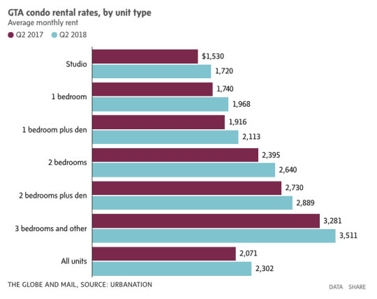
Yesterday Urbanation released its Q2-2018 rental report for the Greater Toronto Area. It tracks both purpose-built rentals and condominium rentals, the latter being condominium units that are listed for rent on MLS. The average condo rent, for all unit types across the GTA, is up 11.2% year-over-year to a face rent of $2,302 per month.
Here is a chart from the Globe and Mail:
The former City of Toronto, which includes downtown, is actually up 13.5%:
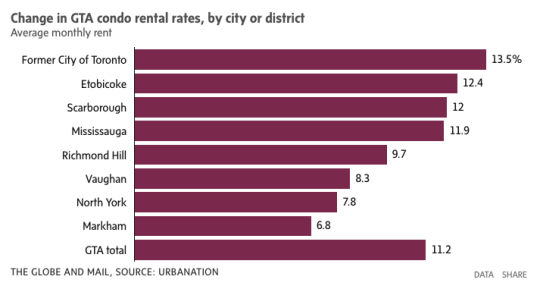
But here are the stats that I really wanted to draw your attention to today (figures from the Globe).
According to Urbanation, there were some 384,000 condo apartments in the Greater Toronto Area in 2017 and nearly 1/3 of them were rented out. Given that the Canada Mortgage and Housing Corporation pegs the total number of rental apartments in the GTA at approximately 311,596, condo apartments represent about 40% of all our rental housing stock.
So condo buildings are actually doing quite a bit of heavy lifting when it comes to providing rental housing in this region.
-
Driving in the HOT lane
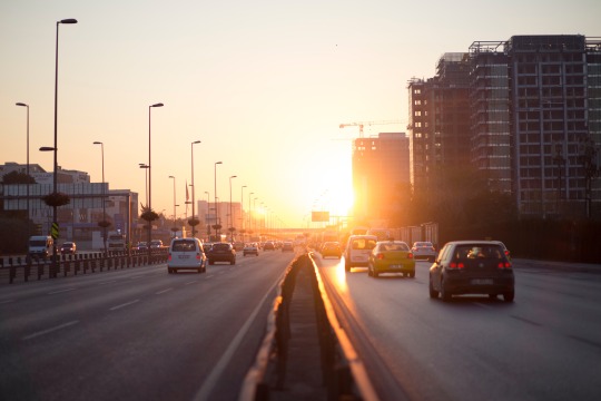
Joe Cortright of City Observatory recently published an interesting post on HOT lanes (high-occupancy toll lanes) and cited a research paper by Austin Gross (University of Washington) and Daniel Brent (Louisiana State University). The paper looked at the behavioral response of drivers to dynamic HOT lane pricing.
They way HOT lanes work is simple: when traffic is light, the price dynamically decreases; when traffic is heavy, the price dynamically increases to ensure a minimum level of service. That is, the price increases until enough cars leave the lane and driving speeds increase to some minimum threshold. In this case, it’s 45 mph.
The key takeaway from the report is that “value of reliability” appears significantly more important to drivers than “value of time”. Put differently: it’s less about the time I’m wasting in traffic and more about the uncertainty of not knowing when I’m going to arrive at my destination.
It’s for this reason that HOT lanes are used more frequently in the morning (when you’re running late for that meeting) than in evening (when you’re just on your way home from work).
Gross and Brent estimate that the spread is about 7.5x. The typical driver values saving time at about $3 per hour and reliability improvements at about $23 per hour! This is fascinating because we tend to focus a lot on time. But arguably what people really want to buy is greater certainty.
I can tell you that it’s definitely one of the things that I love about walking to work, or for that matter cycling somewhere. I always know how long it’s going to take.


