Daily insights for city builders, delivered every morning at 6 AM ET. I’m Brandon Donnelly — a Toronto-based real estate developer and founder of Globizen. I’ve been writing here since 2013.

Tag: renewable energy

  • Vertical solar panels

    Ordinarily, solar panels make the most sense on the roof of a building. This is often where you can harvest the most solar energy. But sometimes it can make sense to install them vertically, like in the case of the above building in Scuol, Switzerland. I am by no means an expert on solar, but I am told that this can make sense in snowy climates (where rooftop panels are likely to get covered) and in northern locations where the lower angle of the sun means a vertical position actually catches the sun more effectively (especially during the winter months). It could also be the case that you just don’t have any available roof space. Either way, you have to look at and model out the entire year when it comes to solar.

  • Ontario should have more solar energy

    I have a very close friend (Peter Vogel) who is in the solar business. He runs business development for a company called Otter Energy. And by volume, I believe they are the largest in Ontario. Since 2009, they have installed over 350,000 panels.

    So when Peter and I hang out, I get the benefit of learning about solar. And he is great at reminding me that installing panels on the roof of buildings in Ontario makes a ton of sense from both an environmental and financial standpoint.

    Generally speaking, the amount of benefit you will see depends on the building’s ratio of roof area to overall building area. Low-rise buildings with a lot of roof area (think industrial assets), are absolute no brainers. But it can also work very well on many other asset classes, including mid-rise multi-family.

    Here are some high-level figures that he recently walked me through:

    • As a rule of thumb, solar in Ontario typically generates between 12-14 kWh’s per year per square foot of roof area (usable flat roof).
    • The average payback period for an install is usually somewhere between 4.5 to 7 years.
    • However, on income producing properties, the permanent decrease in operating expenses and the corresponding increase in net operating income (NOI) will increase your asset value on day one.
    • Consider spending $100k on solar panels to increase your NOI — through lower electricity costs — by $10k. If you were to then capitalize this increase in NOI by 5%, it would mean your asset value has right away increased by $200k. If the cap rate for this asset is even lower, say 4%, the increase goes up to $250k.
    • These multiples can get even better with larger installs. Here are some numbers from a real-world 100,000 sf commercial building in Ontario. In this case, the solar system cost about $800k (net) and resulted in annual operating cost savings of about $140k. This means, that at a 5% cap rate, the owner spent $800k to increase the value of their asset by $2.8 million on day one.
    • Of course, in addition to all of this, you get long-term energy cost certainty. That’s worth something too.

    The business case is compelling. So I think more building owners should be looking at solar. We are certainly looking at it from a development perspective. If you’re interested in learning more, feel free to reach out to my friend. There are a lot of details that help strengthen the case for solar, including depreciation allowances and tax credits.

  • European cross-border electricity interconnections

    The EU has the following target in place for the sharing of electricity:

    The EU has set an interconnection target of at least 15% by 2030 to encourage EU countries to interconnect their installed electricity production capacity. This means that each country should have in place electricity cables that allow at least 15% of the electricity produced on its territory to be transported across its borders to neighbouring countries.

    The main reasons to do this is that it is good for renewables and it is good for overall resilience. The UK, for example, has one of the largest offshore wind markets in the world. But if it’s having a bad wind year, interconnections allow it to import the electricity it may need — perhaps from Norway, which is Europe’s biggest producer of hydropower.

    Here is what that looked like in 2021 (via the FT):

    Of course, this works really well when there’s enough electricity to go around and everyone is cooperating. The question this winter is whether that changes at all.

  • Renewable power now accounts for about 13% of global electricity generation

    This is an interesting chart from Nathaniel Bullard over at Bloomberg Green. In 1985 (the start of this chart), coal-fired power was responsible for about 38% of global electricity generation. This particular stat hasn’t changed all that much since then — the current figure is around 36% — but renewables have gone from 0.8% to 13% of global electricity. That is something. Since 2010, renewables are adding about 0.8% market share each year, and presumably this rate will only increase going forward. (Here, renewable power is defined as wind, solar, geothermal, biomass, and small hydropower.)

    Chart: Bloomberg Green

  • Rise of renewables in the US

    Here are some fascinating figures (from Environment America) about the growth of renewables in the United States:

    • Between 2011 and 2020, renewable energy production (solar, wind, and geothermal) grew at an average rate of 15% per year. Assuming this same rate of growth, the US could be on target to meet all of its electricity needs with renewables by 2035.
    • The US produces 23x more solar power and 3x more wind power than it did in 2011.
    • The median efficiency for new residential solar panels increased by 37% from 2010 to 2019. At the same time, the cost of distributed solar photovoltaic systems fell by 71% and the cost of utility-scale systems fell by about 80% between 2010 and 2018.
    • During this same time period (2010-2018), the cost of land-based wind power fell by 66%.
    • The median range of new electric vehicles increased by more than 3x between 2011 and 2020. The median range is now more than 250 miles on a single charge. By the middle of this year, cumulative plug-in EV sales surpassed 2 million units.
    • Texas is the US state that currently produces the most renewable energy.

    To download the full report by Environment America, click here.

    Photo by Nuno Marques on Unsplash

  • A roadmap for the global energy sector

    The International Energy Agency (IEA) has just published what it is calling the first comprehensive roadmap for transitioning the world to a net zero energy system by 2050. Turns out, it’s only going to take a complete overhaul of pretty much everything to hit this important target. We are going to need to start investing some $820 billion each year (starting in 2030) on our electrical grids to support the electrification of the global economy. 90% of electricity generation is going to need to come from renewables, with 70% likely coming from solar PV and wind alone. 60% of global car sales will need to be electric by 2030. We’ll need to completely halt the sale of internal combustion engine vehicles by 2035. And by 2040, we will need to have retrofitted at least half of our existing building stock.

    Make no little plans. For a copy of the report, click here.

  • Off the grid

    Two things struck me today.

    First, I read Bloomberg Green’s daily newsletter (Nathaniel Bullard) and came across the following statistic. In 2001, the world installed 290 megawatts of solar generating capacity. This year, the world is likely to install more than 100 gigawatts of solar — that’s 350x more per year than we were installing 19 years ago. You can also see how things have changed by looking at the above chart showing wind and solar asset financing per year.

    Second, I read about Fred Wilson’s SunPower Solar system and how, since May, he has been able to satisfy 91.5% of his home’s electrical needs via solar (this includes an electric vehicle). In fact, during the month of May when temperatures were a bit cooler, he had a surplus. He was producing more than he was consuming, and so he was selling that excess production back into the grid. It wasn’t until the summer months and higher AC usage that he started having a shortfall.

    Now I don’t know where his house is located or what its roof looks like, but it is interesting to consider both the macro and micro scale. 91.5% signals to me that it shouldn’t be much longer before many people and many homes no longer need to draw any power from the grid. That’s going to be a game changer.

    Chart: Bloomberg Green

  • Current state of renewable energy

    image

    The United Nations and Bloomberg New Energy Finance recently published a report covering global trends in the renewable energy space for 2017

    Here are some of their key findings:

    – 2016 was a record year in terms of renewable power capacity installed worldwide. This includes wind, solar, biomass and waste-to-energy, geothermal, small hydro, and marine sources.

    – The share of global electricity generated from renewable sources rose from 10.3% (2015) to 11.3% (2016).

    – However, overall investment in renewables declined in 2016 for two main reasons. Costs went down (good news). And China and Japan exhibited a dramatic slowdown in terms of investment activity (bad news).

    – Acquisitions of renewal assets, such as wind farms and solar parks, hit a new peak at $72.7 billion.

    – A number of promising new pricing records set in 2016: $29.10 per MWh for solar in Chile and $30 per MWh for onshore wind in Morocco.

    – In one year, the cost of solar generation dropped on average about 17% and onshore wind dropped about 18%.

  • What technological deflation could be doing to the economy

    Earlier in the week, I came across this post (via Fred Wilson), arguing that rapid technological progress is causing systemic deflation in the broader economy.

    Here’s a chart that illustrates the author’s point:
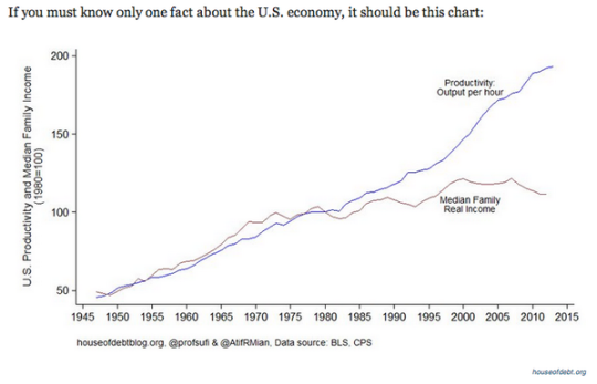
    What is happening here is that despite advances in technology and increases in productivity, real wages have been stagnant for decades. (This chart is for the US, but it likely applies to many other countries.)

    This is an interesting paradox. For a long time, increases in productivity were met with corresponding increases in income. So why the divergence?

    The author believes that it’s because the gains brought about by “extreme technological progress” are being unequally applied to the economy. In other words, they do not benefit the majority of people. He then goes on to argue that we could be entering an entirely new macroeconomic era: 

    “Economic growth may be over soon, at least in absolute terms. On the other hand that will be at least partially offset by the technological deflation. So instead of the decline of the innovation it will be just the opposite, the explosion of the innovation that will turn the economy to the decline. And moreover, it will not be a tragedy since we will be able to produce higher standard of living with fraction of the GDP today. Few adjustments needs to be done into our economic system to cope with the change for sure.”

    When you read things like this it makes the idea of a “basic income guarantee” seem far more palatable.

    The other chart that stood out to me was this one below, which shows the declining cost of solar panels and the rise of global solar panel installations. 
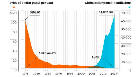
    It’s a great reminder that it’s only a matter of time before we wean ourselves off of oil. And, that we could be headed towards some sort of third industrial revolution where the marginal cost of energy is almost zero. Already about 25% of Germany’s electricity comes from renewables.

    On that note, I am going to end with a fantastic interactive chart from The Economist (screenshot below) that outlines oil reserves around the world by country. If you click through to their website, you can then toggle the price of oil (per barrel) to see how much of those reserves are actually viable.
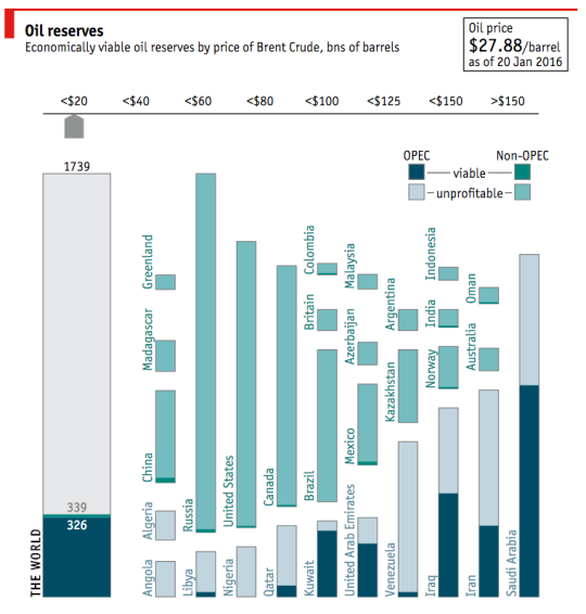
    With the price of oil where it is today ($27.88 per barrel as of January 20, 2016), there are only a handful of countries with profitable oil. I am sure you could have guessed which ones.

    What will happen if, or should I say when, that oil is no longer needed? 

  • Peer-to-peer solar startup

    Airbnb is a platform that connects people who have extra space with people who need space. It’s a peer-to-peer hospitality company.

    Yeloha, which is a startup I just discovered today, is a peer-to-peer solar company based out of Boston. 

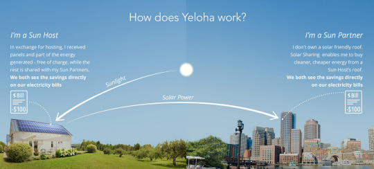
    In the same vein as Airbnb, it connect people who have extra roof space (that’s suitable for solar collection) with people who want to buy solar energy (but may not have a solar friendly roof).

    Here’s an image from their website that explains how it works:

    image

    Basically, if you have a solar friendly roof, Yeloha will come and install solar panels on top of your place for free. You get to keep some of the energy that’s generated (about 1/3 apparently) which becomes a credit to your electricity bill. You are then known as a “Sun Host.”

    The remaining energy gets fed back into the grid and, if you don’t have a solar friendly roof, you can purchase this excess energy, which also results in a credit to your electricity bill. The solar electricity is less expensive than the regular grid electricity. In this case, you are known as a “Sun Partner.”

    I think this is a pretty neat idea. Neither party has to pay anything upfront. Both parties save money. And the result is more solar through a distributed and virtual net metering setup.