Daily insights for city builders, delivered every morning at 6 AM ET. I’m Brandon Donnelly — a Toronto-based real estate developer and founder of Globizen. I’ve been writing here since 2013.

Tag: population growth

  • Largest US cities grew faster and became more diverse over the last decade

    The last decade has been pretty good for many cities. Recent 2020 Census data tells us that of the 50 largest cities in the US, 46 of them grew their population over the last 10 years. On average, these 50 cities grew by about 8.5%, compared to 5.6% for the decade between 2000-2010.

    As you might expect, the fastest growing cities tended to be in the south and the west. The top 3 fastest growing cities over the last decade were Fort Worth (24%), Austin (21.7%), and Seattle (21.1%). The cities with the biggest population declines were Detroit (-10.5%), Baltimore (-5.7%), Milwaukee (-3%).

    It’s important to keep in mind that city boundaries can skew these numbers depending on how they are drawn. A declining “city” population doesn’t necessarily mean that the broader urban area is losing people. Though it does still tell you something about the “city.”

    Another thing that happened over the last decade is that most of the largest US cities continued to become more diverse. In 2000, white populations were a majority (>50%) in 25 of the 50 largest cities. This dropped to 17 cities in 2010 and then 14 cities last year (2020). Meaning that 36 of the largest cities are now “white minority” cities.

    For more data check out this recent article from Brookings.

  • Spiky population density maps

    I rediscovered the maps and work of Alasdair Rae this morning. (He has appeared on this blog before in posts like this one here.) Alasdair works in the Department of Urban Studies and Planning at the University of Sheffield and is author of the blog, Stats, Maps n Pix. Recently, he’s been publishing maps showing population densities around the world. He also gets into the details of how they’re made. They are pretty cool to see.

    Here are the Great Lakes.

    And here is Brazil, as well as a map of the world (without any land shown). Canada and the United States barely register on this second one.

  • The performance of cities proper

    Richard Florida is currently running a four-part CityLab series on the economic performance of America’s cities. What makes this study somewhat unique is that it looks at cities proper, rather than at their larger metro areas. In some cases there may not be that much of a difference. But in other cases, the performance of the city proper could be very different from that of the broader area.

    Here are the fastest and slowest growing cities from 2012 to 2017:

    Here are the fastest and slowing growing job markets:

    And here is the growth in share of adults with a graduate degree:

    It’s interesting to see Seattle at the top of the population growth list. It is not a sprawling sunbelt city. It is an expensive tech hub. And it is also interesting to see Miami’s strong employment and education growth. Years ago, Paul Graham wrote an essay arguing that tech hubs have two prerequisites: capital and nerds. He went on to argue that Miami has lots of the former, but not much of the latter. Maybe that’s changing.

  • The next 15 megacities

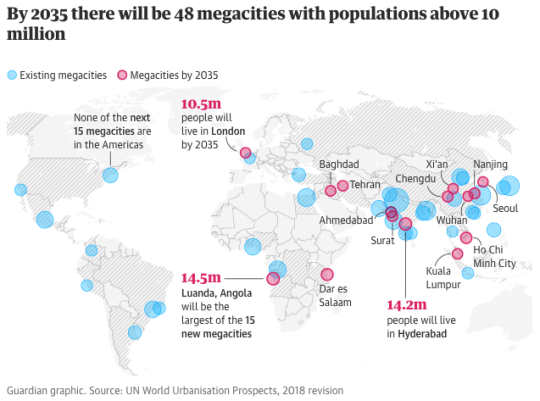
    The Guardian is running a series right now called: The next 15 megacities. A megacity is typically (but loosely) defined as a city (or metropolitan area) with a population of at least 10 million people. 

    By 2035, another 15 cities are expected to become megacities according to the United Nations. Hence the above series. None of these new entrants will be in the Americas. And only one – London – is anticipated to be in the West.

    The first city in their series is Baghdad. The second is Dar es Salaam. And the third, and latest, is Tehran. They are such interesting reads.

    I have said this before on the blog, but the pace of growth in many of these cities is astounding. Dar es Salaam – one of the fastest growing cities in the world – is adding about half a million people ever year.

    For the full megacities series, click here.

  • How large metro areas are driving the global economy

    “The concentration of economic growth and prosperity in large metro areas defines the modern global economy, creating both opportunities and challenges in an era in which national political, economic, and societal trends are increasingly influenced by subnational dynamics.” -Brookings Institute

    The Metropolitan Policy Program at the Brookings Institute has a new report out for 2018 called the Global Metro Monitor.

    Here are some of the highlights (data is from 2014 to 2016):

    – The 300 largest metro areas in the world accounted for 36% of employment growth and 67% of GDP growth.

    – Metro areas in China and the Asia-Pacific region outperformed, whereas Latin American cities, and in particular the largest Brazilian cities, were weaker performers.

    – The majority of large metro areas had growth rates that exceeded that of their respective regions. So again, cities are the driver.

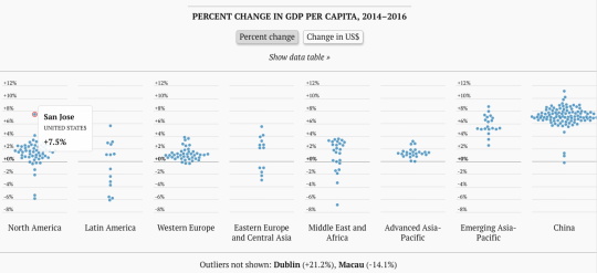
    And here is an interesting interactive chart (better to click through) that shows the % change in GDP per capita. 

    image

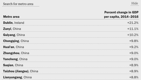
    Look at how much of an outlier San Jose is. Though, check out Dublin in the footnote. And if you look at the actual data table, it is all China, except for Dublin at the top.

    image

    For the rest of the charts, click here. And to download the full Global Metro Monitor report, click here.

  • Toronto: 2000 vs. 2025

    Last week, Joe Berridge, Partner at Urban Strategies, gave a presentation at the Institute on Municipal Finance & Governance titled, Toronto: The Accidental Metropolis. I’ve seen Joe give similar presentations to this one before, and I always thoroughly enjoy his focus on Toronto’s position as a global city.

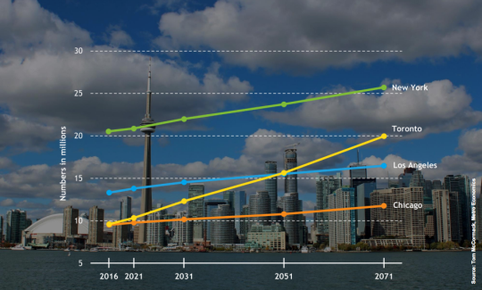
    Here is a slide from the presentation that projects out Toronto’s population to 2071 and compares it to the largest cities in the US.

    image

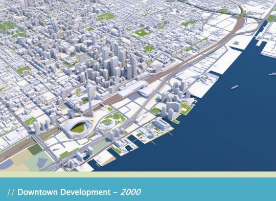
    But the two slides that have been really making the rounds online are the following ones. The first is a rendering of what downtown Toronto looked like in 2000. 

    image

    I remember this time clearly. Queen West seemed to end at Spadina. King West and Ossington weren’t things. And “Richmond and Adelaide” felt like the greatest club district in the world. (If you’re not from Toronto, these references will likely mean nothing to you. Sorry.)

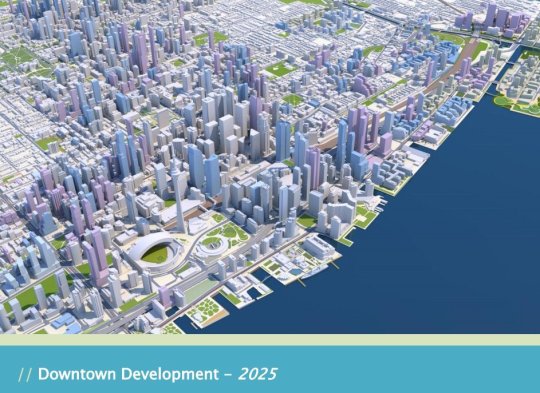
    The second slide is a rendering of what Toronto will look like in 2025. The transformation is just incredible.

    image

    I’ve seen some people comment that the Toronto of 2000 was relatively affordable; the Toronto of 2018 is unaffordable; and the Toronto of 2025 will be even more unaffordable with all of this new development.

    But I don’t understand that logic. Considering the growth rate shown in the first slide, imagine how unaffordable this city would be if we weren’t building new places for people to live and new places for people to work.

    For the full slide deck, go here. And for recent aerial photos of Toronto’s downtown core, check out my Instagram page.

  • Fastest growing large cities in the US

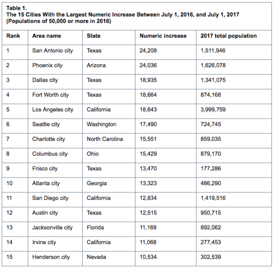
    Last week the US Census Bureau released its 2017 population estimates for the largest cities in the country. All of the figures are for the city itself and not the broader MSA or some other boundary.

    Here are the top 15 cities with the largest numeric increases between July 1, 2016 and July 1, 2017:

    However, if we switch over to percentage increases, Frisco, Texas – which is part of the Dallas-Fort Worth metro area – jumps up to number one with an increase of 8.2%. 

    In fact, the top 3 cities (on percentage basis) are in Texas and 10 of the top 15 cities are located in the South. That shouldn’t come as a surprise to many of you. Related post: Follow the sun and sprawl.

    However, if we only consider the 25 largest cities in the US, the fastest growing city on a percentage basis was Seattle at 2.47%. Number two was Fort Worth at 2.18%. And number three was Charlotte at 1.84%.

    New York City sits at 0.08%. And Detroit lost people. But it’s not a horrible figure (-0.35%). For more tables and data, click here.

  • The 100 million city

    The Guardian recently published this reminder that the real population growth in the world today is happening in Asia and Africa. The article is called, “The 100 million city: is 21st century urbanisation out of control?” Much of the data is from this 2016 paper by Daniel Hoornweg and Kevin Pope, which projected the populations of the world’s biggest cities by 2100.

    The standout example is that of Lagos, Nigeria, which went from under 200,000 people in the 1960s to an estimated 20 million people today. Though, I would imagine that the ubiquity of informal settlements makes it difficult to come up with an accurate number.

    Still, it is one of the world’s top 10 largest cities and, by 2100, it may be the largest city in the world. The Guardian described the population as young, fertile, and increasingly urban. The median age in Nigeria is 18 and the fertility rate for the content is 4.4 births per woman.

    I am mentioning all of this today because I think it grants some perspective. This is an immense city building challenge, not only because of the unprecedented growth rate, but also because it remains largely poor. Lagos, a city, may add more than 2.2x the population of Canada, a country, during the balance of this century.

  • New York is the only US city with an urban core growing faster than the suburbs

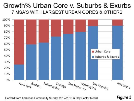
    The latest data from the American Community Survey (2012 to 2016) has placed the suburban and exurban share of the US population (53 major metropolitan areas) at 85.5%. Back in 2000 this number was thought to be around 83.5%.

    Since 2010, automobile oriented suburbs and exurbs have also accounted for 90.5% of population growth. The US – and Canada would be no different – is by and large a suburban nation. And the data suggests this isn’t about to change.

    The one exception is the New York metro area. From 2012 to 2016, 74% of its growth happened in the urban core. No other major metropolitan area in the US comes close to this sort of urbanity. Below is a chart from New Geography that shows you how NYC compares.

    All of the data for this post was also taken from New Geography.

  • Sprawling, but affordable

    The Wall Street Journal recently published an interesting article that ties in nicely with two of my recent posts. My post about North American population growth and my post about the San Francisco pro-development group known as BARF.

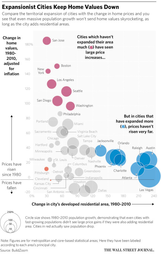
    The WSJ article is about the growing divide between affordable and expensive cities in the US. And the argument is that expansionist, or sprawling, cities are better at suppressing home values and maintaining affordability:

    “The developed residential area in Atlanta, for example, grew by 208% from 1980 to 2010 and real home values grew by 14%. In contrast, in the San Francisco-San Jose area, developed residential land grew by just 30%, while homes values grew by 188%.”

    Now, here’s a chart saying that same thing:

    The reality is that greenfield development (suburban sprawl) generally has far fewer barriers to development than urban infill development. So I’m not surprised to see cities like Las Vegas, Atlanta, and Phoenix clustered towards the bottom right.

    At the same time though, I’m obviously not convinced that sprawl is an optimal outcome. I think there are other costs not reflected in the chart above. So what’s the best solution here, assuming we want to build inclusive mixed-income cities?