Daily insights for city builders, delivered every morning at 6 AM ET. I’m Brandon Donnelly — a Toronto-based real estate developer and founder of Globizen. I’ve been writing here since 2013.

Tag: oma

  • Sloping columns and columns in tension

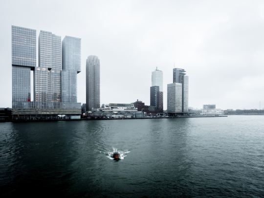
    I had an interesting meeting today talking about the structural approach behind this OMA-designed project in Brooklyn (pictured above).

    I have always found structural engineering fascinating. Structures, along with physics, were some of my favorite classes from high school all the way to grad school. So even though I don’t think my personality is ideally suited to engineering, if I were ever to become an engineer, I’m fairly certain that I would need to be a structural one.

    For this project the big structural challenge was the large cantilevers that you see above in the tower on the left. As I understand it, there a number of ways to deal with this. One way would be to just design large transfer slabs and/or beams. But given the size of this tower, these would end up being very deep, and so you’d be really compromising the spaces where these structural transfers occur.

    How they actually dealt with it is through sloping columns (which you can see in the above photo if you look closely). What these columns do is gradually transfer the loads across multiple floors in the building, until they reach structure that runs all the way down the tower.

    At the same time, the spaces underneath the sloping columns are essentially “hung” from above. Meaning the columns are in tension, instead of being in compression, which is typically how columns work. The result is that you get some sloping columns in the suites. But I think that’s kind of cool. If you’re nerdy enough to care, it tells you how the structure of the building is working.

    Obvious disclaimer: I am not a structural engineer. You probably want to consult one if you’re looking to do a cantilevered tower with sloping columns.

    Photo: Elevated Angles via Highbury Concrete

  • Introducing 100 Lombard

    Earlier this week, Slate Asset Management and Forum Asset Management submitted a new development proposal for 100 Lombard Street in downtown Toronto.

    At the time of writing this post, the applications (zoning by-law amendment and site plan control) hadn’t yet hit the city’s website. So here’s some information about the project, including its big moves:

    • This is the first mixed-use residential project in Toronto designed by the Office for Metropolitan Architecture (OMA). The proposal includes residential, office, and retail spaces.
    • Architecture by OMA and WZMH Architects. Heritage by ERA Architects. Landscape and public realm by Claude Cormier + Associés. Planning by Urban Strategies. Structure by Stephenson Engineering.
    • The principal architectural idea is to create a vertical urban village through a series of “urban rooms” interspersed throughout the tower. These spaces would serve as amenities for the building and house a variety of different functions. See above rendering.
    • The proposal introduces three important public realm moves: (1) a new public plaza that pays homage to the site’s former neighbor to the east — Second City; (2) a new mid-block pedestrian connection running north-south from Richmond Street East to Lombard Street; and (3) an outdoor public art gallery featuring oversized art tableaus.
    • The site currently houses one designated heritage building (86 Lombard Street), and the design contemplates relocating and fully retaining this building on the eastern edge of the site. Once you see the drawings, you’ll fully understand why this was the most logical move.

    The entire project team is very excited to get this proposal out and into the world. And we hope that you will see it as being representative of our ongoing and lasting commitment to elevating architecture, sustainability, culture, and city building in Toronto.

  • New Taipei Performing Arts Center by OMA

    The new OMA-designed Taipei Performing Arts Center opened up last Sunday and so you’ll now find lots of articles, photos, and drone videos circulating around online. The two partners-in-charge, Rem Koolhaas and David Gianotten, were also on this Monocle on Design episode talking about the genesis of the project and how they worked to optimize the various theater spaces.

    My favorite part of the whole story is how they actually won the design competition. The site is located next to Taipei’s renowned Shilin Night Market. And I can attest to this fame because I spent a summer living in Taipei while I was in university. This night market was the thing I was immediately told I needed to visit as soon as I stepped off the plane. And they weren’t wrong. I spent many a nights with those stinky tofu dishes that smell like feet but actually taste pretty good.

    But for whatever reason, the competition brief stipulated that the night market was to be torn down in order to make way for this new performing arts center. And since it was in the brief, almost everyone took it as a non-negotiable given. The only firm that didn’t — out of 140 bidders — was OMA. They questioned why the city couldn’t have both: a new performing arts center and their wildly successful night market.

    So that’s how OMA — at least partially — won the competition. And I’m certain that Taipei is better for it.

  • 50U

    There is a new book out right now about the United Arab Emirates called 50U. It has been fifty years since the confederation of the seven Gulf states was officially declared (December 2, 1971), and so the book is a celebration of that. The format is 50 portraits of people, places, and plants (yes, plants) that tell the story of the UAE.

    Included in the book is an excerpt of a 2009 talk by architect Rem Koolhaas (of OMA) about his reading of Dubai. ArchDaily published an abridged version over here and I thought it was an interesting read. Few people think about cities as deeply as Koolhaas does, and few can express their thoughts in such a rational and Dutch-like way. Here’s a snippet of the talk:

    I came here first in 2004. We were asked to do a major building on the site which is marked by the flag. Then, two years ago it was the exact moment… I became increasingly nervous about the mission of architecture and the uses of architecture. And I really became almost desperate… that the incredible pressure of the market economy was forcing architecture itself into increasingly extravagant conditions. Seemingly, Dubai seemed to be the epicenter of that extravagance. So, I came with deeply ambivalent feelings. It seemed as if the idea of the city and the metropolis itself had been almost turned into a caricature, not a coherent entity but maybe a patchwork of theme parks. And those themes would become the bogus and increasingly bizarre characters that were perhaps partly mythical and partly real.

    I’ve only been to Dubai once. It was back in 2008 or 2009. And to be honest, it wasn’t my favorite city; I think primarily because I enjoy walking cities and Dubai is largely the opposite of that. It felt like a patchwork of theme parks that you had to drive around to — ideally in an exotic car while being as flashy as possible.

    Now if these theme parks were within walking distance (and the drinks were good), that would be an entirely different story.

  • OMA New York has just published its first book

    OMA NY — the New York office of OMA — has just published its first monograph. It’s called OMA NY: Search Term. For those of you who may be unfamiliar, Office for Metropolitan Architecture (OMA) is an architecture firm that was founded by Rem Koolhaas in Rotterdam in 1975.

    The firm is considered to be one of the most influential in the world because of their projects, the writing and thinking of Rem Koolhaas, and because of how many notable architects developed their craft under his tutelage.

    When I was in architecture school, OMA was a firm that people wanted to work at and I had friends who did. You weren’t paid very much from what I remember, but people put up with that because you wanted OMA on your resume and you wanted to learn things from Rem (apparently he’s a big fan of Raisin Bran in the morning).

    The New York office of OMA is run by Shohei Shigematsu and Jason Long who are both partners. The practice started out as an American outpost, but it has become more independent over the years and, from what I can gather, it now prides itself on having its own attitudes and views on architecture and urbanism.

    This monograph is about that. Twenty radical projects from the firm’s new guard. It also includes interviews from people like Virgil Abloh (Off-White). I don’t have a copy yet, but if you’re an architecture and urbanism person, you probably want this one on your bookshelf.

    Image: Rizzoli

  • One big tower split into two

    The OMA-designed Greenpoint Landing Towers in northern Brooklyn recently topped out. Photos and announcement over here. If you aren’t familiar with the project, it’s very OMA. What I mean by that is that there’s a kind of simple rationality to it. (I just made up this architecture speak.) Big bold moves with a certain logic behind it. Here’s the story and thinking behind Greenpoint Landing:

    Supposedly this project is in a part of Brooklyn that stipulates a maximum tower floor plate size of 11,000 square feet. Following this rule, you get a two-tower design that looks something like image number one in the top left hand corner of the above diagram. The resulting tower separation would be 40 feet, or just over 12 meters. (Are you seeing these numbers, Toronto?)

    What OMA did was taper one tower (diagram image #2) and then create an inverted ziggurat form for the second tower (diagram image #3). The effect is two towers that look like they were almost one giant tower that had been simply pulled apart. The resulting tower separation distance in this final scenario is 60 feet, or just over 18 meters.

    I am assuming that there’s some area loss in this design because of the increased tower separation, though maybe the larger podium makes it up. Either way, from what I can tell, there are two main benefits to this design: (1) you get a tower with stepbacks facing the water (so places for outdoor spaces) and (2) it breaks up the visual monotony of two equally extruded towers.

    If any of you are more familiar with this project, I would welcome your thoughts in the comment section below.

    Image: OMA

  • OMA’s first ground-up project in Manhattan finishes construction

    121 East 22nd — which is OMA’s first ground-up project in Manhattan — recently finished up construction at the corner of E 23rd St and Lexington Ave (the site continues through to E 22nd St, where there is basically a 2nd building). I wrote about the project over two years ago, here.

    Below is a photo by Laurian Ghinitoiu, via Dezeen, of it completed:

    The defining feature is its “prismatic corner”, which, I understand from this interview with David Von Spreckelsen (President of Toll Brothers City Living), was largely an outcome of the site’s restrictive zoning. There was a requirement to have constant street walls. That minimized what could be done architecturally on the project’s main elevations.

    The solution is two contextual street walls — the punched windows are designed to match the rhythm of their adjoining buildings — coming together and creating dramatic visual interest only at the point where they intersect. Below is a rolled out elevation from OMA. Note the gradient created by the windows as they converge toward the corner (center in the drawing below).

    The other interesting thing about this project is that it reminded me just how different the built form of Manhattan can be compared to Toronto. In the case of 121 East 22nd, the streetwalls rise 150 feet without any stepbacks. There is then a 10 foot stepback before the building rises another 60 feet — similarly without any additional breaks.

    I love the grandeur.

  • Starchitecture is dead — how OMA thinks about preservation

    I somehow stumbled upon this transcript from Columbia University’s Graduate School of Architecture, Planning and Preservation (GSAPP), covering a talk that architect Rem Koolhaas did at the school back in, I think, 2014. 

    The title: “Preservation is overtaking us.” It’s all about how his firm OMA thinks about and approaches preservation. 

    The overarching theme is that preservation, for them, has become a kind of refuge from the market forces – which they call the “The ¥€$ Regime” – that currently drive architecture and demand constant novelty. It is refuge from “starchitecture.”

    Here is an excerpt:

    At some point, I don’t know who was responsible, the word, “starchitect” was invented. And we all know what it is: a term of derision. And at some point, it becomes very hard to avoid. I would say that preservation is, for us, a type of refuge from this term. What we are hoping to do is propose a number of strategies in which we are working to undo, or escape, from this label.

    And here is a summary of “OMA’s Preservation Manifesto” taken from the GSAPP transcript:

    1. Starchitecture is dead
    2. New forms are no longer relevant
    3. Preservation is architecture’s saving retreat
    4. Preservation creates relevance without new forms
    5. Preservation is architecture’s formless substitution

    It’s a substantial read, but a fascinating one. In case you don’t get to it (understandable), I would like to leave you with this final excerpt:

    What we started to do was look at preservation in general and look a little bit at the history of preservation. Now, the first law of preservation ever defined was in 1790, just a few years after the French Revolution. That is already an interesting idea, that at the moment in France when the past was basically being prepared for the rubbish dump, the issue of preserving monuments was raised for the first time. Another equally important moment was in 1877, when, in Victorian England, in the most intense moment of civilization, there was the second preservation proposition. If you look at inventions that were taking place between these two moments—cement, the spinning frame, the stethoscope, anesthesia, photography, blueprints, etc.—you suddenly realize that preservation is not the enemy of modernity but actually one of its inventions. That makes perfect sense because clearly the whole idea of modernization raises, whether latently or overtly, the issue of what to keep.

    I like the notion that preservation is one of the inventions of modernity, rather than an enemy of it.

    Photo by Reginar on Unsplash

  • 121 E 22nd

    My friends in New York tell me that if you want to sell a luxury residential building, you need a name brand architect. People care about architecture and it’s part of the buying process: “Oh, it’s a Herzog building.”

    To that end, Toll Brothers City Living just released the following video for their 121 E 22nd project in New York. If you can’t see it below, click here. What’s notable, is that it is OMA’s first full building in New York. So the story is: star architect + first building in the city.

    [youtube https://www.youtube.com/watch?v=dSQq8W8od9g?rel=0&w=560&h=315]

    But there’s more. It’s almost unbelievable that, until now, OMA hadn’t designed and constructed a full building in New York. I reread this Dezeen article 5 times just to make sure I wasn’t missing something.

    So much of Rem Koolhaas’ career (founding partner of OMA) is centered around New York City. In 1978, he published Delirious New York, where he both dissected and celebrated the city’s “culture of congestion.” Oysters at the downtown athletic club, anyone?

    This book was so influential that I bet you’d be hard pressed to find an architect that doesn’t have it in their collection. I have his approximation of New York hanging on my wall. So this was clearly overdue. Kudos Toll Brothers City Living.

    Note: OMA’s New York office is led by Shohei Shigematsu.

  • Triple-glazed sliding doors (or walls?)

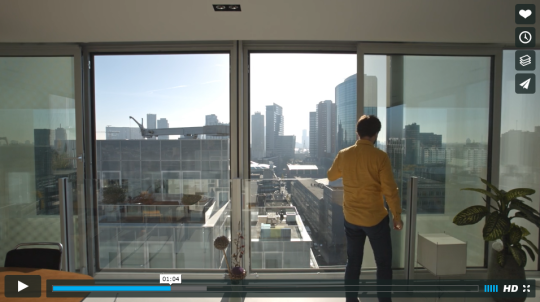
    After my post about “the great balcony debate”, there was a bit of discussion on Twitter. Ken Wilcox then responded with a video talking about the mixed-use Timmerhuis building in Rotterdam designed by OMA

    At the 1 minute mark there’s a clip of one of the residents opening a large set of sliding doors. Here’s a screenshot of what that looks like:

    image

    I did a bit of digging on the project and found this fact sheet. The sliding doors in the residential units measure 1.8m x 2.6m. They go from floor-to-ceiling (~8′-6″). The windows are also triple-glazed! (3 glass panes + 2 air chambers.)

    I think this is a great way to open up a suite to the outdoors. It also looks like the glass balustrades sit inside, which keeps the building’s exterior envelope uninterrupted. Some of the other suites have large terraces where the building steps back.

    In case you’re wondering, the construction costs for the entire project was about €100 million and the total gross floor area (including all of the non-residential uses) is about 45,000 m² (~484,200 sf). Unit rate seems reasonable given that triple-glazing is virtually unheard of in Toronto.

    P.S. I am having some technical difficulties with Tumblr (my blogging platform) and Mailchimp (my email service provider). They both had problems and a few daily emails didn’t get sent out. Sorry about that. Hopefully it’s resolved now. If you missed the last couple of posts, you can read them online.