Daily insights for city builders, delivered every morning at 6 AM ET. I’m Brandon Donnelly — a Toronto-based real estate developer and founder of Globizen. I’ve been writing here since 2013.

Tag: new york city

  • Road pricing for whom?

    New York City is considering a congestion charge for drivers entering Manhattan below 60th street. It is part of Governor Cuomo’s Fix NYC plan. But we all know how difficult these things are to implement.

    Last month, Felix Salmon wrote a piece in Wired where he argued that our cities are dying of traffic congestion and that the cause is ride-hailing services like Uber and Lyft. The solution: A tax on ride-hailing services.

    The article elicited a few reactions, including this one by Charles Komanoff over at Streetblogs and this one by Joe Cortright over at City Observatory. Joe’s message: “The problem isn’t the ride-hailed vehicles, it’s the under-priced street.” 

    Precisely.

    Felix later followed-up with a post on his blog where he clarified that the reason he loves this idea – of taxing ride-hailing companies, not riders – is that it’s far more politically palatable than a blanket tax on all cars. I don’t disagree.

    Which is why I think my idea is something which is eminently politically possible, in contrast to congestion pricing, which has been implemented exactly nowhere in the USA.

    Americans love their cars, and they love the freedom that cars represent, and they hate the idea that they should be taxed for driving their cars. Tolls on roads and bridges are bad enough, but a fee just to drive in to a city?

    That said, I’m with Charles and Joe. 

    Last year, it was reported that roughly 25% of all Uber trips in New York City were UberPool trips. I’m not sure what the number is today, but these are people who are car pooling to get around. That’s generally considered to be a positive thing.

    Are these really the trips we want to be discouraging (and singling out) with a charge simply because we don’t have the moxie to do what is right and makes rational sense?

    Photo by Austin Scherbarth on Unsplash
  • Become a Sidewalk Toronto Fellow

    Sidewalk Toronto is currently looking for “12 smart, creative, and caring people who are interested in the future of Toronto’s waterfront and how we [Sidewalk Toronto] can responsibly incorporate technology to improve urban life.”

    Each Fellow will complete a 2-day orientation session in Toronto; 6 days in Amsterdam and Copenhagen; 5 days in New York City and Boston; 3 days in Vancouver; and then do a final 2-day working session back in Toronto before presenting their takeaways.

    This feels like a response to the criticism that Sidewalk Toronto wasn’t doing enough to listen to the community and that it simply wanted to build a tech-infused neighborhood that could serve us more ads – but it’s cool nonetheless. 

    If you’re between 19-24 years old and you live in Toronto, you can apply here. It sounds like a fun opportunity for young city builders. I know that I certainly would have been all over it when I was in that age bracket.

  • Manhattan apartment rents post biggest decline since 2011

    A friend of mine sent me this article earlier today with a sarcastic comment about the relationship between housing supply and rents.

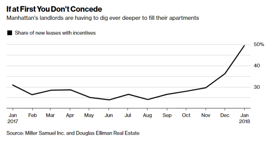
    The article talks about how rents in almost every Manhattan neighborhood have fallen compared to a year ago because of a flood of new apartment supply coming online. The median rent dropped 3.6% (year-over-year) which is the biggest decline since October 2011.

    image

    There has also been a spike in the number of leases with some sort of incentive attached to it (see above). As a landlord you typically want to use incentives, such as free rent, before resorting to lower face rents. Because lower rents mean a lower overall net operating income, which in turns depresses the value of your property.

    But sometimes you have no choice:

    “Landlords have finally realized, ‘OK, we have to adjust these prices because the concessions aren’t doing as much,’” said Hal Gavzie, who oversees leasing for Douglas Elliman. “Customers are looking past the concessions being offered and just looking for the best deals they can find.”

    A few weeks ago I wrote about a similar story playing out in Seattle. It’s almost as if excess housing supply is driving down rents.

  • Why east sides are often poorer than west sides

    In a recent Spacing article, called Pollution and the fall and rise of urbanism, Dylan Reid argues that one of the reasons why urbanism declined in the 20th century was because of industrial pollution. (There are, of course, other contributing factors beyond just pollution.)

    This article is the first time I have come across a study supporting the widely held belief that pollution and prevailing windows are the reasons for why the east sides of many former industrial cities are poorer than the west sides. Here is more on that from the article:

    People recognized and understood that pollution had an impact on them, and they tried to avoid it if they could afford to do so. Have you noticed, for example, how in so many cities (Toronto included), the east side is poorer than the west side? It’s because the prevailing winds in Europe and North America are west to east, and they blow pollution to the east side. A fascinating study by economists Stephan Heblich, Alex Trew and Yanos Zylbergerg quantified this effect, identifying how 19th century pollution was dispersed eastwards and showing that the most polluted areas were also the poorest. 

    What the authors discovered is that not only did pollution cause a geographic sorting based on wealth, but that there’s also a certain degree of persistence to it. This makes sense if you think about it. Pollution in our cities has waned significantly and yet here we are still remarking and talking about east vs. west.

    It goes to show you just how long lasting the impacts of our city building decisions can be.

  • My even shorter Amazon HQ2 shortlist

    Amazon released its shortlist of HQ2 cities this morning. Below are the 20 metropolitan areas. They were selected from 238 bids, so this shortlist represents 8.4% of the original pool.

    • Atlanta, GA
    • Austin, TX
    • Boston, MA
    • Chicago, IL
    • Columbus, OH
    • Dallas, TX
    • Denver, CO
    • Indianapolis, IN
    • Los Angeles, CA
    • Miami, FL
    • Montgomery County, MD
    • Nashville, TN
    • Newark, NJ
    • New York City, NY
    • Northern Virginia, VA
    • Philadelphia, PA
    • Pittsburgh, PA
    • Raleigh, NC
    • Toronto, ON
    • Washington D.C.

    I saw some people on Twitter say that they were surprised to see Toronto and Miami on this list. I was not. If you remember, I publicly predicted on this blog that Toronto would be selected for Amazon HQ2.

    That said, I thought it would be fun to guess at an even shorter list from Amazon’s shortlist. I have no knowledge of Amazon’s actual selections process, but if I had to guess, here is who I would cross off the list:

    • Atlanta, GA
    • Austin, TX
    • Boston, MA
    • Chicago, IL
    • Columbus, OH
    • Dallas, TX
    • Denver, CO
    • Indianapolis, IN
    • Los Angeles, CA
    • Miami, FL
    • Montgomery County, MD
    • Nashville, TN
    • Newark, NJ
    • New York City, NY
    • Northern Virginia, VA
    • Philadelphia, PA
    • Pittsburgh, PA
    • Raleigh, NC
    • Toronto, ON
    • Washington D.C.

    That leaves us with a list that looks like this:

    1. Boston, MA
    2. Miami, FL
    3. Montgomery County, MD
    4. Newark, NJ
    5. Northern Virginia, VA
    6. Toronto, ON
    7. Washington D.C.

    So why this list? I’m probably wrong, but my reasons are as follows:

    – I think Amazon will opt for a metro area on eastern time.

    – There seems to be a predilection for areas around Washington D.C., so I left Montgomery County and Northern Virginia. 

    – As wonderful as it is, New York City feels too center ice for Amazon – at least in my view. But maybe Newark places them in the catchment area.

    – The area needs to be of a certain scale so Amazon doesn’t overpower it and they have enough human capital to draw from.

    – Miami is my sleeper bet. Most people think of it simply as a resort town, but there’s a huge percentage of foreign born residents and powerful arts/design scene.

    – Talent is number one, which is why I left Boston and Toronto and why I continue to believe in Toronto. Toronto is more dynamic than Boston.

    If I had to pick just three from the above shortlist, my bets would be, in alphabetical order: Boston, Toronto, and Washington D.C. What are yours?

  • Where the young and educated are moving to in the US

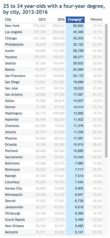
    City Observatory tracks something that they call “The Young and Restless.” It refers to the segment of the US population that is between 25-34 years old and has a bachelor’s degree or higher.

    We know that people in this age bracket tend to be relatively mobile and that the likelihood of moving decreases as people age. So it’s a potential leading indicator for the city regions of the future. It also adds a bit more nuance to the urban vs. suburban growth debate. 

    According to City Observatory, between 2012 and 2016 the number of 25 to 34 year olds with a 4-year degree living in one of the 53 largest largest cities in the US increased by 19%. This is compared to a 4% increase in the overall population in these cities.

    This increase in young well-educated adults is also happening 50% faster in the largest cities. So the young and educated still seem to be demanding city living, even if the world is arguably still suburbanizing.

    Below is a snapshot of City Observatory’s latest data. I’ve sorted the list by total change in population (2012 to 2016). Happy to see Philadelphia near the top. If you do it based on percentage, Detroit wins with a 64% increase.

    For the full list of cities, check out City Observatory.

  • How the Time Warner Center came to be

    New York Magazine is running a weekly series right now that tells the stories behind key moments in the city’s cultural history. This week’s is about how the Time Warner Center came to be.

    Like most real estate projects, it took an enormous amount of time for it be realized. Multiple developers had attempted to buy the site, which previously housed the New York Coliseum.

    In 1987, the agency put out a call for proposals, its parameters calculated to yield the highest price and the biggest building. Among the 13 developers who responded was Donald Trump, who proposed the world’s tallest tower, 137 stories high.

    It’s a good example of just how difficult it can be to get a large project off the ground. The Time Warner Center opened in 2003. Thank you Paul for sending this along. Click here for the full story. 

  • 2017 year in review

    I just finished going through my list of 2017 goals. I didn’t accomplish everything I wanted to, but I did manage to check off a number of professional and personal goals.

    Some of the remaining goals have been pushed to 2018. But there are also items that I have since realized aren’t worth pursuing and so I have dropped them from the list.

    All that said, it was a great year. Here is a rapid-fire summary of 2017 told through posts from this blog.

    Thanks for reading. Onward my friends.

  • New York is the only US city with an urban core growing faster than the suburbs

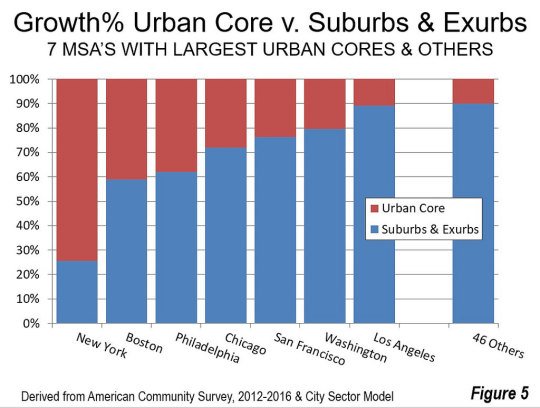
    The latest data from the American Community Survey (2012 to 2016) has placed the suburban and exurban share of the US population (53 major metropolitan areas) at 85.5%. Back in 2000 this number was thought to be around 83.5%.

    Since 2010, automobile oriented suburbs and exurbs have also accounted for 90.5% of population growth. The US – and Canada would be no different – is by and large a suburban nation. And the data suggests this isn’t about to change.

    The one exception is the New York metro area. From 2012 to 2016, 74% of its growth happened in the urban core. No other major metropolitan area in the US comes close to this sort of urbanity. Below is a chart from New Geography that shows you how NYC compares.

    All of the data for this post was also taken from New Geography.

  • Aerial photographs of LA and NY

    I like the built form aerial photography of Jeffrey Milstein. Here is one of Stuyvesant Town in New York City:

    It shows a symmetrical plan view that followed a particular dogma at the time.  But it’s also a view that few people or residents would ever see or appreciate.

    The above image is from his exhibition at the Bau-Xi Gallery here in Toronto (340 Dundas Street West). It runs until December 16, 2017.

    On January 25, 2018, the exhibition moves to the Benrubi Gallery in New York City (521 W. 26th Street). Check them out if you’re interested.