Daily insights for city builders, delivered every morning at 6 AM ET. I’m Brandon Donnelly — a Toronto-based real estate developer and founder of Globizen. I’ve been writing here since 2013.
This is a fascinating short video (by Vox) about a former neighborhood in Manhattan known as Seneca Village. Today, its land forms part of Central Park.
Most of us would probably agree that building Central Park was both a good idea and a powerful example of the value of foresight.
But that doesn’t mean that the area’s pre-park history is something that should be forgotten. (Thanks for sending this along, Jeremiah Shamess.)
If you’d like to learn more about Seneca Village, check out this NY Times opinion piece by Brent Staples. It’s called, The Death of the Black Utopia.
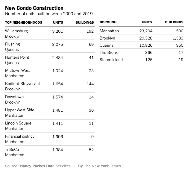
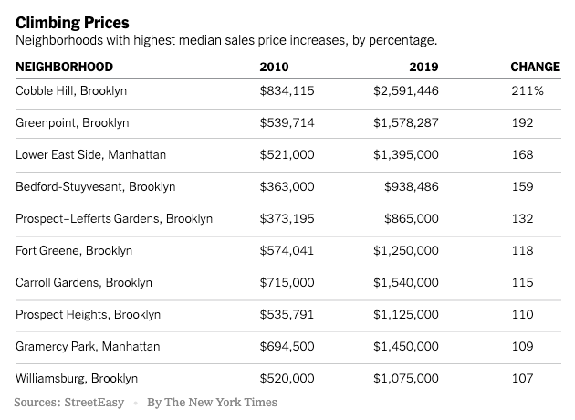
A decade of ultra luxury condos. The New York Times published this story over the weekend talking about how the luxury condo boom of the 2010s transformed New York City, and in particular Brooklyn.
Below are two tables from the article: (1) The number of units built between 2009 and 2019 across the five boroughs and the city’s top neighborhoods, and (2) the neighborhoods with the highest median sale price increase.
The overarching theme is that New York built too many “super-high-end condos” geared toward global capital flows. According to one developer interviewed for the article (Gary Barnett of Extell Development), it was unprecedented.
Apparently, the problem segment remains the $5 million to $10 million market. There’s simply too much inventory, and that has developers both delaying launches and going with much smaller (and hence more affordable) unit mixes.
One stat that stood out for me was the new condo premium over resales. In 2011, the average sale price of a new condo in the city was about $1.15 million, which represented about a 9% premium over resale pricing.
While it is typical to see a premium over resales (the same is true in Toronto), the average price of a new condo in 2019 rose to $3.77 million, representing a 118% premium over resales.
The Nib’s recent comic about Jane Jacobs vs. The Power Brokers (i.e. Robert Moses) is a good little overview of her lessons and legacy. But I don’t understand the claim that developers co-opted her ideals in order to exploit and gentrify urban neighborhoods. According to the comic, gentrification is always a top-down affair by developers, and never a spontaneous emergence as a result of other humans and/or industry wanting to be in a particular place.
I can think of many neighborhoods that have seen investment from groups other than traditional developers, including from individual homeowners. Take, for example, Cabbagetown in Toronto. There was never a top-down developer moment. It was individuals who saw beauty (and also opportunity) at a time when others were scared of the area. Is that acceptable? Perhaps more importantly, did these people wear black suits?
The other missing piece is the fact that desirable urban neighborhoods are, today, in incredibly short supply. During the reign of Robert Moses, Jane Jacobs had a view of cities that was in opposition to the planning zeitgeist of the time. But over time, she went from controversial to enlightened, and alongside this we saw a return to cities.
Combined with strict land use policies, this rising demand for Jacobian-style neighborhoods has meant that many/most dense urban centers operate with a perpetual housing supply deficit. There’s not enough cool urban housing to go around. Add in the current low interest rate environment, and you then have even more money searching for that perfect home in the West Village. That tends to do things to prices.
I was recently having a debate with one of our architecture partners about the interrelationship between architecture, interiors, and branding. This came up because, in New York City, you almost need a name brand architect attached to your project in order to sell luxury condos.
But this raises an interesting set of questions: How much value is driven by the quality of the architecture versus the architect’s brand? (Though, presumably you need the former in order to build the latter.) And how much of the value is actually just driven by the finishes (interiors) and the branding that you layer on after?
This latter scenario is a depressing thought for architects. It is architecture as a kind of “empty vessel.” One that just gets dressed up for today’s Instagrammable moments. And I am sure that you can think of some examples of this. Not everything can be capital A architecture.
But what is clear is that the most successful design-driven projects don’t think in this way. They are thoughtful and deliberate about each component, and they all work together to strengthen each other. Marketing, after all, is about telling the right story. It is always helpful when you actually have one to tell.
Algorithmic home buying companies (or iBuyers) have now started to expand into Los Angeles. If you recall, most of these companies started in smaller markets where the homes are more homogenous, relatively inexpensive, and generally less liquid. Places like Phoenix.
By tackling the second largest housing market in the US (after New York City), the algorithms of Opendoor, Redfin, and Zillow will now need to content with an older housing stock, greater variability, and higher values.
All of these companies have increased their maximum offer price. The sweet spot for algorithmic home buying has typically been in the $150,000 to $300,000 range. Last year, two-thirds of all homes bought by iBuyers were in this range. I can’t imagine that gets you very much in LA.
I keep expecting these companies to scale into something more beyond just iBuying and flipping. Perhaps we will see that happen once they establish themselves in country’s biggest markets.
We all know the story: Much of the world is becoming increasingly less equal thanks to the new knowledge economy. Using data from the Federal Reserve Bank of New York, the NY Times (Emily Badger and Kevin Quealy) recently published this interesting piece on “4 decades of inequality” in American cities. This is what the findings look like:
In 1980, the United States was relatively flat in terms of wage inequality (except for maybe Fairfield). In fact, inequality in a place like Binghamton, New York was about the same as in New York City. But thanks to decline in the former and growth in the latter, New York City is now a much more unequal place.
Economic growth is usually considered a good thing, but inequality is not. Emily and Kevin rightly call attention to the fact that — according to the above charts — these two things seem to come together as one package. See New York, Chicago, San Francisco, San Jose, Washington, D.C., and so on.
The other takeaway from these charts is the way in which inequality seems to correlate with metro area population. We know that as the population of a city increases it tends to also become more productive. And so what we are seeing here are those urban agglomeration benefits accruing to some, but not all.
There’s a lot that can be inferred from these charts.
I spent a good chunk of this morning talking and thinking about underground building details that most people (unless you’re in the industry) would never think to consider. This is not a criticism on most people. I mean, I don’t know how iPhones are made. I just use and enjoy them. But when it comes to buildings, I’m paid to ask questions and understand how things work.
There’s a lot of risk in the ground.
You have to think about things like bearing capacity, environmental contamination (usually), hydrostatic pressure and, generally, how you’re going to manage water, particularly if you have a high groundwater table. Usually this last one is about making sure you’re keeping the water out. A pretty important detail both below and above grade.
So when I came home tonight and saw the below tweet, I felt obligated to write about it.
If you read the reply from NYC’s Metropolitan Transportation Authority, you’ll see that this is them testing something they call a “flex gate.” It is a flood barrier that allows them to seal off subway entrances in the case of a storm surge and they run these tests (shown above) for 4 hours at a time to make sure they’re installed property. This one was.
Managing water is a big part of city building. New York City, Miami, Venice, and countless others know this all too well right now.
The Shed in Hudson Yards has an exhibition on right now called Manual Override. It features the work of five artists. One of those artists is Lynn Hershman Leeson, who is known for exploring the relationship between humans and technology (naturally, she lives in the Bay Area). Her piece at the exhibition is called Shadow Stalker.
The way Shadow Stalker works is that you enter your email address — a single data point. The installation then pulls up all of the publicly accessible information associated with your email address. Things like your name, age, address, phone numbers, where you were last seen, and more.
She refers to this information as your “digital shadow.” It is all of the personal information that is publicly accessible because of the internet. And it is the kind of the information that is already used for things like “predictive policing.” Software that predicts where crime is likely to occur.
I am fairly public as a result of this blog. Already this year I have written over 75,000 words. So I can only imagine what the internet knows about me. Probably a lot. But of course, I am volunteering a lot of this information. What does the internet know about us that we didn’t explicitly tell it?
If you’re interested in learning more about Shadow Stalker, here’s a video.
This December 4 (2019) — the day before Art Basel starts — the Rubell family will open a new 100,000 square foot museum in Miami’s Allapattah district. (For years people have been calling Allapattah the new Wynwood.)
A former industrial space on a 2.5 acre lot, the building was renovated by New York-based Selldorf Architects. Just over half of the building has been allocated to exhibition space and about 65% of this will be for permanent/longer-term collections.
The Rubell family started collecting contemporary art in 1965. At the time, they were living in New York City. In 1990 they moved to Miami and in 1993 they opened up the “Rubell Family Collection” in Wynwood, which was a depressed neighborhood up until probably the early 2000s.
With over 7,200 works, it is now one of the largest privately owned and publicly accessible contemporary art collections in the world. If you live in Miami or you happen to find yourself there this winter, you may want to check out the new Rubell Museum.
Yonge Street divides Toronto between east and west. It’s an iconic street (though it has its ups and downs). Since 2018, the City has been studying ways to redesign and improve the stretch that cuts through the middle of downtown.
It is a story that we have seen in many other cities around the world, perhaps most famously in NYC. Here is a street where pedestrians outnumber vehicles and yet we allocate more space to the latter (within a fixed ROW). This study hopes to fix that.
They’ve narrowed things down to four Alternative Designs (downloadable, here). All of them prioritize pedestrians, but in different ways. As of right now the preferred option is Alternative #4. It looks like this:
The section around Dundas Square (from Dundas Sq up to Edward Street) is fully pedestrianized with only emergency vehicles having access during the day. This segment has the highest pedestrian volumes. The other blocks allow for a combination of one-way and two-way vehicular traffic.
Vehicular access is obviously still important for things like loading, but it’s pretty clear that the future of Yonge Street is pedestrian priority. We should probably be doing this right now. If you’d like to voice your own opinion, you can do that here until Friday, December 6, 2019.