Daily insights for city builders, delivered every morning at 6 AM ET. I’m Brandon Donnelly — a Toronto-based real estate developer and founder of Globizen. I’ve been writing here since 2013.

Tag: Modernism

  • The birth of the open floor plan

    image

    Today most condos and apartments are designed with open concept (or open plan) floor plans. This generally means that the kitchen and main living areas are combined into one continuous and fluid space. 

    Part of this has to do with creating a sense of openness and part of this has to do with simply maximizing small spaces. When you consolidate spaces, you get to take advantage of occupancy overlaps.

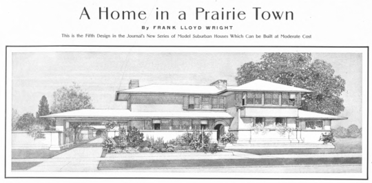
    But this isn’t a new concept. The roots of the open plan go all the way back to the turn of the 20th century with Frank Lloyd Wright’s emerging “Prairie School” of architecture.

    Ian Bogost’s recent piece in the Atlantic called, “The Curse of an Open Floor Plan”, does a good job of explaining this history. He credits Wright with popularizing the open plan.

    Here is an excerpt:

    In the February 1901 issue of Ladies Home Journal, on a single page between a portrayal on the “Life of an English Girl” and a feature asking, “Is the Newspaper Office the Place for a Girl?,” the then-obscure American architect Frank Lloyd Wright published plans for a home “in a prairie town.” It might seem like a strange host for architectural plans, but Ladies Home Journal frequently featured them, amid Rubifoam toothpaste ads, tips on what to do with cheese, serialized romance novels, and journalistic muckraking. It makes sense: Architecture is the foundation of home life, a matter largely relegated to women then—and still today, like it or not.

    Many of the characteristic features of Wright’s “Prairie” style, as others would come to call it, are already visible in the 1901 design: a low-pitched roof, wide eaves, horizontal orientation, and a strong connection to the surrounding landscape. Inside, another feature is present, in nascent form: an early open floor plan, combining multiple rooms together into a continuous space.

    Of course, at the time, the open plan was about much more than raw practicality and economic necessity. It wasn’t just about maximizing space and affordability. Here is another snippet:

    For Wright, Neutra, Harris, and others, open design represented the promise of a new social ideal, one where fluid spaces would allow egalitarian integration. That aspiration continues, in a way, but the ideal is less communal and more individual: Open plan is where everyone does their own thing, but all together.

    For Bogost’s full piece, which is worth a read, click here.

    Image: University of Michigan Library via The Atlantic
  • Don’t touch the walls

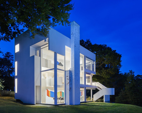
    The Smith House by Richard Meier turned 50 years old last year. In celebration of that, photographer Mike Schwartz took these photographs. And just recently they were published in Surface Magazine along with an interview of both Meier and Chuck Smith. Smith’s mother commissioned the house (completed in 1967) and he was 8 years old when the family moved in.

    My favorite comment in the article is this one by Smith:

    “Don’t throw balls in the house, and don’t touch the walls.” I must have heard “don’t touch the walls” three or four times a day. That said, there’s a crack in one of the windows where I shot it with a BB gun. We got away with some things.

    Modern architecture was supposed to be a perfectly engineered machine for living. But I guess living didn’t include touching the walls or shooting BB guns in the house.

    My favorite photos – both from Mike Schwartz – are these two:

    imageimage

    They feel like inversions of each other. The first one (day shot) is all about the views outward. Meier also talks about how the white on white helps to enhance this experience. The second one (night shot) turns the house inward on itself. Smith talks about how at night the view disappears and all you’re left with is your own reflection.

    I also like how the paint is flaking on the fireplace, which by the way, is perfectly on axis with the home’s entry. It makes you work a little bit for the view. Apparently keeping the paint on was a problem since day one. But it gives the house – which is otherwise seemingly perfect – a bit of a patina. 

    However, I’m guessing that Meier would prefer the paint stay on.

  • 50th year anniversary of Playtime

    This month is the 50th year anniversary of the Jacques Tati film, Playtime. Initially released in December 1967, Playtime is a French comedy that is often considered to be director Tati’s most notable work. Apparently it was commercially unsuccessful at the time of its release. But it has since become recognized, at least by some, as one of the greatest films ever made.

    The film is a satire of modern society. And so it’s also a funny critique on modern architecture and the prevailing ideologies at the time. Watch the trailer below and you’ll very clearly see this relationship: a Frenchman lost in a new, modern Paris. I remember watching one of his earlier movies – Mon Oncle – in one of my undergraduate architecture classes.

    If you can’t see the trailer below, click here:

    [youtube https://www.youtube.com/watch?v=zrYB8hgyq4s&w=560&h=315]

  • Drip, subscription platform for artists and creators

    image

    Kickstarter has just relaunched a subscription service for artists and creators called Drip. It is an acquisition that Kickstarter made a few years ago and so that’s why it’s a relaunchHere is the blog post announcement.

    The simplest way to describe Drip is as follows: “Kickstarter is for projects, Drip is for people.” In other words, instead of backing a specific project, you back the human for, say, $10 a month. It’s a tool for people to fund creators so that they have the freedom to make their work.

    Now compare this model to that of the 19th century Salon in Paris. Arguably the greatest art event in the Western world during its prime, getting exhibited at the Salon was basically a right of passage for artists.

    But the Salon had specific criteria for what it considered to be good and acceptable art. Perhaps most famously, 19th century Impressionism – which some would call the first truly modern art movement in painting – was not considered acceptable.

    The Impressionists routinely had their work refused by the Salon, which is why they ended up having to organize their own shows. Good for them.

    So when I see something like Drip, I think about how amazing it is that we now have platforms where artists and creators have the freedom to make what they want to make and the market – instead of a stuffy institution – can decide what is good and worth supporting. 

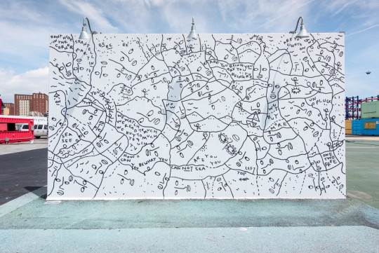
    Check out Shantell Martin if you’re looking to explore Drip. I recently discovered her work and I’m a fan.

    Image: Coney Art Walls by Shantell Martin

  • Thom’s Trent

    image

    This afternoon I walked Trent University’s campus with my father on our way back from the cottage. It is embarrassing that it has taken this long.

    Trent University straddles the Otonabee River in Peterborough, Ontario. It admitted its first students in 1964 and by the early 1970s the renowned Canadian architect Ron Thom had completed the campus plan and its original college buildings, including Champlain College, Lady Eaton College (originally a female-only dormitory), the Bata Library, and the Chemistry Building.

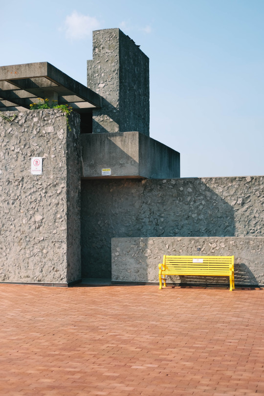
    The photo at the top of this post is one I took of the south elevation of Champlain College, on the north edge of the west bank’s main plaza. (Yes, the sign on the far left says “no skateboarding.”)

    Rob Thom is perhaps not as well known as other Canadian modernists such as Arthur Erickson. But his two masterpieces – Massey College at the University of Toronto and this campus – were instrumental in helping to define modernism in Canada. It is a shame that alcohol and illness ended his life at the young age of 63.

    The first thing that struck me was the rubble aggregate walls. I immediately went to touch them. (See, again, above.) That, combined with the very clear Prairie influences and the terracotta colored pavers, gave the campus grounds an incredible warmth.

    Also notable was the connection to the natural landscape. Around the corner from where I took the above photo was a staircase leading down to the river. At the bottom of the staircase was a broad set of concrete steps and a handful of young people jumping in and out of the water.

    If you happen to find yourself in this part of southern Ontario, I would encourage you to check out Thom’s campus. And maybe bring your bathing suit.

  • Architecture as a tool of capital

    I just stumbled upon an interesting Architectural Review article from last year called: Architecture is now a tool of capital, complicit in a purpose antithetical to its social mission. The author is Reinier de Graaf, who is an architect and partner at the firm OMA.

    The focus of the article is on inequality; capitalism vs. socialism; Thomas Piketty’s book, Capital in the Twenty-First Century (which is now on my reading list); and on how Modernism lost its social mission and got repurposed as a tool that just serves capitalist interests. It went from an ideology to simply an architectural style.

    Here is an excerpt:

    “Once discovered as a form of capital, there is no choice for buildings but to operate according to the logic of capital. In that sense there may ultimately be no such thing as Modern or Postmodern architecture, but simply architecture before and after its annexation by capital.”

    Given that I am initially trained as an architect, but that I work as a real estate developer, this article hits home for me. But unlike the author, I am not as fussed by this intertwining of capital and architecture. In fact, I have always believed that the more architecture can understand its economic milieu, the more likely it can affect positive change.

    Of course, there’s the question of whether that economic milieu is even the right one in the first place. I’ll echo this blog post (on the limits of capitalism), by saying that I consider myself a capitalist, but not an absolute capitalist. Capitalism isn’t perfect.

    I like Reinier’s description of income vs. wealth (borrowed from Piketty):

    He identifies two basic economic categories: income and wealth. He then proceeds to define social (in)equality as a function of the relation between the two over time, concluding that as soon as the return on wealth exceeds the return on labour, social inequality inevitably increases. Those who acquire wealth through work fall ever further behind those who accumulate wealth simply by owning it.

    What are your thoughts?

  • For Sale: Breuer House II

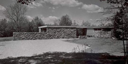
    image

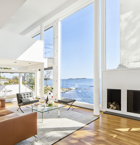
    Breuer House II is currently on the market in New Canaan, Connecticut for $5.85 million. The house has 4 bedrooms, 4 full bathrooms, and 2 half bathrooms. It is 4,777 square feet and sits on 3.11 acres of land.

    Originally built in 1951, the house was designed by the Hungarian-born, Bauhaus-trained, and Harvard-teaching modernist architect, Marcel Breuer. It served as their family home until 1975, after which time it was sold and almost demolished. Thankfully it was instead purchased, restored, and expanded (by another Harvard architect).

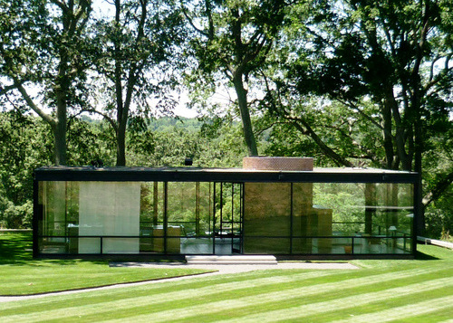
    Marcel Breuer was a member of what is known as the Harvard Five. They were a group of five architects who either taught at or went to the Harvard Graduate School of Design and who had moved out to New Canaan to build experimental modern homes starting in the 1940s. Homes like Philip Johnson’s Glass House.

    Seeing the Breuer House II listed for sale this morning reminded me of how cool it must have been at the time for a bunch of radical architects to move out to a sleepy New England town and start building modernist boxes. I’m sure it pissed off more than a few people.

    Does anyone know of anything similar to this happening today? 🙂

    Image from Modern Homes Survey

  • The day modern architecture died

    image

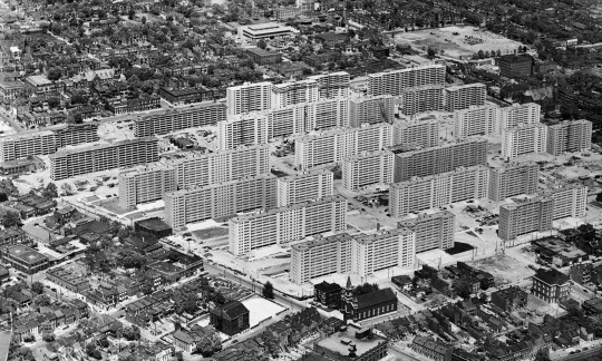
    In 1956, a large 57 acre urban renewal project was completed in St. Louis. It consisted of 33 apartment buildings, each 11 storeys tall. The entire complex was known as Pruitt-Igoe.

    Early residents seemed to really like the buildings. The first tenant, Frankie Mae Raglin, called it the “nicest place she’d ever had.” 

    But 16 years later in 1972, the first 3 buildings within Pruitt-Igoe were demolished. And in 1977, architectural historian Charles Jencks proclaimed that the day Pruitt-Igoe was demolished was the day that modern architecture had officially died.

    The modernist dream had failed. Architecture had failed us. Segregated “towers in a park” was not the way to socially engineer away poverty and slums from our cities. 

    This is the narrative that we have told ourselves, not only in St. Louis, but in cities all around the world.

    But was it really all architecture’s fault?

    Stuyvesant Town in New York (80 acres) shares many of the same architectural ideals that Pruitt-Igoe embodied and it seems to be holding up just fine. The same could be said for Lafayette Park in Detroit (46 acres), which is probably more telling given what the city witnessed in the years following 1956 – the year Lafayette Park was completed.

    So the reality is far more complex.

    Between 1950 and 1970, St. Louis lost about 30% of its population. Coming on the end, Pruitt-Igoe had a vacancy rate of 88%. Racial tensions were also surging. Here’s how the American Institute of Architects put it back in 2012:

    Pruitt-Igoe was built during a tumultuous time in U.S. race relations in a city with an intense history of racial segregation. Pruitt and Igoe were designed as separate, racially segregated projects: Pruitt for African-American residents, Igoe for whites. As the towers were going up, the Supreme Court’s Brown v. Board of Education decision banned segregation. Faced with the possibility of living next to African-American neighbors in an integrated Pruitt-Igoe, white residents moved out en masse, exacerbating Pruitt-Igoe’s vacancy problems.

    So while most cities rightfully would’t dare build in the spirit of Pruitt-Igoe today, this was not a strictly architectural problem. There is always an underlying social, political, and economic environment. And unfortunately architecture, alone, cannot solve everything. 

    If you’re interested in this topic, I recommend you check out a paper by Katharine G. Bristol called, The Pruitt-Igoe Myth.

    Image by Bettmann/Corbis via The Guardian

  • A labor of love

    image

    We’ve taught generations of architects to speak out as artists, but we haven’t taught them how to listen.

    This is a line from a recent New York Times op-ed that has been making the rounds online today called: How to Rebuild Architecture

    The premise of the article is that architects have marginalized themselves by being pompous elitists who increasingly serve only the rich and don’t respond to public opinion about architecture.

    For too long, our profession has flatly dismissed the general public’s take on our work, even as we talk about making that work more relevant with worthy ideas like sustainability, smart growth and “resilience planning.”

    The author’s recommendation is that architects need to get better at listening to their clients and listening to the public. 

    Reconnecting architecture with its users — rediscovering the radical middle, where we meet, listen and truly collaborate with the public, speak a common language and still advance the art of architecture — is long overdue. It’s also one of the great design challenges of our time.

    What’s interesting about this viewpoint is that it’s precisely the sort of thing that entrepreneurs and business people are trained to do today. The mantra is that you should never build your product or service in isolation. Get out of the building. Talk to customers. Get feedback. Adjust. And iterate.

    But architects don’t like to do this. Why is that?

    The answer, at least partially, comes down to taste. As the author correctly pointed out, the kinds of buildings that architects like are often not the same ones that the general public likes.

    I don’t have any hard data to support this claim, but I suspect that most people out there – particularly those with money – would prefer their home to look like something that Robert Stern designed as opposed to a glass box designed by Philip Johnson.

    And yet the latter is what architects and architecture students make pilgrimages to. I certainly did when I was in architecture school. 

    In fact, I think you’d have a difficult time getting into any architecture school right now with a portfolio of work as traditional as the work of Robert Stern. It’s simply not part of the architectural discourse at this stage.

    So to many architects, it can be difficult – even painful – to listen to what the public wants. Architects are not trained in terms of market size and profit maximization. It’s about passion. It’s a labor of love. And when you’ve already fallen in love, it can be hard to change your mind.

    Image: Flickr

  • White peaks

    I like airports. And this past weekend was my first time in Denver’s. Its most obvious feature is its white fabric roof, which is intended to evoke the snow-capped mountains that surround the region (as well as teepees apparently).

    Here’s what it looks like from the inside:

    And here’s what it looks like from the outside (via Wikipedia):

    What I like about it is that it speaks to the place. In our increasingly global world, more and more of our buildings now look the same. This is what Modernist architects wanted, but I’d argue that that was a different time and place.

    Today, there’s something nice about landing in a new city and feeling like you’re somewhere different. There’s something special about architecture that speaks to its environment.

    Is there an airport that stands out for you?