Daily insights for city builders, delivered every morning at 6 AM ET. I’m Brandon Donnelly — a Toronto-based real estate developer and founder of Globizen. I’ve been writing here since 2013.

Tag: Modernism

  • Opinionated design

    This is a longstanding joke / criticism among nerds:

    Namely, it is the fact that the charging port for Apple’s Magic Mouse is on its bottom, meaning, when it’s being charged, you can’t use it. This would be annoying if you ignored the low battery warnings and let it die in the middle of working on something critically important. And so lots of people think it’s a ridiculous design. But is it? Here’s an excerpt from a recent post by John Gruber of Daring Fireball:

    Yes, with the charging port on the mouse’s belly, you cannot use it while it charges. There are obvious downsides to that. But those positing the Magic Mouse as absurd act as though Apple doesn’t know this. Of course Apple knows this. Apple obviously just sees this as a trade-off worth making. Apple wants the mouse to be visually symmetric, and they want the top surface to slope all the way down to the desk or table top it rests upon. You can’t achieve that with an exposed port.

    This is an argument that feels right. Apple is not the kind of company that makes arbitrary design decisions. And the deliberate decision they have made is that a more perfect design is more important than solving for the few instances where a user was negligent and forgot to charge their mouse. Gruber goes on to say, the “charging port placement is an opinionated design, not an absurd design.”

    But this then raises another question: Is opinionated design the right approach?

    For well over a century, one of the maxims of good design has been that form should follow function. In other words, the shape and design of an object should relate to its intended use. And so, in this instance, if “function” involves using the mouse while it’s being charged then maybe, by this criteria, it isn’t a good design. Then again, it is a wireless mouse. Maybe Apple doesn’t want you to use it while it’s charging.

    Let’s consider another design object that you touch with your hand: Walter Gropius’ famous door handle.
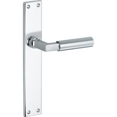
    Originally designed in 1922, the simple design consisted of a square bar and a cylinder. And its job was to communicate to you that, in order to use it, you should grab the cylindrical part, and not anywhere else. So on this level, the design was responding to its intended use, to our hands. Grab here. But is this truly an example of form following function? It’s debatable.

    Architect and professor Witold Rybczynski, who I would say generally isn’t a fan of modernism, has argued that it’s not. His critique of the overall Bauhaus movement — of which Gropius was the founder — was that it was actually a design school dedicated to “form follows predetermined aesthetics rather than form follows function.”

    In some ways, he’s right. You can tell when something came out of the Bauhaus, just as you can tell when something is from Apple. There’s a particular aesthetic and stubbornness to maintaining it. That’s why the Magic Mouse can’t be charged while in use and why Apple, equally famously, clung to the simplicity of a single-button mouse. Two just didn’t look as nice.

    But I see this as an honorable quality. Having an opinion is better than not having one. And there are lots of objects out there without one.
  • Field Guide to Indoor Urbanism

    A few months ago, one of my old professors from architecture school — Phu Hoang — reached out to me through this blog. That’s one of the benefits of writing publicly — it becomes your calling card. In this case, it had been at least 16 years since I was in his design studio.

    We connected over a call. He told me about his and Rachely’s firm, MODU Architecture. And he let me know that he’s no longer teaching at Penn. He is now the Head of Architecture of the Knowlton School at Ohio State University.

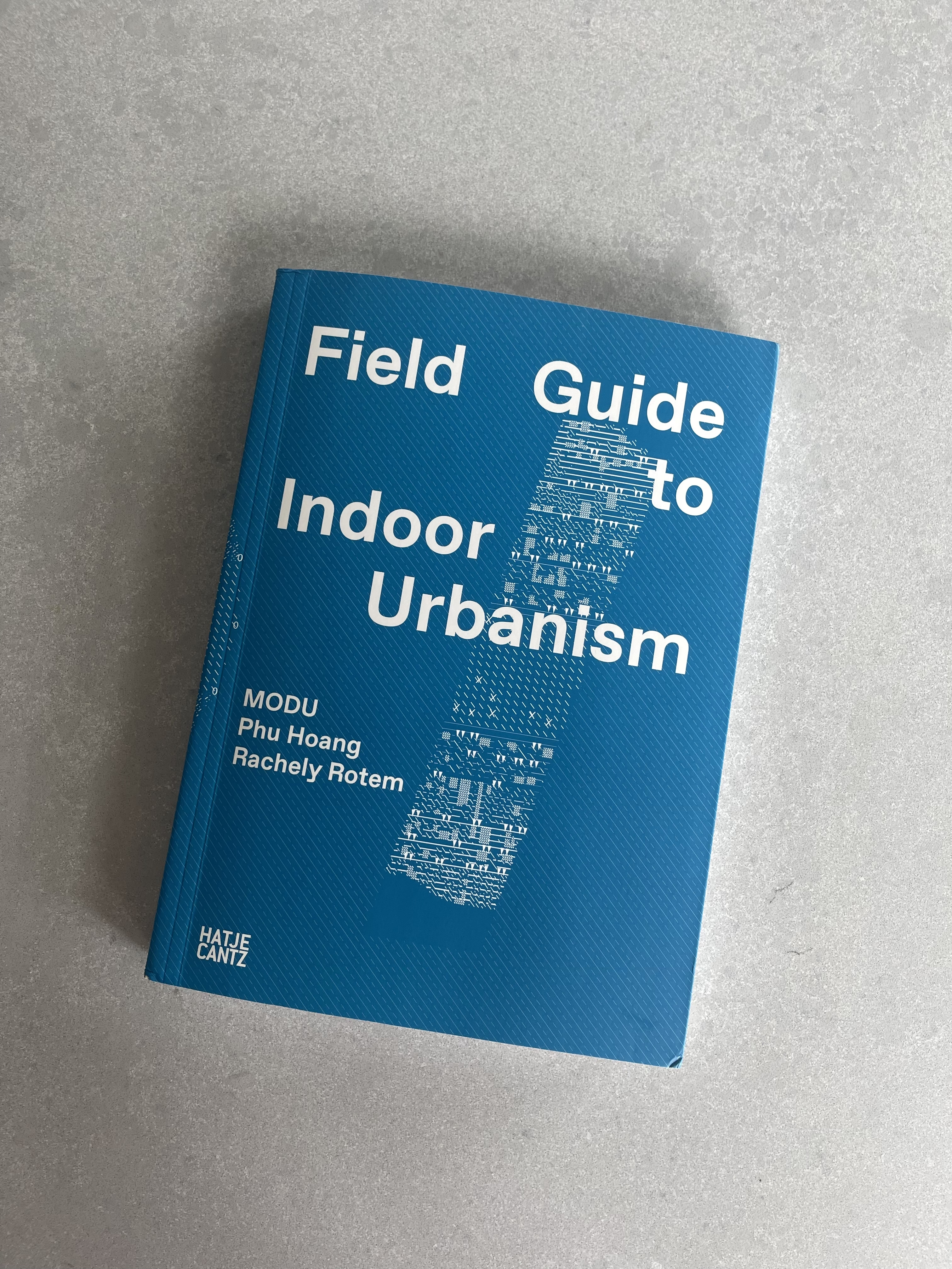
    Then, following the call, he was kind enough to send me a copy of his new book, Field Guide to Indoor Urbanism:

    The typical approach to modern building design is to have clearly defined boundaries between interior and exterior spaces. The outside is the outside. And the inside is a climate-controlled space that is, for the most part, sealed to the outside.

    Most of us spend the vast majority of our lives in these latter spaces. In fact, since the advent of modernism and the International Style over a century ago, the general idea has been that these spaces can and should be mostly the same.

    HVAC systems make it so that you don’t really need to worry about context or the environment. What works in Toronto can work in Phoenix. You just need to dial up your cooling loads.

    This is so much the case that whenever I’m in a city with a fairly benign climate, such as somewhere in California, I always find myself fascinated by the fluidity between interior and exterior spaces. It’s such a foreign concept to me that it stands out: “Wait, how is this not sealed?

    Indoor urbanism, on the other hand, makes the argument that this binary approach is the wrong way to think about spaces. Here’s an excerpt from a recent Metropolis article about MODU:

    They call this approach “indoor urbanism,” which privileges the blurred boundary between what has traditionally been considered interior space and exterior space. This in-between space–straddling open and closed, artificial and natural–deserves architects’ keen attention, especially as the planet warms. “Indoor urbanism recognizes that architecture and cities are situated on an environmental continuum, as a matter of degrees rather than absolutes,” write Hoang and Rotem in Field Guide.

    Examples of this thinking can be found throughout their work. This project in Jackson, Wyoming is one of my favorites both because I love Jackson and because it’s a cold and snowy place. And yet, even in this climate zone, their design includes for several “semi-exterior areas” that serve to connect you to nature.

    This is a decidedly different way to think about architecture and urbanism. But as our climate crisis intensifies, it’s only going to become more relevant.

  • Laser distance metering Le Panier in Marseille

    I usually always have a laser distance meter in my bag. I use it when I’m on construction sites and I need to confirm important dimensions. But they can also be useful when you’re traveling and you want to appear as nerdy as humanly possible to the locals.

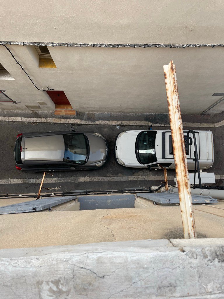
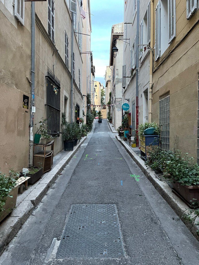
    This is a typical older street in Le Panier area of Marseille, which is the oldest part of the city in probably the oldest city in France. Greek settlers colonized this area around 600, and at that time it was called Massalia.

    There is one major street in Le Panier — la rue de la République — which will make you feel like you’re in Paris. It was pierced through in the late 19th century, around the same time that Paris was doing its large-scale urban renewal things.

    But there remains lots of examples of what you see here: streets that are 12 to 13 feet wide from building face to building face. This is wider than your typical Toronto condo living room, but not by much.

    There are, I guess, sidewalks on these streets. But most of them tend to be taken over by potted plants and other urban accessories. Everyone who uses these streets really just has to figure out how to share them.

    It would be illegal to build this close and compact in most modern cities. Part of this is, of course, because modernity used to view this kind of urban form as being unhealthy and generally undesirable. Humans needed light, air, and space.

    This is true. But we also like intimate urban spaces that put people first.

  • Streets in the sky

    I went out this morning to grab coffee from around the corner and, on my way back home, I ran into two people in the elevator that, from what I could glean, had hit the same button in the elevator and then struck up a conversation. He asked if she had just recently moved into the building. She responded with no, and that she usually doesn’t see anyone else on their floor. He was surprised by this response and said that he knows everybody on the floor.

    Nearly a hundred years ago, architect Le Corbusier, as well as others, had the idea of creating “streets in the sky.” Perhaps the most famous example of this concept is his Unité d’Habitation in Marseille (pictured above). Now a UNESCO World Heritage building because of its role in the development of modernist architecture, the building houses five “streets”, two of which were intended to be fully-fledged shopping streets. These streets house(d) things like shops, restaurants, galleries, and even a hotel.

    Le Corbusier was famous for his desire to create machines for living in. And these streets in the sky were part of this philosophy. The idea was that by having all of the things you needed under one roof, you would then be able to live an efficient, productive, and enjoyable life. Architecture and design could do that for you.

    Of course, the other reason for this thinking was that we needed to get people away from cars. As the car became more commonplace in cities, conflicts arose. And architects began to grapple with how best to separate people and cars. One obvious solution was to simply lift people up and off the ground so that the street could be freed up for cars to do their thing. This was going to be the future.

    The pitfalls of this line of thinking have since then been widely documented. And today, I think it’s pretty clear that most cities are in fact taking the opposite approach. Instead of removing people, they are removing cars through pedestrianization projects. Some of these projects are temporary, but many are also permanent. This happening almost everywhere from Toronto to Sao Paulo.

    The other problem is that it’s extremely challenging to make retail uses work way up in the sky. And that’s why even second floor retail spaces often struggle compared to those on the ground floor. As I understand it, the non-residential tenancies in Marseille’s Unité d’Habitation have naturally evolved from being retail-centric to being more office-like. Supposedly you’ll now find architects and medical offices, which is not at all surprising.

    But that doesn’t mean that Le Corbusier’s instincts weren’t directionally right. We now have lots of examples of tall buildings housing an intense mix of uses and public functions. And in the case of multi-family buildings, the corridors do often serve as a kind of street. I happen to live off of one that houses our building’s amenities. And so in addition to just running into neighbors, I’ll often run into the odd birthday party or Sunday afternoon sumo-suit party. True story!

    It may not be the Champs-Élysées, but it is a kind of street for living.

    Photo by Bernd Dittrich on Unsplash

  • Accessible modernism

    One of the most extraordinary things about Salt Lake City is that you can land at its airport and then, in 20-30 minutes, you’re in the mountains looking at landscapes like this:

    By my estimation, this makes it the most accessible big city and mountain town combination in North America.

    Historically though, Salt Lake City hasn’t really been known for modern architecture. There is, of course, one glaring exception and that is the work of architect John Sugden.

    Sugden was originally from Chicago, had trained under Mies van der Rohe, and is credited with bringing a similar kind of International Style to Utah.

    The house pictured above is one of Sugden’s projects.

    I’m not sure when it was originally built, but it was meticulously renovated by Brent Jespersen, and featured in Dwell magazine back in 2009. If you’d like to take a closer look, click here. (It is again being renovated right now.)

    When I was researching who in Salt Lake City and Park City was building cool stuff, Brent’s name immediately came up. So I appreciate him taking the time to tour me through some of his projects this evening. Thank you, Brent.

    What is now clear to me is that this whole not being known for modern architecture thing is quickly going away.

  • Kaunas — European Capital of Culture

    So each year Europe runs a program called the European Capitals of Culture. The objective is to celebrate the richness of European culture and presumably drive throngs of tourists to its various locales. They do this by choosing a set of cities, designating them “capitals of culture”, and then running events and programming all throughout the calendar year in those places.

    When the program was created in 1985, it was originally called the European City of Culture, as there was only one city being chosen at a time. In the first year that city was Athens. But the program has since evolved and now multiple cities are chosen each year. For 2022, the European Capitals of Culture are Esch-sur-Alzette (Luxembourg), Kaunas (Lithuania), and Novi Sad (Serbia).

    I was reading about Kaunas in FT this morning and I was fascinated to learn that this city of approximately 300,000 people has some 6,000 modernist buildings. Some are apparently in disrepair, but many remain in good form and, as part of the festival, visitors can book stays in some of the restored ones.

    There is, of course, an interesting story behind these buildings.

    This collection of modernist buildings is the result of a relatively narrow window of time and a specific set of circumstances. Lithuania gained independence from the former Russian Empire in 1918, following WWI and while Russia was busy fighting with itself. But at the time, its capital city Vilnius, which remains the capital today, was mostly occupied by Poland.

    So Kaunas became its temporary capital city from 1920 to 1939, the latter date being when Vilnius was returned to Lithuania. This temporary designation created a tremendous need for new buildings, both public and private, and it just so happened to line up with the flourishing of European modernist architecture.

    Kaunas didn’t get any modernist “icons” from architects such as Le Corbusier, but there’s absolutely nothing wrong with that. Kaunas instead created its own varietal of modernism, one that incorporated elements of Art Deco and one that you could argue is now deeply symbolic of a very important moment in its history: A peaceful period of interwar freedom and optimism.

    Image: Kaunas 2022

  • Is Canadian architecture bad?

    Tracey Lindeman over at the Walrus recently asked: Why is Canadian architecture so bad? Is it because Canadians are too passive and apathetic when it comes to good design? Or is it because we’re too cheap and don’t like our tax dollars being spent on unnecessarily lavish public buildings?

    Whatever the case, there is an argument out there that we maybe had this wonderful period between the 50s and 70s where we really excelled in modern architecture and design (including graphic design), but that we kind of stopped caring and have built mostly banal stuff since then.

    Part of Tracey’s argument is simply that we’re cowards. We’re more interested in “checking boxes instead of taking chances.” We’ve become too bureaucratic when it comes to procuring new public architecture. And she’s not wrong.

    Why we accept it is a patently Canadian phenomenon: our national psyche has us much more interested in checking boxes than in taking chances. Our standard process for contracting buildings often gives projects to the lowest bidders, even if a vastly more beautiful design is just a little bit more expensive. We have become so devoted to frugality and bureaucracy, and are so readily appeased by basic functionality, that we have lost the fortitude to take and demand risks, even if the outcome could be the most beautiful thing we’ve ever seen.

    Great architecture requires not only great architects, but also great patrons of architecture. That has generally been the way all throughout history. But here’s the fortunate thing. We have lots of wonderfully talented architects in this country and lots of people who see the value in architecture.

    In fact, I think you could argue that over the last 5-10 years we have seen the quality of architecture in our cities step up dramatically. Some of these projects have been designed by top Canadian architects and some have been designed by leading international architects.

    In both cases it’s because we see the value proposition and have decided to invest in architecture and design. Now we just need to be bolder across the board and get bureaucracy and checkboxes out of the way of Canadian creativity.

  • 🖼 Fondation Marguerite et Aimé Maeght

    Saint-Paul-de-Vence

  • How buildings convey meaning

    Witold Rybczynski and I clearly do not have the same taste in architecture. But he raises an interesting point about the relationship between architecture and art in this recent post. Here’s an excerpt:

    In the name of renouncing the past—and denouncing anything that smacks of decoration—modernism has largely done away with art, the lonely Henry Moore stranded on a plaza, notwithstanding. The problem is that when you strip away figural and allegorical ornament, what is left are mute building materials, mechanical-looking details, and abstract space.

    There is a long-standing tradition of integrating art, and other ornament, into architecture. But modernism viewed this sort of decoration as being superfluous. It wasn’t functionally necessary and so why include it?

    This has led us to today where there is a joke that investing in public art means investing in some sort of add-on that sits outside of your building and that can be classified as art. Perhaps something by Henry Moore.

    The result, Witold argues, is that we have lost something critically important in our buildings: meaning.

    But is allegorical ornament really all that different from a freestanding art piece? Don’t both tell a story? And don’t they both get applied, in a way, to a building that could surely continue on without it?

    At the same time, what is meaningful art? Does it need to include bas-relief and/or figural representations? Or could it be a signed urinal on a pedestal in the lobby with an accompanying digital NFT?

    There’s no question that buildings need meaning. We all crave stories. But sometimes they communicate in different ways.

    Photo by David Vives on Unsplash

  • The Koblick House by Richard Neutra

    I came across the above photo this morning. If you can’t see it, click here. It’s a photo of the Koblick House in Los Angeles designed by Richard Neutra and Gregory Ain for art professor Harry Koblick. Built into the hills of Silver Lake in 1937, the house is a three-storey duplex with about 1,620 square feet according to some sources. (I couldn’t find any plans or drawings, but I’d really like to see the section.) The upper unit has 2 bedrooms and 1 bath. And the lower unit has 1 bedroom and 1 bath.

    Richard Neutra was a prolific modernist and designed numerous “international style” buildings, like the Koblick House. His work was included in the seminal 1932 MoMA (New York) exhibition on modern architecture, which was an important moment for modernism in the United States. It helped to import the international style from Europe at a time when exhibitions did things like that. It is perhaps easy to forget that ideas didn’t spread as quickly around the world back then.

    I love the simplicity of this house. The double car garage that services the two units. The side stair that leads to the front door. And the two large terraces that probably look out over some kind of landscape. Over 80 years later and it still feels contemporary. Perhaps some of you will be equally inspired by this archive photo.