Daily insights for city builders, delivered every morning at 6 AM ET. I’m Brandon Donnelly — a Toronto-based real estate developer and founder of Globizen. I’ve been writing here since 2013.

Tag: mobility

  • Teaming up to fix Toronto’s traffic troubles

    image

    “This will be a game changer and will establish Toronto as a leader in running a truly smart city.”
    – John Tory, Mayor of the City of Toronto

    Yesterday I registered for a hackathon called TrafficJam that’s taking place this October 2 – 4, 2015 here in Toronto. It’s being organized by Evergreen CityWorks and the City of Toronto, with the goal of fixing Toronto’s traffic troubles.

    Tickets are free, but going fast. If you’re interested in this sort of thing, I would encourage you to sign up today. And if you do register or are already registered, drop me on a line so we can connect. I’m excited to see what kind of solutions we’re all able to come up with over the course of a weekend.

    But as I was registering and reading through the website, I couldn’t help but think about some of the traffic problems that we won’t be solving over the hackathon weekend, namely the politicization of transportation planning in this city.

    As an example of that check out a post by transit blogger Steve Munro called, The Vanishing Relevance of SmartTrack

    SmartTrack is the transit platform that Mayor John Tory ran on last year. And this post explains why it is unlikely to achieve its pitch promises.

  • Guest Post: Three minutes that rule the world – Will demolishing the Gardiner East actually make traffic worse?

    Today on Architect This City, we have a guest post by Darren Davis, who is a transport planner in Auckland, New Zealand. He’s a regular commenter on this blog, and I know he’s been following the Gardiner East debate quite closely – as many urbanists around the world are. I appreciate him offering and taking the time to write this piece. Thank you.

    ——————————–

    The decision this month on whether to demolish the Gardiner East Expressway and replace it with a surface boulevard or to rebuild it with a similar elevated structure will be a watershed moment for Toronto, akin to the decision not to have freeways in the urban core of Vancouver in the late 1970s.

    There are numerous good reasons why removing the Gardiner East elevated structure is the right move for Toronto, covered previously by The Globe and Mail and in the Council for Canadian Urbanism’s open letter to Toronto City Council. If you aren’t aware of these, I strongly recommend reading them. 

    Also of note are two things:

    1. Just 3% of Downtown commuters drive on the Gardiner Expressway East, a tiny fraction of the 68% who arrive Downtown on public transit.
    2. The “remove” option does not reduce traffic capacity over the “hybrid” option but could reduce travel speeds in uncongested conditions (read on for why I don’t think that this will happen in real life).

    However, one element of this debate that has not got much airtime is the transportation modelling that claims an additional two to three minutes travel time with the “remove” option over the “hybrid” option which retains the elevated expressway in a slightly modified form. 

    Toronto Mayor John Tory has stated that "I didn’t get elected to make traffic worse. And let’s be clear, removing that piece of the Gardiner will almost certainly make traffic worse.” But is it in fact true that demolishing the Gardiner Expressway East will make traffic worse as the transportation modelling claims?

    The key thing to understand is that transportation modelling, which tries to predict future travel times, is the product of a bunch of assumptions which may not in fact be borne out in real life. 

    For example, the effect of induced traffic, where additional traffic capacity leads to additional traffic being attracted to the route, is reasonably well known but generally not factored into transportation modelling. Induced traffic happens because increased travel speeds attracts traffic that would have otherwise avoided the route at congested times; attracts people to drive where they previously used other modes and encourages trips that would not otherwise have taken place. The effect of induced traffic is to quickly nullify the benefits of adding traffic capacity.

    However, what is less well known is that the reverse happens where there is either a reduction in traffic capacity (not the case in Toronto as the “remove” option retains the same traffic capacity) or speed.

    This is because in this situation, four things happen:

    1. Some travel re-routes. The “remove” option with a widened Lakeshore Boulevard as part of the street grid simply gives more ability for traffic to re-route away from congestion over an elevated expressway structure where drivers are literally trapped until they reach their exit.
    2. Some travel re-times. Some people will retime trips to avoid congested travel times, such as starting and/or finishing work at less congested times.
    3. Some travel changes mode. Some people will be encouraged to change mode by the perceived worsening in traffic conditions.
    4. Some travel is avoided entirely. Some people will choose not to travel at all in the peak of the peak. For example, this could take the form of working from home or shopping on the internet instead of by car.

    Transportation models only take into account the first item but not the others. The modelling is also sensitive to traffic growth assumptions and assumed mode split and trip distribution. Often transportation models assume continued growth in car travel even though per capita kilometres travelled peaked about a decade ago.

    While this may all sound well and good theory, does this actually happen in practice?

    In Auckland city centre, we have extensive experience with the reallocation of road space away from general traffic. Many busy key city centre approach routes have had general vehicle lanes reduced to make way for bus lanes (which generally carry around 65-70% of the people moving capacity of the street). 

    This has involved up to a 50% reduction in private vehicle capacity (whereas in Toronto, the “remove” option retains the same traffic capacity but may slow throughput). Auckland has done two of these in the past twelve months – both involved converting a general traffic lane to a bus lane. 

    Don’t get me wrong: There is sometimes pain at implementation with about a three week period of congestion as car drivers adapt to the new reality – and most likely negative media coverage will accompany this. But after about a month, equilibrium will be restored and life will continue much as it did prior to the change. 

    Part of this is that there will be various “optimisations” during this introductory period where signal timings are adjusted and other tweaks made – the sort of tweaks that can only be fine-tuned in a real world situation. But a bigger part of this is that the four factors above – re–routing, re-timing, mode change and avoided travel – come into play.

    I cannot overemphasise enough that life will return to normal surprisingly soon if the Gardiner East Expressway is demolished and replaced by a widened Lakeshore Boulevard.

    My advice

    When people talk about two to three minutes of extra travel time, take the foregoing into account and take those claims with the very big grains of salt that they deserve. If Toronto makes the right choice and chooses the “remove” option, my bet is that the biggest surprise of all will be how little difference it makes to peak travel times for the 3% of Downtown commuters who used to use the Gardiner Expressway East.

    Disclaimer

    The author of the above post is an employee of Auckland Transport, however, the views, or opinions expressed in this post are personal to the author and do not necessarily represent the views of Auckland Transport, its management or employees. Auckland Transport is not responsible for, and disclaims any and all liability for the content of the article.

  • Scootering around New York City

    image

    I am writing this post on a Porter flight from New York back to Toronto.

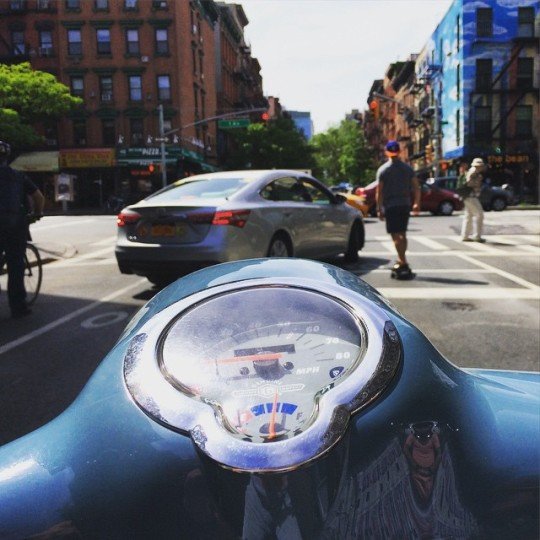
    For my last day in New York, my close friend and I rented scooters and rode all around Manhattan and Brooklyn. It was a great way to cover a lot of ground, but also a great way to still absorb the city. It’s harder to do the latter in a car and I never have any desire to drive in New York.

    Because the great thing about New York is that as a pedestrian you feel like you control the streets. When you’re waiting at a crosswalk, you’re never actually waiting. You walk off the sidewalk and onto the street so that you can assert yourself in front of the cars and wait for an opening. This serves to narrow the portion of road that the cars can actually drive on and reminds the drivers who is boss.

    At the same time, there are many instances throughout the city where New York has purposefully reallocated the space dedicated to pedestrians (and cyclists) and the space dedicated to cars. They’ve created new public spaces, widened the areas where people can walk, and seemingly blanketed the city with bike lanes. And that makes a lot of sense given that in many (most?) areas of the city, pedestrians greatly outnumber cars.

    So does that mean New York is at war with the car? (I’d be curious to know – in the comment section below – if those kinds of discussions take place in the city.)

    I suppose you could spin it that way. But New York also does things for cars. While riding around on the scooter today, I was so impressed by how well timed the streetlights were along the avenues. It made it incredibly easy to go downtown or uptown. In Toronto, I often feel like we time our lights to make driving as slow as possible.

    But make no mistake; New York is not a driving city. 

    New York is about walking, biking, taking transit, and hailing cabs. There is a reason they have the highest transit ridership in the US. The city is built for it. And unless driverless cars and ride sharing completely changes the equation, I will continue to believe that transit is the most efficient backbone for any big city.

  • How Uber is driving down the cost of transportation

    A few days ago, Bill Gurley – who is an investor in Uber – wrote a really fascinating blog post called, Uber’s New BHAG (Big Hairy Audacious Goal): UberPool. Bill doesn’t update his blog very often, but when he does it’s incredible stuff.

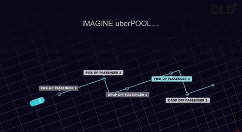
    I’ve touched on UberPool briefly before. But basically it’s a true “ride sharing” service where people with overlapping routes can easily share the same car – much like people do today informally. The obvious advantage of this is cost. It’s cheaper to share.

    image

    What’s most fascinating about this service though is how it fits into Uber’s larger mission to drive transportation costs down. And there’s a specific reason for that (via Bill Gurley):

    When Uber launched its low-cost UberX offering in the summer of 2012, the company quickly realized that the demand for its transportation services is HIGHLY elastic. As the company achieved lower and lower per-ride price points, the demand for rides increased dramatically. A lower price point delivered a much better value proposition to the consumer, yet still remained a great business decision due to the remarkable increase in demand.

    So what Uber quickly figured out was that if they could increase the utilization rate for drivers (the time actually spent with passengers), they could charge consumers lower prices while at the same time maintaining driver salaries. Prices went down, but volume went up.

    One way to do that is to obviously decrease driver downtime by improving liquidity on the marketplace. But another way is to simply increase the number of passengers being transported at one time. Hence the creation of UberPool.

    But it doesn’t stop there.

    Because of all the transportation data that Uber now has (the company has a data group called the “math department”), they can fairly accurately predict what a price cut will do to their ridership levels. This allows them to “forward invest” their capital in new services – such as UberPool – before they even have the revenue from the anticipated increase in ridership.

    So what does this all mean?

    It means that Uber is going to get cheaper and cheaper and cheaper. Uber is trying to get to what they call “The Perpetual Ride”, which basically means that drivers will always have customers (100% utilization). That’s quite a goal, but it would mean the absolute lowest prices for consumers (barring any other changes to their cost structure). 

    Dirt cheap transportation is a pretty compelling value proposition, which is why I continue to believe that cities should be hard at work trying to figure out how to harness this transportation shift.

    If you’re interested in this topic, I would encourage you to give Bill Gurley’s blog post a read.

  • Where Uber operates and where it’s banned

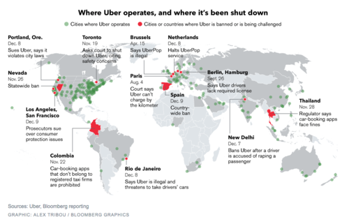
    Earlier this month, Bloomberg published this map showing where Uber operates and where it’s been banned (or is being challenged). You can click on the map for a larger version.

    image

    Uber operates in about 250 cities across the world. But it’s being challenged in a lot of them, including Portland, San Francisco, Los Angeles, Toronto, Rio de Janeiro, Paris, Berlin, as well as others.

    I don’t want to dismiss any of the safety concerns that have arisen lately, because those are very serious and they need to be addressed. Life safety is paramount. But I continue to believe that banning a service that many people clearly want to use isn’t the right solution.

    On top of that, I think it could lull many of the local taxi communities into a false sense of security about the future. Uber is moving incredibly quickly. UberX launched in Toronto in September of this year. And UberPOOL – their new carpool service – is likely next.

    With these releases, Uber is working towards a specific vision for the future: Their goal is to eliminate the need for private vehicle ownership. Should they be successful, this will not only impact taxis, but also car manufacturers and urban mobility in its entirety.

    So as difficult as it might seem right now, I think urban leaders would be better served trying to figure out how to harness these innovations. Cities have been trying for decades to get people out of their cars. Uber wants to do the same.

  • The ultimate Toronto transit map

    image

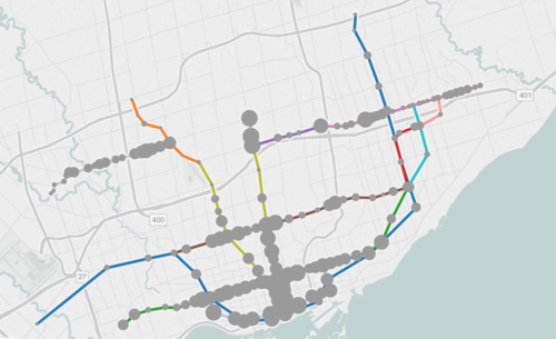
    If you live in Toronto and only give serious thought to one thing today, it should be to this interactive transit map created by Metro.

    The map shows all existing, planned, and proposed transit lines in the city, and then overlays population densities, commuting patterns, household income, and so on. It’s a super valuable map that I think reveals a lot about how we should be focusing our energies to get Toronto moving.

    So what sorts of things does it tell us? I’ll give 2 examples.

    If you look at commuting patterns across the Bloor-Danforth subway line, you’ll see that Runnymede station in the west is where people switch over from taking transit to driving. People west of that station tend to drive. Naturally, it also happens to coincide with where population densities start to fall off.

    By contrast, if you look at the east side of the city along the Danforth and beyond, the entire stretch more or less relies on transit to get around. Part of this likely has to do with income levels, but it’s also because of the availability of the Gardiner Expressway. There’s no equivalent in the east end. Dylan Reid of Spacing Magazine believes this makes a case for some sort of road pricing along the Gardiner, and I would agree.

    As a second example, look at the population densities along the proposed Downtown Relief Line, Finch LRT, and John Tory’s SmartTrack line. Outside of the core, the population densities are relatively low along the proposed SmartTrack line – which is never a good thing for rapid transit.

    There’s also no Sherbourne station on the SmartTrack line, which happens to have the highest population density across the entire Relief Line – 22,131 people per square kilometre! That’s more than any other stop along the Yonge-University subway line except for Wellesley station.

    I’ve written about this a lot before, but I think we need to do a better job of matching up transit investment with expected customer demand. Too often we let politics get in the way of rationale decision making. Maybe it’s time we did something like set minimum population densities. If you want a subway line in your area, you have to first bring the people.

    What else does this map tell you?

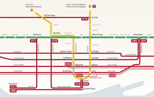
  • Riding the new streetcar

    image

    This afternoon I rode Toronto’s new streetcar for the first time on my way home from Chinatown. I had been meaning to do it for weeks now, but this was my first opportunity.

    The experience was infinitely better than what you get today on our current streetcars. I felt like I was in a new city. The proof-of-payment system makes onboarding much faster and the 4 loading doors means you just get on the train where there’s the most room – instead of getting on at the front and fighting your way to the back.

    The other thing I liked is that they now have a map of our streetcar network within the train (see above image). Toronto never used to do this. For whatever reason, we didn’t like mixing subway lines with streetcar lines on the same map. 

    But why be so pedantic?

    For one thing, our subway map looks pathetic without these additional streetcar lines on it. So for the sake of Torontonian morale, please fill it up with what you can.

    But the other reason why I think it’s important to include them is that we shouldn’t be thinking about our cities just in terms of specific technologies (subway, streetcar, and so on). Our cities are now multi-modal. Which means we navigate them using many different means, from subways and streetcars to bikes and Uber cars. What people care about is getting from A to B in the most efficient and enjoyable way possible.

    This may seem like a subtle distinction, but it’s an important one. And maybe, just maybe, these new maps will serve as an important reminder to us that there’s a lot of fixed rail in this city and that it could be far better optimized if we just tried a little harder.

  • Multi-modal cities are the new reality

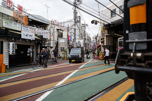
    CityLab published an article last week on multi-modal cities that caught my attention (because it used a picture of Toronto with about 3 or 4 streetcars stacked up along Queen Street). The premise of the article is that all of this car vs. transit debate is actually missing the bigger picture: our cities are multi-modal and we need to be planning for that.

    That’s not to say that the shift away from cars isn’t a good thing. It is. But it’s not as simple as saying that, instead of driving, people should now only take transit. In today’s cities people walk, bike, take streetcars, take buses, take subways, take taxis, take private shuttles, use Uber, and, yes, they still drive.

    From my own experience, this is absolutely how I get around Toronto today. I walk to the gym. I ride my bike whenever I’m going somewhere downtown. I take the subway to my office in midtown because it’s far and I would be too sweaty if I biked there. I use Uber and Hailo when I’m going out at night. And I drive when I need to go to the suburbs or leave the city.

    But the key takeaway here is that we now have a much tougher challenge on our hands. When we were only optimizing for cars – however detrimental to our cities that was – we only had one mode to plan for. Now we have several. Some of which are public and some of which are private.

    However we also have access to technologies that we didn’t have before. We are networked in ways that weren’t possible before and we’re at the dawn of many profound mobility changes, such as driverless cars. (Have you read about Tesla’s new Autopilot feature yet?)

    So as I’ve said before, I really believe that we need to look at this, not as a war on the car, but as a war on inefficiency. The problem we are trying to solve relates to mobility: What’s the best way to move lots of people around dense urban regions? Stop focusing so much on the technologies and focus more on the people.

    Image: Flickr

  • How are you being shaped?

    image

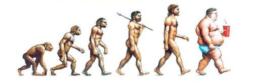
    “We shape the cities, and then our cities shape us.” That’s one of my favorite lines from the documentary The Human Scale, featuring Danish architect and urban designer Jan Gehl. I like it because I don’t think many of us think enough about the way in which the built environment – that we create – ultimately goes on to influence the way we live our lives.

    One of the most interesting connections for me is the link between urban form and public health. There’s been a lot of talk over the years about how suburban sprawl is, or might be, making us fat (among other things). We’ve created environments that are only navigable by cars and that has forced many of us into sedentary lifestyles. We sit in our cars, and then we sit in our offices.

    So today I’d like to conduct a bit of a poll. If you’d like to participate, please share the following 3 things in the comment section below: 1) your city, 2) the type of neighborhood you live in (urban, suburban, rural, etc.), and 3) the amount of time you spend walking or doing something active on an average day.

    Here’s me:

    I live downtown Toronto in the St. Lawrence Market neighborhood (urban). I take the subway to work and the station is a 10 minute walk from my place. So as a bare minimum, I spend at least 20 minutes a day walking. But since I also walk to do most of my regular errands, and since my gym is another 10 minute walk from my place, I’d say I average a good 30-45 minutes of walking each day.

    Now it’s your turn 🙂

    This is a pretty crude survey, but with the advent of things like smartwatches and health monitors, I think we’ll soon have lots of great data on the ways in which our cities might shape our health.

    Image: The Economist

  • Seattle’s first protected bike lane makes a quick adjustment

    Seattle recently installed its first protected downtown bike lane on Second Avenue. Here’s a short video of it in action (pay attention to the signalling setup and the pedestrians that walk into the bike lanes). Click here if you can’t see the video below.

    [youtube https://www.youtube.com/watch?v=x2iQCCHlR0s?rel=0]

    Shortly after it opened, they quickly discovered that the left green arrow and solid green circle (shown above) were confusing drivers. The intent was for the left green arrow to signal that you could turn and for the solid circle to signal that you could drive straight ahead.

    But even with the accompanying sign, drivers kept getting confused and thought a green circle meant you could go wherever you want.

    So the Seattle Department of Transportation quickly adjusted and changed the green circle to a north arrow. And it seems to have fixed the problem. I think it goes to show how important the details can be with these things.