Daily insights for city builders, delivered every morning at 6 AM ET. I’m Brandon Donnelly — a Toronto-based real estate developer and founder of Globizen. I’ve been writing here since 2013.

Tag: migration

  • US migration patterns according to one-way U-Haul truck transactions

    One of the ways to try and keep tabs on where people are moving is to look at the number of permanent address changes. Another way is to look at the number of one-way U-Haul trucks that enter versus leave a particular state. And it turns out that if you’re U-Haul, you do care to track where all of your trucks are going. Each year in the United States there are about 2 million one-way truck transactions.

    Looking at the data from 2020, the top inbound destinations — that is, the states that had the largest net gain of one-way U-Haul trucks — were (1) Tennessee, (2) Texas, and (3) Florida. This is a big jump for Tennessee as it was 12th in 2019. Texas and Florida, on the other hand, were similarly in the top three last year. In last place on this list is California, meaning that it had the largest net loss of one-way U-Haul trucks leaving the state.

    Overall, this data continues to reinforce a shift that is taking place toward more affordable housing markets, such as those in the southern United States.

    For the full U-Haul article, click here.

    Photo by Tanner Boriack on Unsplash

  • Net flow of households across US regions

    These are a set of diagrams taken from a recent WSJ article talking about how, “the pandemic changed where Americans live.” I know that this is a topic that gets a lot of air time (both here on the blog and elsewhere), but these diagrams do a good job of showing the flow of people, as well as how things may have changed/accelerated since 2018.

    These diagrams also remind me of the work of Charles Joseph Minard. A French civil engineer, Minard is best known for his contributions to the field of information graphics, and in particular his flow maps. His most famous piece of work — which I happen to have hanging at home — is his depiction of Napoleon’s losses during the Russian campaign of 1812.

    The map itself is from 1869 and is packed full of information. It shows the number of Napoleonic troops as they left for Moscow, the distance they traveled, the outside temperature (the French weren’t properly prepared for the cold), latitude and longitude, the direction of travel, and the location of the troops relative to specific dates.

    The point of the diagram was really to show how disastrous this campaign was for Napoleon. The thick beige band on the left is showing over 400,000 troops setting out. But by the time they reached Moscow — which, by the way, had been abandoned before their arrival — only about 100,000 troops were left.

    The thin black bar on the bottom is showing how many troops ultimately remained and returned at the end of the campaign — the number was only about 10,000. So the vast majority of Napoleon’s troops perished. Supposedly over half either starved or froze to death.

    Some 150 years later, and we are still using flow charts to clearly depict the movement of people and things.

  • Where Americans moved over the last year

    According some recent data from the US Census Bureau and USPS (via this CityLab article), the number of Americans who registered (between March 2020 and February 2021) that they were making a permanent move somewhere else, only increased by about 3%. And the vast majority of people that did move tended to simply spread out and move within the same metro area — about 84%. About 7.5% moved within the same state. And about 6% moved to some other top 50 metro area in the US.

    Some are of the opinion that these moves to the outskirts of cities would have happened regardless. The pandemic simply sped things up. Perhaps. But whatever the case may be, CityLab and others have argued that an “urban exodus” is likely the wrong way to describe what is happening. Despite reports that everybody seems to be moving to Texas and Florida (yes, Miami saw a spike), most people are simply spreading out in geographies where they already happened to live.

    The notable exceptions are the Bay Area and New York. San Francisco and San Jose — both of which usually register as being two of the most expensive housing markets in the US — saw permanent moves increase by 23% and 17%, respectively. Compared to other metro areas in the US, these figures stand out. (I assume this data is collected after somebody goes to the post office and says that they want to change their address forever.)

    But we are already seeing net outflows from San Jose and San Francisco start to taper off (see above). It’s also important to keep in mind that these cities were losing people well before the pandemic started. They are expensive places. And the fastest growing cities tend to be ones that sprawl, have a more elastic housing supply, and are consequently more affordable. That said, I suspect we’ll see this tapering off continue. The “urban exodus” isn’t going to be what it’s cracked up to be.

    Images: CityLab

  • Intraprovincial migration across the Greater Toronto Area

    This is a chart from a recent blog post by Ryerson University’s Centre for Urban Research and Land Development. It shows net intraprovincial migration across the regions of the Greater Toronto Area. And what you are seeing here is people moving from expensive and built-up areas like the City of Toronto and the Region of Peel to lower cost areas further outside of the city.

    This is interesting for a couple of reasons. One, it’s very much a natural market outcome. Many people tend to “vote with their feet” and look for greater housing affordability. And two, this is a trend that existed prior to COVID-19. It is not the death of cities. In the words of Ryerson’s CUR, it’s about people looking for more affordable lower-density housing.

    But to what extent is “lower density” the key deciding factor? In other words, how much of this is consumer preference and how much of this is people being forced out by a lack of infill housing supply?

  • Where renters want to move

    Every quarter, Apartment List publishes something that they call their Rental Migration Report. What they do is use search data from their website to determine where their (registered) users are hoping to move to and from. Their first report of 2020 is now out and below is their list of the most attractive US metros. It is based on search data from June to December, 2019.

    Now, it’s important to note that this is really only a form of intent — taken from one particular website. This list may not, and probably doesn’t, accurately mirror how and where people are actually migrating within the US. But it is still interesting to see what is top of mind for Apartment List’s users. (If there were multiple search inquiries during a visit to the site, they counted the first metro area.)

    Beautiful mountains. Great snowboarding/skiing. And a burgeoning tech ecosystem. I am not at all surprised to see Denver at the top of this list.

    Images: Apartment List

  • Dendrochronology of U.S. immigration

    I can’t remember where I found it, but I recently stumbled upon this video simulating the dendrochronology of U.S. immigration from 1830 to 2015. 

    It is part of an ongoing project by Pedro Cruz, John Wihbey, Avni Ghael, and Felipe Shibuya, and is supported by Northeastern University.

    As its name suggests, the video (and broader study) uses the metaphor of a tree (and its growth rings) to explain historical immigration to the U.S. 

    If you can’t see the video below, click here.

    [vimeo 276140430 w=640 h=280]

  • Puerto Rican migration during and following Maria

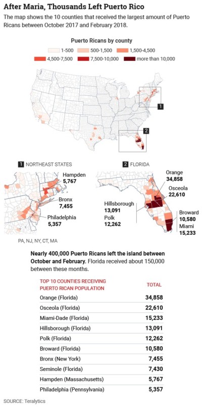
    Teralytics recently looked at data from 500,000 smartphone users to determine how, when, and where Puerto Ricans moved between August 2017 and February 2018 during and following Hurricane Maria – generally considered to be the worst natural disaster on record for the area. 

    CityLab published the data here and along with the following maps:

    image

    It shows the locations and the top 10 counties that received Puerto Rican population during the above time period. Florida and the Northeast are at the top of list, which isn’t all that surprising. Privacy concerns aside, it is once again an example of the kind of granular data that we now have access to. Prior to this data being available, all we apparently had was estimates.

  • Income sorting by city

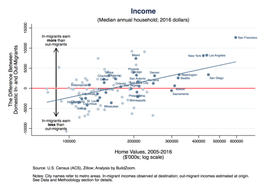
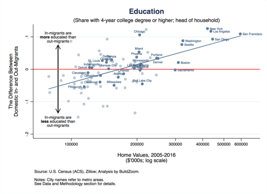
    This is a fascinating study by Issi Romem about the characteristics of cross-metropolitan migration in the United States. The key findings are that in-migrants to expensive coastal cities tend to have higher incomes and more education than the out-migrants, and that the opposite is true for the less expensive cities in the US. “Expensive” means expensive housing.

    Here is the income chart:

    Let’s use San Francisco as the example since it’s the most expensive metro (all the way to the right on the x-axis). The way to read this is that on average, from 2005 to 2016, in-migrants to the San Francisco metro area earned $12,640 a year more per household (y-axis) after they arrived compared to out-migrants before they left. This chart shows the difference between in and out incomes.

    Take note of Miami which is sitting at a similar place to New York and Los Angeles on the horizontal income line, but has home values similar to Phoenix, Chicago, and Philadelphia.

    Now here’s the education chart:

    Similarly, it is showing the difference in educational attainment between in and out migrants.

    So what does all of this tell us? 

    Well, it tells us, among other things, that US metros are continuing to sort based on income and that this process of polarization is probably contributing to home price appreciation. Because even if the incomes of current residents aren’t growing, these “expensive cities” are effectively swapping out poorer residents for richer ones. That, alone, would mean more money for expensive homes.

    For Issi Romem’s full article, click here.

  • The U.S. cities that gained the most workers over the last 12 months

    One of the great things about social media is that it gives us access to data that previously didn’t exist or was difficult to collect.

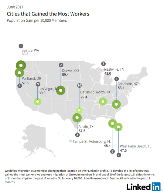
    Take, for example, LinkedIn’s monthly report on employment trends called the Workforce Report. They look at which industries are hiring, where people are moving for jobs, and so on. Click here for the June 2017 edition. 

    Note that architecture/engineering hiring appears to be up nationally, which is usually a positive leading indicator.

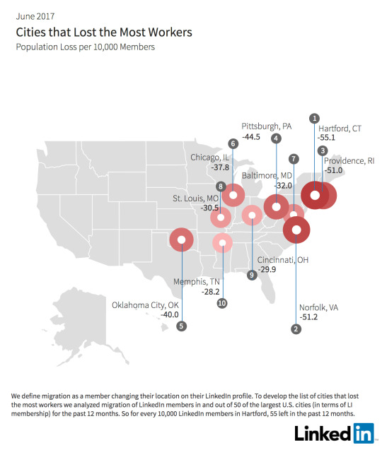
    I’ll leave you all to go through the report, but I did want to pull out a few of their maps and one of their takeaways. Below are maps of the cities that lost the most workers and gained the most workers over the last 12 months.

    The established trend of people moving from colder northern cities to warmer amenity-rich cities seem to play out here.

    That said, one of their “key insights” is that fewer workers today are moving to the San Francisco Bay Area. Since February 2017, there has been a 17% decline in the net number of workers.

    They blame housing affordability (ahem, lack of supply). People are simply turning to other great cities like Seattle, Portland, Denver, and Austin. They’re growing and cheaper.

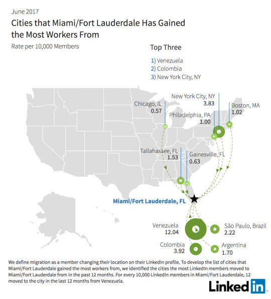
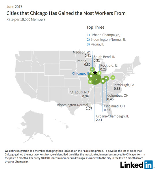
    One of the other cool things about the report is that you can drill down into individual cities to see where people are moving from. I looked up Miami and Chicago just to do a quick comparison. 

    Not surprisingly, Miami is seeing a significant contingent from South America. What’s interesting about this random comparison is how international Miami is and how regional Chicago is in terms of their draws.

    I would love to see similar data for Canada. This is valuable stuff.

  • Mapping of global migration

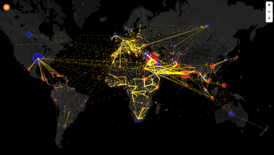
    Max Galka has created an incredible visualization of country-to-country net migration (from 2010 to 2015) on his blog, Metrocosm.

    Here’s a screenshot:

    image

    But you really need to view the full screen interactive version

    In that version, you can hover over a country to see the total net migration number (+/-) and you can click on a country to see where people are moving to and from. A blue circle indicates positive net migration (greater inflows) and a red circle indicates negative net migration (greater outflows).

    All of the data is from the United Nations Population Division. And though the numbers are estimates, it’s a fascinating look at global migration. For instance, look at the outflow from Syria.

    It would also be interesting to see these numbers on a per capita basis because some countries certainly punch above or below their weight in terms of migration. Off the top of my head, I’m thinking of Canada and Australia vis-à-vis the US.