Daily insights for city builders, delivered every morning at 6 AM ET. I’m Brandon Donnelly — a Toronto-based real estate developer and founder of Globizen. I’ve been writing here since 2013.

Tag: midrise

  • The compactness of Paris

    This is a great diagram from Smart Density comparing the urban and regional rail networks of Toronto, London, and Paris. All are at the same scale.

    What immediately stands out to me — besides Toronto’s relatively miniscule network — is Paris’ compactness. I have said this before on the blog (here, here, and here), but I will say it again: There seems to be a tendency to fetishize the scale and height of Paris.

    But building height is only one component of its ubiquitous built form. Unlike Toronto, we’re not talking about midrises built up against single-family homes. Paris is far more dense and its buildings are far closer together (usually with interior courtyards)

    Are we also okay with these attributes?

  • A few observations from Paris

    The last time I was in Paris was in 2006. That’s a long time ago and so it was great to be back in the city earlier this week. I don’t know the city as well as I do many other cities, but I speak enough French to be dangerous and we spent a good amount of time on this trip just exploring. On average, we clocked about 20,000 steps a day. So here’s a list of some of the things I was reminded of or learned of on this visit. If any of you are more familiar with the city, please feel free to speak up in the comment section below.

    • I love Paris.
    • The Parisian art of people watching is alive and well. One of my favorite things about Paris is how so much of the cafe seating faces out toward the street. That’s what you’re supposed to be watching: urban life.
    • Most cities have a clear message. In Los Angeles, it’s probably that you should be more famous. In Boston, it’s arguably that you should be smarter. And in New York, it is perhaps that you should be richer. In Paris, the message feels loud and clear: You should be more fashionable.
    • Compared to Toronto, the center of Paris feels far more static. Less construction. Less change. Less that is new. That’s not such a bad thing given how beautiful the city is. But in my view, cities are about balancing preservation and progress. From what I could tell, a lot of the new construction seemed to be happening in the suburbs and in the outskirts of the city.
    • That said, COVID feels much further along in Paris. The city was very open and everyone seemed to be back in the office. Locals said that the city was operating at maybe 80%. It felt busy.
    • Dress shoes are dead in Paris. Everyone wears cool sneakers no matter how young or old. Think business suits with Nike Air Maxes. My hypothesis is that it’s just far more practical given how much people walk in Paris. I plan to adopt this strategy immediately.
    • In addition to walking, everyone seemingly bikes and/or uses an electric scooter. Again, it didn’t seem to matter how young or old. Paris also seems to have solved the scooter clutter problem, as has many other cities. There are designated spots (painted lines next to on-street car parking) and that’s where you’ll find the scooters. Toronto needs to get on board.
    • Traveling at 300 km/h on a train is a highly civilized way to move between urban centers.
    • There’s nothing wrong with having a picnic and drinking a bottle of wine (or two) in a park. In fact, it is probably something that should be celebrated. Let people be grown-ups.
    • When you purchase a baguette, you should immediately take a bite out of it to see how fresh it is.
    • The Eiffel Tower, much like the CN Tower, looks far better when illuminated.
    • Balconies of any size can be wonderful. We had a small Juliet balcony off of our hotel room in Nice and we used it every day for croissant eating and to dry our bathing suits. In a more permanent situation, I am sure we would have started growing things on it.
    • Midrise buildings do indeed create nice urban street walls. But it’s important to keep in mind that Paris’ midrise blocks are also deep and dense and with lots of courtyard conditions. That’s how the city is able to house so many people at such low building heights.
    • Facing conditions between buildings is less of a concern when you employ less glass. Smaller punched windows allow you to better manage privacy. I would go so far as to argue that if Paris were an all-glass city, much of its current built form would be fairly unlivable.

    What did I miss in this list?

    Photo by Alexander Kagan on Unsplash

  • It’s okay to put buildings close together

    This morning I came across this beautiful photo by @callicles of the 11th in Paris. After admiring it for a few moments, I then immediately tweeted it out with the above caption: “It’s okay to put buildings close together.” Because here’s the thing about this photo: It represents one of the great paradoxes of city building. When most people look at this photo, I suspect that they will find it beautiful. They will like the mid-rise architecture and they will like the quaint European-scaled streets. But despite its fairly universal appeal, very few cities are able to build this way today. It’s often not allowed. So instead what people do is travel to Europe in the summer, sit in cafes, admire the architecture and urban design, and then lament the fact that we don’t build cities like we used to.

    What is it that makes this intersection so inviting? Well, the buildings are tight up against each other. I’m guessing that the right-of-ways (ROWs) in this picture are maybe 6-9 m wide. There are no building setbacks or stepbacks to speak of, save and except for the penthouse floors which taper back slightly. And so all of the spaces in these buildings would likely have some sort of direct facing condition with their opposing neighbors (but partially mitigated by the fact that these aren’t all glass buildings). The ratio of ROW to building height is, I’m guessing, something like 1:4, which, at the end of the day, is a large part of the reason why these streets feel so intimate and inviting. The buildings frame the streets and public realm.

    What I just described breaks many of the guidelines that I suspect many of you in the industry are accustomed to following. In our world, the streets should be wider to allow for adequate fire and service vehicle access. The buildings should stepback to allow light to reach the sidewalks, to mitigate impacts on any surrounding single-family homes, and to provision for sky views. Here in Toronto, the midrise guidelines also stipulate that buildings should have a ROW to building height ratio that is closer to 1:1. Though to be fair this guidance is often rightly broken. But the truth remains, we generally don’t build like this anymore. Why is that?

    It’s not because we can’t do it. We certainly could. We are, for whatever reasons, choosing not to. Is it because we’re bad at understanding what we actually like and what makes for great cities? Is it because what we end up liking is a bit counterintuitive? My unproven and untested theory is that it is at least partially the result of an approach to planning that is defensive — instead of offensive — in nature. We plan around and bow completely to existing contexts. We plan to mitigate impacts. We plan to satisfy some very individualistic concerns about how cities and neighborhoods should be built. For better or for worse, we plan to piss off the least amount of people. Politics also play an outsized role.

    What is far less common to think about is how to plan offensively. The fact of the matter is that the Paris we all love today pissed off a lot of people when it was being constructed. The approach was top-down and hugely disruptive. It ignored and completely erased much of the city’s previous urban context. Artists at the time, and probably many others, despised the new regularity of Paris’ street wall buildings. They longed for the old hodgepodge of medieval blocks and the visual variety that they created. But today, it’s hard not to think of this offensive move as anything but visionary. Of course, there are also countless examples of top-down offenses turning out terribly bad for cities.

    Perhaps the right approach, then, is to simply start being more deliberate about introducing elements of planning offense. My friend David Wex of Urban Capital likes to remind me that Montreal is a city with grandeur and that Toronto, for the most part, is a city without it. So as I have argued before, over here, I think it’s time we rethink our approach. Instead of just worrying about things like shadow impacts and angular planes (defensive), we should also be asking ourselves offensive questions. How refreshing would it be to sit down in a project meeting and have someone ask: “Okay, but does this design contribute to the overall grandeur and beauty of our city?”

    And maybe once we take this new perspective, we’ll come to the conclusion that sometimes it’s okay to put buildings close together.

  • From social housing to highly desirable in Stockholm

    Feargus O’Sullivan is back with another Bloomberg CityLab article about “the iconic home designs that define our global cities.” In this recent article he focuses on the Barnrikehus of Stockholm (and also talks about Sweden’s housing market in general). Originally built in the 1930s, the slab-like midrise buildings were largely intended to address two pressing problems: 1) the need for affordable housing and 2) Sweden’s incredibly low birthrate (supposedly the lowest in Europe at the time).

    The Barnrikehus template was deployed on the edges of Stockholm and other Swedish cities. The designs were/are fairly simple. Very little ornament (this is Scandinavia). Four or five storeys usually. And no more than about 12 meters deep. This allowed for better natural ventilation, which was important for stymying the spread of tuberculosis. The rents were also heavily subsidized and declined even further with every child in the family. In other words: the more kids you had, the less rent you had to pay.

    The suites were fairly compact, with many around the 430 square foot mark. This kind of space might have housed a family of six according to O’Sullivan. But compared to the other available housing options at the time, this was a significant improvement. Perhaps not surprisingly, these “child-rich houses” (which is how the name translates) developed the same kind of social housing stigma that was prevalent in many other countries and cities around the world.

    But that perception changed over time and, today, these rent-controlled apartments are apparently highly sought after. (Here’s a listing to give you a taste of what they’re like.) Originally on the fringe of cities like Stockholm, they are now very well located and offer a high standard of living. (You also can’t go wrong with white walls and pale woods.) To learn more about the evolution of Stockholm’s depression-era housing, click here.

    Photo by Jon Flobrant on Unsplash

  • Short Lane in Surry Hills

    Just look at these deep cantilevered balconies and this board-formed concrete. Let’s also not forget the fine-grain retail and small mid-block laneway.

    Designed by Woods Bagot for Komplete Construction, the “Short Lane” project was completed in the Surry Hills neighborhood of Sydney in 2018. It has 22 suites — each with both north and south exposure — and is about 1,900 square meters in total. So the average suite size looks to be somewhere in the range of 80 square meters.

    Here’s a peak inside:

    And here are those cantilevered balconies again:

    I have no idea what the entitlement process is in Sydney for a project like this. If you do, please share it in the comments below. But this is undoubtedly an attractive scale and type of infill housing, something that I think should be encouraged and allowed as-of-right. No multi-year rezoning process. No complicated site plan process. Just cool infill housing.

    Photos: Woods Bagot

  • Barcelona from above

    Barcelona is one of the densest cities in Europe. And Márton Mogyorósy’s recent photo series, called Barcelona from above, does an excellent job of demonstrating that. My favorite photo is this one here, showing La Barceloneta neighborhood adjacent to the beach:

    None of the buildings are particularly tall (maybe 6 or 7 storeys at the most), but the streets are probably only about 6m wide, including sidewalks. This is one way that you can achieve density without height and it is a good example of what I was getting at in my post, European-style height, but not density.

  • Hong Kong in plan view

    This morning I came across this drone photo of Hong Kong by @vnthota:

    image

    I immediately thought it was a good example of the typical Hong Kong tower plan that I have been writing about on this blog. You can see the cruciform plan, the light/air cutouts, and how this plan allows for towers to be built directly beside each other.

    In some cases the result is perhaps not that dissimilar from a European courtyard block, except the building typology here is high-rise as opposed to mid-rise. Note the outdoor spaces in the middle of the blocks.

    The cruciform plan also creates a secondary scale of courtyards at the corners of these “tower courtyard blocks.” That is, where you have 3 towers arranged in a triangle. I only see two instances where you have 4 directly adjacent towers. Probably discouraged.

    It’s also interesting to note how relatively subtle shifts in tower positioning seem to open up the possibility of additional towers. You can see that just below the boat in this picture (not sure what the boat is all about).

    Is there anything else you find interesting in this picture?

  • Bringing laneway suites to Toronto

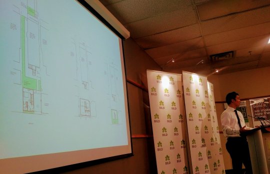
    This morning I presented and sat on a panel at BILD called “bringing laneway suites to Toronto.” The other participants were Councillor Mary-Margaret McMahon, George Pantazis (Planner at the City of Toronto), Mike Collins-Williams (Director, Policy at OHBA), and Andrew Sorbara (co-founder of Lanescape).

    Here is a photo that Mike took of me while I was talking about my failed laneway house:

    image

    For those of you wondering if/when this will happen in Toronto, here are the key takeaways from this morning: The city is already drafting laneway suite policies specific to Toronto & East York (not the other parts of the city) and they are due to report back to council in Q2-2018. Nothing is 100% certain at this stage, but there’s lots of optimism. 

    Councillor McMahon delivered this morning’s opening remarks and I was impressed by her deep commitment to laneway suites. I was also impressed by her stance on NIMBYISM, saying that education is important and that we can’t let NIMBYs stop what makes sense for the greater city.

    She gave the example of the 6 storey condominium in her ward that faced fierce community opposition a number of years back. If you can’t put a midrise building on a main street in this city, where can you put it? 

  • The value equation

    On Tuesday night I attended a great industry event that Quadrangle Architects organized about mid-rise buildings. 

    Mid-rise buildings (somewhere around 4-12 storeys) are all the rage in Toronto these days. But there are many challenges associated with this building typology and this was an event to talk about them and hopefully push things forward.

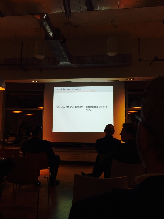
    One of the speakers at the event was Jeanhy Shim of Housing Lab Toronto. And I’d like to share one of her slides here:

    It reads:

    Value = (rational benefit x emotional benefit) / price

    I believe she admitted to taking it from someone at Bruce Mau Design. But that’s okay. That’s how ideas build. What I really like about it is that it attaches a value to the things that are difficult and sometimes impossible to measure: the emotional stuff.

    As I mentioned in this post over the weekend, we are all obsessed with the quantitative side of our businesses. In the case of development, we look at prices, per square foot prices, apartment sizes, and the list goes on. And we often reduce our “products” to these sorts of key metrics.

    But if you’re competing just on numbers, then you’re missing a big and important part of the equation. People consume things – and housing is no different – for a number of different reasons. We buy things because of how it makes us feel, how it reinforces our sense of self, how it improves or promises to improve our lives, and so on. These are all harder to measure than square footage. 

    But we are living in a data driven world and more and more of this type of information will become available for city building. If you and your business can get your head around it first, you’ll have a huge advantage. 

  • Project Profile: Fashion House in Toronto by CORE Architects

    image

    As Architect This City continues to grow in readership, I’m starting to get pitched more and more. People email me with something they want promoted and they try and convince me to write about it. Everybody is looking for distribution. I get it.

    I have no qualms about people and companies reaching out. In fact, I welcome the suggestions. But the vast majority of these “pitches” don’t make it onto ATC. 

    When it comes to these sorts of things, I have two simple rules: (1) I have to like it myself. If I don’t think what you’re pitching is interesting or cool, I’m not going to write about it – even if you’re offering up money. (2) I need to be able to be transparent about it. More on this second point in the coming weeks.

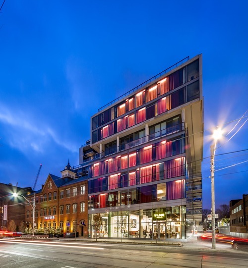
    Recently I was asked to do a post about the Fashion House Condos in Toronto’s King West neighborhood. 

    Here’s why I decided to do it:

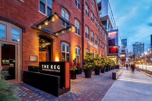
    I like that the existing Silverplate heritage building was preserved and integrated into the base of the condo. It’s now tenanted to The Keg, which has gone into the base of a number of new condo buildings in the city. They’re a successful chain.

    image

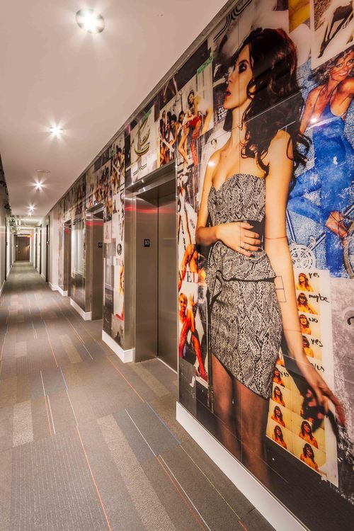
    Each elevator lobby within the building has a unique mural designed by a different fashion designer – most of which are Canadian. The whole Fashion House theme is meant to speak to the area’s history as Toronto’s Garment District.

    image

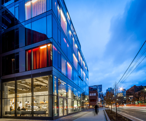
    Many of the residential suites have red curtains (which are white on the interior). They form a “common element” and have to stay in the condo. It gives the building a dramatic and unique feel, though it means you have to be a fan of curtains.

    image

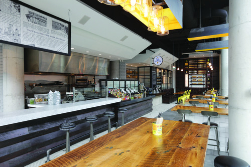
    My good friend designed the Mexican restaurant at the base of the building (Wilbur Mexicana). His firm is called Reflect Architecture.

    It’s also an example of cool startup businesses going into the base of a new development. As far as I know, Wilbur Mexicana is the group’s first venture.

    image

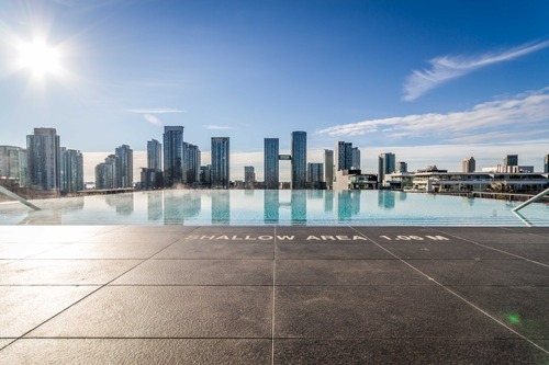
    There’s a rooftop pool that I’m hoping somebody will invite me to this summer.

    imageimage

    And finally, because I think the King West neighborhood is such a great example of urban renewal.

    image

    To end off, here are some stats on the project:

    • Address: 560 King Street West, Toronto
    • Developer: Freed Developments
    • Architect: CORE Architects
    • Project Timeline: 2008-2014
    • Construction Costs: $60M (estimate)
    • Site Area: 4,887 square meters / 52,603 square feet
    • Gross Floor Area: 27,107 square meters / 291,777 square feet
    • Floors: 11 and 12 storeys
    • Building Heights: 33m and 39.7m
    • Residential Suites: 334

    And here are the fashion designers responsible for each elevator lobby mural:

    • 2nd Floor – Beckermans
    • 3rd Floor – Dean Davidson
    • 4th Floor – Jeremy Laing
    • 5th Floor – Adrian Wu
    • 6th Floor – Jenny Bird
    • 7th Floor – Ashtiani
    • 8th Floor – Peach Berserk
    • 9th Floor – Smythe
    • 10th Floor – Jay Godfrey
    • 11th Floor – Bustle
    • Penthouse – Greta Constantine

    What do you think of Fashion House?

    Images: CORE Architects