Daily insights for city builders, delivered every morning at 6 AM ET. I’m Brandon Donnelly — a Toronto-based real estate developer and founder of Globizen. I’ve been writing here since 2013.
I was very impressed by Bordeaux’s tramway network. It felt like no matter where you were in the city, there was a tram gracefully passing you by. Here’s a high-level summary of the system:
The network has 4 lines and a total route length of 77.5 km.
The first line opened in 2003.
The network has 130 stops, which crudely results in an average stop spacing of around 600 m.
The system pioneered ground-level power supply for the trains, which means no overhead wires. Supposedly this caused some issues upfront, but now it seems to be working just fine.
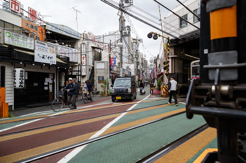
Most of the network runs on a dedicated right-of-way (en site propre). Meaning, the trains don’t compete with car traffic. Many of the lines are quite beautiful too – see above video.
In 2018, the network carried close to 100 million people. This is in a city of ~260k people and a metro area of ~1.4 million people (2020).
The key differentiators for me are (1) the stop spacing and (2) the fact that most of the system runs on its own dedicated right-of-way. These are two reasons why Toronto’s streetcars perform so poorly. They stop too frequently. And most of the lines have to compete with traffic.
So why bother? Walking can be faster.
Bordeaux shows that — if you implement light rail correctly — you can actually move a ton people efficiently. With surface rail, you can also build out a robust network in a relatively short period of time.
If you want to understand a huge divide in Toronto and WHY people are so hyped about the Ontario Line look at the main transit project Toronto built in the 2010s (Eglinton Crosstown) vs. the main one for the 2020s (Ontario Line). Not to mention we needed the OL for decades! pic.twitter.com/2qoxT0dHfe
Sometimes I’ll hear people in Toronto talk pejoratively about all of the development that’s been happening at Yonge & Eglinton (in midtown). They’ll say it’s too much density.
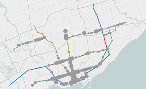
But then you come across charts like the ones above (source previously shared here) and you realize that this location is the only section along the new Eglinton Crosstown LRT line that is actually starting to have enough people.
Based on 2021 Census data, there were about 40k people within 800m of the future Eglinton and Mount Pleasant stations. In contrast, there are many downtown stations along the Ontario Line (also under construction) with around 80k people.
Why this is important is because if the objective is to get people to ride this new transit and collect a lot of fares, then the single most important factor is going to be the amount of people that live, work, and play adjacent to each station.
Now, I’m not a transportation planner, but in my mind there are three simple ways to think and go about optimizing for this:
You can look at where population densities are already high and then add new transit to service these densities. This is what is happening with the Ontario Line and it was long overdue. We know that ridership is going to be relatively high because of the chart at the top of this post.
You can look at where there’s existing transit and then work to optimize the land uses around it. This is what we should be doing a better job of along the Bloor-Danforth line, where certain station areas have actually lost people over the last few decades. This is the opposite of what you want next to transit investments.
Lastly, you can also proactively plan new transit while simultaneously encouraging more density. An example of this would be the Vaughan Metropolitan Centre (just north of Toronto). Extend the line and encourage growth. This is good. The only thing with this approach is that it can seem a bit misaligned if you’re currently failing at #1 and #2.
I often hear people lamenting about all of the construction that is taking place right now at Yonge & Eglinton in midtown Toronto. But that’s kind of what happens when you build a new subway line (okay, a partially buried light rail transit line). Above is a recent drone video that Metrolinx released showing the progress at Eglinton Station (I think I would have gone with a little Booka Shade for the soundtrack instead). I bet that most of you will be surprised to see how much is happening beneath street level. If you can’t see the above video, click here.
A few months ago when I wrote about “Toronto’s great streets” I mentioned that Queens Quay West – while magnificent – has had its share of issues. Cyclists and pedestrians often find themselves battling for space. And drivers are consistently driving in the wrong places.
Part of the problem, I think, is that the turning radii (among other things) are a bit atypical and unusual compared to the rest of the city. And so if you’re at all in mental autopilot, it can be fairly easy to make a wrong turn. You really have to be paying attention.
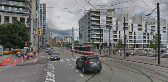
Below is a screenshot from Google Street View showing the foot of Lower Spadina, looking east on Queens Quay West. If you’re making a left turn from the former onto the latter, you need to end up on the left (north) of the streetcar tracks (even though the tracks themselves might be directing you elsewhere).
There’s lots of signage telling you not to drive onto the tracks, but that hasn’t really been working. So the tracks were recently painted in bright red. You can see what that looks like here. Some people are still getting mixed up, but it’s certainly more noticeable.
What I am wondering today is whether all of this signage and paint should be considered a symptom of poor design. In other words: Should good design require few instructions? Or, is this simply a normal part of iterative city building?
Last weekend over dinner, a friend of mine asked me what I thought about the Scarborough Subway Extension debate going on in Toronto right now. Costs are coming in higher than initially projected and the usual back and forth is taking place. Transit blogger Steve Munro has a good post on this called Spinning a Tale in Scarborough.
I haven’t written much about the Scarborough Subway, but I do have a strong opinion. I believe it’s a mistake. I am not saying that we shouldn’t be building higher order transit in Scarborough – we absolutely should – but it does not need to be an expensive subway line. There are more sensible solutions.
Here are a few things to consider:
Light rail transit (LRT) does not equal streetcar. As an avid user of the King streetcar, I’ll be the first to admit that something needs to be done to address the city’s busiest streetcar routes. They are broken. But this is not what was being previously contemplated for Scarborough. True LRT – which Toronto does not yet have – is far more effective at moving people.
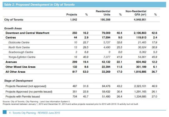
Scarborough Centre is seeing almost no new residential and commercial development. In fact, the “Centres” in general are not seeing much development. The largest share is happening downtown, along the central waterfront, and along the “Avenues.” We shouldn’t ignore this when making our investment decisions. Transit and built form go hand in hand.
I also do not buy the argument that we are building this subway in anticipation of demand 50 or 100 years from now. We are not in a position to be proactive about our infrastructure. We are desperately playing catch up and there are already lots of high growth and high density areas in the city which today are completely underserved by higher order transit.
Finally, a new subway line with low ridership will mean higher operating cost subsidies to keep it afloat. And at the rate that Scarborough Centre is growing today, this would likely continue for many years into the future. Not only is this debate about spending money today, it is about spending money well in the future, month after month.
So let’s be clear: the Scarborough Subway Extension debate is about politics. It is not about transportation planning.
The map shows all existing, planned, and proposed transit lines in the city, and then overlays population densities, commuting patterns, household income, and so on. It’s a super valuable map that I think reveals a lot about how we should be focusing our energies to get Toronto moving.
So what sorts of things does it tell us? I’ll give 2 examples.
If you look at commuting patterns across the Bloor-Danforth subway line, you’ll see that Runnymede station in the west is where people switch over from taking transit to driving. People west of that station tend to drive. Naturally, it also happens to coincide with where population densities start to fall off.
By contrast, if you look at the east side of the city along the Danforth and beyond, the entire stretch more or less relies on transit to get around. Part of this likely has to do with income levels, but it’s also because of the availability of the Gardiner Expressway. There’s no equivalent in the east end. Dylan Reid of Spacing Magazine believes this makes a case for some sort of road pricing along the Gardiner, and I would agree.
As a second example, look at the population densities along the proposed Downtown Relief Line, Finch LRT, and John Tory’s SmartTrack line. Outside of the core, the population densities are relatively low along the proposed SmartTrack line – which is never a good thing for rapid transit.
There’s also no Sherbourne station on the SmartTrack line, which happens to have the highest population density across the entire Relief Line – 22,131 people per square kilometre! That’s more than any other stop along the Yonge-University subway line except for Wellesley station.
I’ve written about this a lot before, but I think we need to do a better job of matching up transit investment with expected customer demand. Too often we let politics get in the way of rationale decision making. Maybe it’s time we did something like set minimum population densities. If you want a subway line in your area, you have to first bring the people.
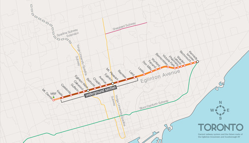
One of the biggest pieces of infrastructure currently under construction in Toronto is the Crosstown LRT line, which will run on and under Eglinton Avenue right through the heart of midtown. The total length of the line is 19 km, and 10 km of it will be underground along with 12 of its stations.
Here’s a map:
But as the Chief Planner of Toronto, Jennifer Keesmaat, rightly pointed out in this blog post earlier this year, it’s important to think of this line, not just as a piece of transit infrastructure, but as a broader city building initiative. With this line comes a tremendous opportunity to rethink and rebuild one of Toronto’s most important avenues.
I have no doubt that this will happen over the coming years and decades. I mean, just look at the development activity taking place on St. Clair Avenue West right now, which you could argue is the result of its right-of-way streetcar line. But in this instance, what I’m specifically curious about is what will happen at each of the stations along Eglinton Avenue.
If you take a look at the Stations and Stops page on the Crosstown website, you can see where all of the primary and secondary entrances will be and how each station will generally function. But what is not clear is whether we will be using this opportunity to build additional density on top of them.
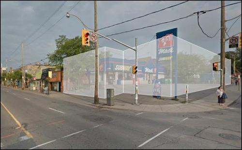
Here’s how they have “blocked out” the primary entrance for Avenue station:
I have no idea what it’ll become. But if it ends up as single-storey and single-purpose building, then I think we will have missed an opportunity. And the same goes for many, if not all, of the other stations along the Eglinton Crosstown line. Fixed rail is such a massive driver of real estate value, and so it seems silly not to take advantage of that in some way.
If anyone has any insights into how these stations will or will not be developed, I would love to hear from you in the comment section below.
CityLab published an article last week on multi-modal cities that caught my attention (because it used a picture of Toronto with about 3 or 4 streetcars stacked up along Queen Street). The premise of the article is that all of this car vs. transit debate is actually missing the bigger picture: our cities are multi-modal and we need to be planning for that.
That’s not to say that the shift away from cars isn’t a good thing. It is. But it’s not as simple as saying that, instead of driving, people should now only take transit. In today’s cities people walk, bike, take streetcars, take buses, take subways, take taxis, take private shuttles, use Uber, and, yes, they still drive.
From my own experience, this is absolutely how I get around Toronto today. I walk to the gym. I ride my bike whenever I’m going somewhere downtown. I take the subway to my office in midtown because it’s far and I would be too sweaty if I biked there. I use Uber and Hailo when I’m going out at night. And I drive when I need to go to the suburbs or leave the city.
But the key takeaway here is that we now have a much tougher challenge on our hands. When we were only optimizing for cars – however detrimental to our cities that was – we only had one mode to plan for. Now we have several. Some of which are public and some of which are private.
However we also have access to technologies that we didn’t have before. We are networked in ways that weren’t possible before and we’re at the dawn of many profound mobility changes, such as driverless cars. (Have you read about Tesla’s new Autopilot feature yet?)
So as I’ve said before, I really believe that we need to look at this, not as a war on the car, but as a war on inefficiency. The problem we are trying to solve relates to mobility: What’s the best way to move lots of people around dense urban regions? Stop focusing so much on the technologies and focus more on the people.
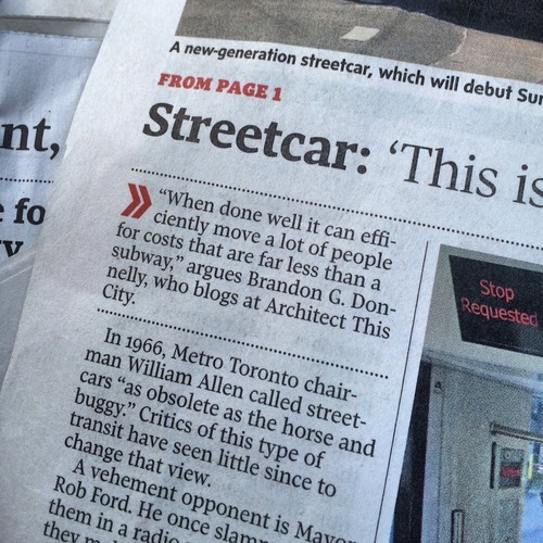
In anticipation of our new streetcars beginning service this Sunday, the Globe and Mail published an article on Friday called: Why Toronto is still a streetcar city. And I was quoted as saying the following:
I had no idea that I was going to be cited, but I like the quote that was chosen. The key words are: “when done well.” There are a myriad of different ways in which a city can implement streetcars, and each will have varying degrees of performance.
So if you’re one of those people who are critical of streetcars, I would encourage you to think about streetcars not just in terms of how they’re implemented today in Toronto, but also in terms of how they could be implemented going forward.
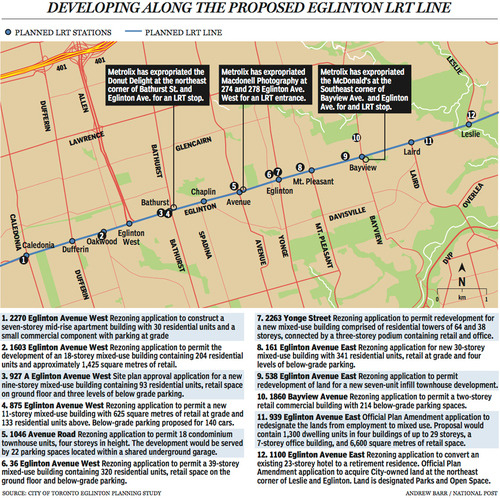
Last week The National Post published an article talking about Toronto’s Crosstown LRT and how it’s spurring a wave of development all along Eglinton Avenue. Below is a map, taken from that article, showcasing some of the developments that are currently in the pipeline and awaiting the Crosstown’s opening date of 2020.
Not surprisingly, developers like transit investment. But more specifically, they like fixed track transit investment. Rarely do new bus routes elicit the same sort of response that you’re seeing above. And that’s because fixed track investment has permanence. If you’re going to go long on an area, you want certainty.
As the Crosstown tunnel boring machines move across midtown Toronto, I thought it would be interesting to look at a transit concept that I first learned about through Jarrett Walker’s Human Transit blog. It’s called: the radius of demand.
One of things that transportation planners look at when designing and building a new line is the spacing of stops. Typically, as you move from buses all the way up to subways, the spacing between stops and stations increases. Spacing is always a bit of a trade off though, because more stops means easier access for riders, but it also means slower overall service. Somewhat famously, Paris designed its metro system so that you’re rarely more than 500 meters away from a station.
Once you have your station locations, it’s quite common to then draw a radius around each stop to simulate the catchment area. In other words: How much of the city can I service with this station and how far will people be willing to walk in order to get there? However, this distance, which is the radius of the circle, usually depends on the type of transit. Oftentimes people are willing to walk further in order to get to faster transit service.
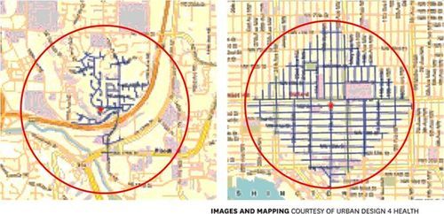
But what’s most interesting about this radius of demand is that it’s entirely dependent on the fabric of the city. Take for example, the following two maps from Seattle, which I have taken from Walker’s blog. On the left is a suburban setting and on the right is a downtown setting. In both cases, the red circle represents a 1 km radius.
Now, if humans could fly over barriers, such as highways, and every Seattle resident was willing to fly exactly 1 km to a transit station, these two radiuses of demand would be perfectly accurate. But since that’s not the case, we instead need to look at what actually represents a 1 km walk – those are the blue lines in each image.
Because once you do that, you realize that the cul-de-sacs and highways on the left make it impossible for most of that radius of demand to actually walk to the station in under 1 km. So the catchment area actually becomes much smaller. On the other hand, if you look at the image on the right, you’ll see that the tried and true city grid is actually remarkably efficient for walking. Almost all of the circle is serviced.
So as the Eglinton Crosstown LRT makes its way through the center of Toronto, I think it’s important to keep in mind that it’ll be cutting through quite a few different kinds of street grids. Some of them will be highly conducive to transit usage and others not as much. And in many ways, this is one of the greatest challenges of transit investment. The track itself is only one part of the puzzle.
That’s why the City of Toronto is also undertaking a planning exercise called Eglinton Connects. Its intent is to leverage the opportunities, as well as address the challenges, that will result from Metrolinx’s Crosstown LRT. If you’re interested in the future of Eglinton Avenue, you should consider getting involved. Oftentimes it’s only the critics that speak up. But that’s not the best way to build anything.