Daily insights for city builders, delivered every morning at 6 AM ET. I’m Brandon Donnelly — a Toronto-based real estate developer and founder of Globizen. I’ve been writing here since 2013.

Tag: london

  • Necessary city

    I’ve spoken about global cities, such as New York and London, many times before on Architect This City. I’ve also talked about the rise of consumer cities. That is, cities with a high “urban amenity premium”, which could be great outdoor amenities or great restaurants, theatre and so on. These are places of consumption.

    Sometimes global cities and consumer cities are one and the same. But there are also cities–such as Vancouver–where I view the urban amenity premium as outweighing their status as a global city. Vancouver, quite simply, is an awesome place to live and enjoy life. I almost went to UBC for grad school because of Whistler Blackcomb and the city itself.

    Today, I’d like to introduce another type of city into the discussion mix: the necessary city. I heard about it here and, although it seems somewhat intuitive, I think it’s an important reminder that, even though a city may not be an alpha global city, it may be fulfilling a specific function for a particular industry or aspect of the global economy. It may still be a necessary city for your corporate headquarters.

    For example, Houston is the city for energy companies. If that’s your business, you likely need a presence there. For fashion and luxury, it’s Paris. And if you’re in the auto industry:

    The major global equipment manufacturers are widely dispersed, but when you look at leading global parts suppliers, they virtually all have their North American headquarters in Detroit – including the German, Japanese and Korean ones. Among them are companies like Robert Bosch, Denso, Yazaki and Hyundai Mobis. If you’re in the auto industry in America, you have to deal with Detroit. Unsurprisingly, Detroit boasts several nonstop flights to key Asian destinations.

    In essence, we’re talking about cities making themselves necessary by becoming niche experts. And what I think is interesting about this concept is that it’s likely much more attainable for a lot of cities. Most cities will never become New York. And most cities will never be able to transform themselves into the next Silicon Valley.

    But maybe those are the wrong economic development goals. It’s not about becoming the next, whatever; it’s about finding and owning a particular niche and making yourself absolutely necessary to the global economy.
  • The best city blogs around the world

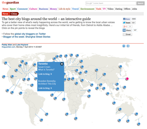
    This morning I’m super excited to announce that Architect This City has just been listed by the Guardian Cities UK as one of ’The best city blogs around the world.’

    There are some great and well known blogs on the list, including The Happy City by Charles Montgomery (Vancouver) and Humans of New York by Brandon Stanton–which went on to become a #1 NYT bestselling book. So it feels good for my fledgling ATC blog to be included.

    A big thanks to the editor of the Urban Times for encouraging the folks over at the Guardian to include it and thanks to everyone who reads ATC. Happy Monday.

  • Can the creation of urban destinations transform or hinder a city’s development?

    I was recently asked by a Canadian architecture website called sixty7 Architecture Road to respond to the following: Can the creation of urban destinations transform or hinder a city’s development? It was for a regular Q+A series they do on their website. Here is my response (I was specifically asked about Dundas Square):

    The best line I’ve ever heard about public spaces and urban destinations was from Bruce Kuwabara of KPMB Architects. He said that the outside of buildings need to be thought of as the inside walls of the public realm. And I think that’s a really great way of framing this discussion. We often think of buildings inwardly and as self contained objects, but by virtue of their existence we’re creating and framing many other spaces.

    With that in mind, I absolutely believe that beautiful and well designed urban destinations–whether public or private–can transform a city and its development patterns. A perfect, but perhaps overused, example of this is the High Line in New York. Not only has it become a destination (“Have you been to the High Line yet?”), it has become an unbelievable city building catalyst. All of a sudden development is happening in, on and around the High Line, where as before developers would have tried to completely ignore it. And so today, the High Line, as an urban destination, is almost being continually reinvented by new development.

    To talk specifically about Toronto, I think that downtown needed a “public” space like Dundas Square. The design could have been less unidirectional (towards the Eaton Centre) and the building to the north is repulsive, but it provided a forum along Toronto’s main street in the heart of downtown. I also believe that good urban destinations give areas a sense of identity, which is why I’m somewhat bothered by the loss of the square at Yonge & Eglinton. Sure it was bad, but we could have made it better. It is the heart of midtown in my mind.

    So not only do urban destinations have the ability to transform, I would argue that they are essential to any great global city. Whether it’s the High Line in New York, the Spanish Steps in Rome, the old Love Park in Philadelphia, or Trafalgar Square in London, these spaces are integral to those city’s brands and identities. What do ours say about Toronto?

    For the full Q+A, click here.

  • Best predictor of a city’s growth is its average January temperature

    With the cold winter that we’ve had in Toronto this year I’m going to be honest and say that I’ve, on occasion, wondered why I haven’t moved somewhere warmer. There aren’t any great mountains nearby, so it’s not like I’m putting up with this cold in order to feed my love of snowboarding.

    Then yesterday, I was reading The Urbanophile blog and I was reminded of a fascinating finding from Edward Glaeser’s book, Triumph of the City: climate matters when it comes to cities and prosperity.

    In fact (from New York Magazine):

    The single variable that best predicts a U.S. city’s growth over the past century is its average January temperature. Hence the decline of many northern and midwestern cities and the boom in the South and the Sun Belt, where the Phoenix, Atlanta, Houston, and Dallas metropolitan areas have each gained a million people since 2000. For every five degrees that a city’s January temperatures top the national average, Glaeser writes, its real-estate prices will beat the national mean by 3 percent, thanks to the increased demand.

    But not all cold places are bleeding people. New York isn’t. And neither is Toronto. The Toronto area accepts roughly 100,000 new people every year. We have more cranes up in the air than any other city in North America. But it’s cold as all hell here. So what gives?

    As the New York Magazine article (cited above) points out, New York essentially offers enough benefits to offset its cold winters. There are enough amenities and economic opportunities to make people put up with the bad. And we’re not just talking about weather.

    A lot global cities–New York, London and so on–are crowded, expensive and somewhat impractical places to live. But they continue to attract and retain people in droves, which is a nice tie in to yesterday’s post about urban renewal and the importance of lifestyle.

    People will put up with a lot if your city is an otherwise awesome place to live.

  • What signage says about your city

    I woke up this morning in the City of London, Ontario, to a parking ticket. Apparently, I had committed an infraction by parking between the hours of 3:00 am – 5:00 am.

    Here’s what the sign looked like, directly in front of my car. There were no other signs nearby other than one at the end of the street telling me where the parking area stopped.

    image

    Perhaps I’m missing something, but based on the signage provided, there’s absolutely no way for me to know that parking is not permitted between the precise hours of 3:00 am and 5:00 am. And truthfully, this seems like an odd set of hours to want to enforce. 

    If there were some feasible way for me to fight this ticket, I would. But since cities make this purposely difficult, I’m just going to pay it. Even though I feel like fighting it out of principle.

    But this post isn’t for me to complain about a parking ticket.

    When I got the ticket this morning, it reminded me of a “theory” that someone once told me at an Urban Land Institute conference a few years back in Washington D.C. I actually can’t remember who it was, but the idea was that you can tell how global a city is by the quality of its signage and wayfinding signage.

    I’m intrigued by this proposition because, if you think about it, a city unaccustomed to receiving outsiders has less of a need for quality signage. As a local, you begin to create your own mental map of the city and you intuitively start to understand what’s allowed, such as where you can park. The importance of good signage somewhat diminishes.

    But outsiders are coming with no understanding. They’re looking for directions and instructions. So you should make sure that your city is giving it to them. However, at the same time, there are lots of big global cities, such as New York, which are or were notorious for bad signage. So signage quality is probably not perfectly correlated with globalization.

    Regardless, signage matters. It’s one of the ways in which a city talks at you and others. How clearly does your city communicate?

  • Urbanization in the developing world

    A few days ago I asked a reader of this blog if there was anything, in particular, that she’d like to see more of on here. She responded by saying that she’d love to learn more about how other cities—outside of Toronto—are managing urbanization, as well as how we shape cities and cities shape us.

    It’s an interesting and important question because, frankly, the challenges are greater outside of Toronto. One of the stats that often gets cited here in the media is how the Greater Toronto Area gets approximately 100,000 new immigrants every year. This doesn’t include domestic migration though, so I would assume that our total number is even greater.

    But if we stick with 100,000 for now, it means the GTA receives about 11.4 new immigrants every hour (100,000 people / 8,765 hours in a year). Lagos, Nigeria, on the other hand, receives between 50-60 new people every hour. In fact, it’s predicted to be 7th fastest growing city in the world between now and 2020. 

    If you take a look at the complete list of the world’s fastest growing cities (all estimates, of course), you’ll likely notice that the vast majority of the cities are in the developing world. And that’s really the challenge. The world is rapidly urbanizing and becoming the most urban it’s ever been, but the changes are the greatest outside of developed nations. This poses entirely unique challenges.

    Of the kinds of cities I’m talking about, I’m most familiar with Dhaka, Bangladesh. In my last year at Penn, I was part of a studio led by KieranTimberlake Architects that focused on water and housing issues in that city. It was a partnership with the University of Dhaka. We spent roughly 2 weeks there and it was an eye opening experience.

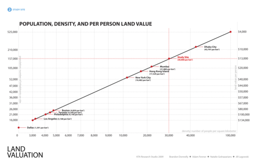
    Here’s a telling slide from our final presentation:

    image

    What we were trying to do with this chart was compare population and per person land value for our development site according to various city types. In other words, we were essentially asking: If we were to build out our proposed site in the same way, as say, Dallas, Los Angeles, Hong Kong, or what is typical for Dhaka, how many people could we fit and what would be the resulting per person land value?

    I don’t remember where we got the land value figures from, but we were trying to be cognizant of the fact that every city requires a unique solution. Using the same per person land values in Dhaka as in Dallas would be unimaginable because Dhaka has over 40,000 people per square kilometre (top right on the diagonal line above) and Dallas has under 1,400 per square kilometre (bottom left on the diagonal line above).

    The challenges of urbanization in the developing world are profound, particularly in places like Dhaka where most of the city is subject to severe annual floods. By some estimates, 18% of the city’s land area gets flooded every year—talk about adding another layer of city building complexity.

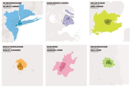
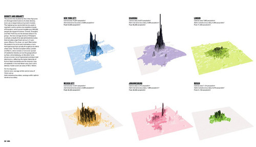
    We didn’t solve all of the problems in that studio and we’re not going to do it here, but I do think it’s important to fully understand the problem. One of my favorite books on cities is called “The Endless City.” It examines New York, Shanghai, London, Mexico City, Johannesburg and Berlin, and has a ton of great data and diagrams.

    Here are a two that outline densities and land use patterns for the above 6 cities (same order starting on the top left):

    image

    image

    If you’re interested in cities, it’s definitely worth having it on your coffee table. And fitting to @PhatNancy’s tweet, ”The Endless City doesn’t just show how cities are changing but also how they are changing us.

  • More on electronic road pricing

    We recently started a Lunch & Learn program at TAS. I did the first one on electronic road pricing and followed-up with the blog post below. Let me know what you think. It’s also cross-posted here on TAS’s website.

    —————————————————-

    image

    Last week at TAS I kicked started our new Lunch & Learn program with a talk on electronic road pricing. It was based on an HBS case that I had prepared for a pricing class I took at the Rotman School.

    The case is essentially about traffic congestion in Hong Kong and a decision to either build more road (a bypass road running adjacent to the harbour: The Central-Wan Chai Bypass) or implement an Electronic Road Pricing (ERP) system, similar to what was implemented in Singapore in the 70s and in London in 2003.

    My own view is that road pricing makes a lot of sense. And I’ve written extensively about it on my own personal blog. But to quickly summarize the economics behind it all, take a look at this graph:

    image


    What this graph plots is the marginal cost of products and services with a fixed capacity.  An example of a product or service with a fixed capacity would be a road. Roads can only handle a certain amount of drivers before it becomes unusable (gridlock). What this graph tells us is that once you reach that capacity—variable k in the graph—the marginal cost goes from zero to basically infinity.

    In laymen terms, it’s telling us that at 4am when nobody is on the road, the cost—to society, to productivity levels, and so on—of adding each one additional driver is basically zero. But, as soon as you hit capacity, at say 830am, and traffic is at a standstill, the cost shoots way, way up!

    So how do you solve this problem? Well, you price congestion. This invariably removes or forces drivers to other times of day and makes it so that demand for the road drops below the available supply. Then the road is able to function as it’s intended to. I don’t know about you, but this makes a ton of sense to me. What good are roads if they’re clogged with traffic?

    What I’d like to do now is bring the discussion back to Toronto. For those of you with an interest in transit, you’re probably aware that Metrolinx has a “Big Move” transit and infrastructure plan that’s going to cost the region $2 billion a year to implement. I view this as investment in our region and so I think it’s absolutely the right move.

    However, the billion dollar question is, where is the money going to come from? Earlier this year Metrolinx proposed 4 main revenue tools. They are:

    – A 1% sales tax (estimated to raise $1.3 billion annually)
    – A business parking levy (estimated to raise $350 million annually)
    – A $0.05 fuel and gasoline tax (estimated to raise $330 million annually)
    – And a 15% increase in development charges (estimated to raise $100 million annually)

    What I would suggest is that there should be a road pricing plan in this list in addition to—or instead of—some of the items listed above. Taxes are just taxes. And they discourage consumption depending on the elasticity of the demand for those items.

    However, I would argue that a well executed road pricing model should be considered not as a tax, but instead as an incredibly accurate way to price roads according to actual usage patterns and costs incurred. Think of it like time-of-use utility billing. Do you think of high-peak utility billing as a tax or as simply the price to use the service when demand is the highest?

    The benefits of a road pricing system would be numerous:

    – We’d get a consistent revenue stream for transit investment in the region (instead of having to rely on government hand outs)
    – We’d be helping to decouple transit building from the political process (because Metrolinx would now make its own money)
    – We’d eliminate traffic congestion (yes, it can be done)
    – We’d increase productivity levels across the region (people will actually be able to get around)
    And we’d be reducing our impact on the environment by encouraging alternate forms of transportation

    This is an incredible list of benefits. However, I think one of the challenges with implementing electronic road pricing is that it’s often misunderstood. People just view it as a tax. Hopefully by looking at the economics behind it all, it has become clearer that it’s actually a bit more nuanced than that.

  • The 2013 Anholt-GfK City Brands Index

    When most people think of brands, I suspect that they think of companies, products and services. But what about the brand of your city? As cities continue to compete for talent in the global economy, brand is becoming a hugely important differentiator.

    I just stumbled upon the Anholt-GfK City Brands Index and here’s their 2013 ranking:

    1. London
    2. Sydney
    3. Paris
    4. New York
    5. Rome
    6. Washington D.C.
    7. Los Angeles
    8. Toronto
    9. Vienna
    10. Melbourne

    The study looks at 6 key dimensions: presence, place, pre-requisites, people, pulse and potential.

    What do you think of the above list?

    Here’s a bit more information on how the index was prepared:

    “The Anholt-GfK Roper City Brands Index measures the image of 50 cities based on more than 50 questions related to perceptions of their Presence, Place, Pre-requisite, People, Pulse and Potential.  For the 2013 study, a total of 5,144 interviews were conducted in Australia, Brazil, China, France, Germany, India, Russia, South Korea, the United Kingdom and the United States.  Adults age 18 or over who are online are interviewed in each country.  Using the most up-to-date online population parameters, the achieved sample in each country has been weighted to reflect key demographic characteristics including age, gender, and education of the online population in that country.  Fieldwork was conducted from May 8th to May 23rd, 2013.”

  • The Toronto font

    Susan Kare was the screen graphics and font designer for the original Apple Macintosh computer in the 1980s. Being from Philadelphia’s affluent Main Line, she initially proposed that the various fonts be named after the railroad stops along it.

    However, when Steve Jobs asked where the names had came from, he contested that, if the fonts were to be named after cities, they should be named after “world-class cities”, rather than small ones that nobody had ever heard of.

    image

    And since that’s what Jobs wanted, that’s what Jobs got. The fonts were renamed: Venice, London, Athens, Toronto, Chicago, New York and Geneva. Some of these font names you’ll probably still recognize but some, including Toronto, were eventually abandoned. 

    The Toronto font was removed from System 6 onwards. So from 1988 onwards.

  • Who knew Gherkins were so aerodynamic

    Lately I’ve been learning a lot about wind and how certain building forms can create dramatically different microclimates.

    In light of this, I’ve gained a new appreciation for the 30 St Mary Axe tower in London (colloquially known as “the Gherkin”). I’ve always been a fan and I was well aware of its sustainability initiatives, but I didn’t fully grasp how much wind played a role in its design.

    Because of its cylindrical shape and the fact that the tower tapers as you move towards the top, the bulk of the wind hitting the building either flows around it or gets pushed upwards, towards the sky. This is in contrast to a typical square or rectangular building where the bulk of the wind often gets pushed down towards street level.

    image

    The benefit of this is that it obviously creates a more pleasant environment for pedestrians at street level. However, in addition to this, it also means that the wind loads against the building were brought down to a minimum and so the structure of the building could also be reduced. 

    This is the kind of architecture I love: architecture that performs.