Daily insights for city builders, delivered every morning at 6 AM ET. I’m Brandon Donnelly — a Toronto-based real estate developer and founder of Globizen. I’ve been writing here since 2013.
Detroit has started testing its new streetcars on Woodward Avenue. Quicken Loans bought the naming rights to the line, so it’s now officially called the QLINE. If you’re British, this name probably won’t instil feelings of rapidity.
Here’s a recent tweet from M1-Rail (click here if it doesn’t show up below):
In the case of Detroit, I also think there’s symbolic importance to bringing back light rail to the core of the city. The last Detroit streetcar was shut down in 1956.
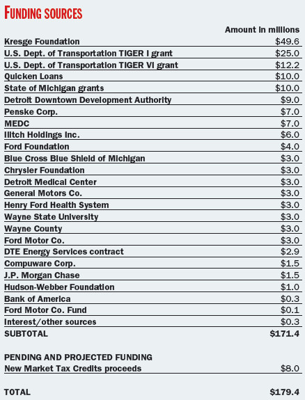
It’s also worth mentioning how the streetcar line was funded. Below is a breakdown of funding sources dated 2014.
There may have been some changes since then, but it’s positive to see the public and private sectors come together, alongside a large infusion of philanthropic money (The Kresge Foundation).
Many of the companies on the above list sponsored individual stations. The cost to do so was $3 million, which is why you see that number show up a few times. Compuware and JP Morgan Chase shared a station at $1.5 million each.
Is this a transit funding model worth replicating?
Back in 2011, the The Pembina Institute published a report called, Building transit where we need it. And in it they quite clearly outlined the population densities that are needed to make various types of transit investment cost effective.
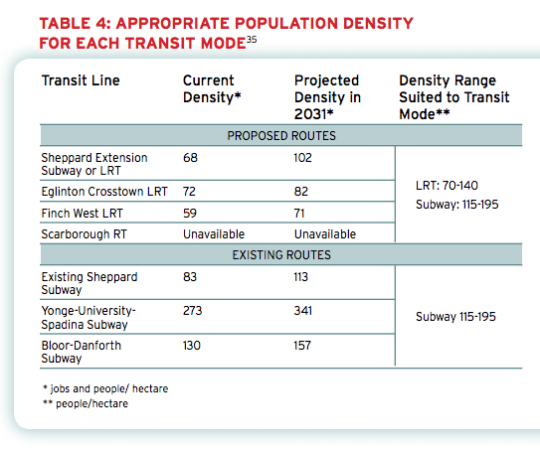
For subway they specify a minimum population density of 115 people per hectare and for light rail (LRT) they specify a minimum population density of 70 people per hectare.
And the reason for this is because there’s a strong correlation between population density (i.e. land use) and transit ridership. The two go hand in hand and should not be decoupled. If population densities are too low (as they are, for example, along the Sheppard subway line here in Toronto), people don’t take transit. They drive.
Here’s a chart from the report showing the current and projected population densities for Toronto’s existing and proposed routes (keep in mind this is from 2011).
So what does this chart tell us?
Subways don’t make a lot of sense in many parts of the city. LRT will do just fine.
The Sheppard subway line is an under-utilized asset. Even by 2031 we’ll barely be reaching the requisite population densities.
The Bloor-Danforth corridor could use more intensification.
Unfortunately, transit decisions are often made based on politics instead of data. And that results in subways in places that don’t make a lot of sense. That’s unfortunate because it means less riders, less revenue, and more subsidies.
The other challenge with running subways through low density neighborhoods is that it then creates tension when the city and developers go to intensify those neighborhoods through transit-oriented development. (See #DensityCreep.)
But if we’re going to be fiscally irresponsible about where we deploy our transit capital, the least we could do is upzone the surrounding areas and impose minimum population densities.
In fact, here’s what I think we should do: Land use should be bundled with the transit decision.
Instead of asking where the subway station should go, we should be asking where the subway station should go and all the density needed to bring the area up to a certain minimum population density. And if that second criteria for whatever reason can’t be met, then we don’t build the line.
I wonder if we framed the question in this way if it would change where subway lines get approved. What do you think?
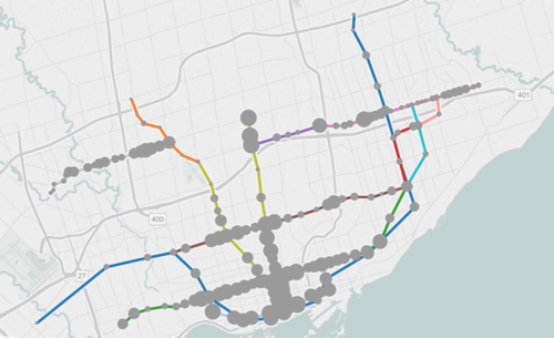
The map shows all existing, planned, and proposed transit lines in the city, and then overlays population densities, commuting patterns, household income, and so on. It’s a super valuable map that I think reveals a lot about how we should be focusing our energies to get Toronto moving.
So what sorts of things does it tell us? I’ll give 2 examples.
If you look at commuting patterns across the Bloor-Danforth subway line, you’ll see that Runnymede station in the west is where people switch over from taking transit to driving. People west of that station tend to drive. Naturally, it also happens to coincide with where population densities start to fall off.
By contrast, if you look at the east side of the city along the Danforth and beyond, the entire stretch more or less relies on transit to get around. Part of this likely has to do with income levels, but it’s also because of the availability of the Gardiner Expressway. There’s no equivalent in the east end. Dylan Reid of Spacing Magazine believes this makes a case for some sort of road pricing along the Gardiner, and I would agree.
As a second example, look at the population densities along the proposed Downtown Relief Line, Finch LRT, and John Tory’s SmartTrack line. Outside of the core, the population densities are relatively low along the proposed SmartTrack line – which is never a good thing for rapid transit.
There’s also no Sherbourne station on the SmartTrack line, which happens to have the highest population density across the entire Relief Line – 22,131 people per square kilometre! That’s more than any other stop along the Yonge-University subway line except for Wellesley station.
I’ve written about this a lot before, but I think we need to do a better job of matching up transit investment with expected customer demand. Too often we let politics get in the way of rationale decision making. Maybe it’s time we did something like set minimum population densities. If you want a subway line in your area, you have to first bring the people.
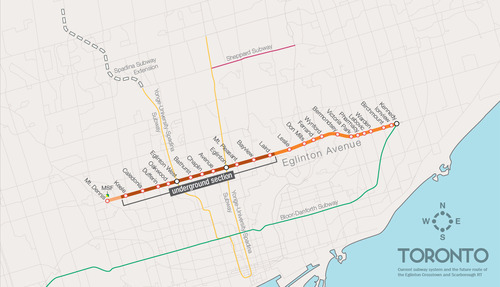
One of the biggest pieces of infrastructure currently under construction in Toronto is the Crosstown LRT line, which will run on and under Eglinton Avenue right through the heart of midtown. The total length of the line is 19 km, and 10 km of it will be underground along with 12 of its stations.
Here’s a map:
But as the Chief Planner of Toronto, Jennifer Keesmaat, rightly pointed out in this blog post earlier this year, it’s important to think of this line, not just as a piece of transit infrastructure, but as a broader city building initiative. With this line comes a tremendous opportunity to rethink and rebuild one of Toronto’s most important avenues.
I have no doubt that this will happen over the coming years and decades. I mean, just look at the development activity taking place on St. Clair Avenue West right now, which you could argue is the result of its right-of-way streetcar line. But in this instance, what I’m specifically curious about is what will happen at each of the stations along Eglinton Avenue.
If you take a look at the Stations and Stops page on the Crosstown website, you can see where all of the primary and secondary entrances will be and how each station will generally function. But what is not clear is whether we will be using this opportunity to build additional density on top of them.
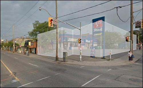
Here’s how they have “blocked out” the primary entrance for Avenue station:
I have no idea what it’ll become. But if it ends up as single-storey and single-purpose building, then I think we will have missed an opportunity. And the same goes for many, if not all, of the other stations along the Eglinton Crosstown line. Fixed rail is such a massive driver of real estate value, and so it seems silly not to take advantage of that in some way.
If anyone has any insights into how these stations will or will not be developed, I would love to hear from you in the comment section below.
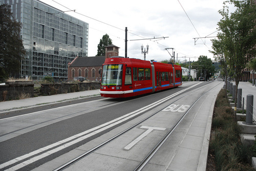
This afternoon I rode Toronto’s new streetcar for the first time on my way home from Chinatown. I had been meaning to do it for weeks now, but this was my first opportunity.
The experience was infinitely better than what you get today on our current streetcars. I felt like I was in a new city. The proof-of-payment system makes onboarding much faster and the 4 loading doors means you just get on the train where there’s the most room – instead of getting on at the front and fighting your way to the back.
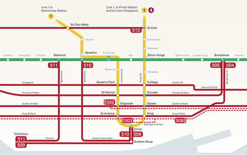
The other thing I liked is that they now have a map of our streetcar network within the train (see above image). Toronto never used to do this. For whatever reason, we didn’t like mixing subway lines with streetcar lines on the same map.
But why be so pedantic?
For one thing, our subway map looks pathetic without these additional streetcar lines on it. So for the sake of Torontonian morale, please fill it up with what you can.
But the other reason why I think it’s important to include them is that we shouldn’t be thinking about our cities just in terms of specific technologies (subway, streetcar, and so on). Our cities are now multi-modal. Which means we navigate them using many different means, from subways and streetcars to bikes and Uber cars. What people care about is getting from A to B in the most efficient and enjoyable way possible.
This may seem like a subtle distinction, but it’s an important one. And maybe, just maybe, these new maps will serve as an important reminder to us that there’s a lot of fixed rail in this city and that it could be far better optimized if we just tried a little harder.
CityLab published an article last week on multi-modal cities that caught my attention (because it used a picture of Toronto with about 3 or 4 streetcars stacked up along Queen Street). The premise of the article is that all of this car vs. transit debate is actually missing the bigger picture: our cities are multi-modal and we need to be planning for that.
That’s not to say that the shift away from cars isn’t a good thing. It is. But it’s not as simple as saying that, instead of driving, people should now only take transit. In today’s cities people walk, bike, take streetcars, take buses, take subways, take taxis, take private shuttles, use Uber, and, yes, they still drive.
From my own experience, this is absolutely how I get around Toronto today. I walk to the gym. I ride my bike whenever I’m going somewhere downtown. I take the subway to my office in midtown because it’s far and I would be too sweaty if I biked there. I use Uber and Hailo when I’m going out at night. And I drive when I need to go to the suburbs or leave the city.
But the key takeaway here is that we now have a much tougher challenge on our hands. When we were only optimizing for cars – however detrimental to our cities that was – we only had one mode to plan for. Now we have several. Some of which are public and some of which are private.
However we also have access to technologies that we didn’t have before. We are networked in ways that weren’t possible before and we’re at the dawn of many profound mobility changes, such as driverless cars. (Have you read about Tesla’s new Autopilot feature yet?)
So as I’ve said before, I really believe that we need to look at this, not as a war on the car, but as a war on inefficiency. The problem we are trying to solve relates to mobility: What’s the best way to move lots of people around dense urban regions? Stop focusing so much on the technologies and focus more on the people.
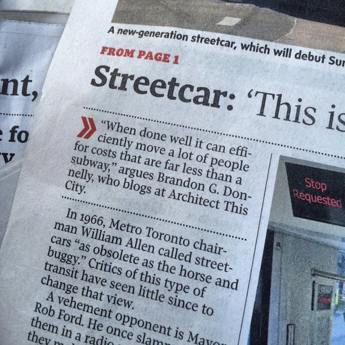
In anticipation of our new streetcars beginning service this Sunday, the Globe and Mail published an article on Friday called: Why Toronto is still a streetcar city. And I was quoted as saying the following:
I had no idea that I was going to be cited, but I like the quote that was chosen. The key words are: “when done well.” There are a myriad of different ways in which a city can implement streetcars, and each will have varying degrees of performance.
So if you’re one of those people who are critical of streetcars, I would encourage you to think about streetcars not just in terms of how they’re implemented today in Toronto, but also in terms of how they could be implemented going forward.
Earlier this month the Toronto Star published an article talking about the resurgence of streetcars in American cities. According to the Star, 89 cities in the US are currently implementing or at least considering building some form of surface-rail system.
But the article also goes on to argue that it could be a snobbish fad. Streetcars are new. They’re shiny. And they make yuppies – who don’t like taking buses – feel better about themselves. But is the ROI really there? Is the economic impact of streetcars as big as people are making it out to be?
To support this argument, the Star quoted transportation planner Jarrett Walker, who I’ve mentioned here before on Architect This City. But according to a follow-up post that Walker did on his blog, it would appear that he was misrepresented in the article. Here’s a snippet of his response:
Here’s the bottom line. Streetcars are just a tool. They can be used in smart ways and in stupid ways. Asking a transit planner for an opinion about a transit technology is like asking a carpenter what his favorite tool is. A good carpenter sees his tools as tools and choses the right one for the task at hand. He doesn’t use his screwdriver to pound nails just because he is a “screwdriver advocate” or “hammer opponent”. Yet the Toronto Star assumes that nobody involved in transit debates is as smart as your average competent carpenter.
I wanted to share this because I think it’s a great way to approach transportation planning and because I think it gets at a larger issue that we continue to face here in Toronto: We keep politicizing mobility tools. Cyclists have become pinkos. Streetcars are a war on the car. And the list goes on. How about we just look at the problem, and figure out what solution would work best?
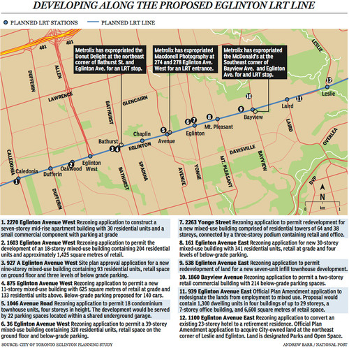
Last week The National Post published an article talking about Toronto’s Crosstown LRT and how it’s spurring a wave of development all along Eglinton Avenue. Below is a map, taken from that article, showcasing some of the developments that are currently in the pipeline and awaiting the Crosstown’s opening date of 2020.
Not surprisingly, developers like transit investment. But more specifically, they like fixed track transit investment. Rarely do new bus routes elicit the same sort of response that you’re seeing above. And that’s because fixed track investment has permanence. If you’re going to go long on an area, you want certainty.
As the Crosstown tunnel boring machines move across midtown Toronto, I thought it would be interesting to look at a transit concept that I first learned about through Jarrett Walker’s Human Transit blog. It’s called: the radius of demand.
One of things that transportation planners look at when designing and building a new line is the spacing of stops. Typically, as you move from buses all the way up to subways, the spacing between stops and stations increases. Spacing is always a bit of a trade off though, because more stops means easier access for riders, but it also means slower overall service. Somewhat famously, Paris designed its metro system so that you’re rarely more than 500 meters away from a station.
Once you have your station locations, it’s quite common to then draw a radius around each stop to simulate the catchment area. In other words: How much of the city can I service with this station and how far will people be willing to walk in order to get there? However, this distance, which is the radius of the circle, usually depends on the type of transit. Oftentimes people are willing to walk further in order to get to faster transit service.
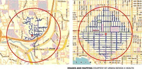
But what’s most interesting about this radius of demand is that it’s entirely dependent on the fabric of the city. Take for example, the following two maps from Seattle, which I have taken from Walker’s blog. On the left is a suburban setting and on the right is a downtown setting. In both cases, the red circle represents a 1 km radius.
Now, if humans could fly over barriers, such as highways, and every Seattle resident was willing to fly exactly 1 km to a transit station, these two radiuses of demand would be perfectly accurate. But since that’s not the case, we instead need to look at what actually represents a 1 km walk – those are the blue lines in each image.
Because once you do that, you realize that the cul-de-sacs and highways on the left make it impossible for most of that radius of demand to actually walk to the station in under 1 km. So the catchment area actually becomes much smaller. On the other hand, if you look at the image on the right, you’ll see that the tried and true city grid is actually remarkably efficient for walking. Almost all of the circle is serviced.
So as the Eglinton Crosstown LRT makes its way through the center of Toronto, I think it’s important to keep in mind that it’ll be cutting through quite a few different kinds of street grids. Some of them will be highly conducive to transit usage and others not as much. And in many ways, this is one of the greatest challenges of transit investment. The track itself is only one part of the puzzle.
That’s why the City of Toronto is also undertaking a planning exercise called Eglinton Connects. Its intent is to leverage the opportunities, as well as address the challenges, that will result from Metrolinx’s Crosstown LRT. If you’re interested in the future of Eglinton Avenue, you should consider getting involved. Oftentimes it’s only the critics that speak up. But that’s not the best way to build anything.
Last weekend a friend of mine sent me an article from The Economist talking about why trams, streetcars, and light rail are a waste of money. The argument is basically that steetcars are expensive, less efficient, and that – despite North America’s renewed interest in them – we should instead be spending our scarce public dollars on more buses.
…but cash spent on streetcars displaces spending on other, more cost-effective forms of public transport like buses, which offer cheaper and more-efficient service but are considerably less sexy. The capital cost per mile of a streetcar is between $30m and $75m, while a rapid bus service costs anywhere between $3m and $30m, according to the American Public Transportation Association.
Now, there’s no question that buse routes are initially cheaper to implement. You don’t have track to build. But I don’t agree that the cost structure is quite that simple if you consider the number of people you need to move in your city. I struggle to see buses as a more efficient service.
The big difference between modern light rail and buses is capacity. Toronto’s new streetcars will move about 3 times as many people as your typical bus. So you’d need to triple the number of buses and triple the number of drivers – adding to your labor costs – if you want to have a chance at moving the same number of people.
Streetcars are also electric, which means they run on a renewable energy source. We’re in the process of making this switch with private transport, so why go backwards when it comes to public transport? You can certainly run electric buses as well, but then you’re building overhead power lines and bringing up your initial costs.
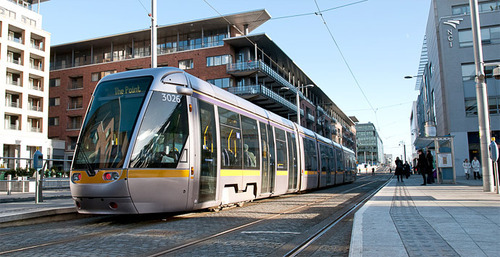
I think the challenge is that when people think of light rail, they think of slow lumbering streetcars. I agree that many of these lines are inefficient and I’ve written about it. But there are a number of ways to implement light rail. And when done well it can efficiently move a lot of people for costs that are far less than a subway.