Daily insights for city builders, delivered every morning at 6 AM ET. I’m Brandon Donnelly — a Toronto-based real estate developer and founder of Globizen. I’ve been writing here since 2013.

Tag: joe cortright

  • K-shaped housing market

    If you’ve been following the housing market (in most cities) over the last year, this chart likely won’t surprise you. It is from a recent City Observatory article by Joe Cortright talking about the “k-shaped housing market” that we have seen emerge over the last year. The above is for the US, but I would imagine that the chart would look similar for Canada, as well as for other countries. Here’s an excerpt from the article:

    There’s an obvious explanation for the different trajectories of house prices and rents:  Low income workers rent; high income workers own and buy homes. High income households have been barely grazed by the Covid-19 recession.  In fact, the combination of low interest rates and enforced savings (because many kinds of consumption spending, including dining, entertainment, travel and even much retail have been constrained by lockdowns), mean higher income households may find housing a much more attractive spending item.  If you can’t go out to dinner, or take a vacation, you have more money to spend on a new home.  Low wage workers are in the opposite situation.  Low wage workers have borne the brunt of the recession; they are also much more likely to be renters than higher income households.

    It is perhaps worth reiterating that our fixation on homeownership is not universal. If you live in Switzerland — a very wealthy country — you’re more likely to rent than own. And if you live in Germany, you’re more likely to live in an apartment than in a low-rise house. Still, that doesn’t change the fact that the impacts of COVID-19, and our lockdowns, have been felt unequally. This chart is an example of that.

  • What’s next for cities? Probably more of the same.

    I am surprised, although maybe I shouldn’t be, by how quickly many seem to be allegedly turning their back on cities. According to the New York Times, cities were “losing their allure” well before this pandemic, and this might just be the tipping point. The underlying argument: Density is bad. We should probably all move somewhere bucolic, where the cost of housing is less and work isn’t so stressful. Zoom only when necessary.

    But as the chief economist for Indeed, Jed Kolko, rightly points out in the article, how people behave (and think) during a global pandemic is probably not a great indicator for how they will want to live their lives when this is all over. It’s also not clear that urban density is really the contributor of spread. Hyper-dense cities such as Seoul and Hong Kong have been performing relatively well. (Joe Cortright has some thoughts on this.)

    Once we get to the other side, we will see the data and we will get a better understanding of this current situation. And then in hindsight, we will find ways to rationalize the outcomes to ourselves. In the interim, I’m not about to bet against cities. Here’s how Paul Romer, professor at New York University, put it in this recent interview in City Journal:

    “I think the underlying economic reality is that there is tremendous economic value in interacting with people and sharing ideas. There’s still a lot to be gained from interaction in close physical proximity because such interaction is a large part of how we establish trust. So I think that, for the rest of my life, cities are going to continue to be where the action is.”

    Photo by bady qb on Unsplash

  • Safety and security per capita

    This is a city metric I haven’t seen before. City Observatory recently looked at the number of police officers (public) and security guards (private) per capita across American cities. They also ask a bunch of interesting questions. Why do some cities have far fewer police officers? Is high security an indicator for “anti-social capital?” (Social norms aren’t encouraging people to behave.) And do some cities simply have more cops because it is perceived to be necessary?

    Here is what they found:

    The average is about 3.3 police officers per 1,000. And in each case, city is defined as the metro area. The study relies on census data and, if we’re being precise, the data represents where people live as opposed to where they work. So some cities could be reporting a lower number simply because police officers tend to live outside of the metro area — perhaps because of housing costs. Either way, it’s interesting to consider why some cities spend a lot more on security than others and why Miami has so many security guards.

    Chart: City Observatory

  • A catalyst for Westside development — but not yet

    A new 280 acre park is currently under construction in an old quarry on the westside of Atlanta. It’s called Westside Park. When it opens this spring (that’s at least the target), it will be by far the largest park in the city. But already there are concerns that this investment in new public space could be triggering “rapid gentrification” in the surrounding area.

    So earlier this month, the mayor’s office issued an executive order that put in place a 6-month moratorium on all new construction permits in the communities surrounding the park. The order read like this: “…refuse to accept new applications for rezonings, building permits for new construction, land disturbance permits, special use permits, special administrative permits, subdivisions, replattings, and lot consolidations for non-public projects.”

    The objective is to avoid displacement. And since new development means change, this is a way to stop change. (Don’t you just hate when things go and change?) The problem, of course, is that a moratorium on new housing doesn’t stop change and it does nothing to address the desire to live next to this new amenity. It only stymies the supply of new housing to meet this demand. (It’s also incongruent with the park investment being marketed as a “catalyst for new development.”)

    In fact, Joe Cortright (of City Observatory) and Jenny Schuetz (of the Brookings Institution) have both argued — either directly or indirectly — that the above move could actually increase displacement in the surrounding area; because the moratorium on new housing could simply redirect demand toward the existing housing stock. The order does seem to suggest that you can still renovate an existing property.

    I wonder if any studies have been done on the externalities associated with temporary housing supply moratoriums. If so, I would be interested in reading them.

  • Shortage of cities

    Joe Cortright of City Observatory recently looked at “the myth of revealed preference for [the] suburbs.” In it, he cites the work of Jonathan Levine, who is the author of a 2006 book called, Zoned Out: Regulation, Markets, and Choices in Transportation and Metropolitan Land-Use.

    There’s an argument out there that, on average, people prefer the suburbs to urban neighborhoods because, well, more people in the US live in auto-oriented neighborhoods compared to urban ones. What Levine wanted to figure out was whether this was truly a result of consumer preference or simply a lack of urban neighborhoods – or a “shortage of cities” as Cortright calls it.

    To do this Levine examined two cities with very different urban fabrics: Boston and Atlanta. The idea was to take a city with lots of urban neighborhoods (Boston) and compare it to one with relatively few (Atlanta). 

    For his comparison, he classified all of the neighborhoods in both cities on a scale according to how urban they were. “A” meant very urban. And “E” meant sprawling/exurban. He then went out and interviewed residents, asking them about both the kind of housing they would ideally like to live in and how happy they were with their current housing. 

    What Levine discovered, among other things, was that in Boston – where about half of all housing fell into the top 3 most urban categories – about 83% of people with a strong preference for urban neighborhoods were also living in one. Whereas in Atlanta, just 48% of people with a strong for urban neighborhoods were living in one.

    Put differently, the study suggests that in cities with fewer urban neighborhoods, it is more difficult for people with a preference for that housing type to find and live in it, which makes intuitive sense. The spread between preference and reality widens, once again suggesting that this could be about supply rather than an issue of demand.

    Anecdotally, I have seen this phenomenon play out here in Toronto. I often hear people talk about the neighborhoods that they would ideally like to live in, if only they could find a reasonably priced home. (Low supply leads to upward pressure on pricing.) How aligned would you say you are with your ideal level of urban-ness? 

    For more on Levine’s work, head over to City Observatory.

  • HQ2 isn’t coming to Toronto

    So I was wrong. Amazon didn’t pick Toronto for HQ2. It instead picked Crystal City, Virginia (Washington) and Long Island City, NY (New York City). More on that, here, in the NY Times. Confession: My prognostication was at least partially about trying to create a self-fulfilling prophecy.

    In any event, it’s interesting to consider the locations that they did pick – as well as the fact that they ended up picking multiple cities. This was not part of their RFP. Though, many have convincingly argued that this process was over before it even began. HQ2 was always going to end up on the east coast, near one of Bezos’ homes.

    Nevertheless, urbanists such as Aaron Renn took the announcement as a direct repudiation of the American heartland. He believed that Amazon would be far more cost conscious in their decision making and ultimately elect for a lower cost locale in the middle of the country. Instead, the coastal hegemony won out. 

    Joe Cortright of City Observatory correctly predicted that Amazon would, for a few reasons, parlay their HQ2 search into multiple smaller locations (HQ2, HQ3, and so on). One of the reasons for this is that it gives the company more leverage when it comes negotiating subsidies on a go-forward basis. If NYC doesn’t want our next round of hires, we’ll take them to Washington.

    Looking at the locations, one of the first things I noticed is that both are just outside of their respective “downtowns” (across a body of water), as well as adjacent or on the way to an international airport. Crystal City is across the street from DCA and Long Island City is a 15 minute drive from LGA. Both are situated on top of higher order transit. Makes sense to me.

    Now, who wants HQ4?

  • Housing supply and displacement in San Francisco

    Joe Cortright recently wrote about a study by Kate Pennington (UC Berkeley), which looked at the impact of housing production on legal eviction in San Francisco. The goal was to figure out if new housing supply actually causes displacement.

    To do this, Pennington went block-by-block and looked at new housing projects, as well as over a decades’ worth of eviction notices. 

    The relationship between the two was found to be “statistically indistinguishable from zero.” In other words, the “monthly probability of an eviction notice” does not change when new housing supply is completed nearby.

    Some have been critical of her findings and some have questioned whether legal eviction notices are, in fact, the right proxy for displacement.

    But I agree with Joe Cortright in that this still feels like a meaningful relationship to understand, especially when we’re talking about a tight housing market like San Francisco’s.

    Photo by Matthew Cabret on Unsplash

  • Autonomous vehicles will strengthen the case for road pricing

    Joe Cortright of City Observatory recently published a post about the types of policies that cities should be looking to adopt in response to autonomous vehicles. It’s called: Pricing roads for autonomous vehicles.

    Many have argued, including urban economist Edward Glaeser, that autonomous vehicles are going to be positively disastrous for cities. Once you remove the labor costs associated with the driver and the overall price per kilometer plummets because of pooling/technological advances, we are going to see an huge surge in demand – well beyond the capacities of our roads.

    Of course, there are solutions. We can accurately price the roads, which is something that more cities should be doing today even before autonomous vehicles arrive. Here is an excerpt from Cortright’s article:

    “With modern electronics, and especially with autonomous vehicles, position and speed is monitored with great precision. There is no reason why they [drivers] should not pay for exactly the amount of roadway that they use. And we know that the cost of the city’s roadway varies substantially across space and over time. Use of road capacity in less dense neighborhoods at off-peak hours imposes nominal costs on the city’s road budget. In contrast, peak hour use of city streets and arterials, particularly in and near the city center, imposes huge costs on the city and its residents. Those who use the system at peak hours in congested locations should pay the costs associated with creating, maintaining, and where necessary expanding that infrastructure.”

    This isn’t a novel concept, which is why when Toronto was looking at a flat road toll I argued here on the blog that it was a step in the right direction but that it was too blunt a tool. 

    It’s a moot point now because sadly the province ended up pandering and rejecting the plan, but we should have been considering something that could achieve the above objectives. It needed more finesse.

    But in all likelihood our cities will have to face that reality sooner rather than later.

  • Driving in the HOT lane

    image

    Joe Cortright of City Observatory recently published an interesting post on HOT lanes (high-occupancy toll lanes) and cited a research paper by Austin Gross (University of Washington) and Daniel Brent (Louisiana State University). The paper looked at the behavioral response of drivers to dynamic HOT lane pricing. 

    They way HOT lanes work is simple: when traffic is light, the price dynamically decreases; when traffic is heavy, the price dynamically increases to ensure a minimum level of service. That is, the price increases until enough cars leave the lane and driving speeds increase to some minimum threshold. In this case, it’s 45 mph.

    The key takeaway from the report is that “value of reliability” appears significantly more important to drivers than “value of time”. Put differently: it’s less about the time I’m wasting in traffic and more about the uncertainty of not knowing when I’m going to arrive at my destination.

    It’s for this reason that HOT lanes are used more frequently in the morning (when you’re running late for that meeting) than in evening (when you’re just on your way home from work). 

    Gross and Brent estimate that the spread is about 7.5x. The typical driver values saving time at about $3 per hour and reliability improvements at about $23 per hour! This is fascinating because we tend to focus a lot on time. But arguably what people really want to buy is greater certainty.

    I can tell you that it’s definitely one of the things that I love about walking to work, or for that matter cycling somewhere. I always know how long it’s going to take.

  • Has there been a “great inversion?”

    Urbanist Richard Florida has spoken a lot about a “great inversion.” This is about poverty moving to the suburbs and the core of cities becoming a kind of “gated suburb.” (i.e. wealthy)

    In response to this narrative, City Observatory recently published a post where they call this a new mythology. Joe Cortright argues that it is simply an exaggeration that sounds good in media headlines. And indeed, if you look at some accounts of poverty, the swings haven’t been that dramatic.

    However, if you dig into this study by Luke Juday at the University of Virginia (cited in the City Observatory article), there have been some interesting changes. 

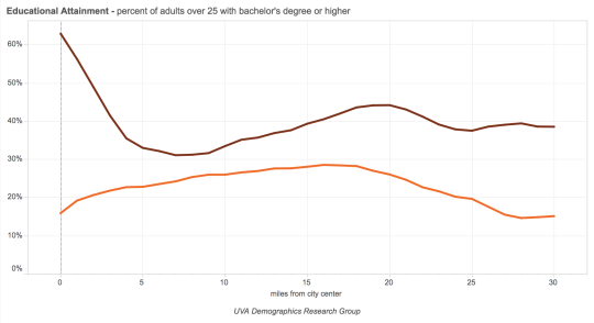
    Below is a chart that shows the percentage of adults (over 25) with a bachelor’s degree (or higher) sorted by distance from the city center. This particular chart is a composite of 7 northeastern (US) cities. The brown line is 2012 and the orange line is 1990.

    As you can see, there has been a huge spike in educated people living in city centers – at least in the northeast.

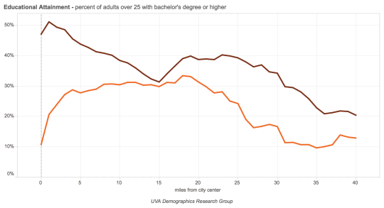
    Here is that same chart for Atlanta:

    New York:

    In the case of New York, it looks like the entire city just became more educated.

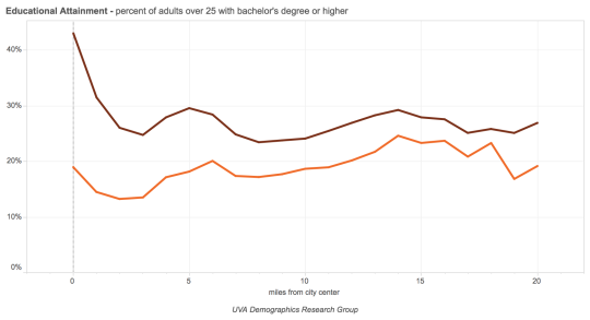
    Miami:

    Educational attainment is often the single biggest determinant of income. So there is something to be said about highly educated people concentrating themselves in city centers. We may not want to call it an inversion of great proportions, but it’s a meaningful shift.