Daily insights for city builders, delivered every morning at 6 AM ET. I’m Brandon Donnelly — a Toronto-based real estate developer and founder of Globizen. I’ve been writing here since 2013.

Tag: immigration

  • Have three, or more if you can afford it

    At the beginning of this year, Singapore expanded its preschool subsidies and improved its support for assisted reproduction and fertility treatments. The goal: more Singaporean children. According to the World Bank (via the Wall Street Journal), Singapore has one of the lowest fertility rates in the world at about 1.14 children per woman as of 2018. This is down from about 3 in 1970, when the government was actually worried about the opposite problem — too many children.

    Of course, this trend is not unique to Singapore. This is generally the way the winds are blowing in the developed world. Young people are spending more time on education, career, and travel. And they’re delaying marriage (or not getting married). On top of this, family-sized housing has become fairly expensive in most big cities. The fastest solution is to ramp up immigration, but many countries, including Singapore, have concerns about what this does to the “national identity.”

    So there seems to be a preference for throwing money at the problem and promotional material with slogans like this one: “Have three, or more if you can afford it.”

    Chart: WSJ

  • Applications to US business schools are declining

    Applications to American business schools, including MBA programs, have fallen for five straight years according to this recent WSJ article.

    Compared to last year, business school applications to US schools are down about 9.1%; whereas they have been rising in other parts of the world. If you look at the change in applications from international students, the drop is even more significant — about 13.7%.

    Here are two charts from the WSJ:

    There are a couple of possible explanations for this. Tech is/has been hot. I would imagine that space has been absorbing many people who would have historically gone to do an MBA.

    But perhaps more significantly, stricter immigration policies are making it harder for international students to come to the US. At the same time, top tier alternatives are emerging around the world, such as in China.

    China exports more business school students than any other country and they are by far the largest international student base in the US. But the numbers are coming down. At the peak in 2015, the US issued nearly 275,000 student visas to people from China. By 2017, that number had more than halved to 112,817.

    Out of curiosity, I decided to look up the class profile for the most recent Rotman MBA cohort (my alma mater). 70% of the class was born outside of Canada. That’s not surprising.

    Charts: WSJ

  • A merit-based system

    I went to graduate school in the United States. After I graduated I was given, if I remember correctly, 90 days to leave the country. The US wasn’t a good place for professionals in architecture and/or real estate at that particular time, and so I did exactly that. I left the country.

    Lately, I’ve been having a number of informational coffee meetings here in Toronto where I have been connecting with highly intelligent and educated people who have moved to this city in search of success. They couldn’t get a visa in the US and so they decided to, instead, move to the greatest city in the world.

    These are people from Brazil to Bangladesh. These are people who are young (late 20’s), who have multiple masters degrees, who are hungry to get ahead, and who have a strong, if not perfect, command of English (or French).

    I have been finding this fascinating. As I sit and drink my coffee, I can’t help but think to myself, “This is what a merit-based immigration system looks like.”

  • Canada admitted 321,065 permanent residents last year

    Bloomberg recently reported that Canada admitted 321,065 permanent residents last year. This is up 12% from 2017, where the country admitted 286,479. Last year was also the largest cohort since 1913 (the year before World War I), where the country admitted just over 400,000 people.

    Here is a chart from Bloomberg (it is interactive if you click through):

    Of course, Canada was a much smaller country back in 1913 (about 7.6 million people), and so on a percentage basis we are much lower than where we were at the beginning of the 20th century. We’d have to admit close to 2 million permanent residents a year to get to a similar rate.

    And that is not what is in the books. Here are the projected admissions for 2019 to 2021. All of the below stats are from the 2018 Annual Report to Parliament on Immigration.

    I couldn’t find a geographic breakdown for last year, but in 2017, about 40% of admitted permanent residents (or 111,925 total) ended up in Ontario and about 72% ended up in Ontario, Quebec, and Alberta (the top 3 provinces for this year). If we add in BC, it brings this figure up to 86%.

    Here are also the top 10 countries of origin:

    If you’d like to download a PDF of the full report, you can do that here.

  • Dendrochronology of U.S. immigration

    I can’t remember where I found it, but I recently stumbled upon this video simulating the dendrochronology of U.S. immigration from 1830 to 2015. 

    It is part of an ongoing project by Pedro Cruz, John Wihbey, Avni Ghael, and Felipe Shibuya, and is supported by Northeastern University.

    As its name suggests, the video (and broader study) uses the metaphor of a tree (and its growth rings) to explain historical immigration to the U.S. 

    If you can’t see the video below, click here.

    [vimeo 276140430 w=640 h=280]

  • Toronto: 2000 vs. 2025

    Last week, Joe Berridge, Partner at Urban Strategies, gave a presentation at the Institute on Municipal Finance & Governance titled, Toronto: The Accidental Metropolis. I’ve seen Joe give similar presentations to this one before, and I always thoroughly enjoy his focus on Toronto’s position as a global city.

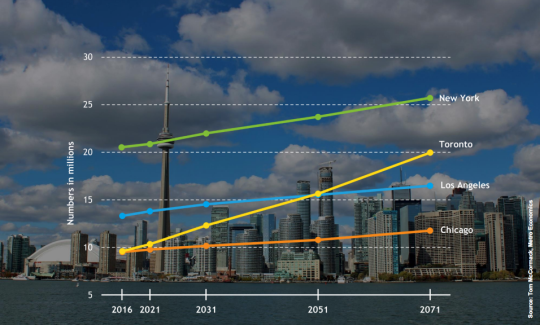
    Here is a slide from the presentation that projects out Toronto’s population to 2071 and compares it to the largest cities in the US.

    image

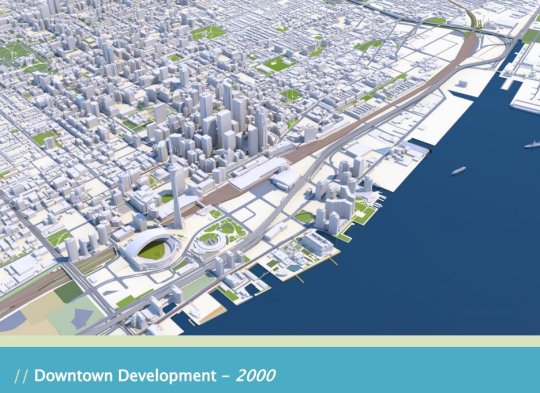
    But the two slides that have been really making the rounds online are the following ones. The first is a rendering of what downtown Toronto looked like in 2000. 

    image

    I remember this time clearly. Queen West seemed to end at Spadina. King West and Ossington weren’t things. And “Richmond and Adelaide” felt like the greatest club district in the world. (If you’re not from Toronto, these references will likely mean nothing to you. Sorry.)

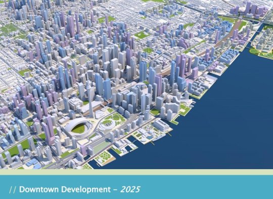
    The second slide is a rendering of what Toronto will look like in 2025. The transformation is just incredible.

    image

    I’ve seen some people comment that the Toronto of 2000 was relatively affordable; the Toronto of 2018 is unaffordable; and the Toronto of 2025 will be even more unaffordable with all of this new development.

    But I don’t understand that logic. Considering the growth rate shown in the first slide, imagine how unaffordable this city would be if we weren’t building new places for people to live and new places for people to work.

    For the full slide deck, go here. And for recent aerial photos of Toronto’s downtown core, check out my Instagram page.

  • Is Trump good for Canada?

    Richard Florida and Joshua Gans just published an article in Politico called: Trump Is Making Canada Great Again. The overarching argument is that as the US closes its borders, Canada benefits. The best and brightest from around the world are coming here.

    This fall, international student applications at the University of Toronto were up 70% compared to last year. And numerous companies in Toronto are reporting “steady, double-digit increases” in the number of job applications from Americans.

    This is exactly what I was getting at when I made the pithy prediction that Amazon is going to choose Toronto for HQ2. It’s about access to human capital (though I acknowledge the political reality of selecting a city outside of the US). 

    Perhaps here or here might work for a location.

    Here is an excerpt from the Politico article that starts to speak to the importance of foreign-born workers in the US:

    As of 2013, foreign-born workers in STEM fields—science, technology engineering and math—accounted for nearly a fifth of workers with bachelor’s degrees in the United States, 40 percent of those with master’s degrees and more than half of those with Ph.D.s. In the San Jose metro area, consisting largely of Silicon Valley, immigrants comprise more than 55 percent of adults who hold advanced degrees.

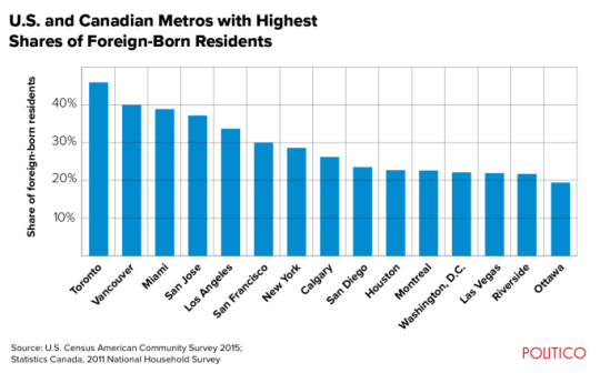
    Here is a chart showing the US and Canadian metros with the highest percentage of foreign-born residents:

    image

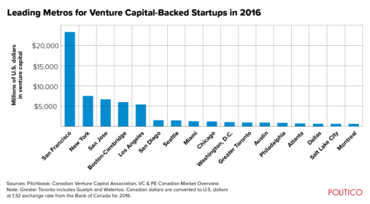
    And here is a chart showing which metro areas receive the most venture capital dollars (in millions of US dollars):

    image

    As to be expected, Toronto, Vancouver and Miami lead in terms of the percentage of foreign-born residents. Though, I would bet that Toronto’s foreign-born population is far more diverse than those of Vancouver and Miami.

    However, when you look at venture capital dollars invested, Toronto is nowhere near the top. Vancouver isn’t even on the list. And I suspect that some of you are surprised to see Miami sitting in between Chicago and Seattle (arguably a city that overperforms in tech relative to VC dollars invested). I was.

    Perhaps Trump will help with this by making Canada great again.

  • International and domestic migration in the US

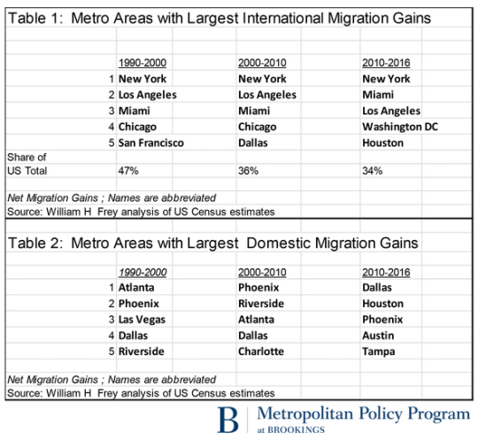
    In response to President Trump’s proposed immigration bill, Brookings recently analyzed census data from earlier this year to demonstrate the importance of immigration for growth within much of the United States. 

    I’d like to share three tables from their analysis.

    The first two look at international migration grains and domestic migration gains over the last 3 decades (the last decade isn’t quite a decade).

    Here you can see that New York, Los Angeles, and Miami (all port cities) have dominated international migration to the US since 1990. But at the same time, international migration has become less geographically concentrated. From 1990-2000 the top 5 cities received almost half of all immigrants moving to the US. More recently, that number has dropped to 34%.

    Domestic migration is different in that it’s a zero sum game. When one US city gains, another US city loses. Here there is a very clear migration trend toward cities in the southwest – arguably because of weather, job growth, cheaper housing, and probably a bunch of other factors.

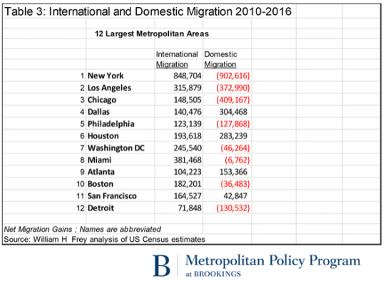
    If we look at actual international and domestic migration numbers over the last 6 years, the 12 largest metropolitan areas look like this:

    The key takeaways here are that 8 of these cities are losing people to domestic migration and only 7 of these cities have a positive net migration number – meaning their population is actually growing.

    What is clear is that the international migration column is a pretty important one if you believe that growth is valuable. 

    If you’re Dallas, Houston or Atlanta, maybe you care a little less about that column. But for most of the other cities, international migration is either the only way you’re growing (look at Miami go) or keeping your population losses in check (see Philadelphia).

  • 4,000 years of urban history

    image

    The Guardian recently published an extract from a book by Greg Clark called, Global Cities: A Short History

    The article and book cover 4,000 years of urbanization. More specifically, Clark explains why some cities become global leaders, others do not, and why it is common for cities to rise and fall over time – at intervals that are only becoming shorter.

    Below is an excerpt that talks about Amsterdam’s rise in the 17th century; a period of time known as the Dutch Golden Age. In the 1600′s, Amsterdam became the undisputed financial capital of the world and spawned the very first stock exchange. (Though, let’s not forget about Tulip Mania.)

    “Amsterdam took over the mantle from Antwerp and Genoa as Europe’s major commercial city during the 1600s, and it developed many of the technologies that underpin today’s global cities. The overthrow of the Spanish elite, which had hampered the interests of powerful local merchants, granted more freedom to Dutch traders. Soon after, the blockade of Spanish Antwerp triggered a flight of capital and talented entrepreneurs to Amsterdam.“

    "The protestant city became prized for its safe port, political stability and access to inland waterways. It maximised its appeal by guaranteeing equal protection to all merchants, wherever they came from, while developing standardised institutional norms. A relaxed attitude toward interest-bearing loans spurred the development of modern finance in Amsterdam, including maritime insurance, making the city both the logistical hub and the trade financier of Europe.”

    Certain things have changed. Maritime pursuits were once paramount to a city’s success, whereas today, connectivity happens in a myriad of other ways. But other things have not changed. 

    As I read through the article, I couldn’t help but notice a few reoccurring themes. Being closed to innovation and immigration didn’t work in the past and I don’t believe it works today.

  • The link between ancestry and foreign direct investment

    Below is an interesting example of how international migration – and being open to it – can have positive economic impacts by way of increased foreign direct investment (FDI). The excerpt is from the World Economic Forum.

    “…we document that FDI follows the paths of historical migrants as much as it follows differences in productivity, tax rates, education, and other conventional determinants of economic competitiveness – for the average US county, doubling the number of individuals with ancestry from a given origin country increases by 4 percentage points the probability that at least one firm from this US county engages in FDI with that origin country, and increases by 29% the number of local jobs at subsidiaries of firms headquartered in that origin country.”

    Their study also found that these ties are long lasting. That is, even after a few generations of assimilation, ancestry still has an effect on FDI patterns. 

    There are of course many other benefits to open borders. But our collective tolerance toward immigration has ebbed and flowed greatly over time. And my sense is that if often has a relationship with prosperity.

    As long as times are good and I – the incumbent – am winning, then immigration is accepted, if not welcome. But as soon as times become scarce, then I – the incumbent – need to start protecting my nest.

    This may be one of the reasons why Canada seems to fair so well when it comes to diversity. We optimize for the middle more than countries like the US.

    An example of this phenomenon can be found in the mid-19th century California Gold Rush. By 1876, the United States had approximately 151,000 people of Chinese ancestry and about 116,000 of them were in the state of California.

    In the early days of the rush, when gold was abundant, it has been said that the foreign Chinese laborers were well received. But as gold became more scarce and difficult to find, Californians began to believe that the Chinaman was stealing their wealth.

    In 1882, the US signed the Chinese Exclusion Act, which flat out prohibited the immigration of Chinese laborers. It was not repealed until 1943. However, the Chinese still found other creative ways to enter the country (see Lo Mein Loophole).

    I say all this simply to provide a bit more context. We can talk about how disruptive technologies are squeezing the middle class in new and profound ways. But in many ways, we’ve all heard this story before.