Daily insights for city builders, delivered every morning at 6 AM ET. I’m Brandon Donnelly — a Toronto-based real estate developer and founder of Globizen. I’ve been writing here since 2013.
This is an interesting map to play around with. It allows you to see how many 15-minute neighborhoods and cities there are around the world. And it works by calculating the average time it takes to walk or bike to the closest 20 points of interest in 10,000 cities. These points include all of the usual suspects like places of work, schools, healthcare institutions, grocery stores, and so on. A blue cell indicates an average walk time < 15 minutes, and a red cell indicates an average walk time > 15 minutes. The darker the color, the shorter or longer the average time in minutes.
By this measure, it’s hard to beat many/most European cities. Here are Paris and Barcelona:
The city propers are completely blue, and you have to go pretty far out (or up into mountains) to find areas that don’t have 15-minute conveniences.
Toronto has a strong core and isn’t terrible overall, but expectedly, we aren’t as uniform and as deep blue as Paris and Barcelona:
Where things get really interesting, though, is when you look at cities like Dallas and Houston:
It’s clear where these cities stand on walkability.
Last week the Prime Minister of the UK, Rishi Sunak, announced a number of initiatives designed to support drivers. The slogan is “slamming the brakes on anti-motorist measures” and you can find more information about it, over here.
Naturally this is sparking the usual debate about driving vs. all the other forms of mobility. But it also seems to be part of some sort of broader political strategy intended to distance his party from things like environmental sustainability, net zero targets, and 15-minute city design.
If you’re looking for a way to process the above announcement, this recent FT article by John Burn-Murdoch is an excellent place to start. Firstly, the UK (outside of London) is generally poorly served by public transport. This is an important thing to know. By the below measure — percentage of large cities that have trams, a metro, or urban light rail — it is even worse than the US:
In fact, one way to think about and measure mobility in the UK is to think in terms of the following geographic categories: there’s US cities, European cities (including London), and then there’s the rest of the UK. In the case of US cities, they have very clearly optimized around road infrastructure. Meaning, the vast majority of people don’t take transit to work, but the area (km2) you can cover by car (in 30 mins) is high.
Look at Houston and Dallas on the left side of this graph:
On the other hand, European cities (again, including London) have optimized in the opposite direction. A lot more people walk, cycle, and take transit to work. In the case of cities like London, Paris, Barcelona, Bilbao, Prague, and others, the number is greater than 60%! However, they’re sucky places to drive, as I learned this past summer. The area you can cover by car within 30 mins, is relatively low (bottom right of the above graph).
The challenge for British cities (excluding London), is that they seem to be right in the middle (burgundy dots above). Poor public transport (low percentage of trips to work). And poor road infrastructure (limited area accessible by car within 30 mins). So it is perhaps no surprise that Sunak is honing in on this issue. London is not representative of Britain. And based on the above data, the majority of people living in British cities are almost certainly mobility frustrated.
Of course, to correct this issue you have two options. You can move toward the left (in the above chart) and optimize for road infrastructure. Or you can move to the right and optimize for public transport and other forms of mobility. Based on last week’s announcement, Sunak has chosen the left.
This data is from 2019, but I imagine that things would look pretty similar today and that it might even be a little more pronounced. The dataset from the above article looked at how many people have cars in a given area (a darker dot = fewer cars) and then plotted this against population density and income per capita.
Here’s what that looks like for the regions of New York, Boston, Los Angeles, and Houston (data from 2013 to 2017):
What is fascinating about these charts is that they show two different correlations. In dense and transit-rich cities such as New York and Boston, car usage is most closely linked with population density and not with income. The dark dots form a horizontal line near the top.
However, in the case of Los Angeles and Houston, car usage is instead most closely linked with income and not with population density. The dark dots form a vertical line near the left — the lowest income per capita.
So what does this tell us?
It tells us that if you design a city to broadly require a car, then you are likely to sort people based on those that can afford a lot of car and those that cannot. On the other hand, if you design a city around transit, then you are likely to instead create a place where both the rich and poor get around in similar ways.
There is also evidence that the latter is being increasingly viewed as more desirable. 2017 was the first year in the US where high-income young people (ages 26 to 33) drove less than low-income young people. Presumably these high-income people had choices, and so I tend to view this as a preference.
As a whole, this is surely a good thing for our cities. But now I think we need to be careful not to allow density and walkability to become the new luxury that only the rich can afford.
Here is an interesting chart from the New York Times explaining the disproportionate impact that highway and urban renewal projects have had on non-white families in the US. The x-axis is the non-white population share in 1950. And the y-axis is the percentage of displaced families that were non-white. What this means is that the diagonal dotted line through the middle represents a kind of racially balanced displacement.
However, as you can tell from the graph, displacement from 1950 to 1966 was not balanced. In Providence, for example, only 3% of families were non-white in 1950. But these families represented 31% of the ones displaced for renewal projects. In Philadelphia, about 18% of families were non-white, but here they represented 71% of those displaced.
I don’t think that this will be news to a lot of you. “Urban renewal” is a loaded term in American urbanism. But the article does do a great job of taking you back through time in cities like Houston, Chicago, and New York. The article is also by Adam Paul Susaneck, who is the founder of Segregation by Design. If you’re interested in this topic, I would encourage you to check out his website.
Maybe it’s confirmation bias, but I continue to feel like there is a groundswell of interest in trying to improve housing supply and overall affordability. The YIMBY movement continues to gain steam. Here are are few excerpts from a recent M. Nolan Gray article where he calls for an end to zoning as we know it today:
In nearly every major U.S. city, apartments are banned in at least 70 percent of residential areas. San Jose prohibits apartments in 94 percent of its residential areas. The most a developer can build in these zones is a detached single-family home.
The results speak for themselves. Houston builds housing at 14 times the rate of peers like San Jose. And it isn’t just sprawl: In 2019, Houston built roughly the same number of apartments as Los Angeles, despite being half its size. Since reforms to minimum-lot-size rules were put in place in 1998, more than 25,000 townhouses have been built, overwhelmingly in existing urban areas.
To be clear, Houston has made its share of planning mistakes. But, free of zoning, the city can constantly remake itself. That Houston is now one of the most affordable and diverse cities in the country is no accident.
The relationship between housing affordability and constraints on development is a well-documented one. If you want more affordable housing, you generally want fewer, rather than more, constraints on delivering new housing.
But as I was reading through the article, I couldn’t help but think more specifically about the relationship between sprawl and affordability. Because it is also true that, for a variety of reasons, the former has tended to help the latter (or at least coincide with it), which is why Gray felt it was important to say “and it isn’t just sprawl” when talking about Houston.
Part of this relationship has to do with the fact that expansionist development tends to be of the low-rise stick-built varietal, which is a relatively cost effective way to build. Whereas the higher density infill stuff tends to be built using more expensive materials like reinforced concrete. But of course there are many other factors at play, including lower land costs.
So I think one really interesting question is this one here: To what extent could we break this relationship between sprawl and affordability with what Gray is advocating for? In other words, how cheap could we make new infill housing in our older cities if we were to greatly loosen zoning controls or possibly even remove them all together?
I don’t know the exact answer, but I know that directionally it would be better.
A colleague of mine sent me this Bloomberg article today and said, “Here’s an article about things you already know.” The article cites a recent report by Altus Group that compared government-related fees on new housing across Canada and the U.S. What they discovered will not surprise any of you who are in the industry: Toronto has some of the highest government-imposed charges on new homes.
For new condo apartments, the report found that government charges can add up to as much as C$124,582 per unit. That’s about 50% higher than the average unit in the U.S. and about 30% higher than the average unit in Canada (see above chart for the list of cities). While all of us in the industry can appreciate this, I don’t think most homeowners and tenants understand this. Hopefully they’re reading this post.
Davis’ argument, which of course has been made by others before, is that deregulation has allowed housing supply to actually keep up with demand. Land use policies were relaxed to allow taller and denser buildings to be built and some degree of decision making (I’m not sure how much) was moved to the central government in order to counteract the NIMBY problem that invariably attaches itself to local politics.
The result is housing numbers that look and compare like this:
In Tokyo last year, housing starts came in around 145,000, according to Japan’s land ministry. This figure is on par with the total number of new housing units authorized last year in New York, Los Angeles, Boston and Houston combined, based on the U.S. Census Bureau data. The same feat was achieved in 2017.
If we are to normalize against New York, it looks like this:
And the belief seems to be that it is working:
“A reason why housing prices in Japan are not rising as fast as in New York, for example, is the large number of housing starts,” says Masahiro Kobayashi, a director general at the Japan Housing Finance Agency, a state-run entity which supports the housing market by purchasing home loans.
One sentence that really stood out for me in the article is this one here: “Private consultants were given permission to issue building permits to speed up construction.” If any of you have tried to pull a building permit for a large project in Toronto, you’ll know that it can take a very long time (understatement). Maybe it is the same in your city. Should we be looking at this?
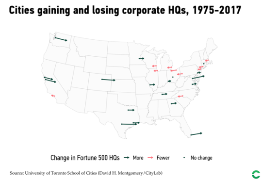
The University of Toronto School of Cities recently looked at the changing economic geography of Fortune 500 companies across the US from 1975 to 2017. Here is a diagram of the results taken from CityLab:
New York sits at the top with 70 corporate headquarters as of 2017. But the San Francisco Bay Area is now the second largest center with 35 headquarters – a testament to tech.
The study does, however, omit service firms, as these weren’t tracked in Fortune’s list back in 1975.
Also noteworthy is the specialization that has taken place across specific cities and regions. Here is another excerpt from CityLab:
America’s headquarters geography reflects the substantial variation and specialization of the U.S. economy. New York leads in finance and business services, consumer services, and goods and materials. But Houston leads in energy, San Jose in tech, and Chicago in retail and wholesale. Chicago also ranks second in consumer services, and goods and materials, and Dallas takes third in energy. Other cities like Nashville and Minneapolis take third in consumer services, and goods and materials, respectively.
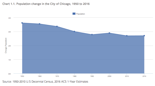
The Institute for Housing Studies at DePaul University recently published this overview of the “socioeconomic factors affecting demand for housing in Chicago.”
Here is the change in population in the City of Chicago from 1950 to 2016:
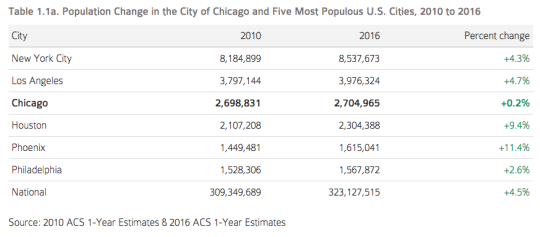
And here is a comparison between Chicago and the five biggest cities in the US. Note the “sun and sprawl” phenomenon. Also note that the list below is for city proper boundaries.
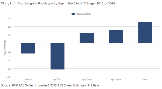
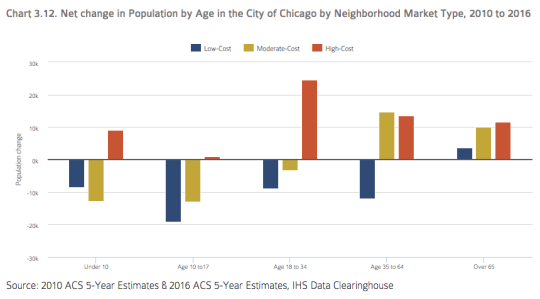
One particularly interesting set of stats is the decline of children (population under the age of 18) in the city:
Since 2010, the city has lost over 40,000 children and teenagers.
But, if you break it down by neighborhood market type, it is the low-cost and moderate-cost neighborhoods that lost the population. The high-cost neighborhoods were up.
The study posits that the old trend of moving to the suburbs after you have kids may not be for everyone – provided, of course, that you have the means. And it goes beyond Chicago. DC is predicting a 25% increase in K-12 students within the District.
Though since Ed Glaeser published Triumph of the City and declared Houston’s unfettered sprawl the secret sauce for housing affordability, it is now frequently held up as the shining example of why housing supply matters.
But this is a hotly debated topic.
Ed Glaeser would argue that increased supply is the key to housing affordability. But Richard Florida would likely be quick to point out that Houston is also one of the most unequal and segregated cities in America. It is not the model we should be following.
But let’s be positive today on the blog.
At the bottom of this post is a great talk by Stephen Klineberg called: Houston, The Global City. Klineberg is a Professor of Sociology at Rice University and the founder of the Kinder Institute for Urban Research.
In this hour long talk, he outlines, among other things, the remarkable transformation of Houston from a one-industry town (oil) comprised predominantly of white people to a mixed economy where every major ethnicity is now a minority.
He also argues that Houston is at the forefront of the demographic shifts happening all across the country and that, without this inflow of immigrants over the past couple of decades, Houston today would probably look a lot like a decaying rustbelt city.