Daily insights for city builders, delivered every morning at 6 AM ET. I’m Brandon Donnelly — a Toronto-based real estate developer and founder of Globizen. I’ve been writing here since 2013.

Tag: housing

  • A short history of redlining

    In 1933, the United States Congress created the Home Owners’ Loan Corporation (HOLC). With foreclosures rising as a result of The Great Depression, the task of the agency was to provide new low-interest mortgages to both homeowners and private mortgage lenders. Between 1993 and 1936, the agency served about one million households.

    By 1935, the parent company of the agency (the Federal Home Loan Bank Board) decided to initiate something called the “City Survey Program.” The idea was to look at local real estate trends – including the racial and ethnic composition of the country’s largest cities – in order to get a better understanding of how to manage all of these outstanding loans.

    One outcome of this program was the creation of the HOLC’s infamous “residential security maps.” (Philadelphia’s is shown at the top of this post.)

    These were maps that categorized city neighborhoods according to 4 grades. Grade A neighborhoods (green) were the best ones. They were ethnically homogenous and had room to be further developed. Grade B neighborhoods (blue) were the second-best ones. They were already completely developed, but were still considered desirable. Grade C neighborhoods (yellow) were starting to decline and showed an “infiltration of a lower grade population.” And finally, grade D neighborhoods were considered “hazardous” and colored in red. These neighborhoods had low homeownership rates, old crappy housing, and an “undesirable population”, which, at the time, largely referred to Jews and African Americans.

    Some have argued that the HOLC and their “residential security maps” are what kicked off systematic mortgage discrimination in America’s inner city neighborhoods – later referred to as “redlining.” This was the practice of denying credit to people who lived in these undesirable neighborhoods (and even to real estate developers who wanted to build in these undesirable neighborhoods).

    But University of Pennsylvania professor Amy Hillier has argued that these maps simply reflected the ethos of the time period. Using a sampling of HOLC mortgages, she found that 62% of them were issued to grade D (red) neighborhoods. The agency, itself, was not actually redlining in practice.

    Furthermore, she also looked at private mortgages issued in Philadelphia between 1937 and 1950 and found that security grade rating actually had no impact on the total number of loans issued. She did, however, discover slightly higher interest rates for properties located near and in the bottom security grades.

    All of this is to say that “redlining” is likely not the only culprit for inner city decay. There are other factors at play.

    To that end, the National Bureau of Economic Research recently published a working paper, which I discovered through CityLab, called, “Racial Sorting and the Emergence of Segregation in American Cities.” The key finding here is as follows:

    “Our preferred estimates suggest that white flight was responsible for 34 percent of the increase in segregation over the 1910s and 50 percent over the 1920s. Our analysis suggests that segregation would likely have arisen in American cities even without the presence of discriminatory institutions as a direct consequence of the widespread and decentralized relocation decisions of white urban residents.”

    In other words, it wasn’t just mortgage discrimination; it was also just general discrimination. That actually makes a lot of sense, because, if you think about it, the former couldn’t have occurred without the latter being present.

    Here’s how the research paper puts it (via CityLab):

    “Policies that reduce barriers faced by blacks in the housing market may thus not prevent or reverse segregation as long as white households have the ability and desire to avoid black neighbors.”

    (Note: Most of the information and data used in this post was sourced from the work and research of Amy Hillier.)
  • Pocket two bedroom

    I recently started reading the blog of Michael Mortensen. Michael is a real estate developer and urban planner based in the UK. And if you like my blog, I think you’ll also like his.

    Last week he published a post talking about a UK development company called Pocket and a recent design competition that they organized called “Pocket two bedroom.”

    Historically the firm has been focused on well-designed and compact one bedroom apartments (38 square meters) that they deliver at a minimum 20% discount relative to typical market rate housing in London.

    But over time, they found that they had to turn people away because they were looking for larger – yet still affordable – two bedroom apartments. So the firm decided to figure out how to scale their model to larger units.

    To do this, they went out and asked 19 architects to come up with ideas for a two bedroom Pocket apartment. They then published all of the ideas online.

    Firstly, I applaud them for making their competition results public. Most real estate companies wouldn’t do this.

    Secondly, it’s interesting to take note of the recurring design themes, as they have on page 24-25 of their competition book. 

    Some of the themes include “deep thresholds” that blur private and communal spaces; “thick walls” that allow for storage and servicing; flexible spaces and fewer dedicated spaces; and dual entry apartments.

    This last item was particularly interesting to me. It’s a simple idea – two separate doors leading into one apartment – but it can allow for a number of flexible sharing scenarios. I am already imagining somebody creating an Airbnb rental out of their second bedroom.

    Housing is certainly undergoing a transformation.

  • A mapping of single family home prices in Vancouver

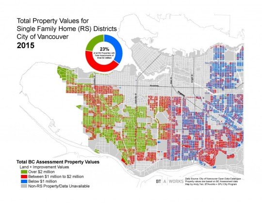
    Bing Thom Architects recently published a blog post looking at the property values of single family homes in Vancouver. The data was taken from the City of Vancouver Open Data Catalogue and is based on British Columbia Assessment data.

    The precise timing of the data is likely a bit off, but here’s how the city looked in 2015:

    23% of single family homes in the city had an assessed value over $2 million.

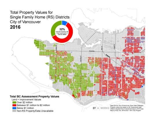
    A year later, this number increased 32% of all single family homes:

    It’s interesting to see how divided the city is along Main Street. But the big takeaway – thanks to BTA – is that $2 million seems to be the new $1 million.

  • How should cities manage their own awesomeness?

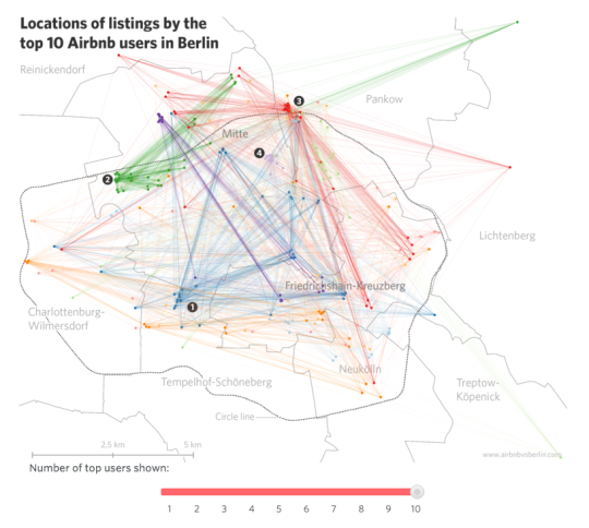
    Conor Maguire introduced me to an interesting site today called Airbnb vs. Berlin. The site does a deep dive into Berlin’s Airbnb market with the hope of answering the question: Is Airbnb contributing to a shortage in affordable housing?

    The site is very well done. It’s filled with lots of great market stats and diagrams such as this one here: 

    Of course, the impetus for a site like this is that cities all around the world, from San Francisco to Berlin, are grappling with rising home prices. If you happen to live in a successful, growing city, that’s probably what is happening.

    But when this happens, we seem to want to look for something or someone to blame. In San Francisco it’s the tech workers. They’re the ones driving up homes prices. In Vancouver, it’s the foreign Chinese buyers. And in Berlin, it’s those Airbnb users who are just out to make a profit. In all of these cases, we like to tell ourselves that if we could just get rid of “X”, everything would be much better. 

    But I think sometimes we forget that this is also the result of doing many things right.

    If Berlin wasn’t a brilliantly cool place to visit, then tourists wouldn’t come. And if tourists didn’t come, then Berlin wouldn’t have, by far, the largest Airbnb market in Germany. If Vancouver wasn’t one of the most enjoyable places in the world to live, you wouldn’t have the same attention from overseas buyers looking to snatch up properties. 

    So in a way, we should be asking ourselves: How do we, as a city, manage our own awesomeness?

    The other thing that Airbnb vs. Berlin reminded me of is the viewpoint that profits are some dirty little secret. I hear it all the time in the real estate development business. People will say: “That developer is just out to make money.” Of course she/he is! They operate a business. And like all for-profit businesses, one of the objectives – it may not be the only one – is to make money.

    I say all this not as a direct response to the website. They remained fairly neutral in their analysis. Instead, I raise it as an alternate viewpoint in the seemingly universal battle against “X.”

    In case you’re wondering about Berlin’s Airbnb market, the site estimates that there are roughly 11,701 Airbnb listings in the city out of a total of about 1.9 million flats. Of these listings, it is estimated that somewhere around 30% are by “professional users” who are only out to make a profit and are not participating in the “sharing economy” in its purest sense. That equates to about 0.18% of all Berlin flats.

    Based on this number, I’d say that Berlin’s cool factor probably has a lot more to do with the city’s rising rents than do the profit seeking Airbnb users.

  • Why multi-family developers are shifting their customer focus

    One aspect of the Toronto housing market that I’ve been paying close attention to is the adoption of multi-family dwellings by both long-term end-users and families. 

    I’ve written about this before (here and here, over a year ago) and have argued that here in Toronto we are at an inflection point. Multi-family dwellings – both rental and condo – are evolving to now target these new customer segments. Whereas previously, the new construction multi-family housing market was heavily geared towards investors and first-buyers. And often it was simply a stepping stone towards a single family home.

    Now, every city and real estate market is different. And I have heard many people in U.S. cities say that Millennials are simply deferring what we saw with previous generations. At the end of the day they (or we, I’m a Millennial) are going to move to the suburbs and buy that car. The current trends we are seeing around city living and reduced driving are just that – short-term current trends.

    But I think it’s worth reiterating: I do not believe that the status quo is what’s happening right now in Toronto. And I’m sure it’s also happening elsewhere. Time and time again I speak to developers in this city who are starting to shift at least some, and in some cases all, of their focus towards end-users, families, and larger units – particularly for new mid-rise product in the “neighborhoods.”

    And if you think about it, this makes perfect sense. 

    The average price of a detached single family house in Toronto is well north of a million dollars. So when a developer brings to market a 1,200 sf family sized apartment at $600 psf ($720,000) or even at $700 psf ($840,000), that home now becomes a relatively “affordable” option in many desirable areas of the city. Particularly if you value location amenities and your time (i.e. shorter commutes) over raw quantity of space. I know I certainly do.

    I know this isn’t going to appeal to everyone. But there is a big market here. Get ready.

    What are you seeing in your city? Let us know in the comment section below.

  • Vancouver approves first laneway apartments in the West End

    It’s no secret that Vancouver is way out in front of Toronto and many other cities when it comes to laneway housing. 

    Good luck trying to get a laneway house approved in Toronto. They’re only allowed under rare circumstances where there is already an existing house in the lane and/or you’re willing to fight it all the way to the province.

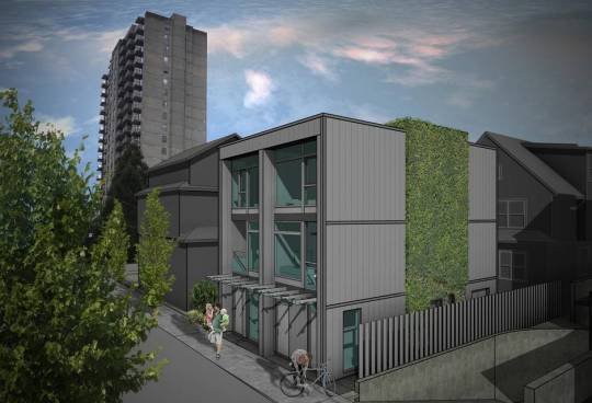
    But in Vancouver, it’s a different story. And they’ve even taken it a step further according to this recent Globe and Mail article by Frances Bula. The city recently approved small scale laneway apartments in the West End:

    “The city, which created the possibility for laneway apartments when it approved a new West End plan last year, has approved the first four buildings with 47 units in total. Three are in this particular alley between Nelson and Comox on either side of Cardero, around the corner from Cardero Bottega and Firehall No. 6. Others are in the pipeline. Many more are expected.

    They’re the first of a new kind of infill that planners hope will produce 1,000 new small homes in this popular downtown neighbourhood.”

    Here’s a rendering from the article to give you an idea of what these laneway apartments might look like:

    Readers of this blog have argued that Toronto doesn’t need laneway housing. There’s enough room for intensification elsewhere. 

    But what is clear to me is that Toronto is continuing to build less and less ground-related housing. There’s little to no room for that. And what is left of our low-rise stock is becoming increasingly unaffordable.

    So if we believe that social diversity is important for building a great city – which I do – then I think it behooves us to figure out how to not only increase the supply of new housing, but also increase its diversity. This is something Andrés Duany argued for in yesterday’s video post.

    The biggest hurdle is community opposition. But below is how one of the neighbours in Vancouver responded to the proposed laneway apartments. He gets it.

    “Dean Malone, who lives across the street from one of Mr. Sangha’s three projects, took the trouble to go to city hall to support it because the laneway apartments provide a way of creating new housing that isn’t a tower and isn’t a luxury development.”

    What this also does is allow the private sector to do more before the public sector needs to step in with affordable housing subsidies. I believe that laneway housing will help, but not solve, the affordable housing problem happening in most of our cities. 

    But every little bit helps. And this is one solution that many cities are simply ignoring.

  • Housing completions in Toronto from 1996 to 2014

    Whenever I read studies that cite census data, I’m often left feeling like the data is out-of-date. 

    Five years – which is how often Canada conducts its national census – is a long time. Somebody could move to this country for school, complete a 4-year degree, and then leave, and we wouldn’t even pick it up in our data.

    Thankfully, we’ve at least reinstated the long-form census for next year. Here are the questions, if you’re curious.

    But all of this is a digression. 

    This morning I read through a housing report that the City of Toronto published in October of this year. It’s about housing trends. And I wanted to share the below chart that covers housing completions for the period of 1996 to 2014. Keep in mind that this is for the City of Toronto, and not the Greater Toronto Area.

    What it shows is that over this 18 year period, 78% of all housing completions in this city have been either low-rise or high-rise condominiums/apartments. The remaining 22% is a mix of detached and semi-detached houses and townhouses.

    However, this 22% is an average. 

    Detached and semi-detached housing completions declined from 22% in the 1996-2001 period to 10% a decade later. And row and townhouses declined from 16% to 6% during this same period.

    At the same time, “many” of the housing units in this 22% were actually replacing existing and older housing stock. That is, according to the report, many were “knock-downs” and rebuilds. In these cases, it means that the completions actually do not represent net new housing units. So in reality, the supply of new single-family housing is even lower than it appears in the chart above.

    When you look at all of this, it should come as no surprise to you that our current combination of low interest rates and low supply has been leading to huge price increases on the single-family side of the market.

    And it’s for this reason that I believe Toronto will eventually start to look towards allowing more low-rise intensification. Laneway housing, as one example, would represent virtually 100% new ground-related housing in already built up areas. Where else are we going to find that kind of housing opportunity?

    So in my view, it is a question of when, not if, this will happen.

  • This U.S. housing boom is different

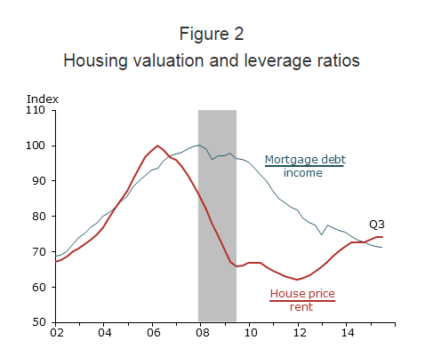
    Just a few days ago, The Federal Reserve Bank of San Francisco published an interesting research study where they argue that this U.S. housing boom is different than that of the early 2000s.

    During the last boom, U.S. home prices peaked in 2006 and then dropped about 30% in the wake of The Great Recession. Since then prices have rebounded – almost to their pre-recession levels. This has some people asking whether this story is headed towards the same ending.

    But the FRBSF is saying no:

    “We find that the increase in U.S. house prices since 2011 differs in significant ways from the mid-2000s housing boom. The prior episode can be described as a credit-fueled bubble in which housing valuation—as measured by the house price-to-rent ratio—and household leverage—as measured by the mortgage debt-to-income ratio—rose together in a self-reinforcing feedback loop. In contrast, the more recent episode exhibits a less-pronounced increase in housing valuation together with an outright decline in household leverage—a pattern that is not suggestive of a credit-fueled bubble.”

    And here’s the chart:

    Source: Flow of funds, Bureau of Economic Analysis (BEA), CoreLogic, and BLS. Data are seasonally adjusted and indexed to 100 at pre-recession peak.

  • The value equation

    On Tuesday night I attended a great industry event that Quadrangle Architects organized about mid-rise buildings. 

    Mid-rise buildings (somewhere around 4-12 storeys) are all the rage in Toronto these days. But there are many challenges associated with this building typology and this was an event to talk about them and hopefully push things forward.

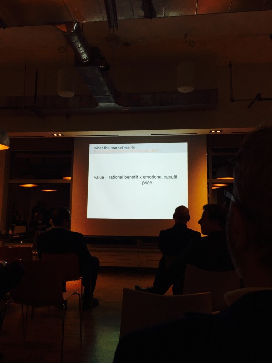
    One of the speakers at the event was Jeanhy Shim of Housing Lab Toronto. And I’d like to share one of her slides here:

    It reads:

    Value = (rational benefit x emotional benefit) / price

    I believe she admitted to taking it from someone at Bruce Mau Design. But that’s okay. That’s how ideas build. What I really like about it is that it attaches a value to the things that are difficult and sometimes impossible to measure: the emotional stuff.

    As I mentioned in this post over the weekend, we are all obsessed with the quantitative side of our businesses. In the case of development, we look at prices, per square foot prices, apartment sizes, and the list goes on. And we often reduce our “products” to these sorts of key metrics.

    But if you’re competing just on numbers, then you’re missing a big and important part of the equation. People consume things – and housing is no different – for a number of different reasons. We buy things because of how it makes us feel, how it reinforces our sense of self, how it improves or promises to improve our lives, and so on. These are all harder to measure than square footage. 

    But we are living in a data driven world and more and more of this type of information will become available for city building. If you and your business can get your head around it first, you’ll have a huge advantage. 

  • #donthave1million

    Tiny Park by David Brookfield on 500px.com

    https://500px.com/embed.js

    After I wrote this week’s post about Chinese homebuyers in Vancouver, I was surprised to learn about the racism debate that flared up in the city / on Twitter. I guess this really is a touchy subject. (See: #donthave1million)

    My reaction to the research was: Great to see someone (Andy Yan) putting in the time to try and better understand a market phenomenon. It’s painful how opaque real estate markets can be. Let’s get even more data so that we can make even better policy decisions. I didn’t read it as: let’s deliberately single out a race.

    Because the reality is that we all knew this was happening.

    Bloomberg recently published an interesting and related article that talks about China’s money exodus and how the Chinese logistically get their money out of the country. There are restrictions in place. 

    But first, here are two snippets from Bloomberg that describe the order of magnitude we’re talking about:

    This flood of cash is being felt around the world, driving up real estate prices in Sydney, New York, Hong Kong and Vancouver. The Chinese spent almost $30 billion on U.S. homes in the year ending last March, making them the biggest foreign buyers of real estate. Their average purchase price: about $832,000.

    In total, UBS Group estimated that $324 billion moved out last year. While this year’s numbers aren’t yet in, during the three weeks in August after China devalued its currency, Goldman Sachs calculated that another $200 billion may have left.

    Now here’s how it is being done:

    It works like this: Chinese come to Hong Kong and open a bank account. Then they go to a money-change shop, which provides a mainland bank account number for the customer to make a domestic transfer from his or her account inside China. As soon as that transaction is confirmed, typically in just two hours, the Hong Kong money changer then transfers the equivalent in Hong Kong or U.S. dollars or any other foreign currency into the client’s Hong Kong account. Technically, no money crosses the border – both transactions are completed by domestic transfers.

    And here’s a snippet that stood out for me because it shows how easy this has become:

    While the first exchange has to be set up face-to-face, customers can place future orders via instant-messaging services such as WhatsApp or WeChat, and money changers set no limit on how much money they can move.

    Given the scale and complexity of this issue – housing affordability – I have to believe that cities and policy makers would be far better off with more, rather than less, information. I hope we can work towards that.