Daily insights for city builders, delivered every morning at 6 AM ET. I’m Brandon Donnelly — a Toronto-based real estate developer and founder of Globizen. I’ve been writing here since 2013.

Tag: house prices

  • Within-city house price gradients

    The Federal Housing Finance Agency recently published a working paper where they looked at within-city house price gradients for a selection of US cities over a 40 year period. The goal of the study was to address what they call a “persistent blind spot” in local house price measurements.

    Here is their diagram showing annual average real appreciation from 1990 to 2015 for 9 US cities: 
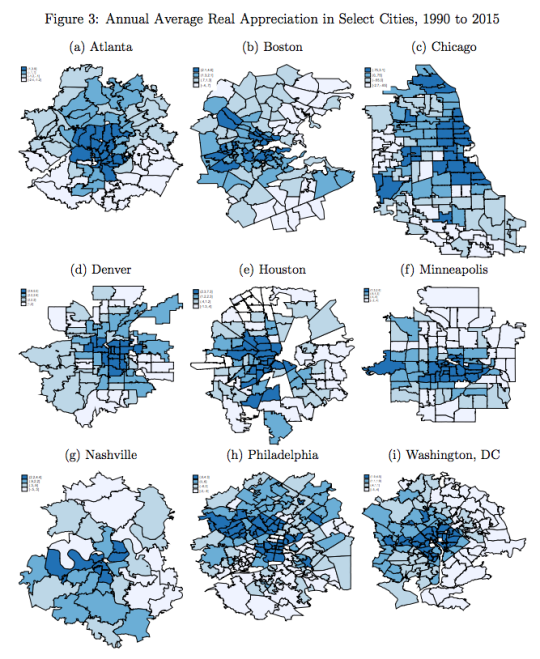
    The darker areas indicate more appreciation. They are generally clustered around each city’s CBD.

    And here is an excerpt from the paper’s conclusion:

    “In an area with a highly elastic housing supply, a permanent housing demand shock is first capitalized into prices, but over time as quantities adjust, prices return to pre-shock levels (see Glaeser, Gyourko, Morales,
    and Nathanson, 2014). In contrast, near the CBD, where buildable sites are less available and regulation is presumably more onerous, a permanent demand shock can outpace supply responses, leading to permanent price increases.

    What stood out for me was this last sentence. It’s a reminder of the perfect storm that many cities now find themselves in.

    When everyone wanted to live in the suburbs, it was fairly easy to just build more homes. Supply was relatively elastic. And this kept prices in check.

    However, the same is not true for city centers. Supply is relatively inelastic, meaning it’s much harder to build more homes when demand increases. And demand has been increasing.

    So what we have today is a situation where many central cities are operating with basically a perpetual supply deficit. Hence the the comment about “permanent price increases.”

    I don’t want to oversimplify the situation, the potential solutions, and/or the well-documented mistakes, but there was arguably a middle class price benefit to mass produced sprawl.

    What should we be doing today to address housing affordability concerns?
  • Global home prices at the end of 2015

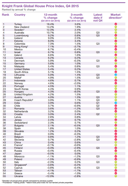
    Seeing how we’ve started looking at data from last year, I thought it would be interesting to look at global home prices as of Q4 2015. Here’s a chart from Knight Frank, which they refer to as their Global House Price Index:

    At the top of the list is Turkey, with an 18.4% increase from Q4 2014 to Q4 2015. (Supposedly this is because it has recently become easier for foreigners to buy property in the country.) Canada is 13th with a 6.2% increase (during this same time period) and the United States is 17th at 5.4%.

    This is obviously a high level analysis. There are lots of regional and local variations within each country. For instance in Canada right now, Calgary is a very different place than, say, Vancouver or Toronto.

    Nonetheless, it’s still valuable to see the relative performance of each country and see what their (Knight Frank’s) prediction is for 2016:

    “Our outlook for 2016 is muted. We expect the index’s overall rate of growth to be weaker in 2016 than 2015. The global economy is experiencing a potentially dangerous cocktail of low oil prices, a strong [US] dollar and a continued slowdown in China.”

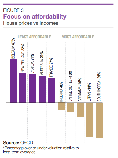
    It’s also interesting to see how the countries rank in terms of affordability:

    Once again, Canada ranks as being one of the least affordable countries in terms of home prices.

  • Urban, suburban, and rural home prices in the U.S.

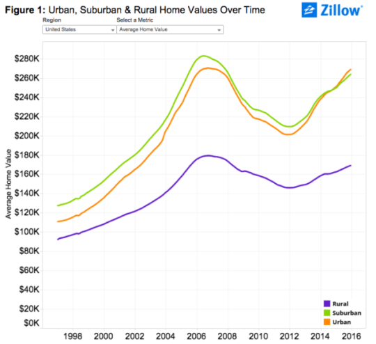
    Zillow.com recently published some research where they looked at U.S. home prices broken down according to location: urban, suburban, and rural.

    Here’s what they found:

    image

    As you can see, urban homes across the U.S. largely trailed their suburban counterparts in terms of absolute value up until the end of 2014. At that point, urban homes then surpassed suburban homes for the first time in the last two decades. (I wonder if this is a first or there was another crossover point before the late 1990s.)

    But if you dig a little deeper and look at both the rate of appreciation and prices per square foot (as opposed to just absolute value), urban home prices appear even stronger. 

    Here’s a snippet from Zillow’s post:

    “Over the past five years (2010-2015), average urban home values have grown 28.4 percent, compared to 21.1 percent for suburban home values. In the past year alone, U.S. urban home values grew 7.5 percent, compared to 5.9 percent for suburban homes.

    On a per-square-foot-basis, homes in urban areas nationwide used to be worth roughly the same as suburban homes, before a gap started emerging in the late 1990s which has become progressively wider over the past roughly two decades. Currently the gap stands at 24.5 percent, with suburban homes valued at $156 per-square-foot and average U.S. urban homes worth $198 per-square-foot.”

    And here is that same chart showing per square foot prices:

    Everyone who reads this blog knows that there is a growing interest in urban centers. But if you look at the above charts for specific cities, there are still many cases where urban home prices are well below suburban ones. 

    To me, that serves as a reminder of the spikiness of this urban transformation, but also that it is likely still in its infancy. As recent as 20 years ago, Toronto largely didn’t believe that people would want to live downtown in modern apartments. Today we take that for granted.

    So even with all of the gushing about urban centers, I still think we are only just getting started when it comes to creating the great urban neighborhoods of the future.

  • The Starbucks Effect

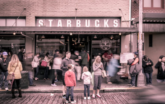
    The Original Starbucks in Motion by Brad Telker on 500px.com

    https://500px.com/embed.js

    This afternoon I was chatting with some friends about Toronto real estate (which is something that happens a lot in this city), and we started talking about “The Starbucks Effect.”

    Basically, we were talking about how this neighborhood just got a Starbucks and how that neighborhood already has one. We were, like a lot of people, using Starbucks as a proxy for neighborhoods that are emerging and neighborhoods that have already arrived.

    There’s been a lot of discussion about the correlation between home prices and the presence of a Starbucks. But the big question is what comes first: the home prices or the Starbucks?

    Earlier this year, the CEO, Spencer Rascoff, and Chief Economist, Stan Humphries, of Zillow.com argued that the mere presence of a Starbucks can cause gentrification. 

    They argued that Starbucks knows the next hot neighborhood before anyone else does and that they are “the fuel, not the follower.” And through their data they demonstrated that homes (in the US) near a Starbucks appreciated significantly faster than homes not near a Starbucks, or even homes near other coffee shops such as Dunkin’ Donuts.

    But I – as well as others – wonder if this isn’t an oversimplification.

    I certainly believe that Starbucks could help fuel home prices in a neighborhood. I think it gives people a comfort level that the neighborhood has arrived and that there are people in the area who are willing and able to spend money on discretionary items.

    But I suspect that for Starbucks it’s a balancing act. They would never want to be late to an emerging neighborhood (and miss that prime corner property), but they also don’t want to be in the business of placing bets on neighborhoods with very few vital signs.

    So I think it’s both. I think Starbucks is analyzing the data and watching home prices like a hawk (the follow) and when it reaches a certain point, they move. And that likely causes a further acceleration of neighborhood change (the fuel).

    What do you think? I would love to learn more about their site selection process.

  • Priced out of the city

    Earlier this month, the Royal Bank of Canada and the Pembina Institute co-published a report on Toronto’s housing market called “Priced Out”. The overarching argument is that homebuyers in the Greater Toronto Area (GTA) are being “priced out” of the areas in which they really want to live, which happen to be walkable and transit-oriented neighborhoods.

    In fact, according to their research, 80% of residents in the GTA would be willing to sacrifice space (size of house and yard) if it meant they could live in a more walkable and urban neighborhood. But at the same time, more than 70% of GTA residents say that they live where they do because of affordability reasons, not because of actual preference. This, of course, isn’t new. It’s the whole “drive to affordability” notion—just keep driving until you can afford the housing. 

    Overall though, the report does reinforce a macro tend that I’ve discussed many times here at Architect This City. People are returning to cities in droves (or would at least like to, if they can afford it).

    If you’re interested, the report also has some good data on Toronto and Canada’s housing markets. 

    Here’s how average home prices in Canada trended between 1980 and 2012. Vancouver became a total outlier starting in the early 90s (thanks Hong Kong).

    image

    And here’s a look at housing completions (so new construction) by product type in the Greater Toronto Area. Note how apartments/condos surpassed single-detached houses in and around 2008. 

    image