Daily insights for city builders, delivered every morning at 6 AM ET. I’m Brandon Donnelly — a Toronto-based real estate developer and founder of Globizen. I’ve been writing here since 2013.

Tag: house prices

  • Listed.fun (and something else)

    This is a fun little passion project by Airbnb-engineer Andrew Pariser and someone known as Potch. The way it works is that it shows you a picture of a recently sold property, and you have to guess what it sold for. You get a bunch of guesses, and after each one, you are given more information about the property and some feedback on how close you are. To win, you need to get within 1%.

    When I tried it out, my initial guess was way off (too high). Toronto has trained me well. I also wasn’t sure where Evansville, Indiana was, so that bit of information didn’t really help me. But the arrows telling me I was way too high, certainly did. The reality is that it’s pretty hard to guess the value of a home if you don’t know where it is, you can’t see interior photos, and you generally don’t have enough information.

    But what if you were from Evansville, Indiana and what if you did have enough information? I bet that the guestimates would actually be pretty accurate. This idea of crowd-sourcing market information and pulling wisdom from crowds has long interested me, because price discovery is a major pain point for real estate. Sure you can look at comparable sales and current listings, but that is not an exact science. Neither are algorithms.

    But what if there was a way to test the market and get pricing feedback before you actually list? Would you trust it more than Zillow’s algorithm? This is something that I’m working on testing right now through a passion project called Unlyst. Myself and a few others are working on a very simple product that will be released this fall. If you’d like to follow along, sign up here.

  • How past pandemics affected the urban housing markets of Amsterdam and Paris

    Past performance, we are often told, is not necessarily indicative of future results. At the same time, history has a funny way of repeating itself. I recently stumbled upon this research paper by Marc Francke (University of Amsterdam) and Matthijs Korevaar (Erasmus School of Economics) looking at the impact of pandemics on housing markets. More specifically, it looks at the impacts of the bubonic plague on 17th-century Amsterdam and of cholera on 19th-century Paris. Here’s an excerpt that summarizes what they found:

    Our analyses for both cities point to substantial impacts of pandemics on property prices. We find that sales prices respond negatively to outbreaks, in particular in heavily affected areas, and that responses are short-lived, with the effects on sale prices being particularly significant in the first six months of an epidemic. Evidence from aggregate house and rent price indices suggests a smaller negative impact on rent prices. Amsterdam and Paris were very resilient to these outbreaks, with population and house price growth quickly reverting to prior trends.

    This paper was first published at the beginning of 2021. A lot has changed since then and, in some ways, their findings now seem obvious. There was still a great deal of uncertainty in the market 12 months ago. While it seems like eons ago, I remember our team having discussions around when would be the right time to launch sales for One Delisle. Of course, 2021 turned out to be a record-setting year for housing and that includes the core/urban housing that the media was quick to write off at the onset of COVID.

    This is not to say that certain things haven’t changed or that there won’t be further changes — both positive and negative — that come out of this. To give one just example, we all continue to hear anecdotal evidence that a lot of tech talent would now prefer to be in cities like Miami over San Francisco. (I’m not tech talent, but this would be my strong preference.) Did the pandemic help fuel this? Probably. It opened a door for the people who no longer wanted to live in a city with such a supply-constrained housing market. (I’m sure there were other reasons, too.)

    These things, of course, happen. Cities are powerfully resilient, but they still need to compete. The bigger point is that cities continue to be our greatest centers of opportunity. And here we have centuries of data and housing records to support the fact that opportunity is both a powerful motivator and a centralizing force for urbanization. This is true even in the face of things like pestilence.

    Happy new year, everyone. I think there’s a lot to look forward to in 2022, including far less talk about pandemics and hopefully far more talk of places like Miami.

    Photo by Adrien Olichon on Unsplash

  • Prime residential pricing in 10 global cities

    The below graphs are taken from a recent (June 2019) report by Knight Frank on “prime” residential pricing across the world. They define “prime” as generally being the top 5% of each market by value. What these graphs show are the spread between the average price of a prime property and the top price achieved in that market.

    The most expensive market is Hong Kong. The average price of a prime property in 2018 was USD 4,251 per square foot (or USD 45,760 per square meter) and the top price achieved was in 2016 at USD 28,154 per square foot (or USD 303,051 per square meter).

    Using the 2018 average, a 350 square foot studio apartment would run nearly USD 1.5 million (or almost CAD 2 million), assuming there are “prime” studios available in the market. Remember, we are talking about the top end of the market.

    If you’d like to download a copy of the full report, you can do that over here.

  • The Knight Frank Global Affordability Monitor 2019

    Here’s a chart from Knight Frank’s 2019 Global Affordability Monitor that I think you’ll find interesting:

    It compares real home price growth and real household income growth (after tax) over the last 5 years for 32 world cities. The bolded percentages represent the former and the non-bolded percentages represent the latter.

    Consider the variations here.

    Amsterdam saw a real home price change of 63.6%, but a household income change of only 4.4% (although the circle looks to be in the wrong spot if this number is correct).

    Moscow, on the other hand, saw flat home prices (0.1%) and a 22.7% increase in household income.

    Though San Francisco is the star in terms of income growth.

    Sao Paulo, unfortunately, saw a dramatic decline in both home prices and incomes. It’s in the bottom left corner.

    When I look at this chart, I don’t see a strong correlation between household incomes and home prices. And the proportions of the chart tell you that the y-axis is moving more than the x-axis.

    But if the top number exceeds the bottom number, then you could come to the conclusion that housing affordability has gotten worse over the last 5 years.

  • Price of a new condominium in Toronto increased 12.5% over the last year

    This morning BILD and Altus Group released their January 2019 new home sales figures for the Greater Toronto Area.

    Here are the highlights:

    • 1,362 new homes sold in January 2019 across the GTA. This is up 14% compared to last January.
    • Of these, 942 (~69%) were condominiums (includes low, mid, and high-rise, as well as townhouses). And 420 (~31%) were single-family homes (includes detached, semi-detached, and freehold townhouses).
    • Condominium sales volume is sitting only about 5% below the 10-year average and the benchmark price increased this month to $803,638, which represents a 12.5% year-over-year increase.
    • On the other hand, single-family home sales are down about 53% from the 10-year average and the benchmark price decreased by about 8.1% compared to last year. It is sitting at $1,130,046.

    While there continues to be a bifurcation in the new home market, we are seeing improvements across the board and the data is consistent with Altus’ prediction that 2019 will see an increase in overall sales.

    It is also important to consider how geography might factor into the above numbers. Here are the January sales numbers for the last three years broken down by region within the GTA:

    Just under 80% of the new condominiums sold last month took place in Toronto, whereas only about 1.2% of the single-family homes sold last month took place in the city. You can count them on one hand. There were only 5.

    So rather than just look at this in terms of housing type, I think the other way to interpret the data is that it could suggest strong and continued demand for centrally located and transit-oriented communities.

    And that just so happens to translate into a condominium.

    Photo by Eugene Aikimov on Unsplash

  • An even longer view on home prices — this time in Amsterdam

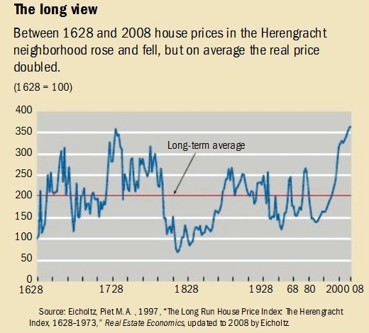
    In the comments of my recent post about Manhattan real estate prices during the Great Depression, a regular reader of this blog shared this terrific blog post (and corresponding research paper by Piet Eichholtz) about house prices along the Herengracht canal in Amsterdam from 1628 to 1973. Later it was updated to include up to 2008. It’s a long run house price index.

    Probably the first thing you’ll notice is that the index is highly volatile. Amsterdam enters its Golden Age, creates the world’s first stock exchange, and becomes the wealthiest city in the western world – house prices go way up. The tulip mania bubble pops – house prices go way down. It’s not until after World War II that prices sort of start to stabilize and increase, maybe, more consistently.

    In nominal dollars, the house price index increases 10x over the study period. But in real dollars most of that disappears. The biennial increase (that’s how the study was done) over the same period of time is just 0.5%. That translates into a doubling of house prices, which may seem quite good, except that remember it’s over a 380 year time period.

    image

    The Herengracht canal is a particularly good study because it was and has remained (or so I’m told) a desirable part of Amsterdam. This is an attempt to control for the variable that maybe some of the volatility could be explained by the area simply falling out of favor. (As a quick sidebar, the Herengracht was one of the first canals laid and dug out around the original city center of medieval Amsterdam during its Golden Age.)

    Generally, this finding is in line with one that economist Robert J. Shiller famously published a number of years ago where he argued that, when you correct for inflation, home prices actually look remarkably stable over long-run forecasts. In one study, he looked at 100 years of US home prices ending in 1990. Real home prices increased about 0.2% a year. What an outstanding hedge against inflation.

  • HOT, HOT HOUSES

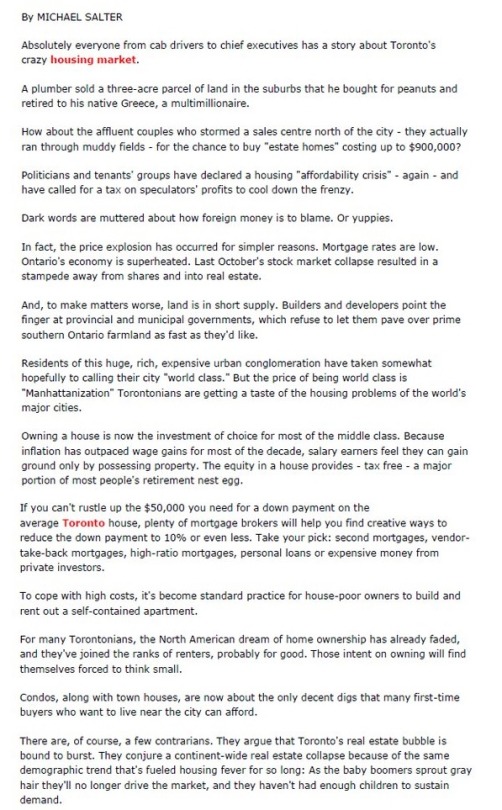
    Below is a piece by Michael Salter from the Globe and Mail. It’s all about Toronto’s HOT, HOT housing market. Michael’s message: Here are the real reasons why home prices are skyrocketing and why they are going to remain high.

    Did you find yourself agreeing with this article or did you notice that something was off? If you noticed something, it may be because this article was originally published on Friday, July 15, 1988. And by that time, the North American dream of home ownership had already died in Toronto.

    Here’s the header I cut out from above:

    Thank you to Tamsin McMahon for tweeting this out last weekend.

  • Latest house-price indicators from The Economist

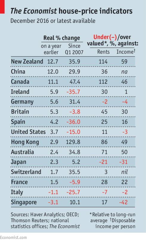
    The Economist recently published the following chart alongside this article talking about the impact of foreign buyers on global house prices.

    image

    They also have this set of interactive graphs that allows you to chart prices according to a number of different measures. The two metrics that The Economist focuses on (above) are house prices against rents and house prices against incomes. 

    The argument they make is that as (foreign) capital begins to think of property as merely a bolthole, it can start to detach itself from fundamentals such as rents and incomes. New Zealand, Canada, and Australia are specifically called out.

    This isn’t necessarily news. And one chart can only tell you so much. But I like staying on top of the various indices.

  • Only $800,000 over asking

    Heads-up: This is going to be a Toronto-specific post.

    This week there was a lot of chatter about escalating house prices in this city (though that seems to be most weeks these days).

    Paul Johnston listed a detached house in Dufferin Grove for $1,285,000 and then turned around and sold it for just over $2.1mm, with 17 potential buyers at the table. I also saw my friend post a note this morning that the average price of a detached house in Toronto has now surpassed $1.5mm.

    What I am curious about – and this is a question for all of you who live here and/or follow the market – is what response does escalating house prices trigger for you? I asked this on Twitter (via a poll), but I would be curious to get your thoughts here in the comments.

    Do you feel rushed out of fear that you may get priced out of the market? Are you now turning your attention to out of the city? Or are you looking at other housing types, such as condos? I am sure the responses will be split.

    My response: condos.

  • 10 most unaffordable housing markets

    image

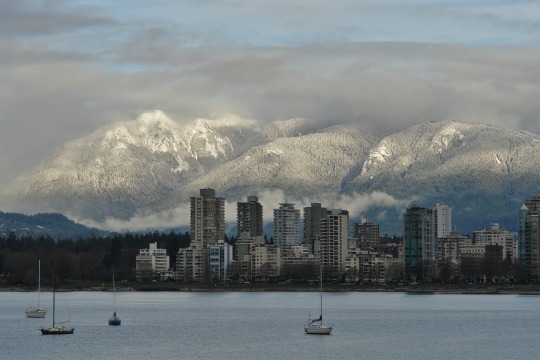
    I flew into Vancouver this morning, which means it was only a matter of time before the topic of house prices came up.

    According to the 13th Annual Demographia International Housing Affordability Survey (2017), the 10 most unaffordable housing markets are as follows:

    1. Hong Kong, China
    2. Sydney, Australia
    3. Vancouver, Canada
    4. Auckland, New Zealand
    5. San Jose, California
    6. Melbourne, Australia
    7. Honolulu, Hawaii
    8. Los Angeles, California
    9. San Francisco, California
    10. Bournemouth, UK

    The survey measured the affordability of “middle-income” housing in Australia, Canada, China (Hong Kong), Ireland, Japan, New Zealand, Singapore, the United Kingdom, and the United States. 

    It is based on a “median multiple” approach, which tries to normalize house prices across the world by looking at median house prices over median household incomes.

    The above list probably won’t surprise you, as well as the report’s focus on land supply. But I did want to call attention to the following remark:

    My own housing research focused on this difference: Why did Germany (and similarly Switzerland) provide housing stability where much of the Anglosphere did not? 

    In a nutshell, the answer to this question has a lot to do with the way councils are funded. In jurisdictions where local decision-makers stand to gain from new development, they will be much more eager to make it happen.

    The topic of incentives is not something that is often focused on when we talk about land supply. But it’s a really interesting point. Because the reality is that, in many cases, the incentives probably work in the opposite direction to the one described above.