Daily insights for city builders, delivered every morning at 6 AM ET. I’m Brandon Donnelly — a Toronto-based real estate developer and founder of Globizen. I’ve been writing here since 2013.

Tag: hong kong

  • 133 Wai Yip Street, Hong Kong

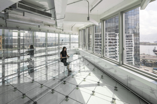
    Dutch architecture firm MVRDV recently converted an old industrial building in Hong Kong into new office space. The overall project size is roughly 200,000 sf. What’s unique about the project is the obsessive focus on transparency and glass.

    Here’s what the interior looks like:

    And here’s how the architect has described the project:

    “We are moving into a transparent society, businesses are becoming more open with the public, and people care more about what goes on behind closed doors. In that way, a clear workspace leaves nothing questionable, nothing hidden; it generates trust.” Tells MVRDV co-founder Winy Maas, “But also it is an opportunity for the building to become a reminder of the industrial history of the neighbourhood, monumentalised in a casing of glass.”

    I have written quite a bit about how I believe we are shifting towards a more transparent world – perhaps even a radically transparent world. And so it’s interesting to see an architect pick up on this broader theme and translate it into physical space.

    The floor is transparent. The partitions are transparent. The furniture is transparent. And you can clearly discern the interfaces between old and new.

    Good architecture, at least in my opinion, should reflect what is happening in our broader society. That’s why I believe that studying the history of art and architecture is really like studying the history of the world.

    For more photos of the project, click here.

    Image by Ossip van Duivenbode via MVRDV

  • Prime property appreciation around the world

    Every year for the last decade, Knight Frank has published something called The Wealth Report. I’ve written about it before, but it’s basically a look at “prime property” and global wealth.

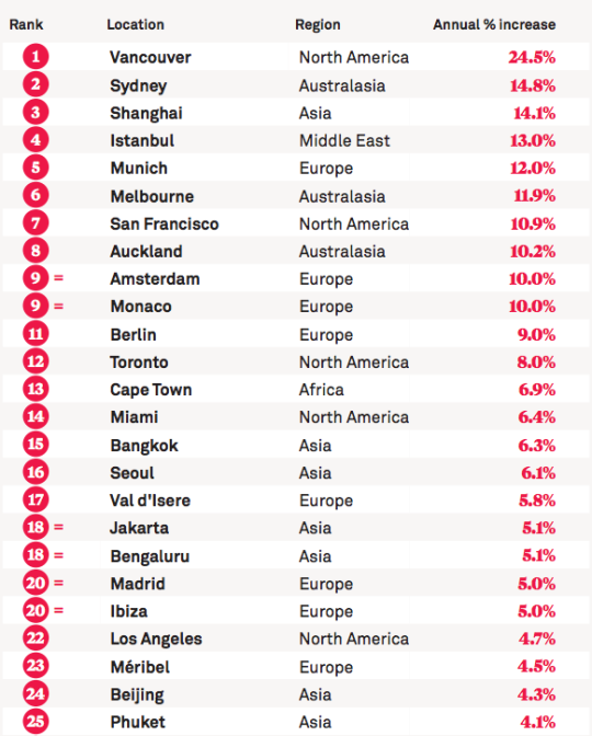
    As part of the report, they have something called the PIRI 100. It’s their “Prime International Residential Index”, which looks at luxury residential property prices around the world. They generally define “prime property” as being the top 5% of each market according to value.

    This year, the top 25 locations in their PIRI 100 are as follows (for the most part, the data is up to December 2015):

    image

    Here in Canada, we like to talk about the insanity of the Vancouver and Toronto real estate markets. This list helps to put that into perspective. Even by global standards, Vancouver is at the top of the pack by quite a significant margin. 

    It’s worth noting that since this is a “prime property” index, it’s pretty safe to assume that the buyer profiles for these sorts of properties would have a significant international bias. So in a way, this list is really about global capital flows.

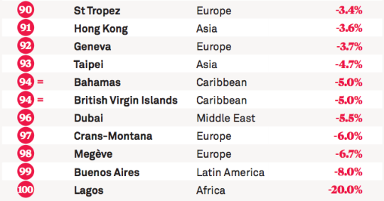
    Here are the bottom 10 locations on this year’s list:

    image

    If you’d like to see the full list, click here.

  • A new era of (digital) globalization

    McKinsey recently published a report called Digital globalization: The new era of global flows.

    The overarching thesis is that we are transitioning to a data-driven global economy:

    “Flows of physical goods and finance were the hallmarks of the 20th-century global economy, but today those flows have flattened or declined. Twenty-first-century globalization is increasingly defined by flows of data and information. This phenomenon now underpins virtually all cross-border transactions within traditional flows while simultaneously transmitting a valuable stream of ideas and innovation around the world.”

    One of the benefits of this shift is that it has become easier for emerging economies and individuals from all around the world to participate.

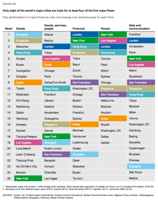
    Of course, not all countries and cities are participating equally. In their report, McKinsey ranks the top cities according to five global flows. In each case a proxy was used:

    “Unfortunately, data on global flows are not available at the city level. However, we have obtained data that serve as proxies for each of our five global flows. Container port volumes approximate goods flows; airport passenger volumes serve as a proxy for goods, service, and people flows; the ranking of cities in the Global Financial Centers Index by the Z/Yen Group provides an indication of financial flows; the number of foreign-born residents in a city measures people flows; and Internet bandwidth approximates data flows.” 

    Using this methodology, they believe that the world only has 8 truly global cities right now: New York, Los Angeles, San Francisco, London, Singapore, Shanghai, Hong Kong, and Dubai. They are the colored cities listed below:

    I always take these city rankings with a grain of salt. This stuff is not easy to quantify and a lot depends on the methodology that you use. 

    For instance, Atlanta sits on the top of “goods, services, and people” because it has the busiest airport in the world according to passenger volume. (It’s the primary hub of Delta Air Lines.) But is that enough to assert that Atlanta is #1? Maybe. Maybe not.

    In any case, the report is packed full of information. If you’d like to take a look, click here.

  • Urban jungle

    Keeping with yesterday’s theme of urban density, here is a photo by Andy Yeung that I am embedding via his 500px page:

    Urban Jungle #04 by Andy Yeung on 500px.com

    https://500px.com/embed.js

    The photo is of Hong Kong and it was taken using a drone. Click here for other photos from his “Urban Jungle” drone series.

    If you remember the maps from yesterday, you might remember that Hong Kong had a peak residential density of around 111,100 people per square kilometre (2013).

    Above is what that generally looks like.

  • Residential population densities compared

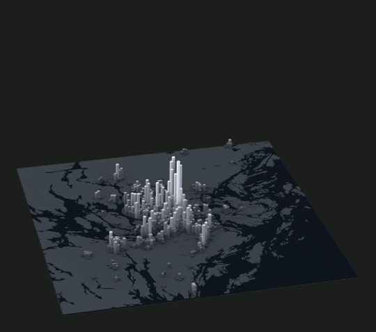
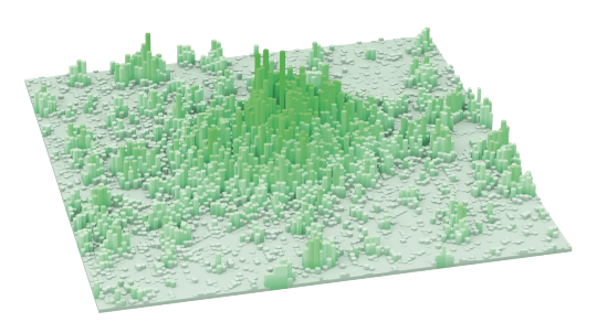
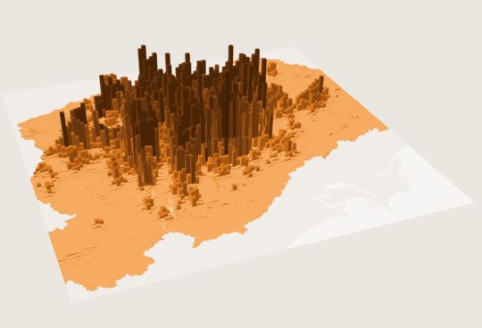
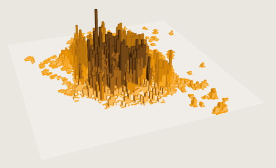
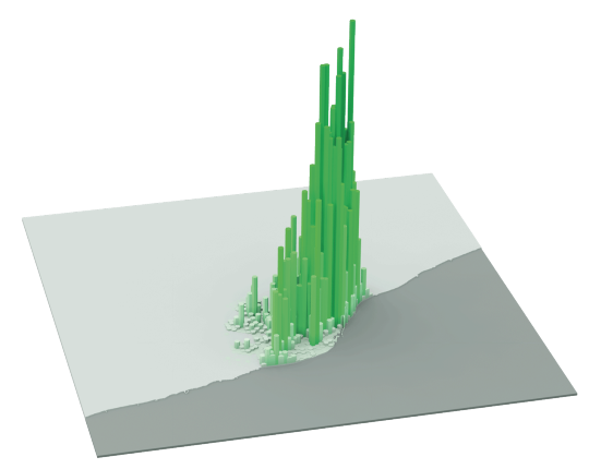
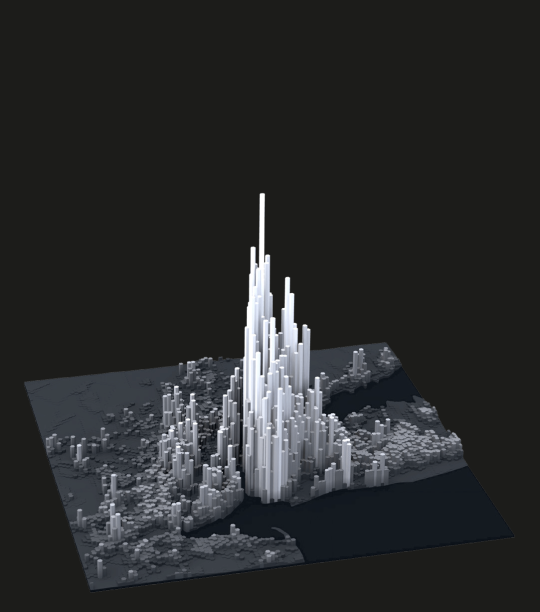
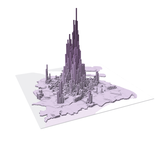
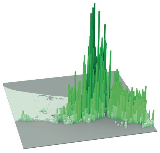
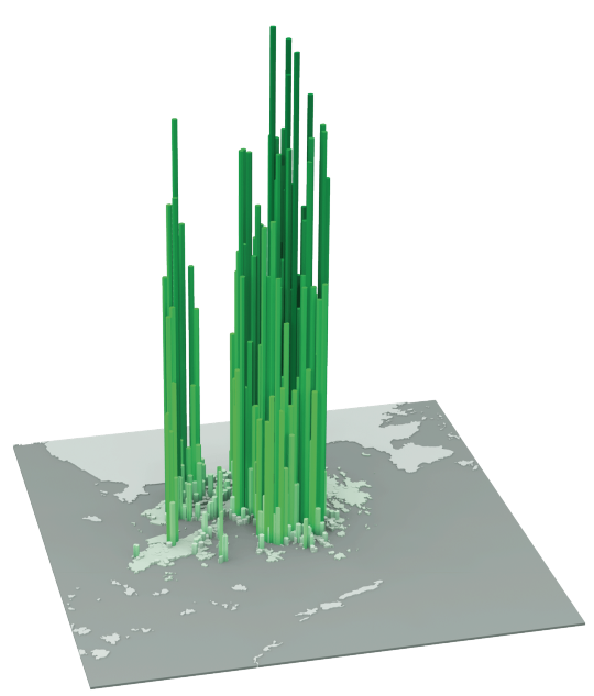
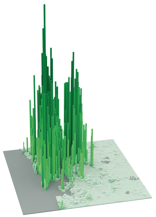
    The following diagrams were taken from LSE’s Urban Age website. I’ve sorted them from lowest to highest peak residential population density. In each case I’ve also included the year of the dataset. 

    It’s amazing how much these simple extrusion diagrams can tell you about the city. It also shows you that high population densities don’t necessarily need to equate to tall buildings. Barcelona, in particular, stands out for me.

    Berlin (Peak residential density: 21,700 people/km2, 2009)

    image

    Stockholm (Peak residential density: 24,900 people/km2, 2012)

    image

    London (Peak residential density: 27,100 people/km2, 2013)

    image

    São Paulo (Peak residential density: 29,380 people/km2, 2009)

    image

    Mexico City (Peak residential density: 48,300 people/km2, 2009)

    image

    Barcelona (Peak residential density: 56,800 people/km2, 2013)

    image

    New York (Peak residential density: 59,150 people/km2, 2012)

    image

    Shanghai (Peak residential density: 74,370 people/km2, 2011)

    image

    Istanbul (Peak residential density: 77,300 people/km2, 2013)

    image

    Hong Kong (Peak residential density: 111,100 people/km2, 2013)

    image

    Mumbai (Peak residential density: 121,300 people/km2, 2013)

    image

  • Let’s fix the UPX train, together

    I am a big fan of the UP Express train that runs from downtown Toronto to Pearson Airport. 

    I love the station architecture, the branding and identity, the trains themselves (with wifi), and the local retailers they house at Union. I also happen to live a stone’s throw away from the downtown station. So I can go from door to bum in seat within 10 minutes.

    But despite all this, it has become clear that something needs to be done to fix the UPX train. Just last weekend a friend of mine and fellow urbanist, who was visiting Toronto from Vancouver, sent me a text message saying: “This UPX train is really nice, but why is it so expensive?”

    Indeed, that seems to be the general consensus. Here is the opening paragraph from a recent Globe Editorial article:

    Toronto’s high-end airport express train is a failure. A city that urgently needs better transit has been saddled with a deluxe boutique rail service that cost $456-million to build and runs nearly empty, 19 ½ hours a day.

    So today I thought we could collectively brainstorm some ideas for how Metrolinx – the public agency that operates the train – should address this issue.

    I’ll start by sharing my thoughts as a rider and then, hopefully, you all will share yours in the comment section below. I know that there are people from Metrolinx who subscribe to this blog, so I am sure your feedback will get through to them.

    My thoughts are twofold. Like many others, I think the pricing is off. But at the same time, I think there should be a focus on enhancing the value proposition of the service.

    Bur first, let’s talk about price.

    At the time of writing this, a one-way trip from Union Station to Pearson Airport on the UPX is $27.50. If you happen to have a PRESTO card, it’s $19.

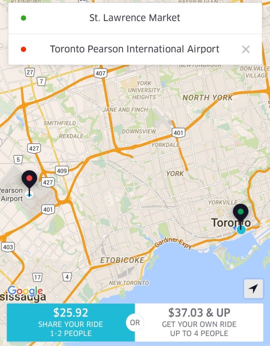
    The alternative for many is probably a taxi. So let’s also look at some Uber fare estimates. For someone like me leaving the St. Lawrence Market area, I’m looking at $25.92 with UberPOOL (meaning I’m sharing the car with 1-2 other people) or $37.03 if I insist on riding solo.

    image

    Against the non-PRESTO fare, UberPOOL is a cheaper option and it’s door-to-door service. Against the PRESTO fare, UPX is potentially $6.92 cheaper. But if you’re someone who has to take the subway to the UPX station, then it’s only $3.67 cheaper (add $3.25 for the subway) and it’s not door-to-door service. So for the vast majority of people, I suspect that UberPOOL would win out in this particular scenario.

    If you happen to be traveling with someone, then UberPOOL and UberX are probably going to be cheaper no matter how you slice it. And again, you’re getting door-to-door service. So I think the consensus is right: fares need to come down.

    But I don’t think Metrolinx should be solely focused on price. They should also be thinking about ways to create additional values for riders. 

    One of my favorite travel experiences is that of Hong Kong’s airport train. There, they have airline check-in counters in the city so you can collect your boarding pass and check your baggage up to a day before your actual flight. This is a huge value add because it means you can check out of your hotel, liberate yourself of your luggage, and spend the day in the city before leaving on the train to catch your flight. You can’t do that with an Uber. And lugging bags around a busy city, sucks.

    My point with all of this is simply that you can’t expect people to pay more or roughly the same, if they are not getting additional value. And right now, the train isn’t door-to-door and taxis are. (Though, the train has a travel time advantage during peak times.) So you either make it cheaper or you create additional value. Or, you do some combination of the two, which is where my head is at.

    What are your thoughts? Please respond in the comments below so all the feedback is public. Thanks.

  • Urban population densities, compared

    Earlier this month The Washington Post published an article called, There’s no such thing as a city that has run out of room.

    And what it was really about was that when we say there’s no more room (I guess people are saying this), we are really saying that we just don’t want to allow anyone else to become our neighbor. Because the reality is that urban population densities vary widely around the world. So how can you really call a place full?

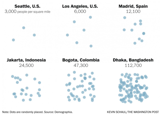
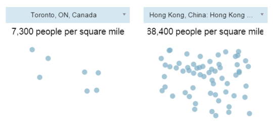
    I’m not sure I feel this pain point as much as the author, but I always find population densities to be a fascinating topic. And accompanying the article was a tool – using data from Demographia – that allowed you to compare the population densities of various cities.

    Here are are two scenarios I ran:

    It’s important to keep in mind that these numbers are averages for the entire economically contiguous region. So it tells you nothing about the potential spikiness of certain areas. That’s why the population density of New York (which includes portions of New Jersey and Connecticut) probably seems low to you.

    Still, it’s fascinating to see how extreme some cities – including some first world cities like Hong Kong – can be. Clearly many cities have a lot of room to become a lot more dense. And I think that would be a good thing.

  • Is Hongcouver better off than Vancouver?

    The Twilight Zone | Vancouver by Apar Sidhu on 500px.com

    https://500px.com/embed.js

    It’s raining this morning in Toronto. The sun really hasn’t come up and out yet. And I’m spending the morning drinking coffee and reading a City Journal article from this past summer called “Hongcouver.”

    The article talks about how the Chinese – first from Hong Kong and then from mainland China (PRC) – have dramatically reshaped the economic and cultural landscape of Vancouver.

    I, unfortunately (it’s a great city), don’t spend a lot of time in Vancouver and so I don’t have an accurate sense of the local sentiment towards all of this change. But there’s no question the city has changed. 

    Here’s a snippet from the above City Journal article:

    As for the notion that Chinese money tended to be ill-gotten, Yu pointed out that the property boom was propelled by the structural disparity between prosperous Hong Kong, a dynamic economy, and the comparative backwater of Vancouver, still “living on the fumes of empire.” For the price of a Hong Kong flat, a Chinese immigrant—even, say, an accountant—could buy a splendid home on Vancouver’s West Side. “The Hong Kong Chinese who came could buy their way into any neighborhood. [They] knew that money was a tool,” Yu told me. “They weren’t going to accept a second-class citizenship in Vancouver. They could say, ‘I don’t care about your British Imperial manners, I am going to buy your house.’ ” The irony was that the Hong Kong arrivals—“more sophisticated than the people they were displacing,” with “better schooling, better English accents,” Yu said—were themselves the products of a system of law and finance instituted by the British with the establishment of their Hong Kong colony in the 1840s, after Britain thrashed China in the First Opium War.

    A lot of this was fuelled by the now defunct Immigrant Investor Program. The intent of the program was to allow “experienced business people” into the country in order to contribute to economic growth. If you had business experience, a net worth of at least C$1.6 million (that was gained legally, of course), and were able to invest C$800,000, then you could get permanent residency.

    Between the mid-1980s and the end of the 1990s, approximately 30,000 Chinese came to Vancouver via this investor-class visa. And between 1987 and 1997, it is estimated that this group of Chinese possessed about $35 to 40 billion in disposable income. No wonder they bought real estate.

    But the interesting question is whether or not Vancouver is better off now than it was in the 1970s before all of this migration really took hold. 

    There many who would argue that it is not. Vancouver now has the most expensive real estate in Canada and prices have completely detached themselves from local income levels – as they have in many international cities.

    But there’s also a strong argument to be made that this influx of money has made the Vancouver economy more dynamic. Unemployment in the city was cut almost in half between the early 1980s and 1991 during the first wave of migration. It went from 13.6% to 7.7%.

    In a way, it’s not all that different than what’s currently happening in San Francisco with tech and housing. I’m not saying there aren’t problems to be solved. But I think many of us can agree that the answer is not to eradicate the tech sector.

    That’s throwing the baby out with the bathwater.

  • How urban density affects how you get around

    Yesterday I wrote about urban-suburban divides within cities. And I argued that built form will largely dictate the kinds of transportation choices that people will ultimately make.

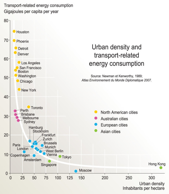
    As a follow-up to that, here is a chart based on the findings of a research report completed by Peter Newman and Jeffrey Kenworthy way back in 1989. On the x-axis is urban density (i.e. built form) and on the y-axis is per capita transport related energy consumption.

    image

    What this chart shows is that as cities become more dense, “automobile dependence” is reduced in favor of, other, more sustainable forms of transport. 

    Here we have Houston at the top left (meaning it has the highest transport-related energy consumption per capita) and Hong Kong all the way on the bottom right. Hong Kong has by far the highest density among the cities looked at in this study, but Moscow seems to have the lowest per capita energy consumption. Still, the trend appears clear.

    Some people think of “density” as a dirty word. But there are lots of benefits to dense urban centers. And density does not necessarily have to mean tall buildings.

    Chart: Globalization Studies in an Urban World (Penn)

  • With Vancouver voting “no” to transit tax, could Hong Kong now serve as inspiration?

    https://500px.com/embed.js

    Earlier today it was announced that Metro Vancouver voted “no” to a 0.5% sales tax increase that would have been used to fund a $7.5 billion regional transportation plan. 

    Roughly 62% of respondents said “no”. And not surprisingly, the percentage of people who voted “no” increased as you moved outward towards the suburbs. But even the City of Vancouver itself sided slightly with “no” at 50.81%.

    Since I’m not that plugged into the Vancouver scene, I’m not going to comment on this issue. But hopefully you all will in the comments below. I know that a lot of you are incredibly passionate about this.

    Instead, I’d like to pose two questions. 

    Firstly, why is it that Asian transit operators seem to be so much better than North American transit operators at recovering their costs through fares? (Urban density and car ownership likely have something to do with it). And secondly, why hasn’t Hong Kong’s famous “rail plus property” transit model been exported to North America?

    For those of you unfamiliar with Hong Kong’s Mass Transit Railway Corporation, here’s how much money they make (via The Atlantic from 2013):

    The Mass Transit Railway (MTR) Corporation, which manages the subway and bus systems on Hong Kong Island and, since 2006, in the northern part of Kowloon, is considered the gold standard for transit management worldwide. In 2012, the MTR produced revenue of 36 billion Hong Kong Dollars (about U.S $5 billion)—turning a profit of $2 billion in the process. Most impressively, the farebox recovery ratio (the percentage of operational costs covered by fares) for the system was 185 percent, the world’s highest. Worldwide, these numbers are practically unheard of—the next highest urban ratio, Singapore, is a mere 125 percent.

    In addition to Hong Kong, the MTR Corporation runs individual subway lines in Beijing, Hangzhou, and Shenzhen in China, two lines in the London Underground, and the entire Melbourne and Stockholm systems. 

    And here’s how they do it (also via The Atlantic):

    Like no other system in the world, the MTR understands the monetary value of urban density—in other words, what economists call “agglomeration.” Hong Kong is one of the world’s densest cities, and businesses depend on the metro to ferry customers from one side of the territory to another. As a result, the MTR strikes a bargain with shop owners: In exchange for transporting customers, the transit agency receives a cut of the mall’s profit, signs a co-ownership agreement, or accepts a percentage of property development fees. In many cases, the MTR owns the entire mall itself. The Hong Kong metro essentially functions as part of a vertically integrated business that, through a "rail plus property” model,  controls both the means of transit and the places passengers visit upon departure.  Two of the tallest skyscrapers in Hong Kong are MTR properties, as are many of the offices, malls, and residences next to every transit station (some of which even have direct underground connections to the train). Not to mention, all of the retail within subway stations, which themselves double as large shopping complexes, is leased from MTR.

    I believe that we could do this too. So hopefully we can have a great discussion about it in the comment section below.