Daily insights for city builders, delivered every morning at 6 AM ET. I’m Brandon Donnelly — a Toronto-based real estate developer and founder of Globizen. I’ve been writing here since 2013.
Bing Thom Architects recently published a blog post looking at the property values of single family homes in Vancouver. The data was taken from the City of Vancouver Open Data Catalogue and is based on British Columbia Assessment data.
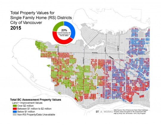
The precise timing of the data is likely a bit off, but here’s how the city looked in 2015:
23% of single family homes in the city had an assessed value over $2 million.
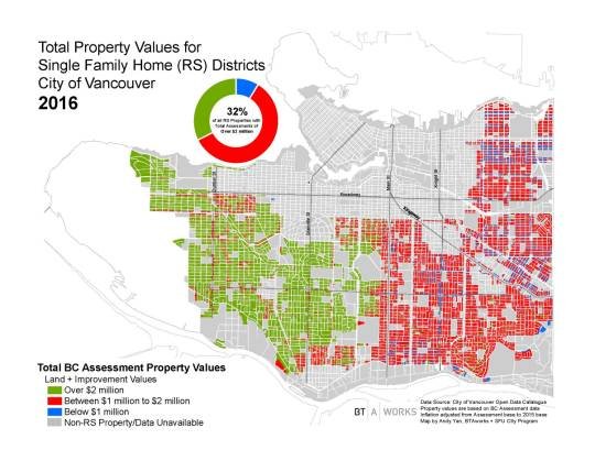
A year later, this number increased 32% of all single family homes:
It’s interesting to see how divided the city is along Main Street. But the big takeaway – thanks to BTA – is that $2 million seems to be the new $1 million.
The key concept here – which is critical to understanding urban real estate economics – is that home values are essentially made up of two things: the land and the improvements (i.e. the building).
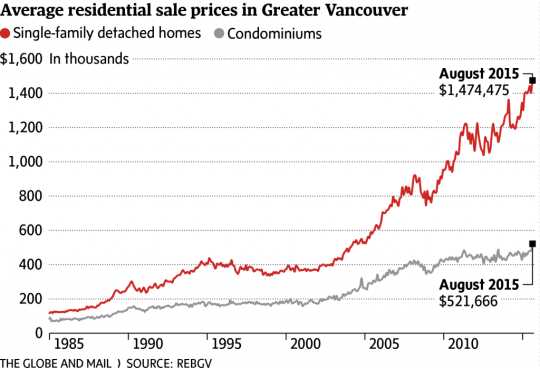
When home prices rapidly appreciate, as has been the case in cities like Vancouver (see below) and Toronto, it’s not the building, but the land that’s really driving the price up.
And as you can see from the chart below (which Daniel shared in his post), it is possible for multifamily housing to be less expensive than single family housing.
So why was someone arguing that multifamily housing is more expensive?
Well if you look at just construction costs, then this is generally true. Single family housing is typically wood frame construction, whereas multifamily housing is usually reinforced concrete or some other material that allows you to build up. In these latter cases, the price per square foot to build is going to be higher.
But Daniel’s argument is that when you build multifamily housing, you also begin to amortize the cost of the land over more housing units. So you begin to use land more efficiently and that offsets the higher construction costs.
However, two thoughts come to mind.
First, the value of a piece of land is entirely dependent on what you can build on it. And the more you can build on it, the more the land is worth. So as densities increase, so do land prices.
Second, a big part of why condominiums are so much more affordable is that they’re smaller. In 2014, the average condo size in Metro Vancouver was estimated to be 840 square feet. I couldn’t find the average size of a detached house in the city, but let’s assume for a second that it’s 2,500 sf.
If that were the case, then a detached house, despite being more expensive overall, would still be cheaper on a per square foot basis. You would be paying less for every square foot of livable space. True that doesn’t make the house more affordable, but I think it’s a bit unfair to compare apples (small condo) to oranges (large house).
So what I would really like to see is a graph of all-in low-rise and high-rise per square foot prices over time and for various cities. Because I would be curious to see at what point – if ever – they intersect.
Conor Maguire introduced me to an interesting site today called Airbnb vs. Berlin. The site does a deep dive into Berlin’s Airbnb market with the hope of answering the question: Is Airbnb contributing to a shortage in affordable housing?
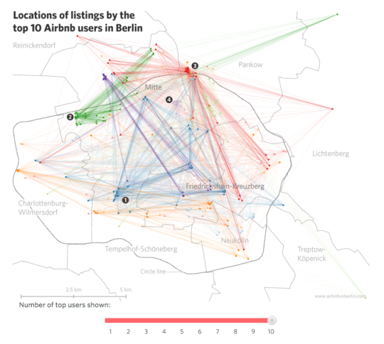
The site is very well done. It’s filled with lots of great market stats and diagrams such as this one here:
Of course, the impetus for a site like this is that cities all around the world, from San Francisco to Berlin, are grappling with rising home prices. If you happen to live in a successful, growing city, that’s probably what is happening.
But when this happens, we seem to want to look for something or someone to blame. In San Francisco it’s the tech workers. They’re the ones driving up homes prices. In Vancouver, it’s the foreign Chinese buyers. And in Berlin, it’s those Airbnb users who are just out to make a profit. In all of these cases, we like to tell ourselves that if we could just get rid of “X”, everything would be much better.
But I think sometimes we forget that this is also the result of doing many things right.
If Berlin wasn’t a brilliantly cool place to visit, then tourists wouldn’t come. And if tourists didn’t come, then Berlin wouldn’t have, by far, the largest Airbnb market in Germany. If Vancouver wasn’t one of the most enjoyable places in the world to live, you wouldn’t have the same attention from overseas buyers looking to snatch up properties.
So in a way, we should be asking ourselves: How do we, as a city, manage our own awesomeness?
The other thing that Airbnb vs. Berlin reminded me of is the viewpoint that profits are some dirty little secret. I hear it all the time in the real estate development business. People will say: “That developer is just out to make money.” Of course she/he is! They operate a business. And like all for-profit businesses, one of the objectives – it may not be the only one – is to make money.
I say all this not as a direct response to the website. They remained fairly neutral in their analysis. Instead, I raise it as an alternate viewpoint in the seemingly universal battle against “X.”
In case you’re wondering about Berlin’s Airbnb market, the site estimates that there are roughly 11,701 Airbnb listings in the city out of a total of about 1.9 million flats. Of these listings, it is estimated that somewhere around 30% are by “professional users” who are only out to make a profit and are not participating in the “sharing economy” in its purest sense. That equates to about 0.18% of all Berlin flats.
Based on this number, I’d say that Berlin’s cool factor probably has a lot more to do with the city’s rising rents than do the profit seeking Airbnb users.
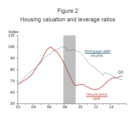
Just a few days ago, The Federal Reserve Bank of San Francisco published an interesting research study where they argue that this U.S. housing boom is different than that of the early 2000s.
During the last boom, U.S. home prices peaked in 2006 and then dropped about 30% in the wake of The Great Recession. Since then prices have rebounded – almost to their pre-recession levels. This has some people asking whether this story is headed towards the same ending.
“We find that the increase in U.S. house prices since 2011 differs in significant ways from the mid-2000s housing boom. The prior episode can be described as a credit-fueled bubble in which housing valuation—as measured by the house price-to-rent ratio—and household leverage—as measured by the mortgage debt-to-income ratio—rose together in a self-reinforcing feedback loop. In contrast, the more recent episode exhibits a less-pronounced increase in housing valuation together with an outright decline in household leverage—a pattern that is not suggestive of a credit-fueled bubble.”
And here’s the chart:
Source: Flow of funds, Bureau of Economic Analysis (BEA), CoreLogic, and BLS. Data are seasonally adjusted and indexed to 100 at pre-recession peak.
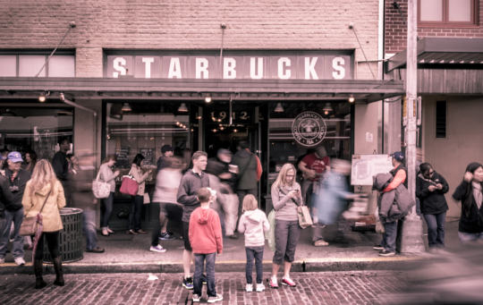
This afternoon I was chatting with some friends about Toronto real estate (which is something that happens a lot in this city), and we started talking about “The Starbucks Effect.”
Basically, we were talking about how this neighborhood just got a Starbucks and how that neighborhood already has one. We were, like a lot of people, using Starbucks as a proxy for neighborhoods that are emerging and neighborhoods that have already arrived.
There’s been a lot of discussion about the correlation between home prices and the presence of a Starbucks. But the big question is what comes first: the home prices or the Starbucks?
Earlier this year, the CEO, Spencer Rascoff, and Chief Economist, Stan Humphries, of Zillow.com argued that the mere presence of a Starbucks can cause gentrification.
They argued that Starbucks knows the next hot neighborhood before anyone else does and that they are “the fuel, not the follower.” And through their data they demonstrated that homes (in the US) near a Starbucks appreciated significantly faster than homes not near a Starbucks, or even homes near other coffee shops such as Dunkin’ Donuts.
But I – as well as others – wonder if this isn’t an oversimplification.
I certainly believe that Starbucks could help fuel home prices in a neighborhood. I think it gives people a comfort level that the neighborhood has arrived and that there are people in the area who are willing and able to spend money on discretionary items.
But I suspect that for Starbucks it’s a balancing act. They would never want to be late to an emerging neighborhood (and miss that prime corner property), but they also don’t want to be in the business of placing bets on neighborhoods with very few vital signs.
So I think it’s both. I think Starbucks is analyzing the data and watching home prices like a hawk (the follow) and when it reaches a certain point, they move. And that likely causes a further acceleration of neighborhood change (the fuel).
What do you think? I would love to learn more about their site selection process.
The headline immediately caught my attention because conventional economic wisdom would suggest that supply constraints – whether natural or artificially created – generally have a negative effect on housing affordability.
To be clear though, I support Ontario’s greenbelt. I think an urban growth boundary is the right thing to have if we want to build sustainable, walkable, and transit-oriented communities. But I’m also not blind to some of the potential (negative) externalities.
However, Keesmaat’s article got me wondering just how prevalent those externalities might be and to what extent our greenbelt is actually impacting housing affordability in Toronto. In her article she cites a recent report by the Pembina Institute that very clearly argues the following:
“There is no shortage of land throughout the GTA [Greater Toronto Area] to build single-family homes for decades to come, but this land is predominantly located far from the City of Toronto and other established centres of employment in the GTA.”
More specifically, the report found that of all the land available for development in the region (within our growth boundary), 81% of it is projected to still be unused by 2031. This got me thinking: it’s not that there isn’t land still available in the region; it’s that there isn’t land in the areas where demand is the greatest.
Put differently, young families aren’t clamoring for single family homes in High Park and Leslieville because the greenbelt has restricted their ability to find new housing. They’re doing so because they want to live in neighborhoods like High Park and Leslieville.
If you dive into the data, the report shows that in 2004 the average price of a detached home in Toronto was about $117,000 more than the rest of the Greater Toronto Area. As of 2013, that spread had grown to about $200,000. And indeed the data shows that it’s the core of the city where home prices seem to be appreciating the fastest.
So when it comes to housing affordability and supply, the greenbelt may actually be a red herring. Releasing it would not increase the supply of housing in areas where demand is already high, which is probably why this same report also found that – with or without an urban growth boundary – most Canadian cities are seeing similar increases in home prices.
So what should we be doing?
I think we should do two things: (1) focus on accommodating more growth in the areas that people already want to live in, and (2) figure out ways to transform the less desirable areas into more desirable ones. This second one will be the hardest, because it’s likely going to mean changing car dependent areas into transit-oriented ones, which is no easy task.
The good news though is that we are already doing these things. There’s more that I would like to see happen, but we’re headed in the right direction.
If your city has a greenbelt or you have experience with greenfield development in the Toronto region, I’d love to hear your thoughts in the comments. This is an area of development that I’ve never really been involved with.
Earlier this week I wrote a post about a new build home under construction at 37 Canerouth Drive in the west end of Toronto. As part of that post, I asked people what they thought the home would be valued at when it was completed. There were just under 10 responses (many thanks!) and I thought it was really fascinating to see the ranges.
A lot of you responded in the comment section of the post, but a bunch of the other estimates came in via Facebook, Twitter, and email. It isn’t a huge data set, but I’ve nonetheless consolidated the ones I could remember I received:
If you average these estimates, you come to a value of $3.3M. However, the clear outlier is the $8.5M. So let’s take that one out and see how the number changes. If you do that, you then get an average estimate of $2.5M. A pretty big swing.
Now, I don’t know offhand how accurate that number really is, but I’m fascinated by this idea of “the crowd” determining value. Particularly for markets such as housing where supply can be completely heterogeneous and there isn’t a lot of transaction volume to refer back to (compared to other types of markets).
Because my strong belief is that under the right circumstances and with enough data points, this number could end up being hugely accurate. And, it could also be more forward looking since it’s capturing current market sentiment as opposed to being based on historical transaction prices.
If you have any thoughts on this, I’d love to hear from you 🙂
Earlier this month, the Royal Bank of Canada and the Pembina Institute co-published a report on Toronto’s housing market called “Priced Out”. The overarching argument is that homebuyers in the Greater Toronto Area (GTA) are being “priced out” of the areas in which they really want to live, which happen to be walkable and transit-oriented neighborhoods.
In fact, according to their research, 80% of residents in the GTA would be willing to sacrifice space (size of house and yard) if it meant they could live in a more walkable and urban neighborhood. But at the same time, more than 70% of GTA residents say that they live where they do because of affordability reasons, not because of actual preference. This, of course, isn’t new. It’s the whole “drive to affordability” notion—just keep driving until you can afford the housing.
Overall though, the report does reinforce a macro tend that I’ve discussed many times here at Architect This City. People are returning to cities in droves (or would at least like to, if they can afford it).
If you’re interested, the report also has some good data on Toronto and Canada’s housing markets.
Here’s how average home prices in Canada trended between 1980 and 2012. Vancouver became a total outlier starting in the early 90s (thanks Hong Kong).
And here’s a look at housing completions (so new construction) by product type in the Greater Toronto Area. Note how apartments/condos surpassed single-detached houses in and around 2008.