Daily insights for city builders, delivered every morning at 6 AM ET. I’m Brandon Donnelly — a Toronto-based real estate developer and founder of Globizen. I’ve been writing here since 2013.

Tag: home prices

  • Climate gentrification is reshaping coastal cities

    Last year, Jesse Keenan, Thomas Hill, and Anurag Gumber of Harvard University, published a research paper called, Climate gentrification: from theory to empiricism in Miami-Dade County, Florida.

    What they were trying to uncover was a possible relationship between climate change and single-family home pricing in places, like Miami, that are vulnerable to sea level rise and flooding. This phenomenon is colloquially referred to as “climate gentrification.”

    One of the things that they uncovered through their work was, in fact, a positive correlation between the rate of price appreciation of single-family homes in Miami-Dade County and incremental measures of higher elevation. In other words: there’s value in higher ground.

    Recent reports (like this one from the WSJ) that Little Haiti in Miami is experiencing a surge in investment, seem to, at least partially, support this finding. Little Haiti sits about twice as high as Miami Beach, which is only about 4 feet above sea level.

    Here is a diagram from the WSJ showing the change in home prices since 2018:

    I’m not sure that this diagram necessarily reinforces the above finding. Mid-Beach in Miami Beach is shown as having an 8% gain, and yet it sits, like pretty much the rest of the Beach, within a 100-year floodplain. But already Miami is looking to manage the impacts of, “gentrification that is accelerated by climate change.”

  • How Opportunity Zones may have impacted real estate prices

    The Tax Cuts and Jobs Act of 2017 (US) created something known as Opportunity Zones. These are low-income and high-poverty census tracts that are designed to attract investment by offering a number of different tax benefits. I first wrote about it on the blog, here.

    Now that some time has passed since the final Opportunity Zones were announced, Zillow Economic Research decided to look at the possible impact of this designation on real estate values. In other words: To what extent, if at all, are the tax benefits getting capitalized into the value of the properties?

    Below is a chart showing the year-over-year change in the 12-month moving average sale price for low-income census tracts that were (1) eligible and selected as an Opportunity Zone; (2) eligible and not selected; and (3) not eligible.

    My understanding is that the “not eligible” category represents census tracts with similar characteristics to the other two categories but, for whatever reason, were not eligible to become an Opportunity Zone. There are criteria.

    The program is still quite new, but what Zillow found was that the eligible census tracts (green and yellow lines) seemed to exhibit similar sale price increases after the Act was signed, but before the final Opportunity Zones were announced. Once the final Zones were announced, sale prices in the selected category (green line) began to surge and move away from the pack.

    This may be evidence that the tax benefits are starting to get capitalized, or it may not be. One question I have is about why pricing in the selected Opportunity Zones seems to be a lot more volatile — even before the Act was announced.

  • Supreme Court dismisses TREB appeal

    Last Thursday the Supreme Court of Canada announced it would not hear an appeal from the Toronto Real Estate Board regarding a 2016 Competition Bureau decision aimed at giving consumers greater online access to information, such as historical (home) sale prices.

    I am not at all surprised by the Supreme Court’s decision and I have said pretty much all I want to say on this topic – over here. But since I believe this is a positive outcome for real estate consumers, I wanted to mention it on the blog because it appears to be a final decision.

    Some sites, such as Zoocasa, have already started publishing sold prices. Good.

  • Urban vs. suburban home prices

    Aaron Terrazas, who is a Senior Economist at Zillow, recently gave this presentation about the US and Virginia Beach housing markets. (I discovered it through City Observatory.)

    There are a bunch of interesting graphs/stats in the presentation. Home values in Virginia Beach, for example, have yet to fully recover from the 2007-2008 financial crisis. They are still 8% below their pre-crisis peak, which was in July 2007. (I presume the presentation is dealing in nominal dollars.)

    I’ll give two more examples. 

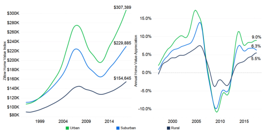
    Below is a chart comparing average home prices for rural (dark blue/purple), suburban (blue), and urban (green) homes. In the late 90′s, suburban and urban homes were roughly equal in terms of average prices. But since then, urban homes have shown greater appreciation. The spread also appears to be widening.

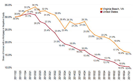
    And here is a graph showing the share of mortgage borrowers in a negative equity position. That is, the value of the home is less than the outstanding balance of the mortgage.

    Now this is only covers people who have a mortgage. According to this Washington Post article, about 34% of all US homeowners don’t have one. Either they have paid it off or they never had one.

    Still, the above numbers stood out to me. They speak to the severity of the financial crisis. At the end of 2011 and the beginning of 2012, over 30% of borrowers were in a negativity equity position. And in Virginia Beach it was more than 1/3 of all borrowers at the peak.

    For the full presentation, click here.

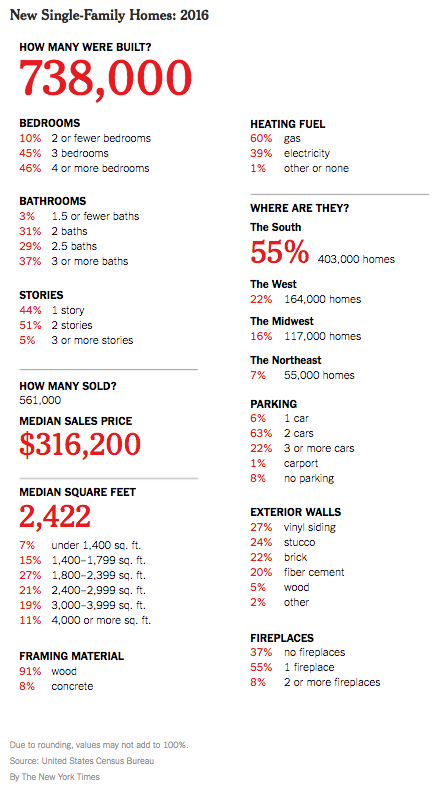
  • 738,000 single-family homes were built last year in the US

    The New York Times recently published “a portrait of new single-family homes” in the US in 2016. Here’s that portrait:

    For those of those living in dense urban centers, this portrait is perhaps a reminder that in many other places a large single-family home can be had for about the price of a studio apartment.

    Nothing in the above portrait likely surprised you, but it’s interesting to note that over half of all new single family homes delivered last year were in “The South.” Only 7% were built in the dense northeast.

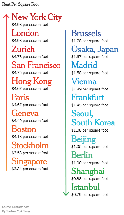
    The New York Times also recently looked at “international rents per square foot” using data from RentCafe. Here they are:

    New York City sits at the top with an average rent of $4.98 psf. This is across all boroughs. I am surprised by how low some of these international rents are. But averages rarely tell you the whole story.

    In any event, I do think that these two graphics start to speak to the economic spikiness that we are seeing across the US. 

  • HOT, HOT HOUSES

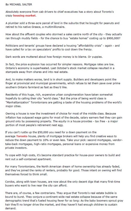
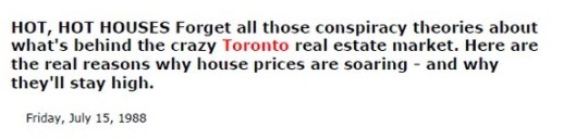
    Below is a piece by Michael Salter from the Globe and Mail. It’s all about Toronto’s HOT, HOT housing market. Michael’s message: Here are the real reasons why home prices are skyrocketing and why they are going to remain high.

    Did you find yourself agreeing with this article or did you notice that something was off? If you noticed something, it may be because this article was originally published on Friday, July 15, 1988. And by that time, the North American dream of home ownership had already died in Toronto.

    Here’s the header I cut out from above:

    Thank you to Tamsin McMahon for tweeting this out last weekend.

  • Home prices and negative interest rates

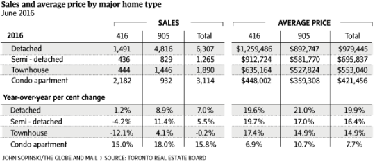
    This morning, I am looking at the following chart of average home prices in the Greater Toronto Area:

    It’s from this Globe and Mail article.

    These are staggering numbers. The average price of a detached home in the suburbs (905 area code) increased 21% year-over-year. In the city (416 area code), the increase was 19.6% YOY. These numbers are almost unbelievable.

    The article focuses on low supply (decrease in listings) and high demand. And that is certainly a big part of what’s going on here in this city, as well as in many others.

    But of course, the backdrop to all of this is our low / zero / negative interest rate environment.

    Larry Summers has a great post on his blog (which I discovered this morning via Fred Wilson) that talks about this “remarkable financial moment.” In some instances, real interest rates are actually negative! (You should read his post.)

    There are always people threatening that interests rates just have to go up. But Larry, as well as others, continue to argue that natural real interest rates are likely to remain close to zero going forward.

    Fred mentions Albert Wenger on his blog this morning and I have written about him before as well, here. In his book World After Capital, Albert argues that capital is no longer the scarce resource of our time. Instead, it has become attention.

    If you believe all of this to be true, then perhaps the numbers at the top of this post aren’t so unbelievable after all.

  • Coffee shops vs. fried chicken

    When it comes to a real estate market, there are always the typical metrics: sale prices, rents, vacancy and so on. But I’m always interested when somebody looks at the market in a different way and comes up with other kinds of metrics.

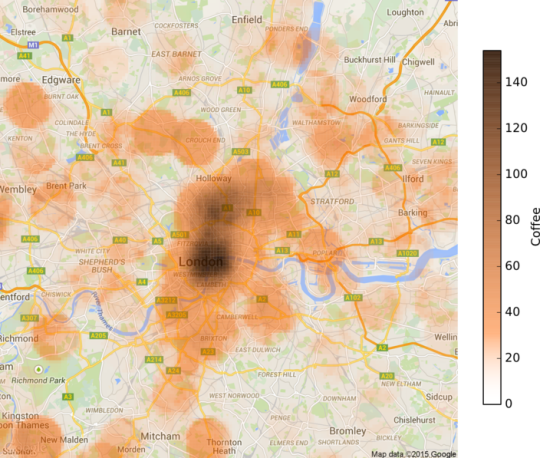
    That’s why I was intrigued when I stumbled upon this post by Sam Floy, where he looks at the concentration of coffee shops and friend chicken shops across London in order to determine which neighborhoods are in fact “up and coming.”

    To give you a taste, here’s his coffee shop map:

    His thinking was that if a neighborhood had a high density of coffee shops, a low density of fried chicken shops, and relatively low house prices, then it could probably be thought of as up and coming. 

    Coffee shops are often considered to be leading indicators of urban change (i.e. gentrification), and, well, friend chicken places I guess speak to a different kind of neighborhood.

    These sorts of playful studies aren’t going to tell you exactly which numbers you should be plugging into your development pro forma. But I think unconventional analyses can sometimes tell you a bit more of the story behind the numbers.

  • Global home prices at the end of 2015

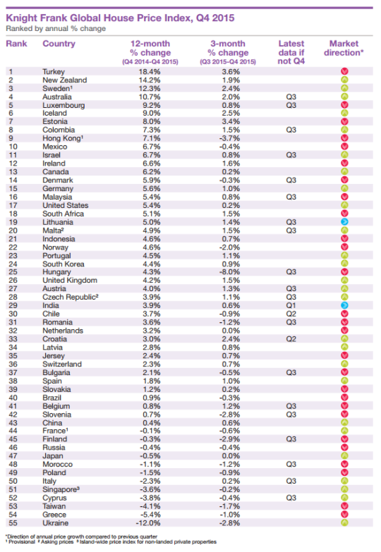
    Seeing how we’ve started looking at data from last year, I thought it would be interesting to look at global home prices as of Q4 2015. Here’s a chart from Knight Frank, which they refer to as their Global House Price Index:

    At the top of the list is Turkey, with an 18.4% increase from Q4 2014 to Q4 2015. (Supposedly this is because it has recently become easier for foreigners to buy property in the country.) Canada is 13th with a 6.2% increase (during this same time period) and the United States is 17th at 5.4%.

    This is obviously a high level analysis. There are lots of regional and local variations within each country. For instance in Canada right now, Calgary is a very different place than, say, Vancouver or Toronto.

    Nonetheless, it’s still valuable to see the relative performance of each country and see what their (Knight Frank’s) prediction is for 2016:

    “Our outlook for 2016 is muted. We expect the index’s overall rate of growth to be weaker in 2016 than 2015. The global economy is experiencing a potentially dangerous cocktail of low oil prices, a strong [US] dollar and a continued slowdown in China.”

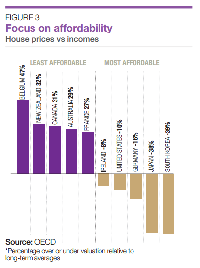
    It’s also interesting to see how the countries rank in terms of affordability:

    Once again, Canada ranks as being one of the least affordable countries in terms of home prices.

  • Urban, suburban, and rural home prices in the U.S.

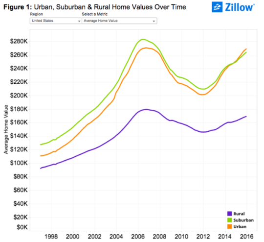
    Zillow.com recently published some research where they looked at U.S. home prices broken down according to location: urban, suburban, and rural.

    Here’s what they found:

    image

    As you can see, urban homes across the U.S. largely trailed their suburban counterparts in terms of absolute value up until the end of 2014. At that point, urban homes then surpassed suburban homes for the first time in the last two decades. (I wonder if this is a first or there was another crossover point before the late 1990s.)

    But if you dig a little deeper and look at both the rate of appreciation and prices per square foot (as opposed to just absolute value), urban home prices appear even stronger. 

    Here’s a snippet from Zillow’s post:

    “Over the past five years (2010-2015), average urban home values have grown 28.4 percent, compared to 21.1 percent for suburban home values. In the past year alone, U.S. urban home values grew 7.5 percent, compared to 5.9 percent for suburban homes.

    On a per-square-foot-basis, homes in urban areas nationwide used to be worth roughly the same as suburban homes, before a gap started emerging in the late 1990s which has become progressively wider over the past roughly two decades. Currently the gap stands at 24.5 percent, with suburban homes valued at $156 per-square-foot and average U.S. urban homes worth $198 per-square-foot.”

    And here is that same chart showing per square foot prices:

    Everyone who reads this blog knows that there is a growing interest in urban centers. But if you look at the above charts for specific cities, there are still many cases where urban home prices are well below suburban ones. 

    To me, that serves as a reminder of the spikiness of this urban transformation, but also that it is likely still in its infancy. As recent as 20 years ago, Toronto largely didn’t believe that people would want to live downtown in modern apartments. Today we take that for granted.

    So even with all of the gushing about urban centers, I still think we are only just getting started when it comes to creating the great urban neighborhoods of the future.