Daily insights for city builders, delivered every morning at 6 AM ET. I’m Brandon Donnelly — a Toronto-based real estate developer and founder of Globizen. I’ve been writing here since 2013.
IKEA opened its first permanent showroom in 1953. And by 1965, it had opened a 500,000 sf flagship store on the outskirts of Stockholm.
Supposedly, the inspiration for this new store was Frank Lloyd Wright’s Guggenheim Museum in New York. Inspired by its continuous looping design, IKEA wanted to create a real-life version of its well-known catalog. This led to the current maze-like design where you wander through staged living spaces and get excited to buy lots of things.
However, as IKEA began to open in more urban locations it actually started doing away with this prototypical design. The thinking, which seems perfectly reasonable, was that mazes weren’t appropriate for smaller and more urban locations. These customers would want to pop in, quickly get what they need, and then leave.
But it turns out they were wrong. Their customers are telling them the opposite: they still want mazes. In other words, they want a curated experience that helps them figure out what to buy. According to IKEA: “People buy more when they are shown more.” Sounds right. And so IKEA is now working to make its urban stores more, you know, maze-like.
The company has already done this in cities like Vienna and Paris, and apparently it consistently leads to higher sales. It’s a good reminder that (1) humans are still humans regardless of where they live and (2) if you want people to visit and linger in your physical store, it’s good practice to curate experiences.
In 1932, Frank Lloyd Wright — the architect who hated tall people — published a book called The Disappearing City. And in this book, he proposed a city planning concept known as the Broadacre City. Wright would go on to spend the rest of his career trying to both promote and perfect this concept, but the salient point is that it was fundamentally anti-urban:
Imagine spacious landscaped highways …giant roads, themselves great architecture, pass public service stations, no longer eyesores, expanded to include all kinds of service and comfort. They unite and separate — separate and unite the series of diversified units, the farm units, the factory units, the roadside markets, the garden schools, the dwelling places (each on its acre of individually adorned and cultivated ground), the places for pleasure and leisure. All of these units so arranged and so integrated that each citizen of the future will have all forms of production, distribution, self improvement, enjoyment, within a radius of a hundred and fifty miles of his home now easily and speedily available by means of his car or plane. This integral whole composes the great city that I see embracing all of this country—the Broadacre City of tomorrow.
It’s important to remember that this was first proposed before the arrival of today’s suburbs. So this was Wright’s response to the squalors of urban life at that time. Many have called the Broadacre City a precursor to the modern suburb and, in many ways, that makes sense. Integral to his plan was, “the man seated in his automobile driving on highways.”
But others see the plan as something totally different. It was about low-density and self-sufficient communities that could sprout up along highways, and not necessarily rely on some sort of decaying urban core. It was thought of as a place for Americans to return to the land.
Whatever your opinion, you’ll be happy to know that Kith has just collaborated with New Balance and the Frank Lloyd Wright Foundation on a trainer that commemorates this utopian vision. It is called the New Balance Made in USA 998 – Broadacre City, and naturally it comes in a variety of colorful earthy tones.
So if you’re looking to celebrate the ethos of Wright and eschew the modern and walkable city, these are, I would think, the shoes for you. Apparently they’re available online, or at Kith Tokyo, which is maybe intended to be ironic? Let’s sell this Broadacre shoe from the largest urban center in the world.
I have been in a few of Frank Lloyd Wright’s houses and in every case it turned out like this:
The Prairie School (of architecture), for which Wright was a pioneer, was all about horizontality. That typically meant flat roofs, deep overhangs and, in the case of Wright’s work, exceptionally low ceiling heights.
I’m about 6’3”. Many of his clear heights were less than 7’ and I believe his doorways were often 6’2”. This clearly doesn’t work for me, but it mattered for what Wright was trying to do. And I don’t think he was the type to worry about small matters like the comfort of tall people.
The above photos were taken at Taliesin West in Scottsdale, Arizona. Wright bought the land (495 acres) in 1937, and turned it into both his winter home and a teaching studio.
Apparently Wright paid $3.50 per acre at the time, which feels like a pretty good deal to me. It shows you the power of just buying and holding things over long periods of time.
Today, Taliesin West is the home base of Wright’s foundation and also a UNESCO World Heritage Site. I’m glad I was able to finally visit it after reading about it for so many years in architecture school.
One of my colleagues likes to remind me that in an open concept floor plan, which is obviously pretty common these days, it is the RCP, or reflected ceiling plan, that really defines a space. (For those of you who might be unfamiliar, an RCP is a plan drawing that shows you what the ceiling of a space looks like.) What he means by this is that it is things like dropped ceilings and bulkheads that really define a space. And when you’re designing a multi-unit building, you are going to have these things to contend with and coordinate (though you can also run exposed ductwork, which eliminates the need for some bulkheads/drops).
I like this reminder for two reasons.
One, he’s right. Ceilings matter. Frank Lloyd Wright, for example, is well known for playing around with them in his projects. He would take you through compressed spaces with lower ceiling heights and then “release” you into grand open spaces. The contrast made it all feel even more dramatic. (But I reckon Mr. Wright was pretty short because I swear I’ve been in some of his houses and the ceilings were in the range of 6′-6″.) And two, I want us to focus on this level of detail in our projects. They can be a pain in the ass to coordinate and you can’t always get them exactly how you want them, but we are paying attention.
Today most condos and apartments are designed with open concept (or open plan) floor plans. This generally means that the kitchen and main living areas are combined into one continuous and fluid space.
Part of this has to do with creating a sense of openness and part of this has to do with simply maximizing small spaces. When you consolidate spaces, you get to take advantage of occupancy overlaps.
But this isn’t a new concept. The roots of the open plan go all the way back to the turn of the 20th century with Frank Lloyd Wright’s emerging “Prairie School” of architecture.
Ian Bogost’s recent piece in the Atlantic called, “The Curse of an Open Floor Plan”, does a good job of explaining this history. He credits Wright with popularizing the open plan.
Here is an excerpt:
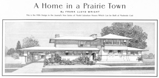
In the February 1901 issue of Ladies Home Journal, on a single page between a portrayal on the “Life of an English Girl” and a feature asking, “Is the Newspaper Office the Place for a Girl?,” the then-obscure American architect Frank Lloyd Wright published plans for a home “in a prairie town.” It might seem like a strange host for architectural plans, but Ladies Home Journal frequently featured them, amid Rubifoam toothpaste ads, tips on what to do with cheese, serialized romance novels, and journalistic muckraking. It makes sense: Architecture is the foundation of home life, a matter largely relegated to women then—and still today, like it or not.
Many of the characteristic features of Wright’s “Prairie” style, as others would come to call it, are already visible in the 1901 design: a low-pitched roof, wide eaves, horizontal orientation, and a strong connection to the surrounding landscape. Inside, another feature is present, in nascent form: an early open floor plan, combining multiple rooms together into a continuous space.
Of course, at the time, the open plan was about much more than raw practicality and economic necessity. It wasn’t just about maximizing space and affordability. Here is another snippet:
For Wright, Neutra, Harris, and others, open design represented the promise of a new social ideal, one where fluid spaces would allow egalitarian integration. That aspiration continues, in a way, but the ideal is less communal and more individual: Open plan is where everyone does their own thing, but all together.
For Bogost’s full piece, which is worth a read, click here.
Image: University of Michigan Library via The Atlantic
There has always been a strong relationship between architecture and film. Next to actually being there, video is one of the best ways to experience architecture.
And that’s because space is not static. A big part of how we experience space has to do with what it feels like as you move through it.
For example, American architect Frank Lloyd Wright was notorious for his sprawling horizontal houses and low ceiling heights. In his Fallingwater House (which is stunning), I swear that my head was rubbing on the ceiling in certain rooms (I’m 6’3").
But he did this to purposefully create a feeling of compression. Because then as you exited the room (in this case to go outside onto a terrace) the feeling of openness and expansion is all that more powerful. The contrast creates awareness.
I’m flying out to Chicago this morning, and so I don’t have a lot of time to write. But I am taking my iPad with me and I plan to continue writing every day that I’m there. As some of you might remember, I’ve never been to Chicago before. This will be my first time. So I’m expecting lots of writing inspiration.
That said, I’m going for a bachelor party and so I may not get the chance to geek out about the city as much as I normally would. There certainly won’t be any any Frank Lloyd Wright pilgrimages taking place. However, I have convinced the group that the architecture boat cruise will be a great way to see the city and a nice way to start off the day following a late night.
If you’re from Chicago (or just know the city well) and have some must-see recommendations, I’d love to hear from you in the comment section below. I’m excited to visit Chicago because it’s another Great Lakes city and I’m told it’s somewhat similar to Toronto. It’ll be interesting to see how they compare and differ.
As an architecture and city lover, it’ll probably surprise you that I’ve never been to Chicago. I think it may have to do with the fact that it has always felt like a sister to Toronto–another Great Lakes city of comparable size. And when you travel, you often want something novel.
But that’s no excuse.
Thankfully I’m happy to report that last week I booked a trip to Chicago for this August. I’ll be there for an extended long weekend. But since it’s for a bachelor party, it remains to be seen how much archi-touring I’ll actually get a chance to do.
When most people think of skyscrapers they think of New York. But in actuality, if there’s one city that gave birth to the modern skyscraper I would argue that it was Chicago. And it was made possible by the steel industry.
Before the late 19th century, tall buildings were largely built with their exterior walls supporting most of the loads. This meant that the taller you went, the thicker the walls had to be near the bottom of the building. This is why older buildings often feel so heavy and permanent.
But when structural steel became widely available, a new building form was created. All of a sudden architects and builders could create relatively light weight structural steel frames to support the building. The skin, or outside of the building, was no longer carrying the weight.
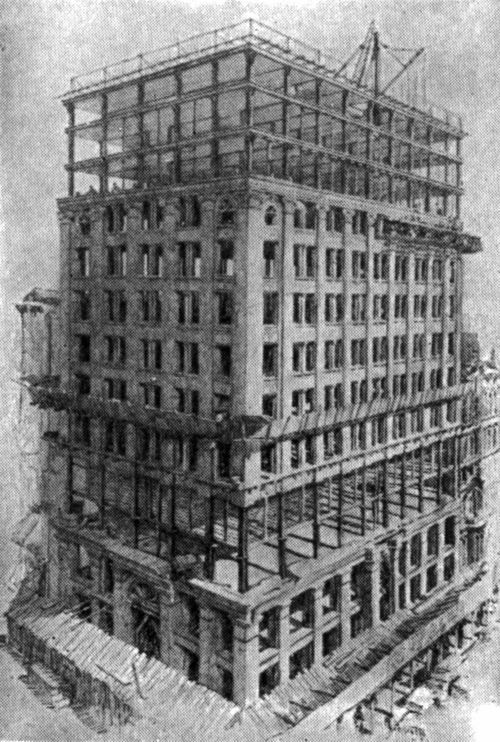
That made images like this possible:
For most of us today, this building under construction looks fairly typical. First the structure goes up and then it gets clad with its window and exterior skin. But at the time, this sort of construction technique–with the 3rd and 4th floors still unenclosed and the upper floors finished–would have blown people’s minds. It was an entirely new way of building.
Steel framed buildings removed the technical limitations of building tall and also opened up entirely new possibilities for architectural expression–such as the all glass building. Today, there’s a lot of criticism around our glass buildings. But it’s interesting to note that it started as the futuristic dream of architects.
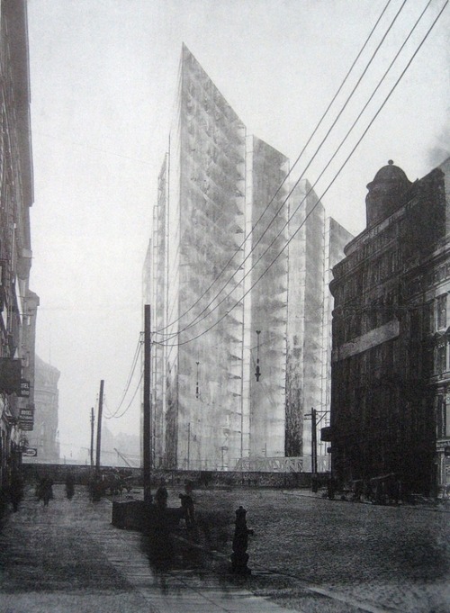
Freed from the technical limitations of load-bearing exterior walls, architects such as Mies van der Rohe began dreaming of transparent, all glass buildings. For them it represented modernity. It was the future. Above is an early charcoal sketch of that dream by Mies.
But our fixation with glass and transparency has never been because of environmental efficiency. It was about light, transparency and feelings of modernity. So as sustainability becomes increasingly critical, we should remember that there’s still lots of innovating left for us to do.
Art and architecture has always been a representation of the time and era in which it was created–which is one of the reasons I’m so interested in technology today. It’s our era. It’s our “structural steel”. And it’s going to impact our cities.
When posterity looks back on us and what we’ve done, I’m sure that will be clear.