Daily insights for city builders, delivered every morning at 6 AM ET. I’m Brandon Donnelly — a Toronto-based real estate developer and founder of Globizen. I’ve been writing here since 2013.

Tag: design

  • Laneway garage conversion in Toronto

    This isn’t a laneway suite per se, but Office Ou here in Toronto recently completed this garage conversion. The idea was to take a typical rear laneway garage and turn it into something that could better house a wide range of uses.

    As Toronto reconsiders its laneways and as fewer people own cars (a separate topic to be debated), we are likely to see many of these spaces rethought. In this case, the result is a true extension of the existing home. You probably want to have a nice looking car — a Porsche would do — if you’re going to continue to use it for that purpose.

    I’m drawn to spaces like this because I start imagining all of the different use cases: a dining room, an office, a studio for photoshoots, a place for Pecha Kuchas, and so on. In big and expensive cities it can be rare to have that bit of extra space that allows you to tinker and experiment. And I am a big fan of tinkering.

    Office Ou was founded by Nicolas Koff, Uros Novakovic, and Sebastian Bartnicki. Nicolas and I went to architecture school together both here in Toronto and in Philadelphia. Congratulations on completing a beautiful project.

    Photo: Adrian Ozimek

  • Form follows what?

    Late 19th century and early 20th century architecture and industrial design is known for the axiom, “form follows function.” I think of the German Bauhaus School when I hear this, but supposedly it can be attributed to American architect Louis Sullivan. Either way, it was meant to represent a functionalist approach to architecture and design, which was, as is often the case, a reaction to what had come before it.

    It was Modernist architects eschewing decorative elements or what was referred to at the time as “ornament.” If it didn’t serve a functional purpose, it was to be removed. Nothing was to be superfluous. And similarly, if the function of something didn’t change, there was no need to change its form.

    Of course, if it was truly all about function, one could argue that there should have been a great deal of variation in the resulting forms. But instead, the designs that emerged out of schools, such as the Bauhaus, are some of the most recognizable in the world. That is true even to this day.

    Which is why I think this is a great line from Witold Rybczynski (taken from a recent post about the book iBauhaus): “It is also a quintessentially Bauhaus example of form follows predetermined aesthetics rather than form follows function.” Ouch. The difference here is that Witold obviously isn’t a fan of the Bauhaus or of Modernism, whereas this period of time is what inspired me the most as a student of architecture.

    Photo by Marina Reich on Unsplash

  • Stairway House, Tokyo

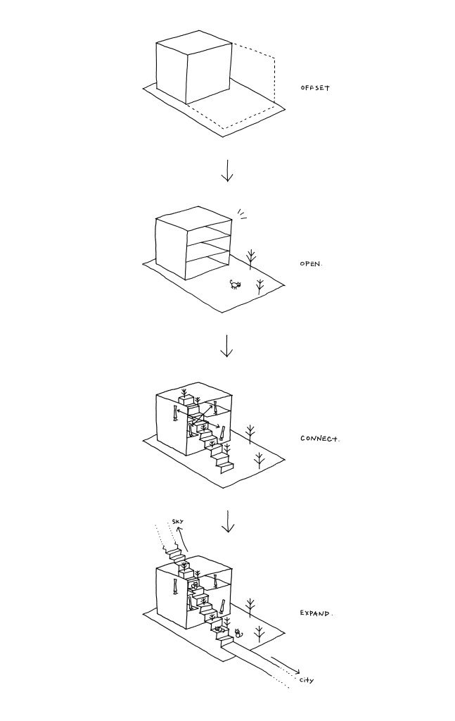
    These sketches tell you everything you need to know about the recently completed Stairway House by Nendo Studio.

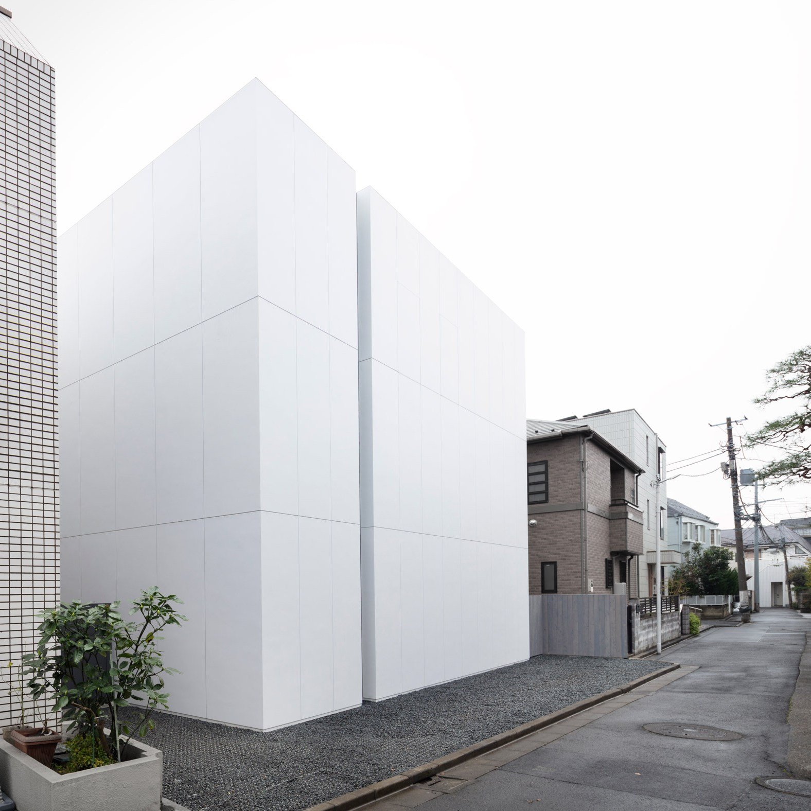
    The house is setback from its south property line as a result of the surrounding context. A south-facing green space is then introduced, preserving one of the existing trees.

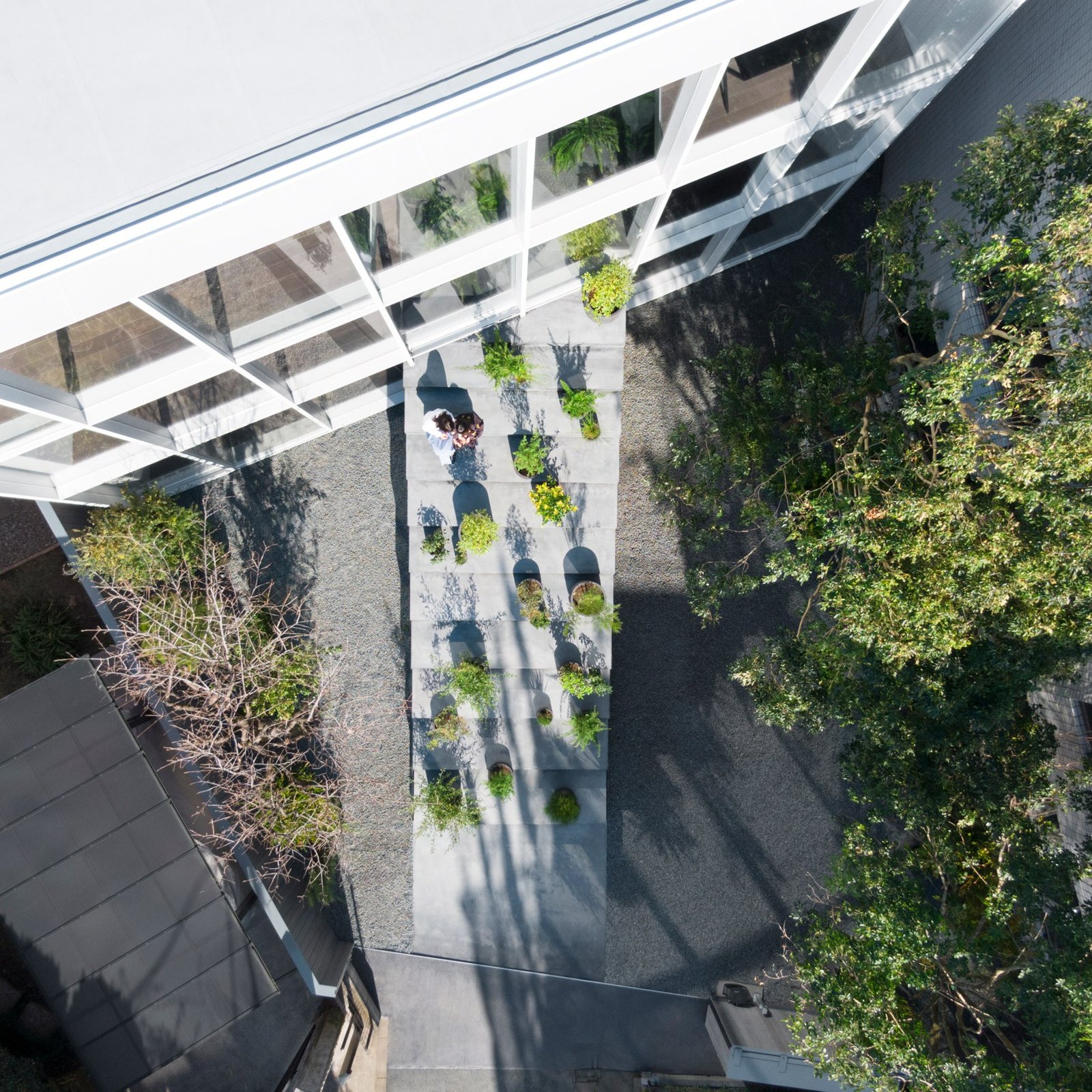
    Given that the house serves as a multi-generational household, a central “staircase” is introduced that visually connects all three floors of the house and serves to mitigate any sort of feelings of social isolation across the families.

    (The staircase-like structure is only partially functional.)

    Finally, the staircase is then expanded outward to connect with the broader city. As you can see from the context plan below, the staircase is on axis with a neighboring city street.

    Here’s how it all turned out:

    Photos and sketches via Nendo Studio

  • Parco de Principi, Sorrento

    Italian architect Gio Ponti is one of the most important architects and designers of the 20 century. An early adopter of modernism, he is credited with helping to renew Italian design after the Second World War through his design work, his writing, and his teaching.

    As many of us dream of one day traveling again (I am currently devising an elaborate list of adventures), I thought I would share one of his projects — the Parco de Principi Hotel in Sorrento, Italy.

    When it was completed in 1962, it represented a new kind of architecture for the town. Sorrento was ancient. The Parco de Principi was not. Ornament had been removed and its rooms consisted of largely two colors: white and blue.

    Here is a photo by Rich Stapleton:

    In some ways this feels like a dreadfully obvious approach. Let’s celebrate and frame views of the Bay of Naples, and introduce the color blue while doing that. But the results are clearly anything but dreadful.

    Ponti was more than just an architect, he was more broadly a designer. His furniture and industrial designs are also widely celebrated. And this attention to detail at multiple scales can make all the difference in the world.

    For more photos of Parco dei Principi, click here.

  • Brick vault house

    This house was designed by the Spanish firm, Space Popular. It was completed last year in Santa Barbara, Spain. Two things, in particular, make it unique: (1) Its exposed steel structure (12×12 grid) and (2) its brick vaults. But both of these things really serve one idea. They express the building’s structure. And that’s about all you need for good architecture — one clear idea. All photography by Mariela Apollonio.

  • Two-up, two-down

    Feargus O’Sullivan is doing a series in CityLab right now on the “home designs” that define four European cities: London, Berlin, Amsterdam, and Paris. The first one is on London’s classic “two-up, two-down” design, which refers to a two storey home with a living room and kitchen on the ground floor and two bedrooms on the second. It’s a simple design, but one that has supposedly endured.

    O’Sullivan argues that for many, or perhaps most in Britain, this is what a “home” feels like. It’s grade-related and there are two floors. Indeed, only 14% of British people live in an apartment, compared to 57% in Germany (a majority). This percentage is much higher in London, with about 43% of people living in an apartment. But about 25% of the population still lives in some sort of attached house.

    Home equals house. And for us North Americans, this is of course relatable. But the Germany example is a reminder that this is not necessarily universal. Attitudes toward housing are cultural. And cultures can and do change. I am seeing that happen right now in Toronto. Some of us are becoming less like the British and more like the Germans.

  • Superkül wins Designer of the Year for 2020

    Designlines Magazine is out with its annual “Designer of the Year” issue and this year’s winner for best overall designer is Superkül — the award-winning architecture firm behind Junction House. Pictured above are Andrea D’Elia, Meg Graham and the team. (The JH project team spends a lot of time in the boardroom that you see in this picture.)

    Other winners for this year include Omar Gandhi, Paolo Ferrari, and LGA Architectural Partners. They were awarded best restaurant, best product, and best public space, respectively. If you aren’t familiar with the work of these four firms, I would encourage you to check them all out. They are truly some of the best in the city. Congrats everyone.

    If you’d like to buy a copy of Designlines, you can do that here. We will also make copies available at our temporary Junction House showroom, which is located at 2843 Dundas St W.

  • Glass curtains in Amsterdam

    For the same reasons that I liked the Interlock in London, I am a big fan of this storefront in Amsterdam by UNStudio. It is contextual, but it also something entirely new. To me, it resembles a triptych of curtains being pulled to the side, which is probably a fitting metaphor for a high fashion street. The developer is Warenar and it looks like the space is still available. So if you’re in the market for a retail storefront on Amsterdam’s PC Hooftstraat, here you are.

    Photos by Evabloem

  • Architectural ambition

    Alex Bozikovic’s review of the book Canadian Modern Architecture: 1967 to the Present raises something potentially troubling. Here’s what I’m talking about:

    It is by turns an exhilarating and depressing narrative: Canada, in this book, appears as a country that announced itself on the world stage in the 1960s and 1970s with incredible ambition but, since then, has retreated toward the mean.

    It is potentially troubling not only because I believe in the value of good design, but because I believe that architecture embodies the ethos and cultural context in which it was created.

    And so if you believe that our architectural ambitions have retreated toward mediocrity, you might also surmise that our overall level of ambition has retreated toward the same.

    That should be viewed as a serious problem.

  • Rethinking Brutalism (in London)

    The Standard recently opened up its first international outpost in London. It’s a 266-room hotel housed in a 1974 Brutalist office building overlooking King’s Cross. London-based Orms (architect) was the lead consultant and they did an incredible job both preserving and modernizing the existing building.

    All of the existing windows were replaced, but otherwise the Brutalist exterior remains more or less intact.

    A tasteful 3 storey addition was placed on top of it, which required threading new steel columns through the existing waffle slabs. There’s a 1st floor transfer slab with concrete columns below it in order to pickup these new loads.

    A dedicated (and red) exterior shuttle elevator was also added to the north elevation of the building. This takes people up to the rooftop, which is a signature feature of all Standard Hotels.

    Brutalist architecture is experiencing a bit of renaissance right now. We are seeing people lament the demise of our concrete blocks from the 60s and 70s. Perhaps it’s because it’s a style/movement that is finally old enough for people to appreciate it. That’s often how these things work.

    The Standard in London is a perfect example of how this history might be both respected and repositioned.

    Images via Orms