Daily insights for city builders, delivered every morning at 6 AM ET. I’m Brandon Donnelly — a Toronto-based real estate developer and founder of Globizen. I’ve been writing here since 2013.

Tag: design

  • Mr. Robinson — Architect as Developer

    I first learned about the work of Jonathan Segal back when I was in architecture school. And he was somebody I immediately admired. 

    At the time, I was struggling to figure out where I wanted to position myself between architecture and real estate development, and he was somebody who had seemingly figured it all out: he simply merged the two.

    For those of you who are unfamiliar with Jonathan Segal, he has made a name for himself by being a pioneer of the “Architect as Developer” business model. That is, he acts as both the architect and the developer/client.

    This business model isn’t going to suit everyone, but I suspect that we’ll see more of it in the future.

    Of course, it doesn’t just have to be an architect acting as a developer. It could also be an architect and a developer joining forces or some other permutation. Whatever the case may be, design and innovation are central to business today and that’s why I think this model will only become more relevant.

    Below is a short 3 ½ minute video about Segal’s latest project, called Mr. Robinson. It is located in San Diego. If you can’t see the video below, click here.

    [vimeo 155403927 w=500 h=211]

    If you’d like to see the typical floor plans or rent one of the apartments (they start at $2,400/month), click here.

    Now I’d be curious to hear your thoughts. Do you like the project?
  • Hot to cold

    Architect Bjarke Ingels will be in Toronto next week to talk about how architecture can create communities and about a new project that he is working on with developers Westbank and Allied REIT here in the city.

    The last time I heard Bjarke speak was when I was in undergrad and he had recently started a firm called PLOT with Julien De Smedt. That was over 10 years ago. So I am looking forward to this talk. If you’re also going to be attending, tweet me and let’s try and connect at the event.

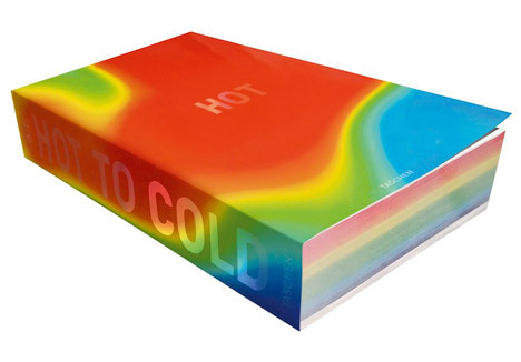
    In anticipation of that, I thought I would share a book that his firm published about a year ago called, BIG, HOT TO COLD: An Odyssey of Architectural Adaptation

    What’s interesting about the book is that all of the projects are organized according to climatic location – literally hot to cold. That’s why the pages themselves start as red and end up in dark blue.

    It’s a direct response to the fact that modern architecture and modern building systems largely did away with regional and climatic variations. Buildings were designed, no matter their location, to look exactly the same. 

    To a certain extent, globalization makes this somewhat inevitable. But climate is climate. And I believe that architecture is stronger when it responds to local context.

    If you were in Toronto this past weekend – perhaps for the NBA All Star Game – you’re probably well aware that Toronto sometimes gets cold. So it will be interesting to see what kind of strategies they employ for their upcoming project.

    If you want to hear Bjarke talk about this book and some of their projects, check out this video from the Architectural Association in London.

  • AMYGDALA — An installation that converts social media sentiment into audiovisual art

    It’s becoming harder and harder to think of tech as a distinct silo. Tech is embedding itself into so many traditional industries that, one day, every company will probably be a software/technology company in some regards. 

    It’s for this reason that I often think and write about tech and its impacts on the built environment.

    An interesting example of this phenomenon is a recent art installation by fuse* called AMYGDALA. What it does is translate collective social media sentiment (specifically from Twitter) into an audiovisual art installation housed within an urban space.

    Here’s how they describe the project:

    “The news and thoughts of users spread across social networks in real time. And so an event with worldwide implications immediately involves millions of people sharing their own opinions and emotions: happiness, anger, sadness, disgust, amazement or fear. Thus, imagining Internet as a living organism, we might think that its emotional state may be given by the overall emotions shared by users at any given time. AMYGDALA listens to shared thoughts, interprets states of mind and translates the data gathered into an audiovisual installation capable of representing the collective emotional state of the net and its changes on the basis of events that take place around the world.”

    And here’s a video of it in action (click here if you can’t see it below):

    [vimeo 154049756 w=500 h=281]

    What I like about the project is how it takes something digital and ephemeral and then both aggregates and translates it into something physical within the urban environment. It’s a perfect visual representation of how technology and networks are – for better or for worse – seeping into our daily lives.

  • Pocket two bedroom

    I recently started reading the blog of Michael Mortensen. Michael is a real estate developer and urban planner based in the UK. And if you like my blog, I think you’ll also like his.

    Last week he published a post talking about a UK development company called Pocket and a recent design competition that they organized called “Pocket two bedroom.”

    Historically the firm has been focused on well-designed and compact one bedroom apartments (38 square meters) that they deliver at a minimum 20% discount relative to typical market rate housing in London.

    But over time, they found that they had to turn people away because they were looking for larger – yet still affordable – two bedroom apartments. So the firm decided to figure out how to scale their model to larger units.

    To do this, they went out and asked 19 architects to come up with ideas for a two bedroom Pocket apartment. They then published all of the ideas online.

    Firstly, I applaud them for making their competition results public. Most real estate companies wouldn’t do this.

    Secondly, it’s interesting to take note of the recurring design themes, as they have on page 24-25 of their competition book. 

    Some of the themes include “deep thresholds” that blur private and communal spaces; “thick walls” that allow for storage and servicing; flexible spaces and fewer dedicated spaces; and dual entry apartments.

    This last item was particularly interesting to me. It’s a simple idea – two separate doors leading into one apartment – but it can allow for a number of flexible sharing scenarios. I am already imagining somebody creating an Airbnb rental out of their second bedroom.

    Housing is certainly undergoing a transformation.

  • A truly modern ski and snowboard resort

    Today my friends and I spent the day at Snowbird.

    In terms of the skiing and snowboarding, it’s way up there for me alongside Jackson Hole.

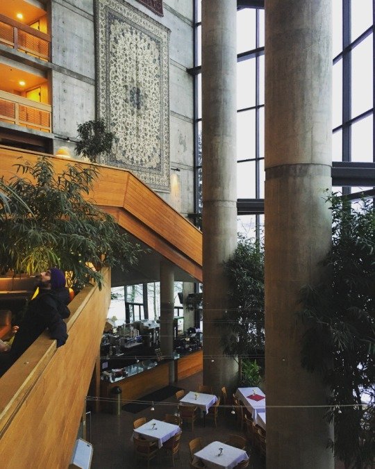
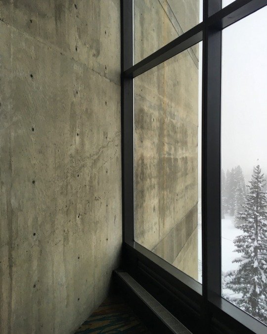
    But beyond the mountain, two things really stood out for me. Firstly, I really liked the overall brand and identity of the resort. Everything from the napkins in the cafeteria to the ski run signs were decidedly modern. Secondly, I loved the Brutalist architecture. And both of these elements combined to create what felt to me like a truly modern ski resort.

    Here are two photos that I took today:

    imageimage

    Developed in the mid-1960s by a man named Ted Johnson, the vision had always been to create a new kind of resort. In fact, Ted was insistent that they eschew the typical faux-alpine architecture that had come to characterize ski towns. 

    Here’s a brief summary of the parties involved and Ted’s design direction, via Salt Lake Modern:

    In 1965, the Snowbird Design Group was founded to create the first master plan. The original group was composed of Robert Bliss, Dean of the School of Architecture at the University of Utah, Jim Christopher, principal at Brixen & Christopher Architects, Dan Kiley, renowned landscape architect and site planning consultant based in Vermont, and architect Jack Smith. Johnson was adamant that the new resort not look “alpine lodgey” and based on the steep terrain and available land, the only choice for design would be to make it compact and dense. An aesthetic very unlike Alta, located just above Snowbird.

    For me, it’s the contrast between the rugged exposed concrete and the warm wood that I love. I left today thinking to myself that Snowbird is the most architecturally interesting ski resort I’ve ever visited.

    But as luck would have it and immediately after we left the resort, I discovered a community group called, “Save our Canyons.” And they don’t appear to be as smitten as I am with the Brutalist architecture. Here’s an excerpt from one of their articles talking about a new construction project at Snowbird:

    “Alas, more Snowbird droppings are fouling our Wasatch nest. Snowbird, already renowned for the hideous concrete bunkers at its base, has plopped another wad of architectural guano on top of Hidden Peak.”

    Of course, it is well known that Brutalist architecture isn’t often a crowd favorite. But when done well, it can be quite beautiful. Hopefully there are others who see what my friends and I saw today.

  • To connect rather than isolate

    When I was
    a kid growing up in the suburbs of Toronto, I never played in the backyard. I
    played in the streets. That’s where all the kids came together.

    We would
    play baseball in somebody’s driveway, using one of the garage door “squares” as
    the strike zone. We would play football on corner lots, where it was tackle on
    the grass and “two-hand touch” on the street. And we would wax our curbs so
    that we could skateboard them.

    None of these
    spaces were ever really intended for baseball, football, or skateboarding, but
    we kids repurposed them.

    As people,
    including families, continue to move into urban centers around the world, I
    have no doubt that the next generation of children will once again repurpose
    spaces for play. But that doesn’t mean that we don’t have work to do when it
    comes to properly preparing our communities for people of all shapes and sizes.

    One of the
    most interesting design challenges facing us today has to do with our towers.

    Architects
    have long been obsessed with the idea of vertical villages. Le Corbusier’s Unité
    d’habitation
    in Marseille had two shopping streets embedded within the tower
    that were intended to act as public spines. I don’t know how well they did, but
    it was a highly progressive idea for the time.

    Following
    on this idea, I was recently watching a
    TED talk with architect Ole Scheeren
    (thanks Mariane) and I was fascinated
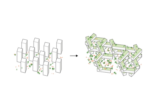
    by his obsession with breaking down the raw verticality of towers.

    His belief
    was that, yes, cities are and will continue to become more dense through tall
    buildings, but that most towers isolate rather than connect people. His work strives to do the opposite.

    And this
    one of the big trends that I think we will see more of in our cites. We will see
    new forms of urban connectedness and a blurring of private, public, and
    semi-public spaces. Screw Euclidean zoning.

    On that
    note, I am reminded that I owe the ATC community a post on my predictions for
    2016. I hope to get that out shortly.

    Diagram via Büro Ole Scheeren

  • Urban infill case study: 1234 Howard Street in San Francisco

    Urban infill developments can be tough. The sites are often small and/or narrow and that creates a lot of design challenges. Access to light is a common problem.

    But constraints can also be beautiful, because they have a way of forcing creativity. 

    When I was in architecture school, I used to find it easier to work when I was given constraints and challenges. It gave me something to latch onto, as opposed to just starting with a blank canvas. A big part of design, at least for me, is about solving problems. So give me a problem to solve!

    One of the ways that architects and designers often deal with the access to light problem is by carving out lightwells or courtyards to bring light down into the building. This can be used when you have a deep site or when you’re building right up against the property line and you can’t have any windows.

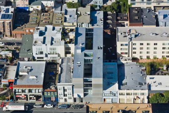
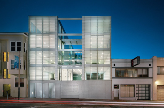
    One project that I’ve always liked for this reason – as well as the fact that it’s beautifully designed – is 1234 Howard Street in San Francisco. It looks like this from above:

    image

    The site is 50′ x 165′ and it spans an entire block. 

    In order to get lots of light into all of the units, the architects (Stanley Saitowitz | Natoma Architects) split the site up into 3 “bars”, each of which would be somewhere around 16′ x 165′. The middle “bar” was then dedicated to a courtyard that cuts through the entire building.

    image

    The two flanking bars were then further subdivided into 2 units per bar, which translates into 4 units per floor x 4 floors. The ground floor is just common areas and parking.

    The advantage of this design strategy is that the apartments now have windows running the length of the courtyard, where as typically on narrow deep lots you would end up with “bowling alley” units and windows just on one end.

    The disadvantage of this design strategy is that you’re now just over 16′ away from seeing what your neighbor is eating for dinner, among other things. 

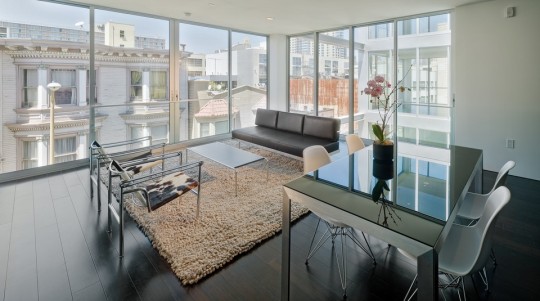
    But with the right window coverings, I’m sure we’d all survive in these apartments with their Bulthaup kitchens and Miele appliances.

    image

    I love seeing creative solutions to tight urban sites. And one of the things that I worry about, with things like the Mid-Rise Performance Standards here in Toronto, is that we’re reducing or even eliminating the possibility for these kinds of creative solutions.

    I recognize that 1234 Howard is not the same as an avenue mid-rise site in Toronto with low-rise residential behind it. But the thought still crossed my mind as I was writing this piece.

    All photos via Stanley Saitowitz | Natoma Architects Inc.

  • Our urban history in 50 buildings

    At the time of writing this post, it’s still 2015 – at least here in Toronto. But by the time you (subscribers) get this post in your inbox, it will be 2016. So happy new year! I am thrilled about getting this year started and I hope you feel the same way.

    To kick things off, I thought I would share a great interactive post from Guardian Cities called, A history of cities in 50 buildings. It’s a look at our urban history through 50 important and pivotal buildings. Buildings such as Southdale Center, which was the first fully enclosed, climate-controlled shopping mall, and Chicago’s Home Insurance Building, which was a building that really set the stage for the modern skyscraper that we know today.

    Not all of these buildings have left a positive legacy on our cities. I am sure that some of you would argue that the creation of the suburban shopping mall, with its corresponding “sea of parking”, was not a step forward for cities, but a step backwards. The architect behind Southdale Center, Victor Gruen, has even gone on record saying that he refuses “to pay alimony for those bastard developments.” He hated the shopping mall.

    But like them or not, these buildings are part of our urban history, and I think it’s not only interesting but important to understand their impacts. If you want to see which important buildings were missed, at least according to Guardian readers, click here. I have to say that I was happy to see both Montréal and Toronto represented in the original list, as well as a few other buildings that I’ve written about here.

    On that note, happy new year to you all, again, and many thanks for reading Architect This City. If you have any suggestions for content you would like to see on this blog in 2016, please leave it in the comment section below. This may be my personal blog, but my goal is to make it valuable for all of you. Hopefully I achieve that sometimes.

  • More than just a coffee shop

    image

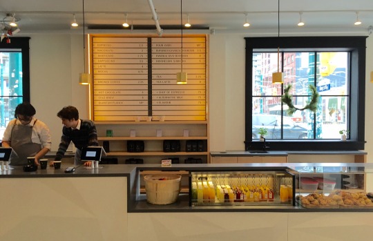
    Today’s blog post is coming to you live from Quantum Coffee at the corner of King and Spadina in Toronto.

    I’m sitting by the window (where I keep running into friends) in a beautiful space that used to be an ugly youth hostel. Nice work Reflect Architecture and MAAST

    It’s my first time at Quantum, but I am so intrigued by all that is happening here that I feel compelled to share.

    So Quantum is a coffee shop. The americano I had this morning was quite good. I hope to have another one sometime in the future. But there’s more to this story. 

    Quantum is actually just one leg of something bigger. Attached to it – literally upstairs – is something called BrainStation. And across the street from it is something called The Konrad Group.

    The Konrad Group is a digital agency that does everything from brand strategy to mobile development. BrainStation teaches those same skills to other people via in-person courses in this recently renewed heritage space. And Quantum is the stimulant that helps fuel it all.

    The connective tissue between these 3 businesses, which are all basically owned by the same poeple, is something that I find super fascinating.

    It also feels like the intersection of design, technology, and space (real estate). And as many of you know, that’s what I’m all about.

  • For the love of Brutalism

    Brutalism is an architectural movement that most people, other than architecture nerds, hate. Derived from the French words for raw concrete – béton brut – Brutalist architecture is characterized by its use of exposed concrete and its imposing fortress-like qualities.

    Most people find it too cold, sterile, and impersonal. But this 99% Invisible episode perfectly sums of where I think we sit with this era of building:

    “Back in the 1960s, Victorian style buildings were considered hideous and impossible to repair. We were tearing batches of Victorians down to erect big concrete buildings. But some Victorians were saved—and today, some of them are considered treasures.

    Concrete architecture now finds itself at an inflection point: too outdated to be modern, too young to be classic. And a small, but growing band of architects, architecture enthusiasts, and preservationists, would like us to just wait a bit and see.

    Maybe, with a little time, we’ll come around to love these hulking concrete brutes.”

    Concrete can be a wonderful building material all on its own. I mean, just look at the work of Tadao Ando

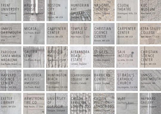
    But all concrete is not created equal. Here is a taxonomy of concrete textures that was also part of that same 99% Invisible episode:

    image

    I say all this because if we believe that Brutalist architecture has no value then we are likely to believe that it doesn’t need to be preserved. And that may very well be the case for some Brutalist architecture. But if history is any indication, some or much of it may also be considered beautiful one day.

    Most cities have a rich history of demolishing (or almost demolishing) buildings and neighborhoods that today we would (or do) treasure. Which tells me that we’re not always very good at figuring out what has value or will have value in the future.

    So maybe some of those brutes are worth a second look.