Daily insights for city builders, delivered every morning at 6 AM ET. I’m Brandon Donnelly — a Toronto-based real estate developer and founder of Globizen. I’ve been writing here since 2013.

Tag: design

  • Unzipped wall on King Street West

    image

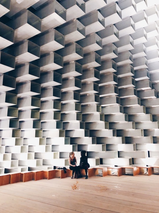
    Last night I checked out the Unzipped Toronto exhibition, which is the relocated Serpentine Pavilion (pictured above) that was designed by Bjarke Ingels Group in 2016. 

    It was initially housed in Hyde Park London, but it’s now on King Street West Toronto. Westbank purchased the “unzipped wall” after it was installed in London and supposedly it will eventually find a permanent home in Vancouver.

    The official opening of Unzipped Toronto is September 15th, 2018. It will be free and open to the public. If you’d like to get a complimentary ticket, you can do that here

    The timing of all this lines up with condo sales for Bjarke Ingels’ first project in Toronto. I believe that will be starting this fall. And I am sure they will end up setting some new records for the King West submarket.

  • Friluftsliv (or open air living)

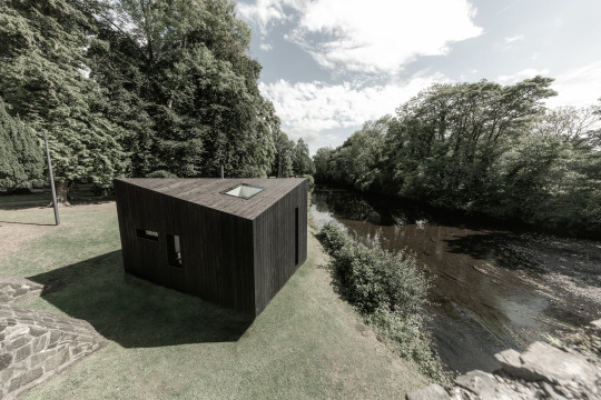
    Johnathon Little (husband) and Zoe Little (wife) recently launched a new housing concept out of the UK called Koto, which is supposedly Finnish for “cozy at home.” 

    (Before Koto, Johnathon worked for Snohetta in Oslo.)

    The goal of the company is to create beautiful, small, and prefabricated houses and cabins that allow people to connect with nature. 

    It is inspired by the Nordic concept Friluftsliv. The literal translation is “open air living” but, more specifically, it is about the benefits of nature on our mental and personal wellbeing.

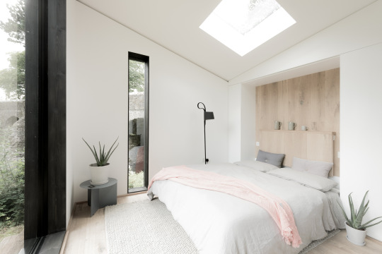
    Their small cabin has a footprint of 15 square meters and their large cabin has a footprint of 40 square meters. Base prices run from about £33,500 to £63,500. A bathroom is optional.

    The most obvious use case for me is that of a bunkie. For more on Koto, check out their website and Instagram.

    Photos: Koto

  • Photoblog: Aga Khan Museum

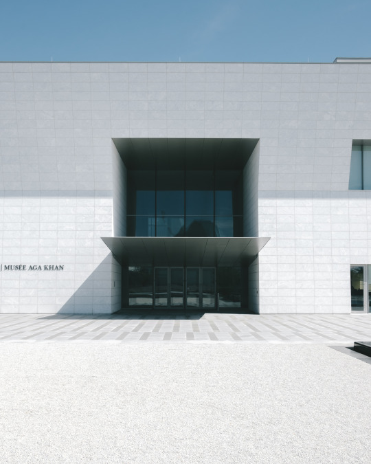
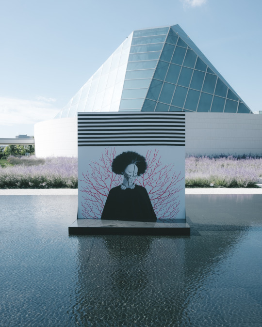
    Today we visited the Aga Khan Museum here in Toronto, which is a museum dedicated to the arts of Islamic civilizations. I had been outside the building before but this was my first time inside and my first time seeing some of the collections.

    Here is the main entrance:

    image

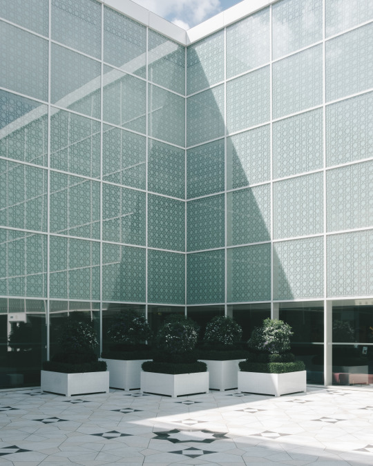
    Here is a photo looking the opposite way over one of the reflection ponds:

    image

    The museum was designed by Japanese architect Fumihiko Maki and was completed in 2014. 

    The site area is approximately 70,000 square meters and the building itself is approximately 11,600 square meters. Maki won the Pritzker Prize in 1993.

    Here is the building’s interior courtyard, which was one of my favorite parts:

    image

    The glass is patterned with the Islamic eight pointed star. But since the symbol is typically represented by two overlapping squares, the patterning was placed on two different sides of the double pane glass. Or at least that’s my guess as to why they did it that way.

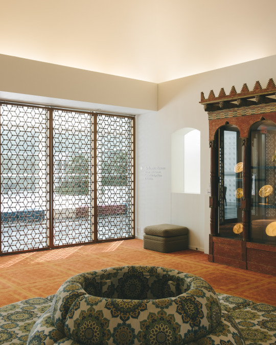
    Lastly, here is the Bellerive Room:

    image

    It was designed to be a contemplative room that could, on occasion, also host intimate events and performances. Note the shadows being cast by the screens in front of the windows.

    If you haven’t yet been to the Aga Khan Museum it is worth a visit, even if you just walk the formal gardens surrounding it.

  • New Toronto architecture bike tour

    I have a friend visiting from Detroit this weekend. We went to architecture school together at Penn. But unlike me, he decided to become a full fledged architect.

    Not surprisingly, he wants to see some new Toronto architecture while he’s here. I say new because he has seen the classics. So I mapped out a short bike route this morning. It’s more or less a downtown loop that starts in the St. Lawrence.

    First we head west to the Queen Richmond Centre West by Allied Properties REIT (developer) and Sweeny&Co (architect). After that I’d like to show him the main drag of King West and point out two buildings by Saucier + Perrotte Architects and CORE Architects. I don’t think Unzipped Toronto is open yet.

    Next it is north to One Spadina Crescent – home of the Daniels Faculty of Architecture, Landscape, and Design. This is one of if not my favorite new building in the city right now.

    After that I figure we’ll cruise east along the Bloor bike lanes and look up at 1 Bloor East. Then it is back south to check out the River City collection by Urban Capital (developer) and Saucier + Perrotte Architects (they are getting good face time on this tour).

    Then we’ll do what every good new Toronto architecture bike tour should do and end with a drink on a rooftop patio somewhere. Maybe we’ll check out the Broadview Hotel. I like the neon in the lobby bar.

    If I missed anything critical, let me know.

    Photo by Tiffany Nutt on Unsplash

  • Five year anniversary

    Today is the five year anniversary of this daily blog. That’s over 1800 posts. 

    It’s almost hard to believe that it has been that long. It seems like just yesterday I was on year 2 or 3. But at the same time, it’s almost hard for me to remember a time when I didn’t blog every day. I guess we’re calling it a habit at this point.

    One of the most common questions I get regarding this blog is: “Do you pre-write posts?” The answer is never. Okay, almost never. Sometimes I’ll pre-write a post if I know I’m going to be on a plane for 12 hours and I won’t make the timezone cutoff. But generally as a rule I don’t.

    Part of the reason I don’t is because it breaks the habit. This is something I do every day. And I like that routine. I also want the posts to be timely and I want to be able to write about things that may be on my mind that day.

    Momentum is a powerful thing. And when you’ve been doing something for a number of years, and especially something as public as this daily blog, there’s a powerful incentive to keep doing it. That’s how streaks work.

    However, in the world of development, five years is perhaps not that long. It’s maybe one project. Streaks take a lot longer to establish.

    This summer One Delisle by Studio Gang went public and you’re now starting to see (bright neon) teasers for Junction House. Both of these projects are many years in the making. The Junction House story started in early 2016.

    So I reckon that this blog needs at least another five years so that there’s enough time for the really juicy stories to surface. I’ll endeavor to do exactly that. 

    Thanks for reading and making this community what it is. See you tomorrow.

  • Preliminary design ideas for Toronto’s Quayside

    Last week Sidewalk Toronto held a roundtable discussion here in the city and released some preliminary design ideas and strategies for Quayside. (That’s why Dan Doctoroff was talking on BNN Bloomberg.) 

    I went through the full presentation this morning and below are a bunch of slides that I thought you all might find interesting.

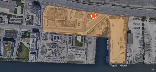
    Here is the extent of “Quayside” along the waterfront. The current land use permissions allow for about 3 million square feet of space and towers as tall as 50 storeys.

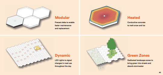
    Here is a paving system being explored for the area. It is modular. It may melt snow. And perhaps most interestingly, it would allow for dynamic changes in road use throughout the day. This sort of thing already happens to a lesser degree on streets like Jarvis. This technology could take that much further.

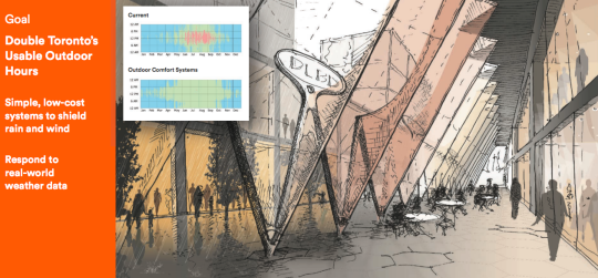
    One of their primary goals is to double Toronto’s usable outdoor hours. To do that, they are proposing simple weather shields (pictured below) and weather-responsive systems.

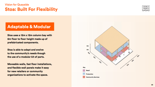
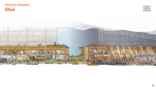
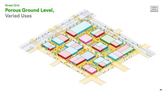
    They are spending a lot of time thinking about the ground floor of buildings, which they are calling Stoa. The idea is to create flexible and porous spaces that respond quickly to changing needs and that integrate more seamlessly with the surrounding public realm.

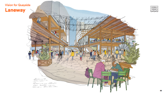
    There’s a lot on the potential hierarchy of the street network and how each will function for transit, conventional cars, AVs, cyclists, pedestrians, and so on. I was happy to see “laneways” as a core part of the pedestrian network. They are designed for walking speeds. Access would be restricted for things that move too quickly.

    This image ties in the street grid and Stoa.

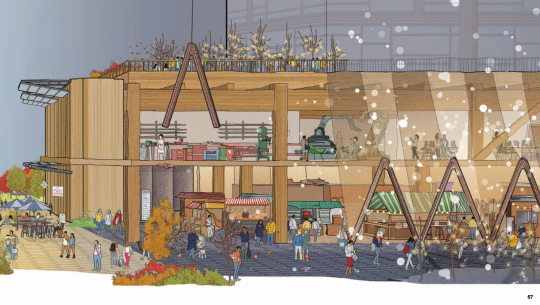
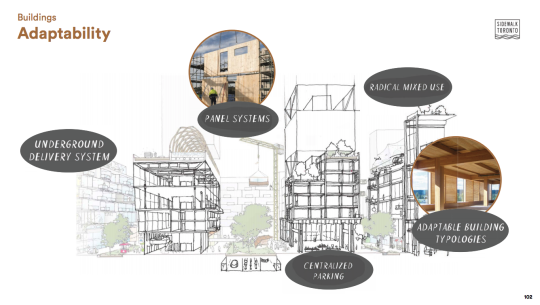
    Finally, the goal is to build the neighborhood entirely out of timber, and more specifically, Canadian timber. If they follow through on this, I think it would really push adoption of this material forward in the city.

    I would encourage you to check out the full package, which you can do here. I can’t wait for these projects to get underway along Toronto’s waterfront.

  • Building on stilts

    image

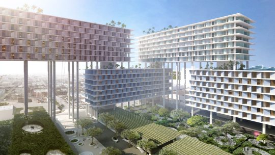
    Last week Bjarke Ingels Group and UIA Management announced a 125,000 square meter mixed-use complex in Allapattah, Miami called the Miami Produce Center. 

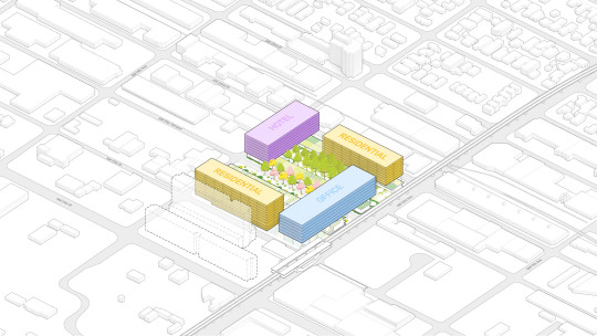
    The proposed project includes office, residential, and hotel uses on stilts over three existing warehouse buildings. The existing buildings will be transformed into restaurants, shops, cafes, and a school. And supposedly, at least according to the renderings, the parking garage will be designed so that it can be transformed into a club at a night. This is Miami after all.

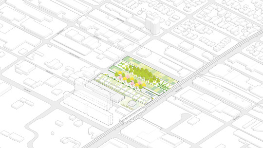
    Here are a few diagrams from BIG showing the build up:

    imageimageimageimage

    Perhaps best known for its warehouses and Dominican population, investors have been speculating for years that Allapattah would eventually become the next Wynwood. Here’s some evidence that it already has the requisite bars and artsy things.

    Does this project signify a tipping point for the area? Feels like it. But those of you who know Miami better than I do would be in a better position to comment.

    Images via Dezeen

  • PAMM, hi

    Yesterday we visited the Pérez Art Museum Miami (PAMM), which has been on my list since it first opened in 2013. 

    The Pérez part of the name belongs to real estate developer and art collector Jorge Pérez. He donated $35 million in cash to the Miami Art Museum in 2011 – so that the below building designed by Herzog & de Meuron could be built – and another $15 million in 2016. 

    This latter donation included some contemporary Cuban art valued at around $5 million. Supposedly after he dies Pérez will be donating the rest of his art collection to the museum.

    Pasted below is a full copy of the architect’s description of the project to go along with my photos. It was taken from here.

    This first picture faces the main entrance (on the left) and Biscayne Bay. In the background, toward the end of the terrace, is also a playground with swings.   

    image

    This picture shows the relationship between the “veranda-like public space” that wraps the building and Biscayne Bay on the left. Also note the hanging plants. These were great.

    image

    And this last picture is my attempt to show a kind of section through the building. Here you can clearly see the raised museum and at-grade parking (described below). 

    I also enjoyed that the parking level housed vegetation that cut through the above veranda.

    image

    -—————————————————–

    An open structure

    The new Pérez Art Museum Miami (PAMM) is located in Museum Park, part of the redeveloping downtown waterfront on Biscayne Bay. Its direct neighbours are the Patricia and Phillip Frost Museum of Science and a major freeway, connecting mainland Miami with Miami Beach. Simultaneously oriented towards the park, the water and the city, the new PAMM is an open and inviting structure from all sides alike.

    Miami is known for its iconic art deco district, decorated boxes with no great relationship and exchange between inside and outside. What makes Miami so extraordinary however, is its amazing climate, lush vegetation and cultural diversity. How can these assets be fully exploited and translated into architecture?

    Nature

    As in previous examples of our work, such as the Dominus Winery in Napa Valley, the building’s environmental circumstances become central to its architectural concept. Due to its proximity to the water, the museum is lifted off the ground for the art to be placed above storm surge level. We use the space underneath the building for open-air parking, exposed to light and fresh air that can also handle storm-water runoff. Rising from the parking level, the stilts supporting the museum platform become columns supporting a shading canopy, which covers the entire site creating a veranda-like public space that welcomes visitors to the museum and the park. Facing the bay, a wide stair connects the platform to the waterfront promenade.

    In this exceptional location, we wanted the museum to offer generous views to the outside. Yet all the building’s expansive windows are recessed, with wooden planks under the concrete beams to minimize the sun’s impact on the glazing and to reduce the building’s energy consumption for cooling. Tropical plants selected for their resilience to the local conditions engulf the structural system. Roof and plants combined will create an overall microclimate reducing the extreme temperature gaps between outside and inside in the hot weather. The exterior surface of the museum’s massive concrete walls is chiseled in places and polished in others. When adjacent to the glazing, the concrete is smooth and reflective. When facing the outside, the concrete becomes rough, exposing its natural ingredients.

    Rather than being an isolated “jewel box” (Schatzkammer) for art lovers and specialists, the museum provides comfortable public space for everybody. It is an extension of the park, offering gradual transitions from the outside to the inside, from the warm to the cool, from the humid to the dry and from the street to the art.

    Specificity

    The expression of the building comes from the canopy, the platform, the columns, the vegetation: in other words, the Veranda occupying the entire site. The museum’s interior volume nests within it, suspended amid the structural framework, each floor assuming the shape it needs. Because the galleries did not have to fit into any given form, we had the freedom to develop the curatorial layout, in close collaboration with the museum staff, to what felt like an optimal configuration to exhibit and develop the growing collection as well as to provide ample space for temporary exhibitions.

    PAMM is organised around four different gallery types: Overview, Focus, Project and Special Exhibition galleries. They occupy part of the first and the entire second floor. The Overview galleries, displaying the museum’s collection, serve as the connecting tissue between the other gallery types. Fluidly connected in a non-linear sequence, they allow relationships to be formed between spaces. They are characterized by large openings with views onto the park, downtown Miami, the bay and the freeway. Along this flowing sequence of rooms, single enclosed spaces punctuated by windows show an individual artist, a theme, a specific collection or a commissioned work. These spaces are called Focus and Project galleries. The fourth type, the Special Exhibitions galleries function as spacious exhibition halls designed to accommodate contemporary art exhibitions. The Overview, Focus and Project galleries form a firm and rhythmic sequence through the building, varying in proportion and relationship to the outside. On the other hand, the Special Exhibitions galleries are flexible, with fewer openings to the outside and can be subdivided by temporary walls.

    The spaces at PAMM and their materiality are very specific. They can be considered an antithesis to the flexible, abstract white cubes that have been a dogma in most recently built art spaces. Concrete and wood are used in different combinations, reflecting the outside materials of the building. Typical drywalls are detailed in a way that they are legible as added to the main structure. In order to enhance the inside-out transition, we designed a customized concrete mullion system that holds the largest ever-used hurricane-proof glass in Florida.

    Community and views

    At the heart of the building, a stair as large as a gallery connects the two exhibition levels. This stair also functions as an auditorium, using sound-insulating curtains in different configurations to provide space for lectures, film screenings, concerts and performances. Our idea was to avoid for such events to be isolated in a space remaining unused for most of the time. At PAMM, events in preparation are visible. When the space is not actively used for events, it is used by visitors and staff for individual readings, introductions to groups and the like. The museum shop and bistro are located on the platform level and are oriented to the bay. Education and research facilities are on the third floor along with the museum’s offices. We place these communal spaces at the periphery of the building, maximizing their exposure to the Veranda, Biscayne Bay, and Museum Park.

    Herzog & de Meuron, 2013

  • Twin Palms turns 60

    2018 marks the 60th anniversary of the Twin Palms neighborhood in Palm Springs, California, and Houzz has just published an excellent story describing the subdivision’s history and its importance for mid-century modern architecture.

    Designed by architect William Krisel and developed by Alexander Construction, the community was initially built with 90 homes. Supposedly each lot was exactly 10,000 square feet and each house had the exact same 40′ x 40′ square floor plan. So 1,600 sf homes.

    In addition to this, each lot had a carport, an open courtyard connecting the house and carport, and a swimming pool. 

    Unlike some of his contemporaries, Krisel was less interested in building one-off homes for the wealthy. He was more interested in tract housing for the masses. And standardizing the plans was one way to achieve greater affordability.

    Krisel still found other creative ways to differentiate the homes, namely by rotating the square floor plan and by rearranging the carport, courtyard, and pool.

    He also employed different rooflines, all of which have become emblematic of this era of architecture and of Palm Springs in general. It was about optionality on top of and around the box.

    If you have a few minutes, check out the Houzz article. The homes are beautiful and the story is compelling: the modern American dream at an affordable price.

    Photo by Nainoa Shizuru on Unsplash

  • Firm Profile: APOLLO Architects & Associates

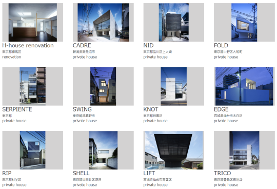
    This afternoon my friend Gabriel, of Gabriel Fain Architects, sent me the work of APOLLO Architects & Associates. They are based in Japan and South Korea. Here is a preview of some of their “private houses”:

    There is a lot that I love about these homes. 

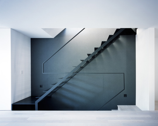
    I love their simplicity. Look at this handrail detail. Nothing more than what is absolutely necessary.

    I love their modesty. Many of the above homes hover around 150 square meters and many of them are much much smaller. 

    I love that each project’s description starts by talking about the owners and the site conditions, signaling that each home represents an individual response tailored to both the occupants and the context.

    And I love that many of these homes have been built on unthinkably small parcels of land in dense urban settings; parcels that would be dismissed as entirely useless in other parts of the world. 

    The site area for this home is 46.53 square meters and the building’s footprint is 36.93 square meters.

    Of course the Japanese housing market is a unique place. It’s worth pointing that out

    But as I browsed through what are effectively custom single family homes, I couldn’t help but be reminded that there’s a fine line between need and want.

    Small can be very beautiful. But small is also subjective.