Daily insights for city builders, delivered every morning at 6 AM ET. I’m Brandon Donnelly — a Toronto-based real estate developer and founder of Globizen. I’ve been writing here since 2013.

Tag: design

  • Opinionated design

    This is a longstanding joke / criticism among nerds:

    Namely, it is the fact that the charging port for Apple’s Magic Mouse is on its bottom, meaning, when it’s being charged, you can’t use it. This would be annoying if you ignored the low battery warnings and let it die in the middle of working on something critically important. And so lots of people think it’s a ridiculous design. But is it? Here’s an excerpt from a recent post by John Gruber of Daring Fireball:

    Yes, with the charging port on the mouse’s belly, you cannot use it while it charges. There are obvious downsides to that. But those positing the Magic Mouse as absurd act as though Apple doesn’t know this. Of course Apple knows this. Apple obviously just sees this as a trade-off worth making. Apple wants the mouse to be visually symmetric, and they want the top surface to slope all the way down to the desk or table top it rests upon. You can’t achieve that with an exposed port.

    This is an argument that feels right. Apple is not the kind of company that makes arbitrary design decisions. And the deliberate decision they have made is that a more perfect design is more important than solving for the few instances where a user was negligent and forgot to charge their mouse. Gruber goes on to say, the “charging port placement is an opinionated design, not an absurd design.”

    But this then raises another question: Is opinionated design the right approach?

    For well over a century, one of the maxims of good design has been that form should follow function. In other words, the shape and design of an object should relate to its intended use. And so, in this instance, if “function” involves using the mouse while it’s being charged then maybe, by this criteria, it isn’t a good design. Then again, it is a wireless mouse. Maybe Apple doesn’t want you to use it while it’s charging.

    Let’s consider another design object that you touch with your hand: Walter Gropius’ famous door handle.

    Originally designed in 1922, the simple design consisted of a square bar and a cylinder. And its job was to communicate to you that, in order to use it, you should grab the cylindrical part, and not anywhere else. So on this level, the design was responding to its intended use, to our hands. Grab here. But is this truly an example of form following function? It’s debatable.

    Architect and professor Witold Rybczynski, who I would say generally isn’t a fan of modernism, has argued that it’s not. His critique of the overall Bauhaus movement — of which Gropius was the founder — was that it was actually a design school dedicated to “form follows predetermined aesthetics rather than form follows function.”

    In some ways, he’s right. You can tell when something came out of the Bauhaus, just as you can tell when something is from Apple. There’s a particular aesthetic and stubbornness to maintaining it. That’s why the Magic Mouse can’t be charged while in use and why Apple, equally famously, clung to the simplicity of a single-button mouse. Two just didn’t look as nice.

    But I see this as an honorable quality. Having an opinion is better than not having one. And there are lots of objects out there without one.

  • Massive transfer slabs

    Sometime next month we’re going to be pouring a large concrete transfer slab at the second floor of One Delisle. Its function is to take the loads coming down from the entire tower above it and “transfer” them onto new structural elements, before being brought down to our mat foundation at the bottom of the parking garage.

    Put differently — and, as always, I should warn you that I’m not a structural engineer — a transfer is used whenever you have a change in your structural grid and the loads don’t have a straight path down to your foundations. Because whenever this happens, you’re now introducing moment forces and those need to be dealt with structurally.

    Transfer slabs are relatively common here in Toronto (which isn’t the case in every market), but they are expensive and they consume a lot of depth. In the case of One Delisle, our level two transfer slab is 1.8 meters deep and it’s going to contain about 1,200 m3 of concrete. (Some of you might also recall that One Delisle’s mat foundation is over 4m deep.)

    We were reviewing this with the team today and we think that we’ll be able to pour about 100 m3 of concrete per hour. That means that this slab will take about 12 hours to pour! This requires a lot of coordination. Neighbors need to be notified, pumps need to be on standby in case of a breakdown, and so on.

    Another major consideration is heat. When concrete cures it generates a lot of it. And with a thick slab like this one, I am told that we run the risk of the middle starting to overheat (especially with the hot weather that we’ve been having lately). The guideline limit is 60 degrees Celsius, so we’ll be monitoring it for probably about 1-2 weeks following the pour.

    I find these details fascinating. Maybe some of you do too. So once it’s poured, I’ll share a few photos.

  • Field Guide to Indoor Urbanism

    A few months ago, one of my old professors from architecture school — Phu Hoang — reached out to me through this blog. That’s one of the benefits of writing publicly — it becomes your calling card. In this case, it had been at least 16 years since I was in his design studio.

    We connected over a call. He told me about his and Rachely’s firm, MODU Architecture. And he let me know that he’s no longer teaching at Penn. He is now the Head of Architecture of the Knowlton School at Ohio State University.

    Then, following the call, he was kind enough to send me a copy of his new book, Field Guide to Indoor Urbanism:

    The typical approach to modern building design is to have clearly defined boundaries between interior and exterior spaces. The outside is the outside. And the inside is a climate-controlled space that is, for the most part, sealed to the outside.

    Most of us spend the vast majority of our lives in these latter spaces. In fact, since the advent of modernism and the International Style over a century ago, the general idea has been that these spaces can and should be mostly the same.

    HVAC systems make it so that you don’t really need to worry about context or the environment. What works in Toronto can work in Phoenix. You just need to dial up your cooling loads.

    This is so much the case that whenever I’m in a city with a fairly benign climate, such as somewhere in California, I always find myself fascinated by the fluidity between interior and exterior spaces. It’s such a foreign concept to me that it stands out: “Wait, how is this not sealed?

    Indoor urbanism, on the other hand, makes the argument that this binary approach is the wrong way to think about spaces. Here’s an excerpt from a recent Metropolis article about MODU:

    They call this approach “indoor urbanism,” which privileges the blurred boundary between what has traditionally been considered interior space and exterior space. This in-between space–straddling open and closed, artificial and natural–deserves architects’ keen attention, especially as the planet warms. “Indoor urbanism recognizes that architecture and cities are situated on an environmental continuum, as a matter of degrees rather than absolutes,” write Hoang and Rotem in Field Guide.

    Examples of this thinking can be found throughout their work. This project in Jackson, Wyoming is one of my favorites both because I love Jackson and because it’s a cold and snowy place. And yet, even in this climate zone, their design includes for several “semi-exterior areas” that serve to connect you to nature.

    This is a decidedly different way to think about architecture and urbanism. But as our climate crisis intensifies, it’s only going to become more relevant.

  • When do iconic chairs actually become iconic?

    Search for the most iconic chair designs in the world and you’ll likely come across a list that includes:

    • Wassily Chair by Marcel Breuer (1928)
    • Barcelona Chair by Mies van der Rohe (1929)
    • Grand Consort by Charlotte Perriand, Le Corbusier, and Pierre Jeanneret (1928)
    • The various Eames Chairs (starting in 1945)
    • Wishbone Chair by Hans Wegner (1949)
    • Wiggles Side Chair by Frank Gehry (1972)
    • And the list goes on.

    Most of these chairs also look as if they were just designed yesterday. Meaning, they’re timeless and have stood the test of time. But they are mostly older designs. Which raises an interesting question: How much does the passage of time play in a role in determining whether or not something is “iconic”?

    There are some more recent designs that you could call iconic. The Roly-Poly Chair by Faye Toogood (2014) and the Louis Ghost Chair by Philippe Stark (2002) come to mind. This suggests that really great designs can become immediate classics. (Though, this latter example is a reinterpretation of a classic French chair that in and of itself is an icon.)

    What I think is the mostly right answer is that, yeah, sometimes you can catch lighting in a bottle. The Louis Ghost Chair, for instance, is one of the top selling chairs of the 21st century. It’s a clever and modern take that used new technologies (as is often the case) to revisit an old classic. Starck nailed it.

    But more often than not, you probably need time. Time is what allows the object to form cultural associations in our mind and to prove that it is, in fact, timeless. However, if this is truly the case, then it makes it difficult to determine if we’re still producing as many design icons today as we did in the past. We won’t really know until they become old.

    Image: Louis Ghost Chair via Knoll

  • Fashion and design capital of the world!

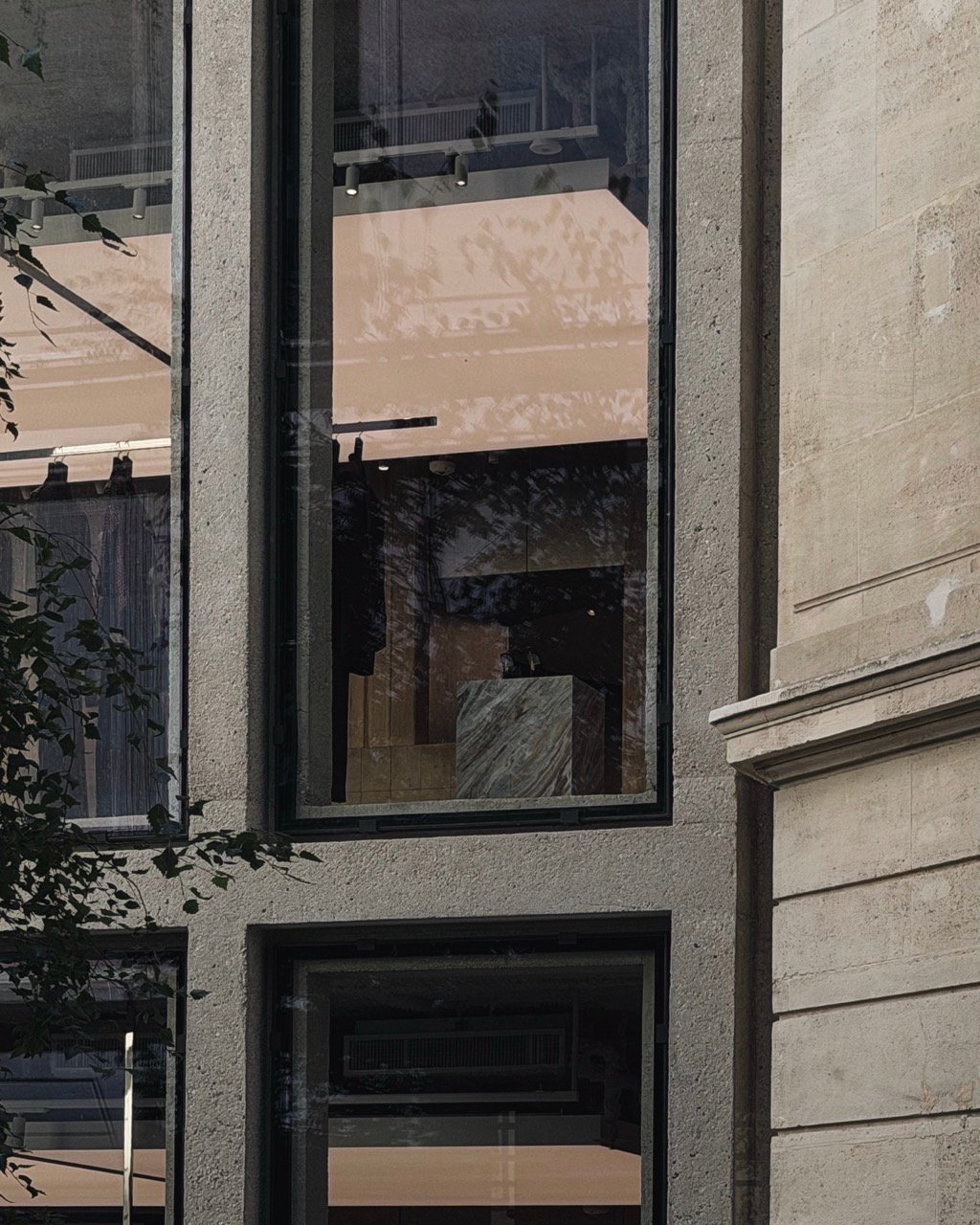
    The first and only other time that I have visited Milan was over 20 years ago. I was 19 or so, and a close friend and I decided to take the train into Centrale without a place to stay and without a plan, other than to get into some trouble.

    We ultimately succeeded at this ambitious plan. But I clearly didn’t see enough of the city, and I left thinking that it was a bit of a grimy and sleepy place. I was disappointed. I thought it would be fashion everywhere, and it wasn’t for me. And this impression has lingered with me ever since.

    Boy have I been missing out.

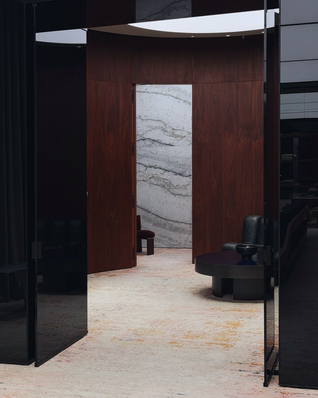
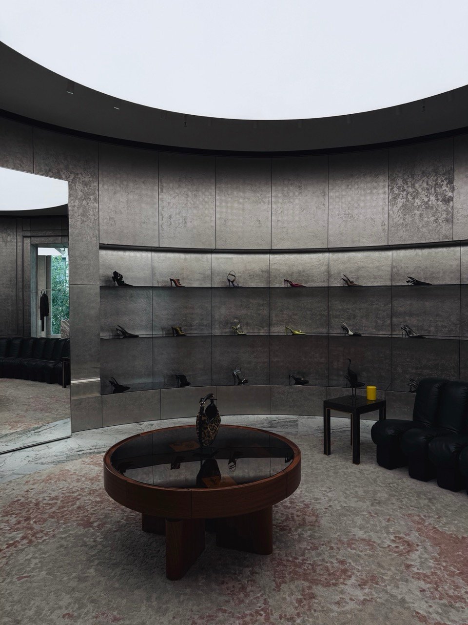
    I have fallen in love with Milan on this very short trip. It really is a capital of fashion and design. This is not a city of meandering tourists looking for the Pantheon (okay, there’s still some of that); it is a big city of business and culture. And if I had to compare and contrast it to other cities, I would say this.

    Its built form is not nearly as manicured and as fussy as Paris’. In fact, in some ways, it’s a bit like Toronto. Its overall urbanism is messier, and you have to scratch beneath the surface and sneak into some courtyards before you really uncover its true beauty. But once you do, it’s magical.

    At the same time, its street fashion strikes me as being slightly fussier. There is an effortlessness in Paris that doesn’t seem as pronounced in Milan (though it is still there). Here, there’s a little more flash and a little more, “I’m sexy and stylish, and I would like you to be aware of that.”

    But this is not to say that you won’t see men and women in suits and stilettos riding a bicycle. It still feels effortless. It still feels natural. And when you’re here, you can’t help but feel like you’re probably not stylish enough for this capital of fashion and design.

  • Lufthansa unveils new multi-seat layout in business class

    Maybe it’s my design background or maybe it’s the extreme discomfort in my legs, but usually when I’m on a plane I can’t help but think about redesigning the cabin interior. Of course, there are only so many options in economy when your femur doesn’t fit between the seats. However, in business class, where airlines actually make their money, the options are endless.

    Below is a redesign that Lufthansa just launched this spring. Co-created with Pearson Lloyd, the concept is based on three distinct travel experiences: calm, focus, and share. The idea here is that maybe you just want to sleep (calm). Maybe you just want to work (focus). Or maybe you want to work and/or hang out with someone beside you (share). And depending on what you’re looking for, your seat should reflect that.

    The result is 7 different seat types that are bookable depending on what “job you’re looking to hire it for.”

    It is about consumer choice instead of one size fits all. But I’m curious:

    • Were they able to maintain the same number of overall seats in business class, or are they betting on higher revenue per passenger because the seats are now better?
    • How does booking work? What happens if I really want “calm,” but the only available seat is “share”? And then what happens if my “share” neighbor is really talkative?
    • Has anyone looked at multi-seat arrangements in economy? Or is it a non-starter because you really need to squeeze femurs in order to make the math work?

    Lufthansa, if you’re reading this and you’d like me to do a thorough review of your new Allegris Business Class seating, I would be happy to accept a flight to Paris sometime this summer. Until then, you can all find more information about this new seating layout and the design process, here.

    Images: Pearson Lloyd

  • Lobbies as pseudo-public spaces

    This is a good idea (taken from a recent FT article by Edwin Heathcote):

    The hotel lobby is already understood as a kind of public space, the corporate lobby should belong to that same world, a place open to the functions of the city, porous and welcoming. It is no accident that the vast lobbying industry has that name, lobbies are where encounters occur.

    Sometimes we do this. Maybe there’s a coffee shop or some other activations in your lobby. But more often than not, a “good” corporate lobby is about grandeur and security, which means that they do very little to animate the street.

    In the above article, Edwin reminds us that before the invention of the modern office building, the entire city functioned as a kind of dispersed workplace. Places like coffee shops and pubs were, of course, central to this.

    While this is still partially the case today — people continue to like coffee and beer — it is interesting to think about what more we could be asking of our office lobbies. And I do think it is more.

  • Which is the most important when it comes to new housing?

    If you can’t see the Twitter poll below, click here:

    At the time of writing this post, affordability was number one, followed by design and beauty, and then sustainability.

    Some of you were right to point out that these options are not always mutually exclusive. Affordability and sustainability, for instance, can be mutually reinforcing.

    Building in walkable and transit-rich neighborhoods where parking is not needed is both good for overall affordability (parking is usually a loss leader) and better for the environment.

    But in other cases, sustainability costs more. Triple-glazed windows might perform better than conventional double-glazed, but they’re also more expensive.

    Now, as a general rule, I believe in working hard to find the mutually reinforcing opportunities. How can we check all of the boxes and not have to compromise?

    But sometimes there’s no other option. So it is interesting to see how people answer the above question. Not surprisingly, affordability is top of mind.

    Which would you pick?

  • A flexible parkade in Calgary

    As a general rule, I believe that our cities should be striving for less rather than more parking. Which is why it still baffles me when allegedly progressive cities continue to mandate ludicrous parking ratios (even when the sites are next to transit). You know who you are.

    But if you absolutely have to build it, the new 9th Avenue Parkade + Innovation Centre in Calgary is a good example to look to.

    Designed by 5468796 Architecture in collaboration with Kasian Architecture, Interior Design and Planning, the project does all of the things to ensure that it doesn’t look ugly today and it doesn’t need to remain a parkade in the future once we all switch over to electric scooters and flying autonomous vehicles.

    Some of the moves include 4m floor-to-floor heights and generally flat floor slabs that only rise 1-2%. This was done so that the floors can be more easily retrofitted to residential and/or office in the future.

    And in fact, this flexibility already gotten proven out during the design process. Originally the ~335,000 square foot building was going to be entirely parking. But then an innovation centre called Platform came to the table for 50,000 sf, and a portion of the building had to be converted to flexible office space.

    Let’s hope this trend continues. But in the meantime, here are some pretty pictures:

    All photos by James Brittain.

  • Playful parkades

    This is perhaps the wrong post to be writing right now with gas prices where they are, but lately I’ve been thinking about parking garage designs. We have talked a lot about parking minimums and other related topics on this blog, but let’s put all of these aside for today and assume that parking garages are a thing that will continue to exist in our cities.

    Generally speaking, parking garages are fairly utilitarian spaces. They store cars and they usually aren’t that nice. And in the case of public garages, they often smell like urine. But there are some extraordinary examples out there. Miami immediately comes to mind as a city with some pretty cool garages. I mean, when you have one designed by Herzog & de Meuron (1111 Lincoln Road) that is usually a pretty good indicator.

    When I was there in January, we went walking one night through the Design District and we ended up on the roof of “Museum Garage” to take some photos and take in the views. Once we got there, we found people doing everything from eating dinner to filming TikTok videos. Great spaces attract people. It also helps when all of your parking is above-grade, which is the case in Miami.

    Here is another example from Sydney (also pictured above). In this case, it’s a residential parking garage and Craig & Karl were hired to create a colorful geometric mural. Garages are a perfect place to be a bit more playful and have some fun. I think we should do more of this.

    Photo via Craig & Karl