Daily insights for city builders, delivered every morning at 6 AM ET. I’m Brandon Donnelly — a Toronto-based real estate developer and founder of Globizen. I’ve been writing here since 2013.

Tag: demographia

  • Where Americans moved over the last decade

    Today’s post is perhaps a good follow-up to yesterday’s post about housing supply in Ontario. Below are a few charts taken from a recent article by Wendell Cox looking at net domestic migration across the US. The takeaway here is that the shift from larger cities to smaller cities seems to be accelerating, following a trend that started before COVID.

    The data in these charts is organized according to population and by Core Based Statistical Areas (CBSAs). At the bottom are America’s two megacities: New York and Los Angeles. Both have metro areas that exceed 10 million people. As you can, these two city regions have been losing the most people, both in terms of total humans and on a percentage basis. The goldilocks sweet spot seems to be cities in the 500k to 1 million range.

    But the most telling figure is probably this one here:

    This chart adds up all major metropolitan areas with a population greater than 1 million, and then shows net migration over the last decade. Here you can see when this trend started (around 2016) and how it has been accelerating. In this case, it does appear that COVID added some fuel to the fire. But the question remains: Why is this longer-term trend even happening?

    Is it a short-term phenomenon? Is it because once a city reaches a certain size it simply becomes more annoying to live in it and people would prefer to live elsewhere? Or is it more about overall affordability? That is, if we could figure out how to deliver more affordable housing in our cities, could we stymie the bleeding toward smaller and more affordable ones?

    I don’t know the answers to the questions. But they have been widely debated and I still think they’re interesting ones. If all things were equal (or closer to equal), how and where would most people choose to live? Put differently, how much of this is some sort of natural market outcome and how much of it is a direct result of our actions (or inactions)?

  • Largest cities in the world — revisited

    Following my recent post about the largest cities in the world (from 100 to 2015 CE), a number of you rightly pointed out that the data looked questionable. Where, for example, is Shanghai in this latest list of largest cities? So I think it’s important that I do a follow-up post.

    There are a number of nuances to consider when trying to measure urban populations. Perhaps the two most obvious are the geographic extent of each city (i.e. what urban boundary do you use) and the number of people living in informal settlements.

    The UN recently estimated that there are some 1 billion people living in slums or informal settlements. That represents nearly a quarter of the world’s urban population, which is a staggering number and a pressing global need. We desperately need more housing.

    When it comes to measuring the size of an urban agglomeration, most of the studies that I have seen tend not to focus on municipal boundaries (“city propers”) or metropolitan areas. The former is often based on arbitrary political boundaries and the latter often contains undeveloped rural land.

    So for the purposes of this post, I’m going to go with Demographia’s definition of “built-up urban area.” They define this as being a continuously built-up area with one labor market and with no rural land. In their view, the world is either urban/built-up or rural. The built-up part is the lighted area that you would see on a nighttime satellite photo.

    Given this definition, there are a number of interesting fringe cases. For example, contiguous/adjacent urban areas with more than one labor market get split up into multiple ones. This is the case in the US with the northeastern “megalopolis” that runs from Boston to Washington.

    Conversely, if adjacent urban areas share a labor market and are linked together by similar commuting flows, then they get grouped into one urban area. This might be the case even if the area(s) straddle a national border. In this particular case, the free movement of people and goods would be another prerequisite.

    With these definitions out of the way, below is another stab at sharing an accurate list of the world’s largest megacities or built-up urban areas. This is one is by Demographia and there are a number of key changes compared to the last one I shared. Shanghai now features in the top 10. But Lagos drops down to number 20, which remains a bit of a question mark for me.

    For a copy of Demographia’s full report, click here. It looks at all urban areas with a population greater than 500,000 people (total is 985). Of course, if any of you have any other data sources that you think I should take a look at, feel free to share them in the comment section below.

  • 10 most unaffordable housing markets

    image

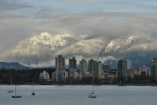
    I flew into Vancouver this morning, which means it was only a matter of time before the topic of house prices came up.

    According to the 13th Annual Demographia International Housing Affordability Survey (2017), the 10 most unaffordable housing markets are as follows:

    1. Hong Kong, China
    2. Sydney, Australia
    3. Vancouver, Canada
    4. Auckland, New Zealand
    5. San Jose, California
    6. Melbourne, Australia
    7. Honolulu, Hawaii
    8. Los Angeles, California
    9. San Francisco, California
    10. Bournemouth, UK

    The survey measured the affordability of “middle-income” housing in Australia, Canada, China (Hong Kong), Ireland, Japan, New Zealand, Singapore, the United Kingdom, and the United States. 

    It is based on a “median multiple” approach, which tries to normalize house prices across the world by looking at median house prices over median household incomes.

    The above list probably won’t surprise you, as well as the report’s focus on land supply. But I did want to call attention to the following remark:

    My own housing research focused on this difference: Why did Germany (and similarly Switzerland) provide housing stability where much of the Anglosphere did not? 

    In a nutshell, the answer to this question has a lot to do with the way councils are funded. In jurisdictions where local decision-makers stand to gain from new development, they will be much more eager to make it happen.

    The topic of incentives is not something that is often focused on when we talk about land supply. But it’s a really interesting point. Because the reality is that, in many cases, the incentives probably work in the opposite direction to the one described above.

  • Urban population densities, compared

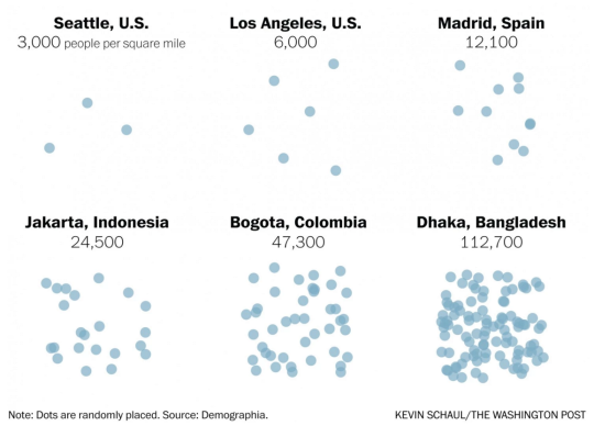
    Earlier this month The Washington Post published an article called, There’s no such thing as a city that has run out of room.

    And what it was really about was that when we say there’s no more room (I guess people are saying this), we are really saying that we just don’t want to allow anyone else to become our neighbor. Because the reality is that urban population densities vary widely around the world. So how can you really call a place full?

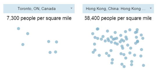
    I’m not sure I feel this pain point as much as the author, but I always find population densities to be a fascinating topic. And accompanying the article was a tool – using data from Demographia – that allowed you to compare the population densities of various cities.

    Here are are two scenarios I ran:

    It’s important to keep in mind that these numbers are averages for the entire economically contiguous region. So it tells you nothing about the potential spikiness of certain areas. That’s why the population density of New York (which includes portions of New Jersey and Connecticut) probably seems low to you.

    Still, it’s fascinating to see how extreme some cities – including some first world cities like Hong Kong – can be. Clearly many cities have a lot of room to become a lot more dense. And I think that would be a good thing.