Daily insights for city builders, delivered every morning at 6 AM ET. I’m Brandon Donnelly — a Toronto-based real estate developer and founder of Globizen. I’ve been writing here since 2013.

Tag: dallas

  • Low-carbon cement

    By some measurements, cement production alone is responsible for about 8% of human-caused carbon dioxide emissions every year. And so there is an imperative to find suitable low-carbon alternatives. Here is what is currently happening in the US (via Grist):

    On Tuesday, Terra CO2 Technology was picked to receive a $52.6 million federal grant to build a new manufacturing plant just west of Salt Lake City. The company has devised a method that turns common minerals into additives that can help replace Portland cement — a key component in concrete, and one of the most carbon-intensive materials in the world.

    In addition to this new facility, the company is set to start construction on its first plant in the Dallas-Fort Worth area:

    The project is expected to break ground in January 2025 and begin shipping out materials by late summer 2026, Yearsley said. The facility will be capable of producing up to 240,000 metric tons of SCM [supplementary cementitious materials] per year when completed, or enough to serve roughly half of the local metropolitan market.

    And all of this is part of a broader initiative by the US Department of Energy:

    The Utah facility is one of 14 projects provisionally selected this week to receive $428 million in total awards from the U.S. Department of Energy’s Office of Manufacturing and Energy Supply Chains. The initiative, which is funded by the Bipartisan Infrastructure Law, aims to accelerate clean energy manufacturing in U.S. communities with decommissioned coal facilities. Officials said the projects are expected to create over 1,900 high-quality jobs across a dozen states.

    For the rest of the article, click here.

  • Mapping 15-minute cities

    This is an interesting map to play around with. It allows you to see how many 15-minute neighborhoods and cities there are around the world. And it works by calculating the average time it takes to walk or bike to the closest 20 points of interest in 10,000 cities. These points include all of the usual suspects like places of work, schools, healthcare institutions, grocery stores, and so on. A blue cell indicates an average walk time < 15 minutes, and a red cell indicates an average walk time > 15 minutes. The darker the color, the shorter or longer the average time in minutes.

    By this measure, it’s hard to beat many/most European cities. Here are Paris and Barcelona:

    The city propers are completely blue, and you have to go pretty far out (or up into mountains) to find areas that don’t have 15-minute conveniences.

    Toronto has a strong core and isn’t terrible overall, but expectedly, we aren’t as uniform and as deep blue as Paris and Barcelona:

    Where things get really interesting, though, is when you look at cities like Dallas and Houston:

    It’s clear where these cities stand on walkability.

  • Toronto is the fastest growing metropolitan area in Canada and the US

    Last month, I wrote a post called, More people, fewer new homes. And in it, was a chart showing that for the 12 months ending July 1, 2023, Toronto grew by approximately 126,000 people, and the Greater Toronto Area grew by about 233,000 people. Big numbers. At the end of the post, I also mentioned that this is more growth than the city has seen over the six preceding years.

    But how does this compare to other cities in Canada and the US? If we look at only central cities (not metro areas), Toronto is, in fact, first. Canadian central cities, in general, also seem to be growing more quickly than their US counterparts. After Toronto is Calgary, which added nearly 87,000 people for the same time period.

    Looking at metro areas, Toronto is still first. I don’t know why the ~222k figure, here, doesn’t reconcile with the ~233k figure from last month’s post, but presumably it’s some sort of boundary difference. In any event, Toronto is first. But now, once you include metro areas, US cities do much better in this list. Number two is Dallas-Fort Worth-Arlington.

    This difference between central cities and metro areas likely tells us something about the way in which these city regions are growing. Still, it would be interesting to see how much of this population growth is being accommodated through infill development vs. greenfield development. One way to measure that might be to look at changes in the footprint of their built up areas.

    For more about the above two charts, check out this recent post from TMU’s Center for Urban Research and Land Development.

  • Slamming the breaks on anti-motorist measures

    Last week the Prime Minister of the UK, Rishi Sunak, announced a number of initiatives designed to support drivers. The slogan is “slamming the brakes on anti-motorist measures” and you can find more information about it, over here.

    Naturally this is sparking the usual debate about driving vs. all the other forms of mobility. But it also seems to be part of some sort of broader political strategy intended to distance his party from things like environmental sustainability, net zero targets, and 15-minute city design.

    If you’re looking for a way to process the above announcement, this recent FT article by John Burn-Murdoch is an excellent place to start. Firstly, the UK (outside of London) is generally poorly served by public transport. This is an important thing to know. By the below measure — percentage of large cities that have trams, a metro, or urban light rail — it is even worse than the US:

    In fact, one way to think about and measure mobility in the UK is to think in terms of the following geographic categories: there’s US cities, European cities (including London), and then there’s the rest of the UK. In the case of US cities, they have very clearly optimized around road infrastructure. Meaning, the vast majority of people don’t take transit to work, but the area (km2) you can cover by car (in 30 mins) is high.

    Look at Houston and Dallas on the left side of this graph:

    On the other hand, European cities (again, including London) have optimized in the opposite direction. A lot more people walk, cycle, and take transit to work. In the case of cities like London, Paris, Barcelona, Bilbao, Prague, and others, the number is greater than 60%! However, they’re sucky places to drive, as I learned this past summer. The area you can cover by car within 30 mins, is relatively low (bottom right of the above graph).

    The challenge for British cities (excluding London), is that they seem to be right in the middle (burgundy dots above). Poor public transport (low percentage of trips to work). And poor road infrastructure (limited area accessible by car within 30 mins). So it is perhaps no surprise that Sunak is honing in on this issue. London is not representative of Britain. And based on the above data, the majority of people living in British cities are almost certainly mobility frustrated.

    Of course, to correct this issue you have two options. You can move toward the left (in the above chart) and optimize for road infrastructure. Or you can move to the right and optimize for public transport and other forms of mobility. Based on last week’s announcement, Sunak has chosen the left.

    Charts: FT

  • Net domestic migration is still pretty suburban

    For years, the data has been clear. Many Americans are moving from expensive cities, like Los Angeles, to less expensive metropolitan areas like Dallas-Fort Worth.

    But Wendell Cox’s recent article over at New Geography is a good reminder that these data sets can be limited. The US Census Bureau currently tracks domestic migration at the county level only. This can be a bit of a problem as counties vary dramatically in terms of geography and population.

    The New York metropolitan area, for example, is comprised of 25 different counties averaging about 750,000 residents. The Los Angeles metropolitan area, on the other hand, is compromised of two counties averaging about 6.6 million residents.

    These sorts of nuances become important when you’re trying to figure out things like whether people are moving to/from urban cores or the suburbs. Case in point: The San Diego metro area is compromised of a single county. When people move there, the data says nothing about how urban or suburban they might be.

    Dallas-Fort Worth is a lot easier to read. Since 2010, it has had the largest net domestic migration of any metro area in the US: +443,000 residents. But county data reveals that it is entirely suburban. The core (Dallas County) actually lost 57,000 people from 2010 to 2019. And this is not unique to the Dallas-Fort Worth area.

    Photo by Gabriel Tovar on Unsplash

  • New Brutalism in Dallas

    Mr. and Mrs. Gehan recently completed this home for themselves in the Preston Hollow neighborhood of Dallas. Mr. Gehan is the founder of a home building company called UnionMain Homes, but this home is like nothing the company builds. The architect, Scott Specht, describes it as being “new brutalist.” There’s exposed and ribbed concrete walls (which alone are reported to cost ~$720,000). But the sliding planes, cantilevered roof, and expanses of glass are reminiscent of the International Style, and in particular of the Barcelona Pavilion.

    At around 8,826 square feet, the house cost about $6 million to build (presumably this excludes the 1.5 acre land cost). That works out to around $680 per square feet, which once again goes to show you why “only the rich can afford this much nothing.” Minimalism is expensive. Here’s an excerpt from the WSJ: “He [Mr. Gehan] was amazed by the level of detail required and the complication involved in creating a clean and simple aesthetic. That less-cluttered, simpler look will start to make its way into his production houses, he says.”

    Photos: Specht Architects

  • Mapping auto emissions in America

    This morning the New York Times published what they are calling the most detailed map of auto emissions in America. In it, they remind us that transportation is the largest source of greenhouse gases in the US today and that most of it comes from our driving habits within metro areas. See below charts.

    Not surprisingly, if you look at total on-road emissions, the biggest cities — New York and Los Angeles — are at the top of the list. But you also have car-dependant regions like Dallas-Fort Worth that punch above their (population) weight in terms of total emissions.

    Now, here’s where it gets interesting. The story flips as soon as you adjust for population.

    On a per capita basis, New York is pretty much at the bottom of the list. It is yet another reminder that one of the most sustainable ways to live is in a dense urban environment where it is possible to get around without the use of a car. New York is, of course, one of the best places in the US to do exactly that.

    Charts: New York Times

  • The densest urban cells in America

    Garrett Dash Nelson recently published a study looking at urban density on a cell-by-cell basis for a number of US cities. Each “cell” is a 30 arc-second grid cell, but you can think of them as being approximately one square kilometer. The goal of the project was to better define urban density and do it in a more granular way. City averages don’t tell you a whole lot about how neighborhoods vary, and they can be skewed by the denominator you use. i.e. Where are you drawing the urban boundary?

    You can play around with his interactive study, here. Each city can be explored according to its 200 most dense cells. One interesting takeaway — though it is probably not all that surprising to this audience — is that New York City is really a unique place when it comes to American cities. If you look at the above chart (sourced from CityLab), you’ll see that most other US cities don’t come close to it in terms of urban density. New York’s 200th densest cell is still denser than the most dense cells of Boston, the Twin Cities, and of Dallas.

    The y-axis is the total population in each grid cell.

  • US cities with the most corporate HQs

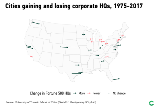
    The University of Toronto School of Cities recently looked at the changing economic geography of Fortune 500 companies across the US from 1975 to 2017. Here is a diagram of the results taken from CityLab:

    New York sits at the top with 70 corporate headquarters as of 2017. But the San Francisco Bay Area is now the second largest center with 35 headquarters – a testament to tech.

    The study does, however, omit service firms, as these weren’t tracked in Fortune’s list back in 1975.

    Also noteworthy is the specialization that has taken place across specific cities and regions. Here is another excerpt from CityLab:

    America’s headquarters geography reflects the substantial variation and specialization of the U.S. economy. New York leads in finance and business services, consumer services, and goods and materials. But Houston leads in energy, San Jose in tech, and Chicago in retail and wholesale. Chicago also ranks second in consumer services, and goods and materials, and Dallas takes third in energy. Other cities like Nashville and Minneapolis take third in consumer services, and goods and materials, respectively.

    The full article can be found, here.

  • The Great Recession only paused suburbanization

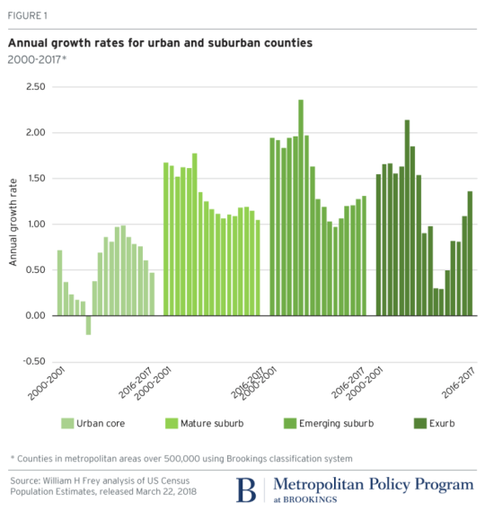
    According to newly released US census data for 2010-2017 – which Brookings analyzed here – the “back to the city” movement appears to have peaked in 2012. (This is something that we’ve looked at before on the blog.)

    Here is a graph from Brookings showing the annual growth rate for urban and suburban counties. Note how growth in the “urban core” peaked in 2012 and how growth in both the “emerging suburb” and “exurb” have increased since then.

    image

    The other finings from Brookings are that growth has slowed in large metropolitan areas (small metro areas and non metro areas, on the other hand are up) and that people are continuing to move from the Snow Belt to the Sun Belt.

    If you look at population gains and losses from 2016-2017 for the 100 largest US metro areas, the only Snow Belt gainers within the top 20 are New York (15th), Columbus (19th), and Boston (20th). Dallas, a Sun Belt city, was first with a gain of 146,000 people.

    So what’s going on? The narrative is that soon as the US economy and housing market recovered from the Great Recession of 2008, the trend lines simply reverted back to business as usual: sun and sprawl.