Daily insights for city builders, delivered every morning at 6 AM ET. I’m Brandon Donnelly — a Toronto-based real estate developer and founder of Globizen. I’ve been writing here since 2013.

Tag: city of toronto

  • Dimensioning pedestrian happiness

    The area that stretches between the property line on one side of a street and the property line on the other side of a street is called a public right-of-way here in Toronto. It may be called something different in other cities and countries.

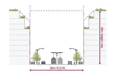
    In the example below (taken from Toronto’s Avenues & Mid-Rise Buildings Study), it includes the sidewalks, the car lanes, and the streetcar lanes. But it could also include other public elements. In this instance, the buildings on either side of the street are assumed to be built right up against their property lines.

    ROWs obviously serve an important public function. But their size also has important urban design implications. As a pedestrian, it feels different to walk on a narrow street than it does on a broad street.

    The width of a ROW can also be used to inform what the preferred height of the buildings along it should be. In the example above, they’re talking about a 1:1 relationship between the width of the ROW and the preferred height of the buildings.

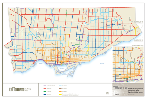
    Given their importance, I thought it would be interesting to share this map of Toronto (dated 2010) showing ROW sizing throughout the city. The mustard colored lines in the core of the city represent 20 metres, the red lines 36 metres, and the purple lines 45 metres or more. The rest of the colors fall somewhere in-between. For the most part, the purple lines represent highways, although there are a few other instances of purple.

    What’s interesting – but not surprising – to see is how we basically kept expanding the size of our ROWs as Toronto grew outwards. This was obviously to make more room for cars on the road.

    But the other, perhaps more interesting thing about this map, is that it could also serve as a guide to pedestrian happiness. The mustard/yellow lines are where it’s most enjoyable to walk. And the red and purple lines are where it’s least enjoyable to walk.

    If you’re from Toronto, give this framework a try and see if it holds true.

  • Downtown Toronto in numbers

    Last week I tweeted out a Tweetstorm with some of the key facts from this City of Toronto study on the downtown core. Here are two of those tweets:

    //platform.twitter.com/widgets.js

    While I realize that reading city reports is probably not everyone’s idea of fun, it is a good one if you want to understand the massive change that is taking place in Toronto right now and also the importance of the downtown core for this region.

    To put things into perspective, consider that the downtown core (including King West, King East, and the Portlands) is estimated to be responsible for 51% of the entire wealth generated in this city. And yet its physical area is easily less than 10% of the entire city (which is about 630 square kilometers).

    That’s fascinating to me.

  • Understanding the radius of demand for transit

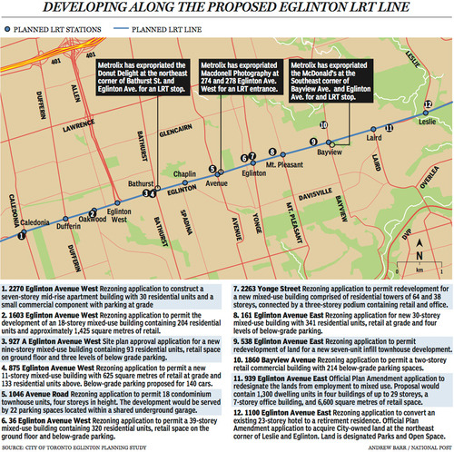
    Last week The National Post published an article talking about Toronto’s Crosstown LRT and how it’s spurring a wave of development all along Eglinton Avenue. Below is a map, taken from that article, showcasing some of the developments that are currently in the pipeline and awaiting the Crosstown’s opening date of 2020.

    image

    Not surprisingly, developers like transit investment. But more specifically, they like fixed track transit investment. Rarely do new bus routes elicit the same sort of response that you’re seeing above. And that’s because fixed track investment has permanence. If you’re going to go long on an area, you want certainty.

    As the Crosstown tunnel boring machines move across midtown Toronto, I thought it would be interesting to look at a transit concept that I first learned about through Jarrett Walker’s Human Transit blog. It’s called: the radius of demand

    One of things that transportation planners look at when designing and building a new line is the spacing of stops. Typically, as you move from buses all the way up to subways, the spacing between stops and stations increases. Spacing is always a bit of a trade off though, because more stops means easier access for riders, but it also means slower overall service. Somewhat famously, Paris designed its metro system so that you’re rarely more than 500 meters away from a station. 

    Once you have your station locations, it’s quite common to then draw a radius around each stop to simulate the catchment area. In other words: How much of the city can I service with this station and how far will people be willing to walk in order to get there? However, this distance, which is the radius of the circle, usually depends on the type of transit. Oftentimes people are willing to walk further in order to get to faster transit service.

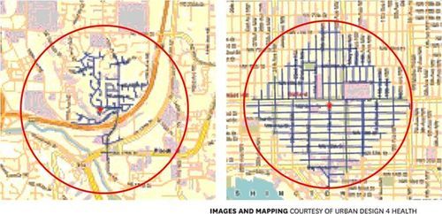
    But what’s most interesting about this radius of demand is that it’s entirely dependent on the fabric of the city. Take for example, the following two maps from Seattle, which I have taken from Walker’s blog. On the left is a suburban setting and on the right is a downtown setting. In both cases, the red circle represents a 1 km radius.

    image

    Now, if humans could fly over barriers, such as highways, and every Seattle resident was willing to fly exactly 1 km to a transit station, these two radiuses of demand would be perfectly accurate. But since that’s not the case, we instead need to look at what actually represents a 1 km walk – those are the blue lines in each image.

    Because once you do that, you realize that the cul-de-sacs and highways on the left make it impossible for most of that radius of demand to actually walk to the station in under 1 km. So the catchment area actually becomes much smaller. On the other hand, if you look at the image on the right, you’ll see that the tried and true city grid is actually remarkably efficient for walking. Almost all of the circle is serviced.

    So as the Eglinton Crosstown LRT makes its way through the center of Toronto, I think it’s important to keep in mind that it’ll be cutting through quite a few different kinds of street grids. Some of them will be highly conducive to transit usage and others not as much. And in many ways, this is one of the greatest challenges of transit investment. The track itself is only one part of the puzzle.

    That’s why the City of Toronto is also undertaking a planning exercise called Eglinton Connects. Its intent is to leverage the opportunities, as well as address the challenges, that will result from Metrolinx’s Crosstown LRT. If you’re interested in the future of Eglinton Avenue, you should consider getting involved. Oftentimes it’s only the critics that speak up. But that’s not the best way to build anything.

  • How Toronto is growing

    If there are two things we like to talk about here in Toronto it’s that there are a lot of condos going up and that it’s becoming increasingly difficult–some would say impossible–to get around. Just this past weekend, I had 2 or 3 people tell me that biking is the only practical way to get around downtown and that it’s fairly easy to outwalk a streetcar on either Queen Street or King Street.

    Usually these statements are followed by a question, asking what the city is doing to address these issues. The unfortunate reality is that I think urban mobility is going to get worse before it gets better (although I am thrilled about the Eglinton Crosstown line now under construction). If you’re a regular reader, you’ll know that I’m a supporter of a Downtown Relief Subway line and that I was disappointed by John Tory’s recent transit proposal.

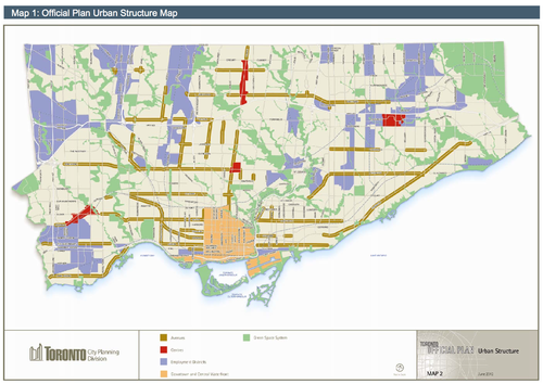
    The best way to explain why I feel this way is to talk about how and where Toronto is growing. In my post on John Tory’s transit proposal, I talked about how Toronto is developing in the shape of an upside down letter T. And the reason for that is because in the city’s Official Plan, the “Downtown and Central Waterfront” area is identified as a growth node and is shaped more or less like an upside T. It’s the light orange in the following map.

    image

    In addition to the downtown core, the areas shown in red are earmarked as “Centres” for growth. There’s one in each borough (Etobicoke, North York and Scarborough) and one at Yonge & Eglinton, which most people would consider to be the heart of midtown. Finally, you have the “Avenues” which are the greenish brown lines on the above map. Those are areas that city also hopes will accommodate future growth.

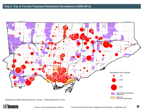
    Now, let’s look at where development is happening in the city. Here’s residential development from 2008 to 2012. The biggest circle represents 2,000 proposed residential units.

    image

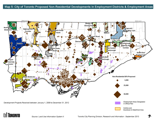
    And here’s non-residential development. The largest diamond represents projects with a non-residential floor area greater than 50,000 square meters (~540,000 square feet).

    image

    What should become immediately apparent is that growth–particularly on the residential side–is happening more or less according to plan. The biggest “outliers” are really the development happening along Mimico’s waterfront and all the development happening along Sheppard Avenue East. But those are because of the water and the Sheppard subway line.

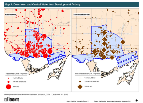
    In both the residential and non-residential cases though, the downtown and central waterfront area is quite clearly receiving a significant share of the development happening in the city.

    image

    Which always makes me wonder: Why are we so reluctant to build proper transit in the core?

    The city’s Official Plan is clearly funneling growth to downtown and yet we continue to propose, fund, and build subway lines in areas where the population densities are lower and ridership levels will inevitably be less. Which ultimately means that the required government subsidies to keep those lines operating will be higher.

    I’m not suggesting that the inner boroughs don’t also need top notch transit and infrastructure. They absolutely do. But I get frustrated when politics trumps rational city building. And so does everybody else who’s stuck with inadequate mobility options.

    Images: City of Toronto

  • Why the Gardiner East should be torn down

    Warning: This post turns into a bit of a rant near the end 🙂

    Since 2009 (well, much earlier actually), Toronto has been trying to figure out what to do with the eastern portion of the elevated Gardiner Expressway (the portion from Jarvis Street to the Don Valley Parkway). The process used to help make this decision is called an Environmental Assessment (or EA) and that’s what is currently underway. But it’s a painstakingly slow process.

    Recently though, a third public meeting was held in order to solicit feedback on the various design solutions and so there’s been a renewed interest in this city building issue. Since the beginning, my position has been that we should tear it down. And in this post I’m going to explain why I think that is exactly what the city should do. 

    But first, a bit of background.

    The EA started by identifying four “Alternative Solutions” to the problem of the Gardiner East. And they are: 

    1. Maintain the elevated expressway (Basically do nothing)
    2. Improve the urban fabric while maintaining the existing expressway
    3. Replace with a new above or below grade expressway
    4. Remove the elevated expressway and build a new boulevard

    They then went out and assigned these solutions to a bunch of architects and designers—whom are some of the world’s best—and asked them to come up with specific design proposals. These proposals are available online and that’s part of what the public has been commenting on.

    City Council seems to generally want the Gardiner down, but there are some naysayers. 

    Rob Ford doesn’t want it removed (option #1) because it’ll add to driver commute times (no surprise there) and Councillor Denzil Minnan-Wong is worried that tearing it down will just lead to another wall—a wall of waterfront condos.

    But I think these views are terribly shortsighted and I’ve made my position clear by submitting a formal response through the City’s public engagement portal. To explain my view here on Architect This City, I thought the best way would be to simply share my answers. So here they are.

    What do you like?

    [slideshare id=22945545&sc=no]

    I can honestly say that I love my city. I was born in this city. And I was raised in this city. This city has given me so much, which is why I feel so compelled to try and give back to it. It’s also the reason why I’m first to defend it when people talk about how great this or that city’s waterfront is and how much ours sucks. I mean, I know ours sucks. But we’re fixing it.

    We have a lot of great plans in the pipeline for our waterfront, but there’s a remaining obstacle: our elevated expressway. Boston buried theirs. And San Francisco transformed theirs into a magnificent public space. What are we going to do with ours? Now is the time to be bold and not settle for the status quo. That’s too easy. We need to remove the eastern portion of the Gardiner Expressway today and the design proposal by Field Operations offers a brilliant way to do it.

    Not only is removing the Gardiner the most cost effective solution ($470M, versus $870M to maintain, $865M to improve and $1.4 billion to replace), but it’s also the most desirable from a city building standpoint.

    The Gardiner is not the only barrier. We also have the rail lines. So while repurposing the Gardiner might be doable in isolation, we simply have too much friction standing between us and the lake. We need to remove the barriers that we can. It’s for this precise reason that Field Operations spent so much time worrying about the north-south connections. And I think their “architectural sleeves” are a really interesting way to solve this problem.

    At the same time, timing is an important consideration. As the surrounding East Bayfront area develops, it’s only going to become more costly to remove this stretch of the Gardiner. If we’re going to do this, now is the time.

    Finally, I think it’s important to note that Field Operations is the landscape architecture firm behind the wildly successful High Line in New York. So what we have is a firm that made a name for itself repurposing an old elevated rail line, telling us that our own elevated structure is worthless and uninspiring. Think about that for a minute. Should we really be spending more money to salvage the Gardiner East?

    What concerns do you have?

    That we’re getting hung up on commute times as one of the key decision making criteria. It’s a red herring. Let’s face it: irrespective of whether we tear down the eastern portion of the Gardiner or not, Toronto is fucked from a transportation and infrastructure standpoint. We’re sitting on decades of disinvestment and some of the longest commute times in North America.

    Field Operations put it well when they said that the tearing down of the Gardiner East needs to be thought of as a paradigm shift. We have a 25-year transportation plan waiting to be funded. Let’s go out and do that instead of trying to sacrifice our waterfront so that suburban commuters can save a few minutes. Let’s give them a shiny new train instead. They’ll like that.

    Either that or Torontonians need to stop talking about how great Chicago’s waterfront is, because we can do it too. Now is our chance.

    What advice do you have for the Project Team as the study moves into the next phase?

    Don’t listen to Rob Ford.