Daily insights for city builders, delivered every morning at 6 AM ET. I’m Brandon Donnelly — a Toronto-based real estate developer and founder of Globizen. I’ve been writing here since 2013.

Tag: cities

  • Income sorting by city

    This is a fascinating study by Issi Romem about the characteristics of cross-metropolitan migration in the United States. The key findings are that in-migrants to expensive coastal cities tend to have higher incomes and more education than the out-migrants, and that the opposite is true for the less expensive cities in the US. “Expensive” means expensive housing.

    Here is the income chart:
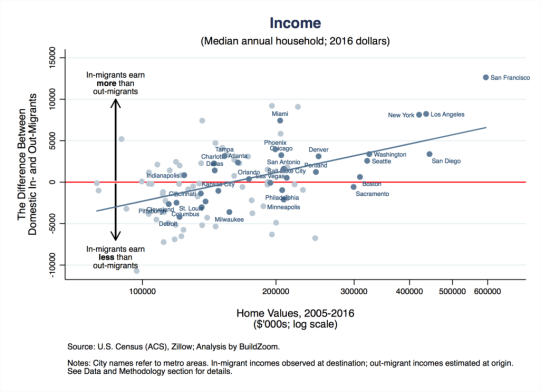
    Let’s use San Francisco as the example since it’s the most expensive metro (all the way to the right on the x-axis). The way to read this is that on average, from 2005 to 2016, in-migrants to the San Francisco metro area earned $12,640 a year more per household (y-axis) after they arrived compared to out-migrants before they left. This chart shows the difference between in and out incomes.

    Take note of Miami which is sitting at a similar place to New York and Los Angeles on the horizontal income line, but has home values similar to Phoenix, Chicago, and Philadelphia.

    Now here’s the education chart:
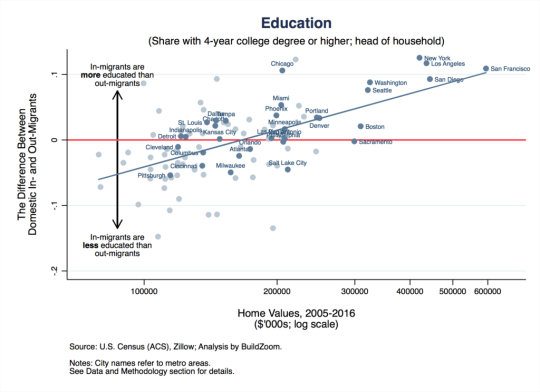
    Similarly, it is showing the difference in educational attainment between in and out migrants.

    So what does all of this tell us? 

    Well, it tells us, among other things, that US metros are continuing to sort based on income and that this process of polarization is probably contributing to home price appreciation. Because even if the incomes of current residents aren’t growing, these “expensive cities” are effectively swapping out poorer residents for richer ones. That, alone, would mean more money for expensive homes.

    For Issi Romem’s full article, click here.

  • Half of Toronto condos completed last year became new rental housing

    image

    Shaun Hildebrand (Urbanation) and Benjamin Tal (CIBC) published a report today called, “A Window Into the World of Condo Investors.” In it they revealed that last year (2017 data) no less than 48% of the Greater Toronto Area’s newly completed condo units were closed on by “rental investors.” In other words, almost half of the units became new rental supply.

    This stat was not surprisingly turned into clickbait-y type headlines like, “Half of Toronto condos bought last year were by investors”; whereas an alternate headline might read: “Half of Toronto condos completed last year became new rental housing.” Not as jarring, I know.

    In any event, there are a bunch of other interesting stats in the reports. Here are a few of them:

    – 80% of all new home sales in the GTA last year were condo.

    – Average resale condo prices (per square foot) increased by 26% last year and rents grew by 9%.

    – Over 20% of condo investors purchased their property with no mortgage.

    – Average down payment made by investors was 20%; non-investors were closer to 15%, likely because of mortgage insurance and other factors.

    – Out of the condo investors who took possession in 2017 with a mortgage, no less than 44% are in a negative cash flow position – meaning their rental income isn’t covering their carrying costs. 

    – The returns, which the report calls exceptional, have been coming in the form of price appreciation.

    – As a stress test for the market – what if all these negative cash flow investors suddenly sold their condos? – the report also estimates that if you took all of the rental investors who closed in 2017 with a mortgage and who are in a negative cash flow position greater than $500 per month, it would represent only 3.4% of the total annual supply of condos (both new and resale product).

    If you would like to check out the full report, you can do that over here.

    Photo by Scott Webb on Unsplash

  • The Great Recession only paused suburbanization

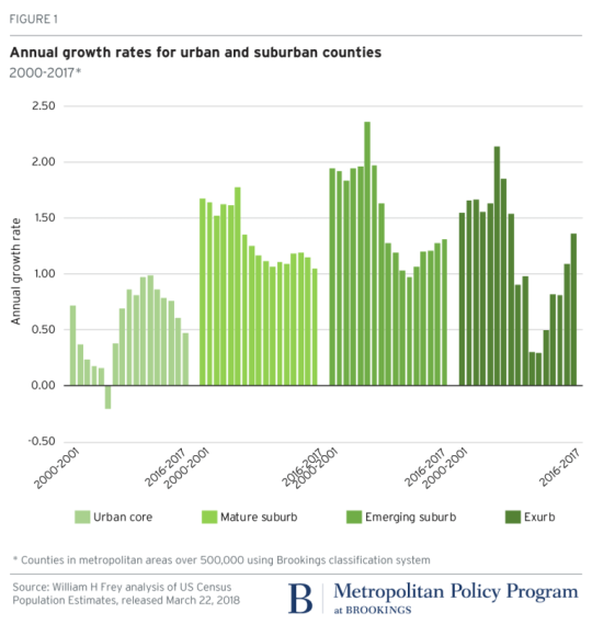
    According to newly released US census data for 2010-2017 – which Brookings analyzed here – the “back to the city” movement appears to have peaked in 2012. (This is something that we’ve looked at before on the blog.)

    Here is a graph from Brookings showing the annual growth rate for urban and suburban counties. Note how growth in the “urban core” peaked in 2012 and how growth in both the “emerging suburb” and “exurb” have increased since then.

    image

    The other finings from Brookings are that growth has slowed in large metropolitan areas (small metro areas and non metro areas, on the other hand are up) and that people are continuing to move from the Snow Belt to the Sun Belt.

    If you look at population gains and losses from 2016-2017 for the 100 largest US metro areas, the only Snow Belt gainers within the top 20 are New York (15th), Columbus (19th), and Boston (20th). Dallas, a Sun Belt city, was first with a gain of 146,000 people.

    So what’s going on? The narrative is that soon as the US economy and housing market recovered from the Great Recession of 2008, the trend lines simply reverted back to business as usual: sun and sprawl.

  • Two new chiefs

    image

    There were some big announcements in the planning world this past week here in the Greater Toronto Area. Gregg Lintern (follow him on Twitter) was named the new chief planner of Toronto (he was previously the acting chief planner following Jennifer Keesmaat’s departure) and Andrew Whittemore (couldn’t find him on Twitter) was named the new chief planner of Mississauga.

    As I went through the articles announcing the above appointments, I couldn’t help but be reminded that this region is at an exciting and pivotal moment in its history. All of the talk is about improving urban mobility (i.e. becoming less dependent on cars); intensifying around transit stations (as well as gently intensifying neighborhoods); making downtown a better place for families; and so on.

    It can be easy to feel defeated in this big bad world of city making. Oftentimes things seem to get reduced to either urban vs. suburban rhetoric or, as if nothing else matters, this one simple question: “But, how tall is the building?” So its nice to know that those at the helm continue to see endless opportunity in this region. I know that I wouldn’t want to be doing what I’m doing anywhere else.

    Photo by mwangi gatheca on Unsplash

  • First 3D printed home in America

    The video below is a good follow-up to my recent post about the 100 million city and the rapid population growth that we are seeing in some parts of the developing world.

    If you can’t see the embedded video below, click here.

    [youtube https://www.youtube.com/watch?v=SvM7jFZGAec?rel=0&w=560&h=315]

    It’s a video about what is allegedly the “first permitted, 3D-printed home in America” – an 800 square foot home that was built/printed in Austin during SXSW in about 24 hours.

    The project is a partnership between New Story (a non-profit) and ICON (a construction technologies company), and the goal is to pioneer a fast and cheap housing model for the developing world.

    The cost for the above home is said to be about $4,000.

  • The 100 million city

    The Guardian recently published this reminder that the real population growth in the world today is happening in Asia and Africa. The article is called, “The 100 million city: is 21st century urbanisation out of control?” Much of the data is from this 2016 paper by Daniel Hoornweg and Kevin Pope, which projected the populations of the world’s biggest cities by 2100.

    The standout example is that of Lagos, Nigeria, which went from under 200,000 people in the 1960s to an estimated 20 million people today. Though, I would imagine that the ubiquity of informal settlements makes it difficult to come up with an accurate number.

    Still, it is one of the world’s top 10 largest cities and, by 2100, it may be the largest city in the world. The Guardian described the population as young, fertile, and increasingly urban. The median age in Nigeria is 18 and the fertility rate for the content is 4.4 births per woman.

    I am mentioning all of this today because I think it grants some perspective. This is an immense city building challenge, not only because of the unprecedented growth rate, but also because it remains largely poor. Lagos, a city, may add more than 2.2x the population of Canada, a country, during the balance of this century.

  • Vancouver’s Empty Homes Tax

    In an effort to curb the much talked-about and much debated empty home situation in Vancouver (supposedly the number is ~20k vacant homes), the city, as many of you know, implemented an Empty Homes Tax.

    To enforce this, the City of Vancouver now requires that every year, every owner of residential property must file a status declaration. If you don’t file this by the deadline, the property is automatically deemed vacant and the tax (1% of assessed taxable value) and a penalty ($250) are applied.

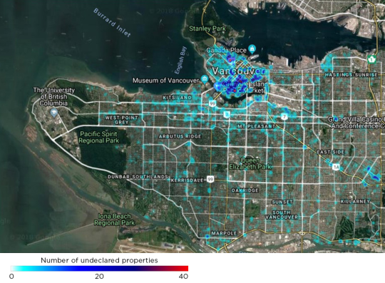
    Last month, 11 days before the 2017 deadline, the city published the below heat map showing the concentration of Vancouver property owners who hadn’t yet made their declaration. There were just under 4,000 undeclared properties.

    image

    But as Jens von Bergmann points out on his blog, Mountain Doodles (great data-driven blog), this was really just a map of where people live. Because if you also create a map of residential properties subject to the tax, which he did, it looks pretty similar to above.

  • New high-rise home prices up 39.5% year-over-year

    February data (2018) for the new home market in the Greater Toronto Area was released this past week by BILD and Altus. I seem to have gotten into the habit of writing about this every month.

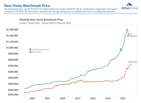
    The benchmark price for new low-rise single-family housing was down slightly from January to $1,219,874, but still up 12.8% from a year prior.

    The benchmark price for new high-rise housing was up a whopping 39.5% year-over-year to $729,735. But part of this is being driven by an equally dramatic increase in average unit sizes.

    Here is the relevant graph:

    image

    The story continues to be about tight supply, historically low developer inventories, and a lack of affordable low-rise product. 

    As I have argued many times before on this blog, I believe these factors — and in particular the last one — are, at least partly, driving this recent pop in high-rise pricing. People are priced out and now searching for substitutes.

    So my prediction continues to be that we will see a convergence (i.e. diminishing spread) between new low-rise and high-rise pricing.

    That will also bring about design and product changes on the high-rise side.

  • My new gig…

    image

    So this is interesting.

    Earlier this month, Travis Kalanick – co-founder of Uber and its former CEO – formed a new venture fund called 10100. According to the WSJ, it was funded with his own money after he sold 30% of his position in Uber for a cool $1.4 billion. 

    Ten-one-hundred’s spartan website explains that the goal of the fund is “large-scale job creation, with investments in real estate, ecommerce, and emerging innovation in China and India.” On the non-profit side, the initial focus will be on “education and the future of cities.”

    Then this week, Travis tweeted out “My new gig…” and disclosed that 10100 had entered into an agreement to buy a controlling interest in a real estate holding company called City Storage Systems (CSS) for $150 million. 

    He also announced that he would become CEO.

    The focus of CSS is on the redevelopment of distressed real estate, particularly parking, retail, and industrial assets. He goes on to say: “There are over $10 trillion in these real estate assets that will need to be repurposed for the digital era in the coming years.”

    This whole series of events is a big bet on some significant changes in the real estate space.

    Photo by Martin Reisch on Unsplash

  • What are the most important condo and rental building amenities?

    Last night I casually asked the

    Twittersphere

    what the most important condo amenity is, besides a gym. 

    That tweet got quite a few responses – everything from rock climbing to a proper facility for realtor lock boxes.

    Given the response, I thought it would be worthwhile to be a bit more rigorous in this analysis. So I have created an online survey that you can very quickly fill out by clicking here

    Here’s how this is going to work:

    – You have to enter your email address. Sorry, some friction. I figured that would make the data a bit more reliable. Don’t worry your email is safe.

    – You can select a maximum of 3 amenities. One of them can be “Other”, in which case you would then enter in an amenity not already found on the list.

    – The order of the amenities in the survey is being randomized so as to avoid any possible it’s-near-the-top-and-I’m-too-lazy-to-scroll bias.

    – You’ll be able to see the results of the survey after you’ve responded. I’ll also post the results to this blog so that it’s public and people learn things. Individual emails will, of course, never be published.

    Developers should be building what people actually want and will use. Now is your chance to tell us what that is. Click here for the survey.