Daily insights for city builders, delivered every morning at 6 AM ET. I’m Brandon Donnelly — a Toronto-based real estate developer and founder of Globizen. I’ve been writing here since 2013.

Tag: cities

  • Building height fallacy

    Studio Gang has a project currently under construction in New York City called 40 Tenth Avenue. It is also known as the “solar carve tower.” Here are a couple of progress photos taken by Timothy Schenck. The glass is beautiful. (If you can’t see the embedded tweet below, click here.)

    https://platform.twitter.com/widgets.js

    This is one of my favorite buildings by Studio Gang and one that we all studied when we were kicking off One Delisle

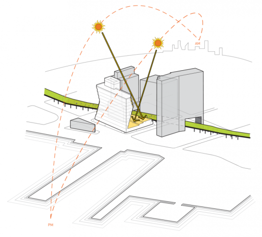
    The geometry of the building is a result of carve outs that maximize the amount of sunlight that is able to reach the adjacent High Line (public space). It is form driven by functional logic. Here is a diagram from Studio Gang showing the carve outs that result from the sun’s rays.

    image

    The other thing I like about this project is that it is a clear proof of something that I’m going to call the “building height fallacy.” There can be a tendency to overfocus on building height, which I have argued against before on this blog. 

    In this case, a shorter and squatter building without these solar carve outs, would have actually been worse for the High Line and the surrounding environment in terms of access to light and air.

    The building is responding to site-specific criteria – which is what great architecture should do.

  • A language map of Toronto

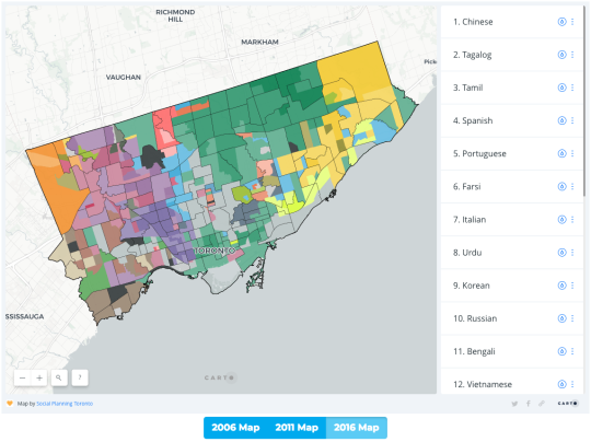
    This is a language map of Toronto showing the most commonly spoken non-official languages at home. (It only counts individuals who reported speaking a single non-official language most commonly at home, as opposed to multiple ones.) The map you see below is based on 2016 census data, but if you’d like to check out the previous census years, as well as an interactive version, you can do that here at Social Planning Toronto.

    image

    The top languages are also listed on the right of the map, with the exception of the gray areas. These areas indicate census tracts where English > 90%. I don’t know why French shows up as #13, since this map is supposed to be non-official languages.

    In any event, green represents Chinese (includes Cantonese, Mandarin, and so on). Sky blue is Tagalog. And yellow is Tamil. I’ll let you play around with the map to explore the others. There shouldn’t be many surprises if you know Toronto well, but it’s still interesting to explore the clustering and the percentages. Some of the census tracts have a single non-official language representing 90%+ of the responses.

    The biggest gains over the last decade – following the same methodology as the above mapping – were Tagalog, Farsi, Bengali, Arabic, and Pashto. And the biggest declines over this same time period were Italian, Tamil, Urdu, Punjabi, and Polish. But this data is only for the City of Toronto and so I suppose that a decline could also be because of people relocating to other parts of the region.

    A big part of Toronto’s strength comes from exactly what you see in this map: the world in a city.

  • PAMM, hi

    Yesterday we visited the Pérez Art Museum Miami (PAMM), which has been on my list since it first opened in 2013. 

    The Pérez part of the name belongs to real estate developer and art collector Jorge Pérez. He donated $35 million in cash to the Miami Art Museum in 2011 – so that the below building designed by Herzog & de Meuron could be built – and another $15 million in 2016. 

    This latter donation included some contemporary Cuban art valued at around $5 million. Supposedly after he dies Pérez will be donating the rest of his art collection to the museum.

    Pasted below is a full copy of the architect’s description of the project to go along with my photos. It was taken from here.

    This first picture faces the main entrance (on the left) and Biscayne Bay. In the background, toward the end of the terrace, is also a playground with swings.   

    image

    This picture shows the relationship between the “veranda-like public space” that wraps the building and Biscayne Bay on the left. Also note the hanging plants. These were great.

    image

    And this last picture is my attempt to show a kind of section through the building. Here you can clearly see the raised museum and at-grade parking (described below). 

    I also enjoyed that the parking level housed vegetation that cut through the above veranda.

    image

    -—————————————————–

    An open structure

    The new Pérez Art Museum Miami (PAMM) is located in Museum Park, part of the redeveloping downtown waterfront on Biscayne Bay. Its direct neighbours are the Patricia and Phillip Frost Museum of Science and a major freeway, connecting mainland Miami with Miami Beach. Simultaneously oriented towards the park, the water and the city, the new PAMM is an open and inviting structure from all sides alike.

    Miami is known for its iconic art deco district, decorated boxes with no great relationship and exchange between inside and outside. What makes Miami so extraordinary however, is its amazing climate, lush vegetation and cultural diversity. How can these assets be fully exploited and translated into architecture?

    Nature

    As in previous examples of our work, such as the Dominus Winery in Napa Valley, the building’s environmental circumstances become central to its architectural concept. Due to its proximity to the water, the museum is lifted off the ground for the art to be placed above storm surge level. We use the space underneath the building for open-air parking, exposed to light and fresh air that can also handle storm-water runoff. Rising from the parking level, the stilts supporting the museum platform become columns supporting a shading canopy, which covers the entire site creating a veranda-like public space that welcomes visitors to the museum and the park. Facing the bay, a wide stair connects the platform to the waterfront promenade.

    In this exceptional location, we wanted the museum to offer generous views to the outside. Yet all the building’s expansive windows are recessed, with wooden planks under the concrete beams to minimize the sun’s impact on the glazing and to reduce the building’s energy consumption for cooling. Tropical plants selected for their resilience to the local conditions engulf the structural system. Roof and plants combined will create an overall microclimate reducing the extreme temperature gaps between outside and inside in the hot weather. The exterior surface of the museum’s massive concrete walls is chiseled in places and polished in others. When adjacent to the glazing, the concrete is smooth and reflective. When facing the outside, the concrete becomes rough, exposing its natural ingredients.

    Rather than being an isolated “jewel box” (Schatzkammer) for art lovers and specialists, the museum provides comfortable public space for everybody. It is an extension of the park, offering gradual transitions from the outside to the inside, from the warm to the cool, from the humid to the dry and from the street to the art.

    Specificity

    The expression of the building comes from the canopy, the platform, the columns, the vegetation: in other words, the Veranda occupying the entire site. The museum’s interior volume nests within it, suspended amid the structural framework, each floor assuming the shape it needs. Because the galleries did not have to fit into any given form, we had the freedom to develop the curatorial layout, in close collaboration with the museum staff, to what felt like an optimal configuration to exhibit and develop the growing collection as well as to provide ample space for temporary exhibitions.

    PAMM is organised around four different gallery types: Overview, Focus, Project and Special Exhibition galleries. They occupy part of the first and the entire second floor. The Overview galleries, displaying the museum’s collection, serve as the connecting tissue between the other gallery types. Fluidly connected in a non-linear sequence, they allow relationships to be formed between spaces. They are characterized by large openings with views onto the park, downtown Miami, the bay and the freeway. Along this flowing sequence of rooms, single enclosed spaces punctuated by windows show an individual artist, a theme, a specific collection or a commissioned work. These spaces are called Focus and Project galleries. The fourth type, the Special Exhibitions galleries function as spacious exhibition halls designed to accommodate contemporary art exhibitions. The Overview, Focus and Project galleries form a firm and rhythmic sequence through the building, varying in proportion and relationship to the outside. On the other hand, the Special Exhibitions galleries are flexible, with fewer openings to the outside and can be subdivided by temporary walls.

    The spaces at PAMM and their materiality are very specific. They can be considered an antithesis to the flexible, abstract white cubes that have been a dogma in most recently built art spaces. Concrete and wood are used in different combinations, reflecting the outside materials of the building. Typical drywalls are detailed in a way that they are legible as added to the main structure. In order to enhance the inside-out transition, we designed a customized concrete mullion system that holds the largest ever-used hurricane-proof glass in Florida.

    Community and views

    At the heart of the building, a stair as large as a gallery connects the two exhibition levels. This stair also functions as an auditorium, using sound-insulating curtains in different configurations to provide space for lectures, film screenings, concerts and performances. Our idea was to avoid for such events to be isolated in a space remaining unused for most of the time. At PAMM, events in preparation are visible. When the space is not actively used for events, it is used by visitors and staff for individual readings, introductions to groups and the like. The museum shop and bistro are located on the platform level and are oriented to the bay. Education and research facilities are on the third floor along with the museum’s offices. We place these communal spaces at the periphery of the building, maximizing their exposure to the Veranda, Biscayne Bay, and Museum Park.

    Herzog & de Meuron, 2013

  • Before & After — Miami Beach

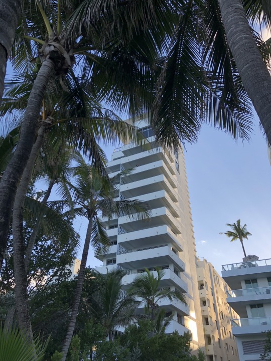
    We switched coasts today. Here is a photo of our Miami Beach hotel taken from the boardwalk with my iPhone:

    image

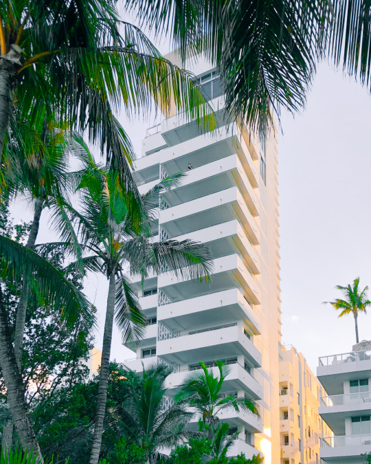
    And here is the after:

    image

    I took it into Lightroom. Fixed the alignment of the building. Whitened it, but brought out the beautiful warm sunset light on the north elevation. And I took the greenery in the foreground out of the shadows.

    The balconies remind me of one of Donald Judd’s “Untitled” pieces. He was one of my favorite artists. I also like the one dude leaning over that upper balcony. It gives the photo a tranquil feel, which is not usually how one would describe Miami Beach.

  • Red tide, scooters, and civic security

    image

    I am reading up on a few different things this morning.

    Southwest Florida, which is where I am right now, is in the midst of a “red tide” that began last November. These happen fairly regularly along the Gulf Coast, but this one is high up on the severity scale. There doesn’t appear to be a clear explanation for what causes them, but sustained warmer temperatures and fertilizer and other pollutant runoff are thought to stoke it. Whatever the cause, they are devastating to the environment. We are switching coasts tomorrow morning.

    Portland now has electric scooters. (Why don’t we have these in Toronto?) But to combat possible concerns around urban clutter, the company, Bird, has committed to collecting all of its scooters each night and has agreed to remit $1 per scooter per day to the city. These scooters are pissing off some cities (or maybe it’s just San Francisco), but I still believe the problem will eventually get resolved. City Observatory also has this interesting piece where it compares the above scooter pricing to car pricing. Are we underpricing cars?

    Finally, here is a short film on civic security in Paris. In an effort to mitigate terrorism, the city has, of course, been implementing and erecting fencing, barricades and other reactive security measures. But sadly, now that this has become a new reality, the capital is spending more time considering how these measures could be more thoughtfully designed. The video showcases some of them. Certainly a more deliberate approach, but are they just as reactive?

    Maybe one of these topics will be of interest to you too.

    Photo by Andreas Selter on Unsplash

  • Melting lollipops

    I’m out of office for the next week and so I’m going to try a bit of photoblogging. Here is a photo that I took this afternoon at Elena Bulatova Fine Art Gallery on St. Armand’s Circle. I really liked the art, and especially the melting lollipops and popsicles. They certainly felt climate appropriate.

  • Homes built in the past year

    I’m on a flight right now reading the latest issue of Monocle Magazine in a seat that barely accommodates the length of my femur. This month’s issue has their annual ranking of the top 25 cities in the world.

    Munich is first, which is not unusual for their ranking methodology. It generally scores well. Quality of life is high. Crime is low. The economy is strong. Beer gardens are fun. And you’re close to the Alps for snowboarding.

    One stat that caught my attention — and it’s not included for all of the cities — is the number of homes built in the past year. Presumably this is all housing units in the metro area — for sale, for rent, subsidized and so on.

    Here are their (clearly rounded) numbers. The order is as they appeared in the ranking, but again, not ever city included this stat.

    • Munich: 8,300
    • Tokyo: 150,000
    • Copenhagen: 5,000
    • Berlin: 11,000
    • Madrid: 1,600
    • Hamburg: 7,000
    • Melbourne: 5,100
    • Helsinki 4,400
    • Stockholm: 7,000 (18,000 in Greater Stockholm)
    • Sydney: 39,000
    • Hong Kong 17,000
    • Vancouver 22,600
    • Amsterdam 5,100
    • Kyoto 8,900
    • Dusseldorf 2,600
    • Barcelona 1,000

    Some of these numbers appear to stand out, such as the counts for Tokyo, Sydney and maybe Vancouver. But it’s hard to draw any conclusions around housing supply and housing affordability.

    Melbourne and Amsterdam allegedly have the same number of homes built over the past year, but according to Monocle the metro areas of Melbourne and Amsterdam have populations of 4.85 million and 2.4 million, respectively. This also says nothing about their growth rates.

    So which one is doing a better job of addressing housing demand? I’m not sure.

    But it was still interesting to see that Tokyo delivers somewhere around 150,000 homes a year. Tokyo is somewhat unique globally in that it’s a big city — one of the biggest — that somehow manages to gracefully balance both scale and quality of life.

    Photo by Elias Keilhauer on Unsplash

  • Portland is considering whether to solve traffic congestion

    image

    Chris Hagerbaumer is the deputy director of the Oregon Environmental Council. She recently delivered the below testimony on “variable traffic-based tolls”, a form of road pricing. This is something we have talked a lot about here on the blog. 

    Oregon is currently looking at implementing this on two freeways in Portland, which is why Chris delivered this testimony. And as many of you know, I am very much in support of this demand management approach. So here you are: why congestion pricing makes sense for Portland (taken from City Observatory).

    ——————————————————–

    The question in front of you is: how do we actually solve congestion, solve it in a way that is the least cost to the taxpayer, and in a way that doesn’t result in more pollution. When we add more supply (in other words, build more roads) we end up exactly where we started when it comes to congestion (due to induced demand), we spend billions of taxpayer dollars (much of which comes from drivers who aren’t the ones demanding more road space), we harm surrounding communities as highways encroach into neighborhoods, and we pollute the air and heat up the planet.

    Induced demand is the fact that when you add freeway capacity it induces longer trips, more sprawl and more driving. Traffic is like a gas, expanding to fit whatever space there is. In one infamous example, Texas spent nearly $2.8 billion expanding Katy Freeway to 26 lanes and congestion has actually worsened.

    Building new roads is a supply-side solution that simply doesn’t work.

    An effective, least-cost, environmentally sound way to address congestion is the proposal before you: congestion pricing to manage demand. Drivers pay an automated fee to enter highly congested roads at peak hours; in return, they travel smoothly and reliably, getting where they need to go on time. Prices are set at the lowest possible level to free up just enough road space to eliminate bottlenecks.

    When you eliminate bottlenecks and get traffic flowing freely, you have—in essence—added capacity. You no longer need to add new lanes, you save taxpayers a bundle, and you reduce dangerous auto and truck exhaust.

    Congestion pricing is a demand management solution that’s proven to work and does so in cities around the world. Drivers opposed congestion pricing at first: no one wants to pay more. But that opposition of 60% or more turned into support of 60% or more after congestion pricing was implemented. People’s opposition turned to support because they now get that it works—they experience the value.

    Equitable application of congestion pricing absolutely requires mitigating diversion to local streets. But note that congestion pricing actually pulls many drivers who were already cutting through local roads back to the highway because those drivers who were stuck in traffic now have an option to get where they need to go, on time, for a small price.

    Equitable application of congestion pricing also requires significantly increasing transit service and other travel options in the corridor and considering other means to make the system work for low-income commuters who must drive during peak hours, such as targeted discounts or exemptions.

    We think of highways as free and we think of driving as freedom, but by investing almost solely in infrastructure for cars over most of the 20th century and into the 21st century, we created a transportation system that is costly not only for our pocketbooks, but for our very health and wellbeing and our region’s economic prosperity, a transportation system that contributes to the existential risk of runaway climate change.

    You have an opportunity to make a decision that will lead to less time stuck in traffic, healthier air, and more economic prosperity for the region and state. We hope you embrace that opportunity.

    Photo by Zach Savinar on Unsplash

  • Urban metabolism

    I spent this morning in the suburbs bouncing around to a few different meetings. I then came back downtown so that I could get some actual work done in the office. And then after that, I was around downtown getting a bunch of different things done.

    I am mentioning this to you all because today I was reminded of how different the metabolic rate can feel in the city compared to the suburbs. There are even studies suggesting that people walk faster in larger cities.

    Some businesses, of course, require a lot of space and the economics simply do not work in the core of the city. We all get that. But if you’re competitive advantage is human capital, then this is something to think about.

    I feel like I spent most of my morning driving around, which I’m not complaining about, except that I could have probably had 3x as many meetings in the city during that same period of time. If you multiply that out over time, then we’re talking about a material spread in overall productivity.

    And we haven’t even touched on those fortuitous urban encounters, which do happen and do provide all sorts of benefits. As much as we’re all connected like never before – through things like, well, this blog – there’s nothing like shaking somebody’s hand and looking them in the eyes.

  • The Hess triangle

    A friend of mine recently shared this Twitter thread with me. It is by Chaz Hutton. I didn’t know who Chaz was before I read the thread. But I now know that he draws things, sometimes for the New Yorker.

    Chaz’s Twitter thread covers the history behind what was once believed to be the smallest plot of land in New York City. He also positions the story as the “perfect embodiment of New York’s attitude.” Guess what the means.

    The story is about the isosceles triangle pictured above, measuring 25-1/2″ at its base and 27-1/2″ along its sides. It is known as the Hess triangle and it reads: “Property of the Hess Estate which has never been dedicated for public purposes.“

    Click here for the full story.

    Image: Chaz Hutton