Daily insights for city builders, delivered every morning at 6 AM ET. I’m Brandon Donnelly — a Toronto-based real estate developer and founder of Globizen. I’ve been writing here since 2013.

Tag: boston

  • How Japan increased its housing supply

    River Davis’ recent article in the Wall Street Journal about Tokyo’s generally flat home prices had me, again, wondering about demographics. I mean, aren’t their demographics working in reverse? They have an aging population, low immigration, and a low birthrate. But Tokyo, which represents about 11% of Japan’s total population, is still growing. And their home price index looks like this compared to San Francisco and New York:

    Davis’ argument, which of course has been made by others before, is that deregulation has allowed housing supply to actually keep up with demand. Land use policies were relaxed to allow taller and denser buildings to be built and some degree of decision making (I’m not sure how much) was moved to the central government in order to counteract the NIMBY problem that invariably attaches itself to local politics.

    The result is housing numbers that look and compare like this:

    In Tokyo last year, housing starts came in around 145,000, according to Japan’s land ministry. This figure is on par with the total number of new housing units authorized last year in New York, Los Angeles, Boston and Houston combined, based on the U.S. Census Bureau data. The same feat was achieved in 2017.

    If we are to normalize against New York, it looks like this:

    And the belief seems to be that it is working:

    “A reason why housing prices in Japan are not rising as fast as in New York, for example, is the large number of housing starts,” says Masahiro Kobayashi, a director general at the Japan Housing Finance Agency, a state-run entity which supports the housing market by purchasing home loans.

    One sentence that really stood out for me in the article is this one here: “Private consultants were given permission to issue building permits to speed up construction.” If any of you have tried to pull a building permit for a large project in Toronto, you’ll know that it can take a very long time (understatement). Maybe it is the same in your city. Should we be looking at this?

    Charts: WSJ
  • Toronto vs. Boston

    I worked late this evening, which is pretty typical these days. After I got home, I flipped on the Raptors vs. Celtics and sat down to write something about cities, as is the case every day.

    But the game was too close and too good to resist. The Raptors turned things around in Q3 and ultimately went on to spank the Celtics with a 10-0 run in the last few minutes of the game. It was sweet, particularly because Toronto and Boston are likely to end up at the top of the eastern conference this season.

    So needless to say, I spent more time watching basketball and less time writing about cities. But that’s okay because I am pretty excited about this year’s Raptors. Here are a few Kawhi Leonard highlights.

  • Detroit. Move here. Move the world.

    As part of the Amazon HQ2 bid process, a number of cities produced videos. I only discovered them today and so maybe some of you also missed them when they were released last fall. There are videos from Detroit, Boston, Pittsburgh, Philadelphia, Dallas-Fort Worth, Las Vegas, Louisville, Atlanta, and maybe others that I am still missing. 

    Some of the videos are bad. (I’ll let you make your own judgement calls.) I like the idea behind Atlanta’s video, which is the journey of someone named Georgia physically delivering their bid to Seattle. And Philadelphia’s video made me feel really nostalgic about my time there. Those were some great years. 

    But my favorite video is Detroit’s video. It feels authentic. The footage is outstanding. And it feels powerful. Though it is probably too long. It was a good reminder that I’m overdue for a visit. So here is Detroit’s video. If you can’t see it below, click over to YouTube.

    [youtube https://www.youtube.com/watch?v=DO4J_PC1b5M&w=560&h=315]

  • Car-dependent spatial structure

    Earlier this week a 58 year old woman named Dalia was struck and killed by a car near the University of Toronto’s downtown campus. This tragedy has everyone talking about and questioning how to make our roads safer, though the answers are not difficult to find. Here is an excerpt from a piece that Richard Florida penned following the incident called, Toronto’s Deadly Car Crisis:

    Today, more Torontonians die from being hit by cars than from being killed by guns. In 2016, nearly 2,000 pedestrians and 1,000 cyclists in the city were hit by cars. Of these, 43 resulted in fatalities. On average, a pedestrian in Toronto is hit every four or five hours, and a cyclist every eight or nine. This means that Toronto’s rate of pedestrian deaths was 1.6 per 100,000 people in 2016 — worse than in Chicago, Seattle, San Francisco, Boston, Washington, D.C., Portland, Pittsburgh, Cleveland, and Buffalo. It has risen to 1.7 deaths per 100,000 people in 2017 and is on track to rise still further to 1.8 deaths per 100,000 this year. And, children and the elderly face the greatest risk of being struck and killed by a car. The problem is only getting worse. Across Canada, pedestrian fatalities increased by more than 10 percent between 2010 and 2016; at time when they decreased by more than 25 percent in European countries like Norway, Switzerland, and the Netherlands.

    The broader issue is what he refers to as Toronto’s “car-dependent spatial structure.” And it is detrimental to not only our public safety, as we saw this week, but also to our ability to grow as a global city. The Greater Toronto Area is projected to reach 10 million people by 2041. I agree with Florida that, for a number of important reasons, we are going to need to commit ourselves to a new model for growth.

  • Urban American life before the car

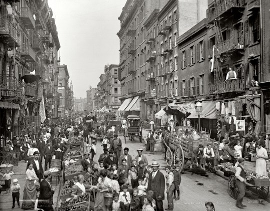
    This morning I stumbled upon an old (2013) post from Rebel Metropolis that documents urban American life through street photos taken before the automobile. 

    Above is Little Italy, New York City, 1900. All of the photos in the post are from Shorpy

    The photos are beautiful architecturally and from a photography standpoint. But as is pointed out in the post, they also speak to a different kind of street:

    What’s more, the street here is not purely the thoroughfare – it is the essential common gathering place for demonstrations, for buying and selling food, for children to play in, for celebration, for lingering and people watching.

    That sounds like a great street. And now I am off to start my day. Because I have meetings all around the city today, I’ll be driving to the office. 

  • The Great Recession only paused suburbanization

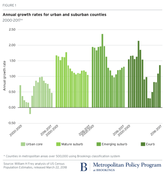
    According to newly released US census data for 2010-2017 – which Brookings analyzed here – the “back to the city” movement appears to have peaked in 2012. (This is something that we’ve looked at before on the blog.)

    Here is a graph from Brookings showing the annual growth rate for urban and suburban counties. Note how growth in the “urban core” peaked in 2012 and how growth in both the “emerging suburb” and “exurb” have increased since then.

    image

    The other finings from Brookings are that growth has slowed in large metropolitan areas (small metro areas and non metro areas, on the other hand are up) and that people are continuing to move from the Snow Belt to the Sun Belt.

    If you look at population gains and losses from 2016-2017 for the 100 largest US metro areas, the only Snow Belt gainers within the top 20 are New York (15th), Columbus (19th), and Boston (20th). Dallas, a Sun Belt city, was first with a gain of 146,000 people.

    So what’s going on? The narrative is that soon as the US economy and housing market recovered from the Great Recession of 2008, the trend lines simply reverted back to business as usual: sun and sprawl.

  • Become a Sidewalk Toronto Fellow

    Sidewalk Toronto is currently looking for “12 smart, creative, and caring people who are interested in the future of Toronto’s waterfront and how we [Sidewalk Toronto] can responsibly incorporate technology to improve urban life.”

    Each Fellow will complete a 2-day orientation session in Toronto; 6 days in Amsterdam and Copenhagen; 5 days in New York City and Boston; 3 days in Vancouver; and then do a final 2-day working session back in Toronto before presenting their takeaways.

    This feels like a response to the criticism that Sidewalk Toronto wasn’t doing enough to listen to the community and that it simply wanted to build a tech-infused neighborhood that could serve us more ads – but it’s cool nonetheless. 

    If you’re between 19-24 years old and you live in Toronto, you can apply here. It sounds like a fun opportunity for young city builders. I know that I certainly would have been all over it when I was in that age bracket.

  • My even shorter Amazon HQ2 shortlist

    Amazon released its shortlist of HQ2 cities this morning. Below are the 20 metropolitan areas. They were selected from 238 bids, so this shortlist represents 8.4% of the original pool.

    • Atlanta, GA
    • Austin, TX
    • Boston, MA
    • Chicago, IL
    • Columbus, OH
    • Dallas, TX
    • Denver, CO
    • Indianapolis, IN
    • Los Angeles, CA
    • Miami, FL
    • Montgomery County, MD
    • Nashville, TN
    • Newark, NJ
    • New York City, NY
    • Northern Virginia, VA
    • Philadelphia, PA
    • Pittsburgh, PA
    • Raleigh, NC
    • Toronto, ON
    • Washington D.C.

    I saw some people on Twitter say that they were surprised to see Toronto and Miami on this list. I was not. If you remember, I publicly predicted on this blog that Toronto would be selected for Amazon HQ2.

    That said, I thought it would be fun to guess at an even shorter list from Amazon’s shortlist. I have no knowledge of Amazon’s actual selections process, but if I had to guess, here is who I would cross off the list:

    • Atlanta, GA
    • Austin, TX
    • Boston, MA
    • Chicago, IL
    • Columbus, OH
    • Dallas, TX
    • Denver, CO
    • Indianapolis, IN
    • Los Angeles, CA
    • Miami, FL
    • Montgomery County, MD
    • Nashville, TN
    • Newark, NJ
    • New York City, NY
    • Northern Virginia, VA
    • Philadelphia, PA
    • Pittsburgh, PA
    • Raleigh, NC
    • Toronto, ON
    • Washington D.C.

    That leaves us with a list that looks like this:

    1. Boston, MA
    2. Miami, FL
    3. Montgomery County, MD
    4. Newark, NJ
    5. Northern Virginia, VA
    6. Toronto, ON
    7. Washington D.C.

    So why this list? I’m probably wrong, but my reasons are as follows:

    – I think Amazon will opt for a metro area on eastern time.

    – There seems to be a predilection for areas around Washington D.C., so I left Montgomery County and Northern Virginia. 

    – As wonderful as it is, New York City feels too center ice for Amazon – at least in my view. But maybe Newark places them in the catchment area.

    – The area needs to be of a certain scale so Amazon doesn’t overpower it and they have enough human capital to draw from.

    – Miami is my sleeper bet. Most people think of it simply as a resort town, but there’s a huge percentage of foreign born residents and powerful arts/design scene.

    – Talent is number one, which is why I left Boston and Toronto and why I continue to believe in Toronto. Toronto is more dynamic than Boston.

    If I had to pick just three from the above shortlist, my bets would be, in alphabetical order: Boston, Toronto, and Washington D.C. What are yours?

  • New York is the only US city with an urban core growing faster than the suburbs

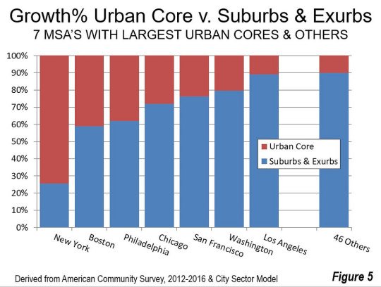
    The latest data from the American Community Survey (2012 to 2016) has placed the suburban and exurban share of the US population (53 major metropolitan areas) at 85.5%. Back in 2000 this number was thought to be around 83.5%.

    Since 2010, automobile oriented suburbs and exurbs have also accounted for 90.5% of population growth. The US – and Canada would be no different – is by and large a suburban nation. And the data suggests this isn’t about to change.

    The one exception is the New York metro area. From 2012 to 2016, 74% of its growth happened in the urban core. No other major metropolitan area in the US comes close to this sort of urbanity. Below is a chart from New Geography that shows you how NYC compares.

    All of the data for this post was also taken from New Geography.

  • The geography of innovation and equality of opportunity

    The Equality of Opportunity Project has a recent paper out called: Who Becomes an Inventor in America? The importance of Exposure to Innovation. Vox also has a summary of the findings, here.

    The overall goal of the project is to “use big data to identify new pathways to upward mobility.” And in this particular study, they discover that in America there are many “lost Einsteins” – people who have the ability, but not the opportunity.

    Not surprisingly, socioeconomic class, race, and gender play a significant role. Children from high-income families are 10x more likely to become inventors (measured in patents) as compared to children from low-income families.

    Geography, place, and environment also matter. Where and how a child grows up has a significant impact on future outcomes. If a child grows up in a city/network that exposes them to other inventors, it increases the likelihood that they too will invent. 

    Where a child grows up also has an impact on the types of inventions, even if the child move cities as an adult. For example, the study found that if a child grows up in Silicon Valley but moves to Boston as an adult, it is still more likely to author patents related to computers because that’s what it was exposed to as a child.

    These associations also impact in a gender-specific way. Women are more likely to invent in a particular technology if they grow up surrounded by similar female inventors. The presence of male inventors has no impact. This makes a powerful case for better gender diversity and strong role models.

    If you would like to read the full paper, click here.