Daily insights for city builders, delivered every morning at 6 AM ET. I’m Brandon Donnelly — a Toronto-based real estate developer and founder of Globizen. I’ve been writing here since 2013.
Today I’m excited to announce the latest artist collaboration at Junction House. (For a background on the others, click here.) Bogota-born, Toronto-based Juanita Lee-Garcia has created a series of hand-cut collage panels for the construction hoarding at Junction House (the background color is the project’s signature electric blue color).
In this installation, Lee-Garcia uses repetition and image repurposing to investigate the limits and the potential of decor in consumer culture. Her work uses simple gestures such as slicing, inserting, folding, and layering to build these new and abstract forms. They are intended to feel both fresh and unfamiliar, as well as comforting — perhaps because of some of their cultural associations.
We love these sorts of collaborations because we want every single one of our development projects to be more than just a new building. We want it to be a catalyst for positive city building change. So the next time you’re in the Junction, I would encourage you to stop by 2720 Dundas Street West and take in Juanita’s work. Limited edition prints of the panels are also available on her website.
I received an email this week from a senior real estate executive who was sharing the fact that, in response to COVID, he had decided to give up driving completely. He was now cycling everywhere — whether for work or for personal errands. And it was doing wonders for his health and his overall well-being.
Indeed, this feels like some sort of golden era for urban cycling. Back in May I wrote about how Toronto City Council had just approved the largest ever one-year expansion of bike lanes. Some 40 km. When have we ever moved this quickly and without months (okay, years) of painful debate? Probably never.
Of course, it’s not just Toronto. This is happening all over the world. Here are some of the numbers (taken from this recent Journal article):
Paris added 400 miles of pop-up bike lanes across the region — all of which didn’t exist before the pandemic – some of the streets being tracked have seen a doubling in usage
Oakland closed almost 10% of its streets to cars
Montreal is adding an additional 70 miles of pedestrian and cycle paths
Bogota is the midst of planning for 47 miles of temporary bike lanes
The UK has fast tracked over $315 million in capital spending for bike infrastructure — referring to this as a “once-in-a-generation” opportunity
New York’s bike share service (Citi Bike) saw year-over-year usage surge 67% in the first 10 days of March alone — before any shelter-in-place rules were even imposed
There are obvious reasons for this rush to build out cycling infrastructure. We’re in the midst of a global health crisis and people are staying away from public transit in big numbers. But I think it’s also important to keep in mind that in many / most cases, there is really no other viable mobility solution. You cannot take all the people that used to ride the tube in London and plop them into cars. There isn’t enough space.
So cities all around the world are doing the sensible thing and acting fast to make sure that it’s safer for people to move about on bikes. But as we all know, humans tend to have a bias toward the status quo. And so when this is all said and done, I suspect that many of these pop-ups will end up sticking around. And that will be a good thing for cities.
This UN report (2018) on urbanization trends is a fascinating way to understand how our world is growing and changing. So today’s post is about some of my takeaways. If you have others, feel free to add them to the comment section below.
But first, some definitions.
The UN report considers 3 ways to measure the size of a city, all of which we have used before on this blog. The first is the “city proper.” That is the current administrative boundary of a city. The second is the “urban agglomeration” area, which is a city’s contiguous built-up area. And the third is the “metropolitan area,” which is the approximate area of economic and social interconnectedness.
Above is what these 3 boundaries might look like for Toronto (which is the example they use in their report). About the only one that isn’t debatable is the “city proper” boundary; but it really doesn’t capture the full extent of a city. Wherever possible, the UN report relies on the city’s urban agglomeration area. They also define a “megacity” as a city of over 10 million people.
The largest city in the world is currently Tokyo. However, from 2018 to 2030 it is expected to decline by almost 900,000 people. Whereas, the city in 2nd position — Delhi — is expected to add more than 10 million inhabitants during this same time period. By 2030, these are expected to be the largest cities in the world:
Most current megacities are located in what the UN refers to as the “Global South.” And 9 out of the 10 cities projected to become megacities by 2030 are located in developing countries. The one exception is London. Though all regions in the world are becoming more urban, the real population growth is happening in Asia and Africa.
Most cities — 59% of cities with 500,000 or more people — are at risk of at least one natural disaster. And 3 megacities — namely Manila, Osaka, and Tokyo — are high risk for 3 or more types of natural disaster.
Going through the report’s data charts, it’s also interesting to note that Toronto is not projected to become a megacity by 2030. However, the Toronto area already represents over 20% of Canada’s entire urban population.
In the United States, Chicago’s urban agglomeration is projected to continuing growing and does come close to megacity status by 2030. The Miami region is similarly expected to grow and is actually right on top of Toronto in terms of population. But the fastest growing regions are, of course, expected to be the city’s that can more easily sprawl (Las Vegas, Phoenix, and so on).
Bogotá, Colombia is already a megacity and is expected to add almost 2 million people by 2030. It currently represents about 26.5% of the country’s entire urban population. São Paulo remains one of the top 10 largest cities in the world and is similarly projected to add over 2 million people in the same time period, but to a much larger base.
In Europe, it’s London, Paris, and Moscow, with the latter two already in possession of megacity status.
Now quantity isn’t everything. Despite not ranking in the top 10 in terms of population, both New York and London are widely considered to be the world’s preeminent global cities. At the same time, we do know that the size of a city does create certain socioeconomic benefits. Urban agglomerations create agglomeration economies.
If you’d like to download a copy of the World’s Cities in 2018 (United Nations), click here.
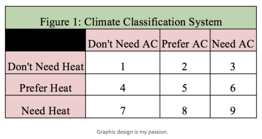
In his original study, Gray had 9 climatic categories, all of which were based on average high and low temperatures throughout the year. Category 1 was you definitely don’t need AC or heat. These cities are essentially perfect year round. And category 9 was you definitely need heat and AC. These cities are basically the worst places on earth to occupy from a climate perspective.
The climatic utopias ended up being places like Bogotá, Guatemala City, Lima, Mexico City, San Diego, São Paulo, and Sydney. The worst places were the southeastern United States, Central Asia, and northern East Asia.
But one factor that is not included in the study is humidity, which Gray rightly points out has a meaningful impact on comfort. Toronto, for example, is classified in his system as category 7. Heat needed. But AC definitely not needed. Personally, I would bump us up to category 8: AC preferred, but not needed.
Still, this is an interesting study. There are relatively few cities with so-called perfect climates. And I have always found these sorts of climates fascinating because they empower a very different kind of relationship to outside spaces.
More and more people are moving to cities. This much we know. But in our fast paced world, census data is becoming increasingly limited in its ability to tell us exactly where and how people are moving.
Thankfully we now have Facebook.
I just discovered a fascinating study conducted by the Facebook Data Science Team called “Coordinated Migration.” What they did was anonymously analyze every Facebook user that has inputted both a hometown and a current city to see where people of a particular hometown are most likely to live, today.
But more specifically, the study is looking at coordinated flows, rather than just total flows to a particular city. A “coordinated migration” is defined as an instance where “a significant proportion of the population of a city has migrated, as a group, to a different city.”
What the study found (perhaps not surprisingly) was that the vast majority of coordinated migrations are happening in countries that are in the midst of rapid urbanization. It’s a case of people moving within the country to its largest city.
Here are the top coordinated migration destinations:
If you’re interested in the nitty gritty of how they actually computed the coordinated migrations, check out the original post by the Facebook Data Science Team.