Daily insights for city builders, delivered every morning at 6 AM ET. I’m Brandon Donnelly — a Toronto-based real estate developer and founder of Globizen. I’ve been writing here since 2013.

Tag: australia

  • BC now allows single egress stair buildings up to 6 storeys

    The province of British Columbia made the following announcement this week:

    The Province has updated the BCBC to remove the [building] code requirement for a second egress, or exit, stairwell per floor in buildings up to six storeys. This change will make it possible to build housing projects on smaller lots and in different configurations, while allowing more flexibility for multi-bedroom apartments, more density within areas of transit-oriented developments and the potential to improve energy efficiency in buildings. Previously, the BCBC called for at least two egress stairwells in buildings three storeys and higher.

    This is meaningful progress. And BC is the leading the way in Canada. But from a global perspective, we are not leading the way. This is us catching up.

    As part of this building code change, the province commissioned a report on single egress stair building designs. In this report, they looked at various jurisdictions from around the world:

    Their non-exhaustive findings:

    There are at least 30 jurisdictions with SES building design requirements that permit midrise buildings with a building height of at least 5 or 6 storeys. In addition, the Center for Building in North America (www.centerforbuilding.org) reports that 8 US states have passed legislation into law, or are reviewing possible options for doing so, to allow larger SES buildings when their Building Code is next revised. In most cases these revisions are intended to allow SES buildings of up to 6 storeys.

    For example, Seattle already allows up to 6 storeys. Belgium, New Zealand, and Australia allow up to 9 storeys (driven by a maximum height in meters). And Finland allows up to 18 storeys, according to the report.

    Though keep in mind that building codes are complicated and often have frustrating gray areas. There may be other requirements that need to be met in order to achieve these heights.

    It’s great to see BC making these moves. Now watch for other provinces to follow suit.

  • [Project Profile] High Street Apartments, Thornbury

    It is an overwhelmingly positive thing for cities when you can somehow figure out how to turn a site like this (which looks to have been a single-family home):

    Into 13 homes and new ground-floor retail that looks like this (non-Google street view images can be found here):

    This particular example is at 752 High Street in Thornbury, which is an inner suburb of Melbourne. Designed by Gardiner Architects, the build has 4 floors of residential, a 5th floor rooftop amenity, and a single elevator with a single wraparound staircase. It was also constructed out of cross-laminated timber.

    For more about that process, here’s a short video:

    If you watch the video, you’ll hear the architect talk about how his firm had been working on this project for about 8 or 9 years. I have no idea the backstory and I’m not about to speculate, but clearly 8-9 years is far too long for only 13 new homes. And the reality is that we often don’t make it easy to build this kind of infill housing.

    Broadly speaking, if you’re trying to encourage this scale of housing, I think at a minimum you want to look at 3 things: (1) the planning permissions need to be flexible and as-of-right, (2) you need to look at the local building codes to see if there are any obstacles in place that don’t necessarily make sense for this typology, and (3) you want to look at the impact fees being levied.

    It’s hard not to imagine our cities being better off having more apartments like High Street.

  • How Sydneysiders got to work in 2021

    I’m not sure how much you can actually glean from this Australian Bureau of Statistics data (taken from this recent New Geography article):

    The data was collected on August 20, 2021 and, at that time, there were still a number of pandemic lockdowns in place. But consider the fact that during the last census (2016), Sydney’s “work @ home” share was only 4.9% and that its transit share was 26.2%.

    Where Sydney is sitting today is obviously somewhere between where it was in 2016 and where it was in 2021. Who knows where exactly things stabilize — that is largely unknowable — but at least I got to use “Sydneysider” in a blog post title.

  • The Local Project

    Regular readers of this blog will know that I am huge fan of the YouTube channel Never Too Small. I have seen most of their episodes and I like to tell people about it even when it is only remotely related to the conversation at hand.

    I love the urbanity of it all. There is just something so satisfying about turning constrained spaces into homes that are both beautiful and functional. It also makes you question how much space you really need.

    But if constraints aren’t your thing, and you’d like to see a wider variety of homes, another great channel to check out is The Local Project. The homes — which are all in Australia and New Zealand — are equally as beautiful, but tend to be more, uh, extensive. See above video.

    What are some other channels worth checking out? It seems to me like Canada needs something similar to The Local Project. Maybe it already exists.

  • An architect’s lot

    In this short video about the Harry and Penelope Seidler House in Sydney (which is a beautiful heritage-listed modernist house), Penelope talks about how her and her late husband, Harry, used to drive around looking for the ideal block of land in which to build their own home.

    When she begins to talk about the property they ultimately chose (pictured above), she is about to call it a challenging lot, but then immediately corrects and says that it is “an architect’s block” — it’s steeply sloping. I thought this was interesting for two reasons.

    One, there are countless examples of famous homes built into steep and sloping terrain. Think, for example, of the Douglas House by Richard Meier. A personal favorite. And two, I myself am drawn to these sorts of lots. Topography creates challenges, but also opportunities. It forces you to engage the site and also really study the section as you design.

    Is this really an architect thing?

    Image: Monocle

  • Project Profile: Writer’s Shed

    Sometimes when you’re a writer, you just really need a quiet shed in which to work. This “writer’s shed” by Matt Gibson Architecture + Design out of Australia is remarkably simple — it’s 10 square meters — but also exceedingly cool. All photos by Shannon McGrath.

  • Australia lost 124,000 millionaires last year

    Global household wealth is currently estimated at about $360 trillion, according to Credit Suisse’s 2019 Global Wealth Report. This represents an increase of about $9 trillion (~2.6%) from 2018-2019.

    Over the last decade, much of this growth in household wealth has come from two countries: the United States and China. 40% of the world’s US dollar millionaires reside in the United States, and China now has the second highest number of dollar millionaires. (If there are any curious Canadians reading this, Canada represents 3% of the world’s total.)

    The number of ultra-high-net-worth individuals — individuals with a net worth greater than $50 million — exhibits a similar pecking order. The US is by far the most dominant.

    Of course, dollar millionaires represent a small percentage of the world’s total population. Credit Suisse estimates that there are about 5.1 billion adults in the world. About 56.6% have a net worth under $10,000 and about 0.9% (okay, 1%) are millionaires. This 1% controls/owns about 44% of global wealth. Thinking back to figure 7 (above), consider this math: 50% of the world’s millionaires are now in the US and China.

    Fluctuations do happen, however. Australia lost some 124,000 millionaires last year largely because of a (-6%) drop in home prices, which tends to correlate pretty closely to the real asset part of household balance sheets. Australia shed about $443 billion in household wealth since 2018, making it the biggest loser in Credit Suisse’s report.

    The other thing that you may find interesting from this report is the wealth/GDP ratio that they use. Household wealth and GDP tend to correlate. But the ratio of wealth to GDP also has a tendency to increase as a country develops. This makes sense because things like the rule of law and access to capital tend to increase people’s willingness to invest/borrow. But in developed countries, it could also be a signal for asset inflation.

    If you’d like to download a PDF of the full wealth report, click here.

    Note: Credit Suisse’s definition of household wealth is your typical net worth calculation: assets (financial assets and real assets) minus liabilities. For most people, the real asset part is principally housing.

    Charts: Credit Suisse Global Wealth Report 2019

  • Latest house-price indicators from The Economist

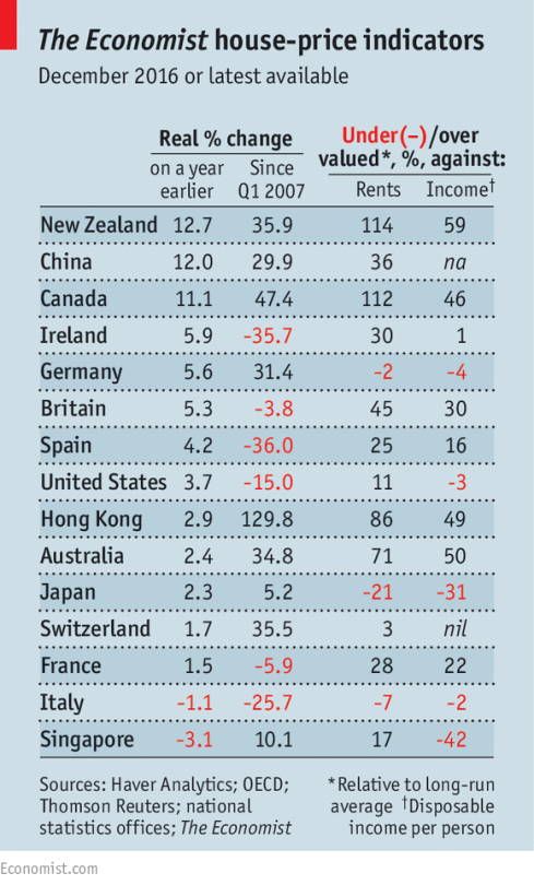
    The Economist recently published the following chart alongside this article talking about the impact of foreign buyers on global house prices.

    image

    They also have this set of interactive graphs that allows you to chart prices according to a number of different measures. The two metrics that The Economist focuses on (above) are house prices against rents and house prices against incomes. 

    The argument they make is that as (foreign) capital begins to think of property as merely a bolthole, it can start to detach itself from fundamentals such as rents and incomes. New Zealand, Canada, and Australia are specifically called out.

    This isn’t necessarily news. And one chart can only tell you so much. But I like staying on top of the various indices.

  • LED neon lighting by Electric Confetti

    image

    Ever since I attended Art Basel Miami Beach last year, I’ve been determined to get a neon piece for my condo. I got inspired by all of the neon I saw at the show and so I told myself that I was going to get something made.

    I found a company in Vancouver called Endeavour Neon, but I never ended up pulling the trigger. It turns out that traditional neon lighting is pretty expensive. 

    However, I recently discovered a Melbourne-based company called Electric Confetti. Founded by designer Natalie Jarvis, the company makes LED neon lighting using flex tubes. Supposedly, this makes them more durable and more energy efficient. They’re also less expensive.

    I am trying to figure out shipping to Canada, but it looks like I might be finally getting my neon. I really like the banana (pictured above), but that might be an odd reference for a bedroom. I’ll sleep on it.

    I thought I would share with all of you in case you have a home, an office, or a project that could use some neon lighting.

  • Mapping of global migration

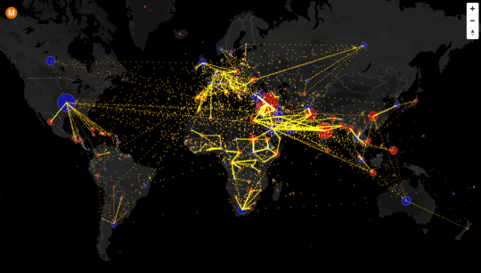
    Max Galka has created an incredible visualization of country-to-country net migration (from 2010 to 2015) on his blog, Metrocosm.

    Here’s a screenshot:

    image

    But you really need to view the full screen interactive version

    In that version, you can hover over a country to see the total net migration number (+/-) and you can click on a country to see where people are moving to and from. A blue circle indicates positive net migration (greater inflows) and a red circle indicates negative net migration (greater outflows).

    All of the data is from the United Nations Population Division. And though the numbers are estimates, it’s a fascinating look at global migration. For instance, look at the outflow from Syria.

    It would also be interesting to see these numbers on a per capita basis because some countries certainly punch above or below their weight in terms of migration. Off the top of my head, I’m thinking of Canada and Australia vis-à-vis the US.