Daily insights for city builders, delivered every morning at 6 AM ET. I’m Brandon Donnelly — a Toronto-based real estate developer and founder of Globizen. I’ve been writing here since 2013.

Tag: athiscity

  • Coffee shops vs. fried chicken

    When it comes to a real estate market, there are always the typical metrics: sale prices, rents, vacancy and so on. But I’m always interested when somebody looks at the market in a different way and comes up with other kinds of metrics.

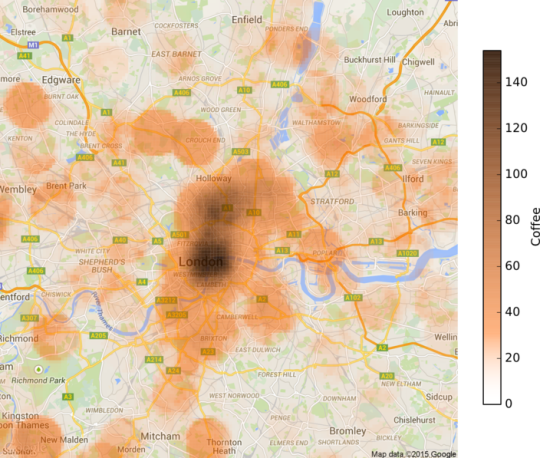
    That’s why I was intrigued when I stumbled upon this post by Sam Floy, where he looks at the concentration of coffee shops and friend chicken shops across London in order to determine which neighborhoods are in fact “up and coming.”

    To give you a taste, here’s his coffee shop map:

    His thinking was that if a neighborhood had a high density of coffee shops, a low density of fried chicken shops, and relatively low house prices, then it could probably be thought of as up and coming. 

    Coffee shops are often considered to be leading indicators of urban change (i.e. gentrification), and, well, friend chicken places I guess speak to a different kind of neighborhood.

    These sorts of playful studies aren’t going to tell you exactly which numbers you should be plugging into your development pro forma. But I think unconventional analyses can sometimes tell you a bit more of the story behind the numbers.

  • Sprawling, but affordable

    The Wall Street Journal recently published an interesting article that ties in nicely with two of my recent posts. My post about North American population growth and my post about the San Francisco pro-development group known as BARF.

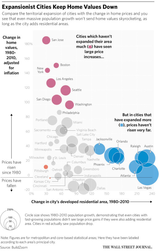
    The WSJ article is about the growing divide between affordable and expensive cities in the US. And the argument is that expansionist, or sprawling, cities are better at suppressing home values and maintaining affordability:

    “The developed residential area in Atlanta, for example, grew by 208% from 1980 to 2010 and real home values grew by 14%. In contrast, in the San Francisco-San Jose area, developed residential land grew by just 30%, while homes values grew by 188%.”

    Now, here’s a chart saying that same thing:

    The reality is that greenfield development (suburban sprawl) generally has far fewer barriers to development than urban infill development. So I’m not surprised to see cities like Las Vegas, Atlanta, and Phoenix clustered towards the bottom right.

    At the same time though, I’m obviously not convinced that sprawl is an optimal outcome. I think there are other costs not reflected in the chart above. So what’s the best solution here, assuming we want to build inclusive mixed-income cities?

  • Gray on gray on gray

    This past weekend was gorgeous in Toronto. I always love seeing the city come to life after the winter and last weekend was the first sign of that this year.

    Being the fair-weather cyclist that I am, I had the flat fixed on my single speed bike and I was ready to go by the weekend. I managed to test out the GoPro handlebar mount that I mentioned last week but, quite honestly, the footage was so jittery and bouncy that it made me nauseous to watch it. So I need to rethink my city geek filming strategy. 

    (Sidebar: GoPro needs to make it easier to turn their raw footage into content that is actually worth sharing.)

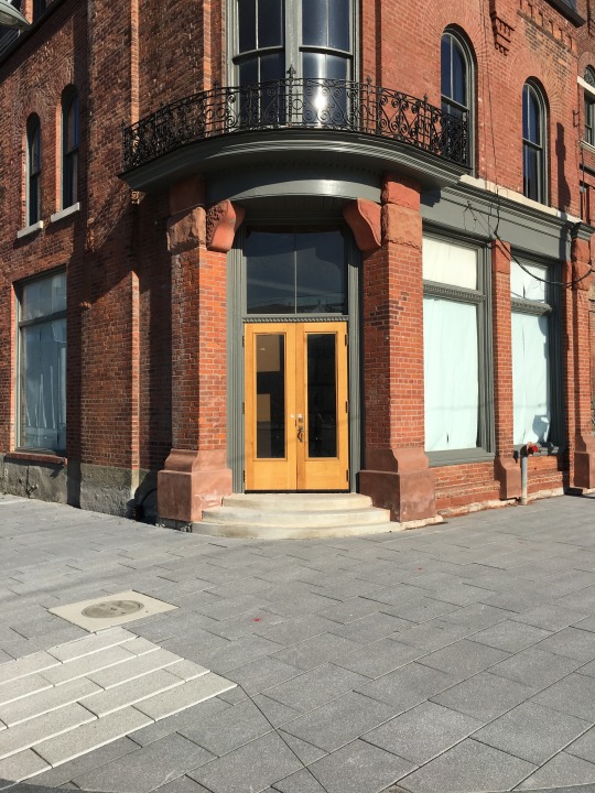
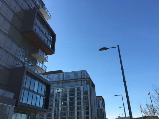
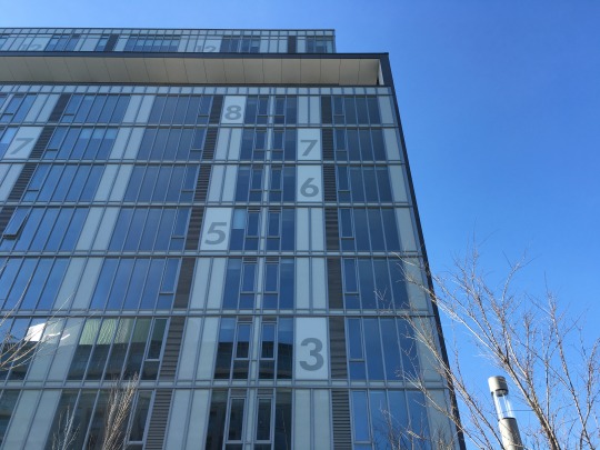
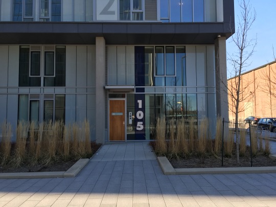
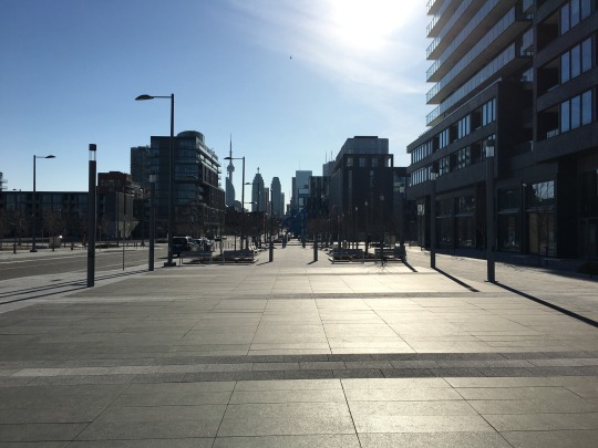
    Still, I had a good ride over to the new Canary District on the east side of downtown. The gates just recently game down, so I was itching to take a look at it. Here are a couple of photos to give you some context for the rest of this post:

    None of the retailers have moved in, so the area currently feels like Toronto post zombie apocalypse (to use a friend’s description of the neighborhood). But all of the bones are in place for an incredible downtown neighborhood.

    Here are some of my thoughts as I was riding around:

    The opening of this neighborhood repositions the Distillery District. Initially, the Distillery District struggled as a kind of island on the edge of downtown. But thankfully they stuck to their initial vision for the community and now they get the benefit of this new mixed-use anchor to the east of it.

    Trinity Street to the north of the Distillery District proper is a fantastic opportunity to not only extend the magic of the Distillery northward, but also “plug” the area into Front Street East, which is the primary east-west spine that connects the Canary District back to the downtown core. I hope we (the city, developers, and so on) take advantage of this.

    The Front Street Promenade running through the Canary District and connecting into Corktown Common (park) is going to be an absolutely magical urban space once the restaurants, cafes, and retailers open up. I can’t wait for this to happen. Live Work Learn Play has been orchestrating the retail component.

    Finally, why are all of the buildings gray? 

    Gray brick. Gray window wall. Gray spandrel panel. It’s gray on gray on gray. We’re playing into that boring Canadian stereotype here. I hope the subsequent developments introduce some wild colors. Although some red brick to tie into the Distillery District would work well too. The best nearby architecture (just to the north) is the River City complex by Saucier + Perrotte.

    Notwithstanding the gray, I’m super excited about the Canary District and I am generally bullish on the east side of downtown. If you’ve had a chance to visit, I’d love to also hear your thoughts in the comment section below.

  • Population growth across North American cities

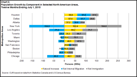
    The Centre for Urban Research and Land Development at Ryerson University recently published the following chart on their blog:

    It’s a look at population growth across a few North American cities, broken down according to natural increases, net internal migration from other parts of the respective country, and net immigration from outside of the respective country.

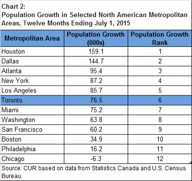
    When you sum up the pluses and minuses shown above, you get to population growth numbers that look like this:

    Houston, Dallas, and Atlanta are monsters in terms of population growth. They’re obviously smaller than New York and Los Angeles, and so on a percentage basis they are really adding a lot of people. Much of this has to do with the ease in which housing can be added in those cities and their relative affordability.

    Toronto is competitive with New York and Los Angeles in terms of an absolute number, but again our base is smaller so on a percentage basis we are growing faster. The big story with Toronto is our dependence on immigration to grow.

    The one city on this list that might surprise some of you is Chicago. Toronto and Chicago share many similarities and are often compared. But when you look at how the Chicago metropolitan area is shedding people, you see that, at least in this regard, it’s in structural decline.

  • BARF is fighting for more housing in San Francisco

    A new YIMBY activist group is starting to gain meaningful traction in San Francisco. They were recently featured in the New York Times and they have managed to secure the financial backing of people like Jeremy Stoppelman – co-founder and CEO of Yelp. 

    (All excerpts in this post were taken from the NY Times.)

    image

    The group is called SF BARF, which stands for SF Bay Area Renters’ Federation. The group, however, supports new development of all kinds. So I think the name is more driven by the fact that the founder, Sonja Trauss, wanted the acronym to be BARF. It speaks to their shit disturbing approach:

    “Her group consists of a 500-person mailing list and a few dozen hard-core members — most of them young professionals who work in the technology industry — who speak out at government meetings and protest against the protesters who fight new development. While only two years old, Ms. Trauss’s Renters’ Federation has blazed onto the political scene with youth and bombast and by employing guerrilla tactics that others are too polite to try. In January, for instance, she hired a lawyer to go around suing suburbs for not building enough.”

    The impetus for all of this, of course, is San Francisco’s lack of affordability and severe housing shortage. Housing supply is decades behind the city’s population and job growth. 

    Most people are directing the blame at the tech community for bidding up housing. But there’s clearly growing recognition that housing supply matters.

    As a real estate developer, my industry obviously benefits from fewer barriers to building. So let’s get that out there:

    “Ms. Trauss’s cause, more or less, is to make life easier for real estate developers by rolling back zoning regulations and environmental rules. Her opponents are a generally older group of progressives who worry that an influx of corporate techies is turning a city that nurtured the Beat Generation into a gilded resort for the rich.”

    But let’s also be clear that I don’t believe we should be developing roughshod over our cities. New development should respond to what’s already there and give back. 

    At the same time, housing supply matters a great deal. A big part of the reason that cities like San Francisco, New York and Vancouver are so expensive is that they’re naturally supply-constrained markets. Geographically, they are either peninsulas or islands.

    When you overlay tight land use restrictions, fierce community opposition and/or foreign investment on top of this geography, it should come as no surprise to anyone that demand is outstripping supply. 

    New supply won’t solve every problem, but I do agree that it is an important part of the solution.

  • Can starchitecture trump soul-crushing sprawl?

    Hunter Oatman-Stanford just published a longish read over on Collectors Weekly that talks about the history of suburban office complexes in America. That part alone makes it an interesting read.

    But he also makes the argument that innovative companies like Apple and Google are still stuck in a midcentury suburban mindset with their new mega headquarters:

    “I look at Apple’s Norman Foster building, and it’s 1952 all over again,” Mozingo says. “There’s nothing innovative about it. It’s a classic corporate estate from the 1950s, with a big block of parking. Meanwhile, Google is building another version of the office park with a swoopy roof and cool details—but it does nothing innovative.”

    Others have made this same argument. Back in 2013, Wired published an article talking about why Apple’s new Norman Foster spaceship could result in them losing the war for tech talent. 

    And if you read the piece in Collectors Weekly, you’ll see just how little, in some cases, the office environment has changed since the middle of the 20th century.

    Back then, we also had big name starchitects designing suburban head offices for innovative companies. Below is a photo from the GM Technical Center in Warren, Michigan. It was designed by Eero Saarinen and it opened in 1956.

    image

    There’s lots of research that suggests that, today, both entrepreneurs and capital are flocking to urban centers, instead of the suburbs. And I certainly don’t need to repeat that to this audience.

    But given this shift, I think we will increasingly view the suburban sprawl of places like Silicon Valley as a serious competitive disadvantage. I mean, I am sure these new buildings will be lovely, but I certainly wouldn’t want to work there. 

    Would you?

  • New curated city building bulletin

    I have decided to spin-off the Architect This City identity into a weekly newsletter that I’m referring to as a “curated city building bulletin.” (This is as a result of the unbranding of this blog last week.)

    The inaugural issue went out this past Monday at 9am eastern with a collection of city building-related links. And that was it. This is not another blog. I’m not writing any new content for it. It’s simply going to be a collection of links to things that I think city builders would find interesting and/or valuable.

    Here’s why I decided to do this:

    It allows me to keep this new bulletin entirely focused on one thing. You’re not going to find me sneaking in a link about snowboarding, wine or something else that I’m interested in. It’s strictly about targeting city builders. (Of course, city building can be a pretty broad topic.)

    Keeping in mind what I wrote yesterday about saying no, I also chose this format because the additional workload for me will be minimal. In order for me to write a daily blog like this one, I have found that I need to keep a running list of reading material. But a lot of what’s on this list (stored in Pocket) never sees the light of day – there’s only so much I can write about. This new bulletin will be a quick way for me to share the rest of it.

    Finally, I’m also hoping it’ll be an efficient way for me to share the links, events, projects, and other things I receive from readers. In an ideal world, the bulletin will evolve into having a “links” section and a “from the community” section – which will be things that subscribers send me but today don’t get shared.

    So that’s the plan. If that sounds good to you, please subscribe at architectthiscity.com

    To kick things off, I’m going to be giving away 5 x free ATC t-shirts. (See photo at the top of this post.) To win one, just (1) subscribe and tweet out a link to this new city building bulletin, (2) tag @athiscity, and (3) tell everyone which city/town you live in.

    Regularly scheduled programming will resume tomorrow.

  • How Premise is crowdsourcing economic data in developing countries

    I have to tell you all about a company that I just discovered called Premise. I think it’s incredible what they’re doing and a perfect example of mobile (smartphones) eating the world.

    The problem that Premise is solving is that of developing-world economic data being both not timely enough and not all that accurate/granular. This is important, because lots of big organizations – ranging from governments to private companies – are making funding and investment decisions based on this inadequate information.

    So here’s what Premise did:

    They put smartphones into the hands of the people who are on the ground in these places. They paid them meaningful amounts of money (relative to local wages). And they developed a technology platform that could index and analyze the millions of local observations being sent in. So far they have paid out over $3 million to their contributors located across 34 countries.

    As an example: Premise has developed food price indices. And the data comes directly from locals physically going to the market on a regular basis (which most would do anyways) and snapping photos of the food + prices. This allows Premise to provide basically realtime pricing data. (There are checks and balances to ensure data integrity.)

    Why does this matter? 

    Because it allows Premise, for instance, to figure out exactly what happens to food staple pricing when something like an Ebola epidemic hits:

    “Premise started tracking food prices in Monrovia on September 8, and throughout the month we observed upward pressure on prices (our Liberia indices and data are freely available at data.premise.com). The price of rice, Liberia’s primary food staple, increased 12% during September. Moreover, we saw significant price differences across the city. Prices in neighborhoods with the most exposure to Ebola were 8-12% higher on average than relatively unaffected neighborhoods. As the disease tore through the city, market sellers avoided the worst-hit areas and trade declined.”

    This is powerful information and just one example of what Premise is doing. Obviously this data is also of use to for-profit companies, which is how the company has managed to raise over $66 million in VC funding. But I think there will also be big benefits for these developing countries. As the saying goes, you make what you measure.

  • Not zoned for dancing

    Yesterday, when I was reading up on Toronto’s “TOcore” initiative, I came across a report from 2014 called Not Zoned For Dancing: A Comprehensive Review of Entertainment in Downtown Toronto

    It was prepared by five graduate planning students at the University of Toronto: Anna Wynveen, Brenton Nader, Carolyn Rowan, Chris Hilbrecht, and Kyle Miller. 

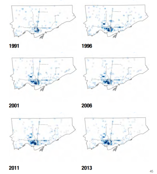
    The entire report is fascinating, but here’s one diagram that stood out to me:

    image

    It shows the migration of bars, clubs, and lounges westward, away from the downtown core, from 1991-2013.

    This migration doesn’t surprise me at all. I saw it happening and I understand the market forces at play here. There’s also the simple fact that nightlife is often viewed as a nuisance.

    But it’s worth calling this out. 

    Because I don’t think enough city builders appreciate the value of nightlife. It can and has served as a valuable catalyst for urban regeneration and I believe that it should form part of any city’s economic development strategy.

    A lot of cities are focused on things like bike lanes, public spaces, and on becoming the next Silicon Valley. And don’t get me wrong, those are all important things (though we could debate the Silicon Valley part). 

    But let’s not forget about nightlife.

  • Have your say in the future of downtown Toronto

    I was recently on a call with someone living in California, but who is originally from Toronto. He told me that every time he comes back to Toronto to visit, it feels like the city has changed, grown, and become even more cosmopolitan.

    That is a great compliment, because every city today is in a competition to remain relevant. Which means that if a city is not changing, evolving, and adapting, then it is falling behind. Competition is fierce and it’s global.

    Toronto is fortunate enough to be experiencing rapid population growth and that is driving a lot of this change. But at the same time, it naturally raises questions about how to best manage and leverage that growth, particularly in areas like the downtown core where a lot of that intensification is happening.

    To that end, the City of Toronto has been working on a three year study called TOcore, that will, among other things, result in a new comprehensive plan for the downtown core. (I’ve blogged about this before and it has come up in the comments a few times.)

    Today, however, marks the start of their public engagement process. And so if you’d like to have your say (there will be implications for developers, architects, and other city builders), you can do that here. There’s an online survey, an email address, events you can attend in person and, of course, a hashtag: #DTadvice.

    But the tool I think is really neat, is their “Favourite Places” map. What it allows you to do is drop pins onto a map of downtown and describe your “Favourite Places” and places that have “Great Potential.” Notice that the focus is on positivity. There’s no pin for “Shitty Places.”

    I have a lot to say, so I’ve been flooding the map with pins. I would be curious, though, to hear what you would like to see happen in downtown Toronto – and so would the TOcore team.