Daily insights for city builders, delivered every morning at 6 AM ET. I’m Brandon Donnelly — a Toronto-based real estate developer and founder of Globizen. I’ve been writing here since 2013.

Tag: architecture

  • Architecture and well-being

    I haven’t spent a lot of time in hospitals. So I may not be the best judge of what I’m about to say. But why do we design hospitals to be so depressing? Why do they have to look so, well, clinical?

    I asked this question on Twitter a few days ago and I was recommended to listen to a 99% Invisible podcast called The Blue Yarn. If you haven’t yet heard of this podcast series, I would highly recommend you check it out (in addition The Blue Yarn episode).

    What this particular podcast was about was rethinking hospital design in terms of patients, as opposed to staff hierarchy. And the way they illustrated the need for that was through some simple blue yarn.

    Using yarn, management physically mapped out the paths of patients as they moved through this particular medical center. And what they found was a tremendous amount of waste. There was a lot of waiting around (in dingy rooms) and a lot of unnecessary moving around.

    Instead of putting patients first, the hospital had been designed in terms of staff offices and other criteria. Ultimately, this exercise ended up triggering a complete redesign of the hospital.

    After the redesign, there were a lot of grouchy doctors who had lost cushy offices. Some even quit. But the hospital became more efficient, more profitable, and, most importantly, safer for patients. So much so that their insurance expenses dropped by 37%!

    But this obviously isn’t the only foray into rethinking hospital design. In fact, there’s something out there called “evidence-based hospital design”, where the objective is to leverage data and actual evidence to figure out the relationship between architecture and patient well-being.

    One of the pioneering studies in this area was done in 1984 by Roger Ulrich. 

    The study took patients in Pennsylvania recovering from gallbladder surgery and split them up into two groups. The first group was given a room with a beautiful nature view and the second group was given a room with a view of a brick wall.

    What they discovered from this experiment was that the group with the view of nature not only recovered faster but also needed fewer painkillers during the recovery. That’s a fascinating finding.

    So it’s not surprising that this sort of thinking is making its way into contemporary hospital design. And that’s a great thing.

    Hospitals should be uplifting, restorative, and beautiful spaces. Does that not seem sensible?

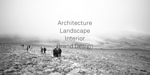
  • Snøhetta — an integrated architecture, landscape, interior, and brand design firm

    Last month I wrote a post talking about YOO Architecture. And in the body of that post I mentioned my interest in branding and marketing and how I wondered why it was something we never really talked about in architecture school.

    After publishing that post, a close friend of mine from architecture school quickly pointed out to me that there are firms today that are integrating brand design into their practices. Specifically, he mentioned two firms: Gensler and Snøhetta.

    Here’s some of Snøhetta’s work (click here for more it):

    I wasn’t aware that this was the case with these firms, but I’m delighted to see it happening. At the same time, I’m not surprised to see it happening. Architecture and branding have the potential to go hand-in-hand.

    A good brand and identity isn’t just about logos and tag lines. It should speak to and reinforce an organization’s belief system. 

    And one of the most powerful ways to do that is through its architecture and environments. I mean, just look at how important the design of Apple’s stores are to the Apple brand.

    Images: Snøhetta

  • What’s your complete neighborhood?

    Photograph Toronto - St Lawrence Market by Chris Dufresne on 500px

    Toronto – St Lawrence Market by Chris Dufresne on 500px

    This past Saturday night I was out with a few friends in my neighborhood (St. Lawrence Market area). And I was delighted to see how busy it was. Virtually every bar or club we walked by had a line down the street.

    Being the city geek that I am, I started thinking about two things: (1) how often I get localized to my neighborhood (I have data to back this up) and (2) what makes a “complete neighborhood”, such that you’re even able to be localized?

    In some ways the idea of a “complete neighborhood” is universal. Everybody needs a grocery store and access to food, for example. But in other ways, a “complete neighborhood” is very much a personal thing – you want goods and services that are important to you.

    So today I thought I would do a quick breakdown of the goods, services, and amenities that I really value in my neighborhood and that I think make it more or less “complete.” This list is a combination of universal and personal choices in no particular order. At the end, I summarize some of the things I wish I had.

    What I have:

    • A 5-10 minute walk to subway and streetcar
    • A 24/7 grocery store
    • A world famous food market (St. Lawrence Market)
    • Staple coffee shops (Starbucks and Balzacs)
    • Lots of restaurant and food choices (including decent Mexican, one of my favorite foods, and Pho, for when I feel a cold coming on)
    • 2 drugstores (Shopper’s Drug Mart and a new Rexall)
    • A great gym that’s less than a 10 minute walk away
    • An outdoor/athletic store that also fixes bikes
    • Cool local bar (AAA) where I can watch the Raptors (because I don’t own a TV)
    • After work bar with a good Happy Hour (Pravda)
    • Patios for the summer (all along the Esplanade)
    • All the major banks
    • Nearby recreational amenities (bike trails, waterfront, etc.)
    • Local employment base (Wattpad, BNOTIONS, etc.)
    • Great architecture (from Daniel Libeskind to the classics)
    • High walkability

    What I wish I had:

    • Less chains and a few more independent businesses
    • A hip indie coffee shop where the (male) staff have waxed moustaches
    • A good takeout sushi place
    • A pool that I could walk to (I ride my bike to Regent Park)
    • A liquor store with longer hours (but alas this is Ontario)

    Those are my working lists. What would create a complete neighborhood for you? And how does your current neighborhood hold up?

  • Architect and developer partner to build affordable prefab housing in Sweden

    image

    In this month’s issue of Monocle magazine (#80) they profile an interesting prefabricated and affordable housing project in Knivsta, Sweden.

    A collaboration between architect Andreas Martin-Löf and developer Junior Living, the project contains 124 single occupancy units, each of which has 32 square meters of interior space (that’s about 344 square feet).

    The way it was built is quite simple. The modular housing units were fabricated off-site and then inserted on-site into a prefabricated concrete frame. Think bottles going into a wine rack. Here’s a diagram showing how it works:

    image

    What’s truly amazing about this project though is how quickly it was built and how cost effective it actually was for end users. Construction started in January 2014 and residents started moving in about 3 months later. The sale prices ranged from €50,000 to €87,000 per unit. That’s roughly $62,000 to $98,000 in US dollars.

    Finally, here’s a shot of one of the interiors:

    image

    What do you all think of this project?

    Photography by Åke E:son Lindman via Andreas Martin-Löf Arkitekter

  • Introducing YOO Architecture

    Back in 2006 when I was fresh out of architecture school and looking for work, I knocked on the door of a design company based in London with my polished resume in hand. I was sleeping on a friend’s couch at the time and the company seemed like a perfect fit for me – so I went for it.

    There’s no happy ending to this story though – because I didn’t get past the front door that day – but there’s never any harm in trying. As my friend told me the morning I went: fortune favors the bold.

    The firm I visited that day is called YOO.

    They call themselves “a residential and hotel design company”, but their model is actually more unique than that. Founded in 1999 by John Hitchcox (a property developer) and Philippe Starck (a rockstar designer), the firm partners with local real estate developers around the world and creates value through design, branding, and marketing expertise – as well as through celebrity names like Philippe Starck and Jade Jagger.

    They did one project in Toronto with local developer Peter Freed called 75 Portland.

    What makes their model interesting is that, unlike the real estate developers they partner with, they’re not assuming the same level of risk (unless, of course, they co-invest). They get paid (well) for the design services and marketing expertise they provide, as well as the brand equity that they bring.

    This is similar to what Donald Trump does with some (most?) of his developments now. Want the Trump name on your building? Pay $X. Want Philippe Starck at your condo sales launch? Pay $Y.

    When I was in architecture school, I used to wonder why we didn’t talk about the importance of branding and marketing. I thought we should. Which is probably why I ended up in business school afterwards.

    I think there’s a lot of potential in overlaps and hybrid business models, which is why I was excited to learn today that YOO has just launched a new architectural practice called YOO Architecture.

    You can read more about it here.

    Image: Icon Brickell, Miami via YOO

  • What do you want to read about on Architect This City in 2015?

    Photograph Schönefeld by Vladimir Smirnov on 500px

    Schönefeld by Vladimir Smirnov on 500px

    Though this blog is focused on cities and geared towards city builders, I cover a lot of different topics. 

    I talk about real estate, architecture, planning, transportation, technology, and even personal topics. My primary goal is to create a worldwide community of people passionate about building great cities, but at the same time it’s still a personal blog.

    Usually I just write about whatever is currently on my mind. I never queue up posts and so each post is written the day of. But sometimes I wonder if I’m delivering on what you, the readers, really want to read and talk about. 

    So today I thought I would simply ask: what would you like to see more of on ATC in 2015? Let me know in the comment section below and I’ll try my best to deliver.

  • Sliding House

    [youtube https://www.youtube.com/watch?v=ZxmvRDTELy8?rel=0]

    A close friend of mine (from Urban Capital) sent me the above video this morning. It’s of the “Sliding House” in Suffolk, UK. If you can’t see it above, click here. You have to watch the video to fully appreciate the house.

    Built as a place to retire, the Sliding House consists of a building envelope with fairly typical punched windows that physically slides overtop of a minimal glass structure. This allows the building to adapt to the changing seasons (or to the moods of its occupants).

    This concept of adaptable architecture is incredibly interesting to me. Because for a lot of climates — where the temperatures can swing dramatically from hot to cold and vice versa — it can actually be incredibly difficult to design an efficient building.

    When it’s cold, you’re trying to trap heat inside the house. And when it’s hot, you’re trying to exhaust heat to the outside. So by default, the building has to be adaptable. 

    In its simplest form, this could mean an operable window. But in a more elaborate form — like in the case of the Sliding House — the entire skin of the building might adapt.

    And if it means having to rely less on active mechanical systems then I think it’s a step in the right direction.

  • Mirvish+Gehry architectural model

    The developers behind the much talked about Mirvish+Gehry project in Toronto (Projectcore) recently released a video showcasing the architectural model. It’s a great way to see the project from every angle. Click here if you can’t see it below.

    [youtube https://www.youtube.com/watch?v=mka2kVUCyDk]

    I’ve written about this project a number of times before and my view has always been that I’m excited by the project, but that I don’t think we should be demolishing all of the heritage buildings on-site. This latest scheme – with two towers ranging from 82 and 92 storeys – is the result of that compromise.

    What are your thoughts on Mirvish+Gehry? And what do you think the condos will ultimately go to market at? My guess would be somewhere around $1,000 per square foot.

  • Firm Profile: ASH NYC

    A friend of mine recently introduced me to a young real estate company out of New York called ASH NYC (the founders are around 30). 

    But in reality, calling them just a real estate company is an oversimplification. They’re actually a vertically integrated firm that brings interior design, real estate development, property management, hospitality, and a few other disciplines all under one roof. The way they talk about it is in terms of “joining historically compatible disciplines” and “creating both aesthetic and economic value” – which is a pretty neat approach.

    I’ve written a few times before about the future of the architecture profession and so I think it’s really interesting to see yet another example of design being completely integrated with real estate. And I’m certain we’re going to see more of these kinds of hybrid and integrated business models across many other industries.

    In my own career, I’ve been (somewhat similarly) fascinated by the intersection of design, real estate, and technology. And I suspect that many of you also feel like you’re operating in some kind of overlap. Is that true?

    Image: ASH NYC

  • An example of low-rise intensification: Union Street EcoHeritage

    image

    In yesterday’s post about the 3 stages of intensification, I mentioned a project in Vancouver called Union Street EcoHeritage by SHAPE Architecture. I used it as an example for sensitive low-rise intensification.

    Since it’s a very cool project (and most of you probably didn’t click through), I thought I would dedicate today’s post to explaining the project.

    The picture at the top of this post is what it looks like today (the front elevation). If you were to pass by it, I suspect most of you would just think it was a pair of renovated single family homes. But there’s much more to it. What started out as only 2 dwellings, ended up as a site for 7 dwellings.

    Here’s the before shot:

    image

    The homes were moved and actually raised up in order to accommodate additional density. Here’s a section that better explains what was done (black is existing; green is new):

    image

    The 2 existing homes were raised up so that an additional dwelling unit could be placed beneath each one. At the same time, additional units were added in the rear, both attached to the existing homes and at the back of the site facing the laneway. And so this project is actually one part laneway house.

    Here’s a photo of what that rear interior space looks like (it’s stunning):

    image

    Not surprisingly, this project won a bunch of awards and has been widely celebrated as an affordable housing solution. It’s exciting to see Vancouver take the lead on low-rise intensification. It’s one of the reasons that I think it’s only a matter of time before Toronto starts to look towards similar solutions.

    Images: SHAPE Architecture Inc.