Daily insights for city builders, delivered every morning at 6 AM ET. I’m Brandon Donnelly — a Toronto-based real estate developer and founder of Globizen. I’ve been writing here since 2013.

Tag: architecture

  • Nest or cave?

    I was recently introduced to the work and writing of Japanese architect Sou Fujimoto. One concept that he writes about that I really like is the idea of nest vs. cave.

    The way Fujimoto describes a cave is that it’s a naturally occurring and pre-existing condition. It is exists independent of humans. So if and when a human decides to occupy a cave, he or she must assimilate their lives to that which is already there. They have to deal with the ambiguity of the spaces because it is not clear how everything should be used.

    A nest, on the other hand, is something completely created by and for the benefit of a person or animal. It would not exist without someone creating it and so it is prescriptive and functional in a way that a cave is not.

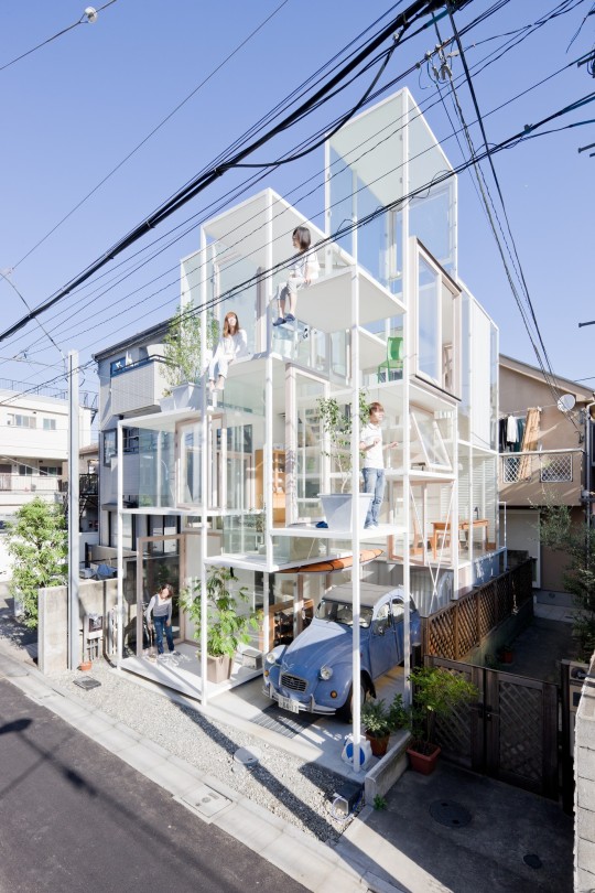
    Fujimoto is interested in exploring architecture that is analogous to caves. Which is why he designs houses like this one (House NA) in Tokyo:

    In most countries, a house like this would not meet code and would be illegal. But in Tokyo it’s obviously allowed. And his hope is that the owners will discover new and unintended ways to interact with the unusual pairing of levels and platforms.

    However, I think about this juxtaposition differently – likely incorrectly in the mind of Fujimoto.

    I’m actually more interested in nests. Because in a way, mass produced housing is like a cave. It exists whether or not we decide to occupy it. And it is generally created to appeal to lots of people, rather than to the idiosyncratic tastes of one person. So when someone does occupy it, they invariably end up trying to shape it.

    But not to the extent of a nest. A nest is custom. It is what you would build for yourself given the opportunity to do so. And that thought is really appealing to me. Maybe it’s because I don’t like the ambiguity of a cave. That could be a possibility.

    I could also be thinking about it differently because I tend to think of Japanese homes as being quite individualistic. Since Japanese people generally don’t care about resale value, they don’t have the same fixation with marketability and future value. That means they’re more likely to just build what they want.

    I’d love to have my own nest.

    Image: Wall Street Journal

  • Gray on gray on gray

    This past weekend was gorgeous in Toronto. I always love seeing the city come to life after the winter and last weekend was the first sign of that this year.

    Being the fair-weather cyclist that I am, I had the flat fixed on my single speed bike and I was ready to go by the weekend. I managed to test out the GoPro handlebar mount that I mentioned last week but, quite honestly, the footage was so jittery and bouncy that it made me nauseous to watch it. So I need to rethink my city geek filming strategy. 

    (Sidebar: GoPro needs to make it easier to turn their raw footage into content that is actually worth sharing.)

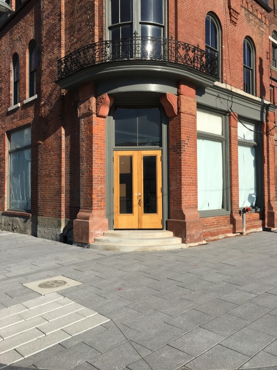
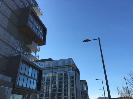
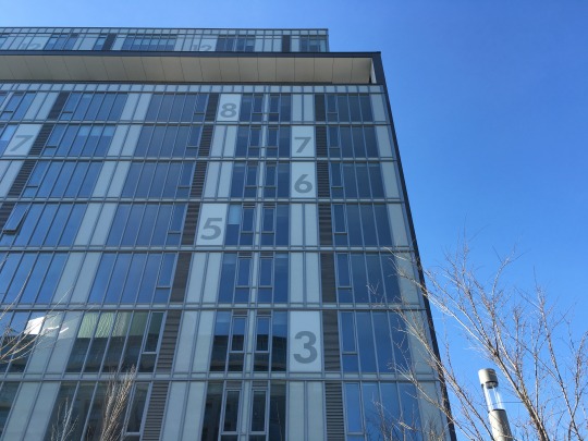
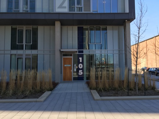
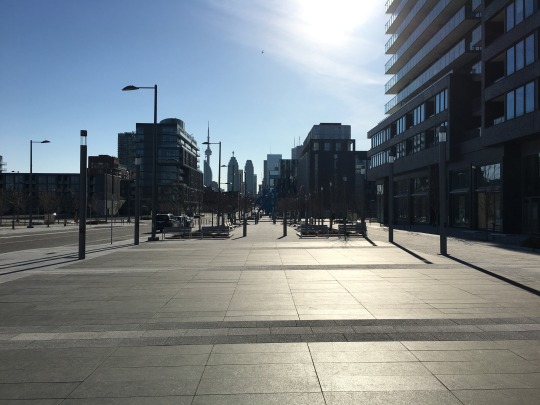
    Still, I had a good ride over to the new Canary District on the east side of downtown. The gates just recently game down, so I was itching to take a look at it. Here are a couple of photos to give you some context for the rest of this post:

    None of the retailers have moved in, so the area currently feels like Toronto post zombie apocalypse (to use a friend’s description of the neighborhood). But all of the bones are in place for an incredible downtown neighborhood.

    Here are some of my thoughts as I was riding around:

    The opening of this neighborhood repositions the Distillery District. Initially, the Distillery District struggled as a kind of island on the edge of downtown. But thankfully they stuck to their initial vision for the community and now they get the benefit of this new mixed-use anchor to the east of it.

    Trinity Street to the north of the Distillery District proper is a fantastic opportunity to not only extend the magic of the Distillery northward, but also “plug” the area into Front Street East, which is the primary east-west spine that connects the Canary District back to the downtown core. I hope we (the city, developers, and so on) take advantage of this.

    The Front Street Promenade running through the Canary District and connecting into Corktown Common (park) is going to be an absolutely magical urban space once the restaurants, cafes, and retailers open up. I can’t wait for this to happen. Live Work Learn Play has been orchestrating the retail component.

    Finally, why are all of the buildings gray? 

    Gray brick. Gray window wall. Gray spandrel panel. It’s gray on gray on gray. We’re playing into that boring Canadian stereotype here. I hope the subsequent developments introduce some wild colors. Although some red brick to tie into the Distillery District would work well too. The best nearby architecture (just to the north) is the River City complex by Saucier + Perrotte.

    Notwithstanding the gray, I’m super excited about the Canary District and I am generally bullish on the east side of downtown. If you’ve had a chance to visit, I’d love to also hear your thoughts in the comment section below.

  • Can starchitecture trump soul-crushing sprawl?

    Hunter Oatman-Stanford just published a longish read over on Collectors Weekly that talks about the history of suburban office complexes in America. That part alone makes it an interesting read.

    But he also makes the argument that innovative companies like Apple and Google are still stuck in a midcentury suburban mindset with their new mega headquarters:

    “I look at Apple’s Norman Foster building, and it’s 1952 all over again,” Mozingo says. “There’s nothing innovative about it. It’s a classic corporate estate from the 1950s, with a big block of parking. Meanwhile, Google is building another version of the office park with a swoopy roof and cool details—but it does nothing innovative.”

    Others have made this same argument. Back in 2013, Wired published an article talking about why Apple’s new Norman Foster spaceship could result in them losing the war for tech talent. 

    And if you read the piece in Collectors Weekly, you’ll see just how little, in some cases, the office environment has changed since the middle of the 20th century.

    Back then, we also had big name starchitects designing suburban head offices for innovative companies. Below is a photo from the GM Technical Center in Warren, Michigan. It was designed by Eero Saarinen and it opened in 1956.

    image

    There’s lots of research that suggests that, today, both entrepreneurs and capital are flocking to urban centers, instead of the suburbs. And I certainly don’t need to repeat that to this audience.

    But given this shift, I think we will increasingly view the suburban sprawl of places like Silicon Valley as a serious competitive disadvantage. I mean, I am sure these new buildings will be lovely, but I certainly wouldn’t want to work there. 

    Would you?

  • Building Toronto Tomorrow

    I’m going to be speaking on a panel on May 3rd, here in Toronto, called Building T.O. Tomorrow. The topic is the future of this city.

    It is being put on by the good folks at BuzzBuzzHome and it will be held in the lobby of Allied’s new Queen-Richmond Centre (134 Peter Street). If you haven’t yet been to this building, that alone makes attending worthwhile.

    Here’s the event poster:

    If you’d like to attend, make sure you RSVP to aleks@buzzbuzzhome.com.

    On a largely unrelated note, I recently picked up the handlebar bicycle mount for my GoPro and I’m looking for some fellow city geeks who would like to ride around the city and film some – potentially cool – videos.

    I find that being on a bike is one of the best ways to experience a city (at least the cities that are actually bikeable). So I’m hoping some of that magic will translate into video. If that sounds at all interesting, drop me a line.

  • New curated city building bulletin

    I have decided to spin-off the Architect This City identity into a weekly newsletter that I’m referring to as a “curated city building bulletin.” (This is as a result of the unbranding of this blog last week.)

    The inaugural issue went out this past Monday at 9am eastern with a collection of city building-related links. And that was it. This is not another blog. I’m not writing any new content for it. It’s simply going to be a collection of links to things that I think city builders would find interesting and/or valuable.

    Here’s why I decided to do this:

    It allows me to keep this new bulletin entirely focused on one thing. You’re not going to find me sneaking in a link about snowboarding, wine or something else that I’m interested in. It’s strictly about targeting city builders. (Of course, city building can be a pretty broad topic.)

    Keeping in mind what I wrote yesterday about saying no, I also chose this format because the additional workload for me will be minimal. In order for me to write a daily blog like this one, I have found that I need to keep a running list of reading material. But a lot of what’s on this list (stored in Pocket) never sees the light of day – there’s only so much I can write about. This new bulletin will be a quick way for me to share the rest of it.

    Finally, I’m also hoping it’ll be an efficient way for me to share the links, events, projects, and other things I receive from readers. In an ideal world, the bulletin will evolve into having a “links” section and a “from the community” section – which will be things that subscribers send me but today don’t get shared.

    So that’s the plan. If that sounds good to you, please subscribe at architectthiscity.com

    To kick things off, I’m going to be giving away 5 x free ATC t-shirts. (See photo at the top of this post.) To win one, just (1) subscribe and tweet out a link to this new city building bulletin, (2) tag @athiscity, and (3) tell everyone which city/town you live in.

    Regularly scheduled programming will resume tomorrow.

  • Un bosco verticale

    At the end of 2015, the Council on Tall Buildings and Urban Habitat awarded Bosco Verticale in Milan the “2015 Best Tall Building Europe” and the “2015 Best Tall Building Worldwide.” It was the 14th Annual of these awards.

    What makes Bosco Verticale (or Vertical Forest) special is its integration of landscape into the tower building typology. In fact, the architect, Stefano Boeri, describes the project as a “skyscraper for trees that also takes humans.”

    Here is a photo of the two towers via Wikipedia:

    And here is description of the plantings via Houzz:

    “The more than 17,000 plantings include 780 full-size trees of 60 species on all sides of both towers for a suspended-garden visual effect. Among the plantings are holly oak, ornamental apple and beech trees, as well as a great mass of smaller plants, such as lavender, azaleas and camellias, positioned among the trees with taller crowns. The plantings provide shade in summer and help filter the air. The number of trees in each building is the equivalent of 1.7 acres of forestland and 18.5 acres of an urban area with single-family dwellings. The vegetation is watered with a greywater filtration system.”

    This idea is something that has appeared a lot in theoretical projects. But it is still in its infancy in terms of realized projects. So the architect has also published a book explaining – using drawings and photos – how the project works and how it could be reproduced in other cities. It’s in both Italian and English.

    With so many cities trying to build up, as opposed to out, it makes a lot of sense for us to figure out how to make up as livable, enjoyable, and sustainable as possible.

    Photo by Luca Nebuloni from Milan, Italy – Milan_7899, CC BY 2.0, Wikipedia

  • Getting older

    Yesterday I promised that today’s post would be less sad. I am sticking to that promise, but I am also sticking with a somewhat similar theme: getting older.

    Fast Company recently published an interview with New York-based architect Matthias Hollwich. The topic is aging and the kinds of spaces that we have created for people as they age: retirement communities, nursing homes, and so on.

    The reason this is getting airtime right now is because Matthias has just published a book on the topic called, New Aging: Live smarter now to live better forever

    image

    But this isn’t a new focus. Matthias actually taught at the University of Pennsylvania while I was there and I remember his design studio being focused on this topic. (I wasn’t in his studio, unfortunately.)

    The sound bite that I really like from the interview is this one:

    “I think the biggest flaw is that it’s age segregation. You take all of the people who are above 75, 85, or 95, depending on what type of environment it is, and put them into one place. And then you’re just surrounded by old people, people who have social and physical challenges, and you’re not around the vibrancy of a multi-age environment, which is something that we experience all life long. I think that is something that society really has to rethink.”

    Not only do I agree with him, but I think it exemplifies one of the things that I love about architecture. The idea that the way things are done today is usually not some sort of universal truth. Instead, everything can be questioned, rethought, and reinvented for the better. It’s a very entrepreneurial way of operating and I don’t think that parallel, between entrepreneurs and architects, is drawn or leveraged nearly enough.

    I also don’t think we’ve given enough design consideration to this topic of aging. I mean, why can’t the spaces that people end their lives in be as (or more) sexy and enjoyable as (or than) the spaces they live the rest of their lives in? That’s what I want when I’m 95.

    So kudos to Mattias and the rest of the team at Hollwich Kushner (his firm) for caring about and working on this

    Book image from Matthias Hollwich’s Facebook.

  • Zaha Hadid dies at 65

    Today the world lost one of the most important architects of our time: Zaha Hadid. She was only 65.

    But the thing about architects, particularly famous “starchitects” such as Zaha Hadid, is that when they pass, they leave behind a rich legacy through their buildings. So probably the best way to write a sad post like this one is to just share her work. Courtesy of the Guardian (she was an Iraqi-British architect after all), here are: Zaha Hadid’s 10 best buildings in pictures.

    I did, however, want to add a few more thoughts. 

    When I found out about her death I was sitting in the St. Lawrence Market having lunch. I had my phone out and the news had completely flooded my social feeds. I immediately started messaging a few people because, well, she was Zaha Hadid – a figure you don’t go through architecture school not talking about. But it also hit me because she was only 65. This is the age that some people retire at. It’s the age that some people work their entire lives for.

    Whenever this happens I can’t help but think to myself: Why are we so afraid of risks? (I know that this is part of the reason.) And are we even focused on the right risks? So many of us are afraid of sticking our neck out and potentially failing, and yet we all have an expiry date, which means there’s the big risk of potentially dying without having done all the things we want to do. Logically, this should probably be the greater risk.

    I realize that this may sound a bit trite, but it feels appropriate. Zaha Hadid took big risks. Her architecture was way out there and that meant she struggled early on. Not only was she a female in a male dominated industry (she was the first woman to win the Pritzker Prize), but her work carved out an entirely new architectural language. She embedded technology into the world of architecture – something we talk a lot about on this blog.

    The sad thing about death – besides the obvious death part – is that it can take someone dying to remind you of the shortness of life. So to end, I’m going to leave you all with an excerpt from a recent essay by Paul Graham aptly called, Life is Short.

    “If life is short, we should expect its shortness to take us by surprise. And that is just what tends to happen. You take things for granted, and then they’re gone. You think you can always write that book, or climb that mountain, or whatever, and then you realize the window has closed. The saddest windows close when other people die. Their lives are short too. After my mother died, I wished I’d spent more time with her. I lived as if she’d always be there. And in her typical quiet way she encouraged that illusion. But an illusion it was. I think a lot of people make the same mistake I did.”

    I promise that tomorrow’s post will be less sad.

  • Fun Friday: Saltz, Zurich

    Earlier this month a new restaurant – called Saltz – opened up in Zurich’s historic Dolder Grand Hotel. (The building was originally built in the late 19th century, but an extension was added in 2008 by architecture firm Foster + Partners.) 

    Designed by artist Rolf Sachs, the 280 square meter restaurant is fitted out with an eclectic mix of unusual materials: neon, salt, rock, climbing rope, felt, and so on. And everything is intended to relate back to Swiss culture in some way.

    The interiors caught my attention as I was browsing through the press release this morning, so I have decided to post a few photos. All of the photography is by Nico Schaerer, courtesy of The Dolder Grand and artist Rolf Sachs.

  • VIA 57WEST in New York starts renting apartments

    image

    Bjarke Ingels’ West 57th Street project in New York (developed by The Durst Organization) has just started renting apartments (March 1). 

    Since I’m in the rental business, I thought it would be worthwhile to take a look at the rents – though I tend to obsess over all buildings and not just rental ones.

    Firstly, the project has a total of 709 apartments and 178 different unit types because of the architectural variations in the building. Of these units, 142 of them (20%) have been designated as affordable and were offered up via a lottery to people who fall within certain incomes ranges. 

    Here are the affordable rents via 6sqft.com:

    image

    I don’t know the exact numbers, but Curbed New York speculated – based on what was seen at other buildings on the west side – that the total number of applicants for these 142 units may have reached over 100,000!

    For the market-rate units, the average monthly rents are as follows (via Curbed NY):

    • Studio: $2,770
    • One-bedroom: $3,880
    • Two-bedroom: $6,500
    • Three-bedroom: $11,000
    • Four-bedroom: $16,500

    I wasn’t able to find average unit sizes (to calculate per square foot rents), but I estimate the overall average unit size to be around 1,000 square feet. 

    940,000 sf (total gross floor area)45,000 sf of retail x 0.80 efficiency (lower than average because of the shape of the building) / 709 units = approximately 1,000 sf of rentable area per unit. That’s just my rough guess based on what I could find online.

    Based on the Curbed comment section though, there are certainly some smaller units:

    image

    If anyone has any additional figures, please share them in the comments below. I think there are a few subscribers to this blog who are involved in the project.

    Image from via57west.com