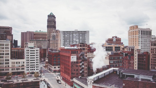
Last week, Detroit hosted the 24th annual Congress for the New Urbanism. The theme was: The Transforming City.
I wasn’t there, but I would have loved to attend. So many interesting things going on, but so little time. Attention is scarce.
For those of you who also did not attend, below is a copy of a speech that was delivered by Carol Coletta – senior fellow at the Kresge Foundation’s American Cities Practice. I found it on City Observatory.
The speech does a great job of addressing many of the common misconceptions that people have about cities. I can tell you that I heard many of them just this past weekend.
Also, if you aren’t familiar with The Kresge Foundation, they are a large private philanthropic foundation based in Troy, just outside of Detroit. You might not recognize the name, but Kresge is the K in Kmart.
And now Carol Coletta…
———————————————————
Could there be a more apt place to observe “The Transforming City” than Detroit?
On behalf of Rip Rapson and my colleagues at the Kresge Foundation, welcome to Detroit. If you travel to Detroit regularly, as I have over the past 15 years, you see that Detroit changes quickly.
The speed of change here sometimes takes your breath away.
How many of you have walked the Detroit Riverfront or ridden the Dequindre Cut?
Visited the expanding Eastern Market?
Seen the Q Line construction on Woodward?
Eaten a meal at Selden Standard or Wright & Company, one of those meals so special that it deserves its own social media channel?
Walked the streets of downtown or Midtown and discovered Great Lakes Coffee, City Bird, or the El-Moore Lodge?
Or met Claire Nelson at the Urban Consulate, or any one of Detroit’s arts and civic innovators responsible for some of the most exciting urban work in the country?
This is the Detroit you can see right outside this theatre.
But there is another Detroit, one that is harder to see. It’s the Detroit that feels threatened by the pace of change in the city, suspicious of newcomers eager to be part of the change, and wondering when their loyalty to Detroit will be rewarded.
Such feelings are not unique to Detroit. Every morning my Google Alerts brings a new batch of headlines from around the country detailing the gentrification battles.
Because “new urbanism” is the butt of some of this criticism, I want to spend the next few minutes unpacking the myths and the realities of gentrification and what those of us who care about great places can do about it.
First, let me share some numbers.
In 1970, about eleven hundred urban Census tracts were classified as high poverty.
By 2010—40 years later—the number of high poverty Census tracts in urban America had increased from 1100 to more than 3,000. (3165)
The number of people living in those high poverty Census tracts had increased from 5 million to almost 11 million. And the number of poor people in high poverty Census tracts had increased from 2 million to more than 4 million.
So over a 40-year period, the number of high poverty Census tracts in America’s core cities had tripled, their population had doubled, and the number of poor people in those neighborhoods had doubled.
Given that record, I’ll bet a lot of people are hoping for a little gentrification– if gentrification means new investment, new housing, new shops without displacement.
The idea that places might benefit from gentrification runs against the popular narrative. But here’s the really startling fact: only 105 of the eleven hundred Census tracts that were high poverty in 1970 had rebounded to below poverty status by 2010. That’s only ten percent! Over 40 years!
A similar study of Philadelphia by Pew found almost exactly the same result in that city’s neighborhoods. There, ten times as many poor neighborhoods (164) experienced real declines in income as experienced gentrification since 2000.
It is the lack of gentrification that we rarely count and never see. The deterioration happens too slowly for us to notice. But it doesn’t mean the deterioration isn’t devastating. In fact, the high poverty neighborhoods of 1970 lost 40 percent of their population in 40 years.
You could make the case that poor people are displaced from poor neighborhoods because of their poor schools, their lack of jobs, their more chaotic public spaces, their lack of opportunity.
Understand, this is not the fault of the people who live there. This is a public policy failure.
But… when a combination of government intervention, philanthropic support, community development, and market forces combine to change a place as quickly as Detroit—even when that change means new residents, new jobs, and new places to live—it also rightfully generates concern.
See, we are conflicted about change. Many of us wish we could fix place in time.
But neighborhoods do change. You know that. You change them. And when change results in mixed income neighborhoods—in other words, when we achieve investment without displacement — it’s good for everybody.
The research on this is quite clear: The ability of people to improve their economic status from one generation to the next is strongly correlated with mixed-income neighborhoods.
Many of the public policy interventions to achieve economically integrated neighborhoods have supported poor people moving to wealthier neighborhoods. But that is an expensive, slow political slog that is hard to scale.
But what if we flipped that script? What if… we could lure people with financial options about where they live to disinvested neighborhoods—resulting in the kinds of places that enable opportunity?
And what if we also made a special effort to insure that the people remaining in low-income neighborhoods—people without options about where they live—what if an extra effort were made to insure they benefited from new people and new investment in their neighborhoods?
The research tells us that mixed-income neighborhoods benefit poor people naturally. But can we double down to accelerate those benefits?
Think of it this way: Can we get gentrification with broadly-shared benefits.
I think so. But it’s not easy. Remember: Only 10 percent of high poverty neighborhoods “gentrified” over the past 40 years. And today we have triple the number of high poverty neighborhoods than we had 40 years ago.
Clearly, mixed income neighborhoods won’t happen if we don’t work at it.
So how can we do that?
First, let’s acknowledge that, for the first time in 50 years, the market is moving in our favor. People (and jobs) are moving to cities. We need to see that as the opportunity it is to get mixed-income neighborhoods and not fear good, thoughtful development.
That means we can’t let NIMBYs win the day. The same people who complain about high prices also complain when developers show up to build more supply. We have to make the connection between supply and demand for the protesters and the press.
But attention must be paid to creating more mixed income housing. Our success on this has been mixed, and I’m struck by the comparison on methods used in NYC and in Portland, Oregon’s Pearl District to create more affordable housing in mixed income settings.
As City Observatory reported today, The City of New York, one of the nation’s hottest housing markets, has had inclusionary zoning for the past 10 years. And over that time, the city has produced an average of 280 units per year for a total of 2800 units.
In contrast, Portland took a very different approach. Portland used additional property tax revenue from construction in one neighborhood to subsidize affordable housing. Using just a third of such revenues from The Pearl District (along with Low Income Housing Tax Credits), Portland has built more than 2300 units of affordable housing—almost as many units as the much larger New York.
Portland’s Pearl District is an example of a desirable neighborhood. The cost of desirable neighborhoods goes up. And it is the fear of rising costs, new investment, (and sometimes a changing demographics) that spawned the “just green enough” movement.
Think about that: Disinvested neighborhoods lack access to parks and quality public space. But wait! Let’s not make it too nice for fear it will attract new investment. That’s craziness born out of legitimate frustration when prices start going up.
The fact that buyers and renters are willing to pay more for quality neighborhoods means we need to build more of them, not fewer of them.
How do we do that at scale?
When Paul Krugman or—the American electorate willing—the next president calls for new investments in infrastructure to stimulate the economy, will we be ready with a plan that defines infrastructure as something more than roads and bridges?
Why can’t “infrastructure” include new and redesigned parks and libraries, neighborhood community and cultural centers, trails and gardens—a reimagined civic commons? That’s the defining line I want to hear from our next president. I want so many desirable neighborhoods that people will have good choices at all price points.
The way we live today is changing so fast. We are decoupling and recoupling. We have mothers raising kids alone, and people delaying childbearing—some forever—who want to help. We are sharing jobs, cars and homes. We are retiring later and living longer. And our lives, increasingly, are lived in public.
We need to ready our cities for these changes. We need to figure out how to revalue what exists and give new life to the material, the buildings, the neighborhoods, the cities and the people we too often discard and write off.
Equity does not sit in opposition to a thriving, appealing city. It is central to it.
This is the work of CNU. This is your work. And that’s why I’m happy to be with you here in Detroit to celebrate and learn alongside you this week. Thank you for inviting me.