Daily insights for city builders, delivered every morning at 6 AM ET. I’m Brandon Donnelly — a Toronto-based real estate developer and founder of Globizen. I’ve been writing here since 2013.

Tag: architecture

  • Paris syndrome (in China)

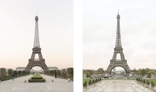
    French photographer and graphic designer François Prost has a new photo series out that I thought I would share with you today. It’s called “Paris Syndrome” and I discovered it via CityLab.

    What the series does is visually compare Paris to a housing estate in Hangzhou, China called Tianducheng, which was designed to be a replica of Paris. Tianducheng even has its own Eiffel Tower, though this Chinese version is only 108m tall and the French original is 324m.  

    image

    Still, in many of François’ photos, you may find it difficult to distinguish between the two (provided you ignore the Chinese people and the Chinese signs). The neighborhood was initially a ghost town, but apparently it’s now starting to fill up.

    The reason I mention this photo series is because it reminded me of the day that I spent in Macau last week. I’m not much for gambling – and Macau is firmly the gambling capital of the world with revenues that greatly exceed Las Vegas – but I was curious to see it.

    Similar to Hong Kong, Macau is a Chinese Special Administrative Region with a lot of autonomy. But from 1557 to 1999 it was under Portuguese administration. And so historically it has been home to this very unique Eurasian culture spanning everything from food to language. 

    I say “historically” because the Macanese and their Patuá language – which is supposedly a blend of Portuguese, Cantonese and Malay – seem to be on the brink of extinction

    Today it’s all about the casinos. And the demand is firmly coming from mainland China. In 2016, 90% of Macau’s 31 million tourists came from there.

    I fully appreciate the demand drivers, but I struggle to understand the allure of replicating and bastardizing attractions from other places. Macau also has an Eiffel Tower, as well as a Venetian (like Las Vegas). You can go for gondola rides in its canals.

    The more interesting part for me was the historic center of Macau with its Portuguese paving on the sidewalks. But maybe that’s just me.

    Image: François Prost

  • What’s with all these tower cutouts?

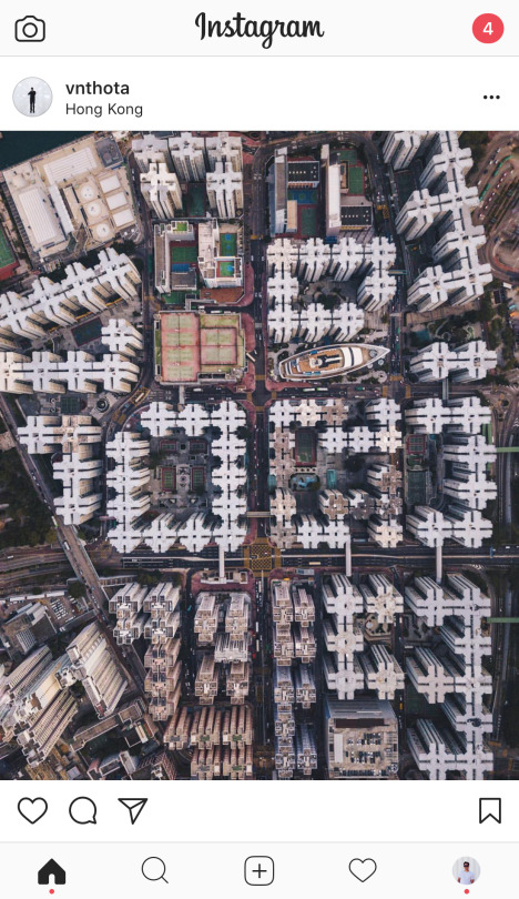
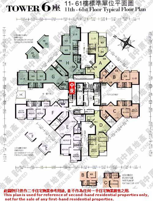
    One question that was nagging me after seeing Hong Kong’s “typical” tower typology was: what’s with the cruciform tower plan and all these notches and cutouts? Wouldn’t it be far more efficient to square off the floor plates? I figured that it had to be in response to building regulations. I was going to mention that in this post on the typical “8-units-per-floor” tower plan, but I wanted to first understand what was going on. Thankfully a reader of this blog who is from Hong Kong was kind enough to send me a wonderfully detailed email outlining some of Hong Kong’s building regulations and how they impact the design of tall buildings.

    It turns out that there are requirements for both “natural lighting and ventilation” and for “external air.” All rooms for habitation, as well as offices, bathrooms, and kitchens, are subject to these requirements. There are prescribed window areas for the “glass areas” and for the “openable areas”, both of which are a function of the room size. The glass area must equal the room area divided by 10. And the openable area must equal the room area divided by 16. I presume that these are minimum sizes because they don’t feel all that big.

    For the “external air requirement”, the room must face a street no less than 4.5m in width or it must face an unobstructed space as delineated by “rectangular horizontal planes” and by “inclined planes.” The incline planes are drawn in section from the sill of the window and the angle depends on the type of room. The rectangular horizontal planes are drawn in plan and have a minimum area of 21 square meters (or ~225 square feet). If you would like to deep dive into more of the technical details you can do that here. But suffice to say that it is these requirements which are driving all of the tower notches and cutouts.

    The result is tower floor plates that can look something like this:
    image

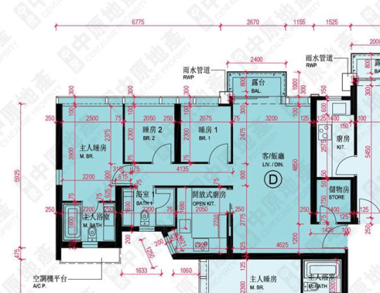
    And if we zoom into a unit (this one being a 3 bedroom apartment), you can see that both bathrooms have a window, as does the kitchen. From what I saw, there appears to be less interest in open concept floor plans. You may also finding it interesting to note some of the room dimensions (in mm) and the A/C platform sitting outside of the master bedroom. 
    image

    Finally, I should follow-up on my previous comment about tower separation distances and the ability for the above tower floor plates to be built directly adjacent to each other. Not surprisingly, this resulted in walls of towers being constructed. Ultimately this became known as the “wall effect.” So in 2011, the Sustainable Building Design (SBD) guidelines were put in place which stipulated that groups of buildings having a continuous facade length greater than 60m should comply with various separation and permeability guidelines.

    So there you have it. Every market has its local nuances. The above post is a good example of that. I also love when this blog becomes a platform for two-way discussion. I learned something new today and hopefully you did too. Thank you Hiu Yeung for your emails and for providing me with all of this information.

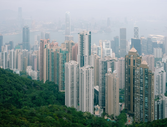
    Top image: Photo by me taken at Hong Kong’s Peak

  • Hong Kong’s “8-units-per-floor” tower plan

    One of the pedestrian overpasses in Central has an exhibition running right now called Density 2.0. Here is a photo of one of the posters talking about Hong Kong’s typical “8-units-per-floor” tower plan.

    Noteworthy is the fact that the floor plates contemplate minimal tower separation distances. This allows multiple towers to be built right beside each other. As a point of reference, the guideline in Toronto is 25m between tall buildings.

  • Inside-outside

    Take a look at this photo from Central in Hong Kong and note the MEP (mechanical, electrical, and plumbing) systems running up the cutout in the middle of the tower. Also note the bamboo scaffolding next door and the epic terrace on top of the ground floor bank. The building on the opposite side put parking on top of its podium.

    image

    I was told that systems are commonly run on the outside of buildings here to maximize interior square footage. Again, space is a precious commodity in this city. But it also speaks to not having to worry about freeze-thaw cycles. Winter in Hong Kong has so far equaled me walking around in a t-shirt.

    These exposed systems look ugly as all hell, but I suppose they also mean not having to break open drywall when you have a problem.

    I am fascinated by the relationship that buildings have between interior and exterior space. In cold cities like Toronto we are forced to hermetically seal off our buildings from the elements. We have to worry about thermal bridging and about heat tracing cold spots.

    But in a city like Hong Kong I would imagine that the greater concern is stifling heat and humidity. All of this comes through in the built form.

  • Inverted podium

    One of the things that I noticed yesterday morning on my walkabout from Wan Chai to Causeway Bay is that some/many of the buildings in Hong Kong actually step-in, as opposed to step-back, once you get above the base or “podium.” In many cases the step-in comes out almost to the curb line.

    (Note how the reference point is the public realm. You step back from it or you step into it.)

    Here is an example:

    image

    Setbacks and step-backs are longstanding urban design tools because they can allow more light to reach the street and they can visually break-up the mass of a building and establish clear datum lines, among other things.

    We’re obsessed with them in Toronto because everyone is always trying to hide building height. But in Hong Kong, space is such a rare commodity that it seems to be about filling in every available inch.

    I posted this remark on Twitter yesterday and it was suggested that some of these step-ins may have been the result of additions made after the fact. They seemed original to me, but whatever the case may be, they are an existing condition that I have started calling the inverted podium.

  • 50th year anniversary of Playtime

    This month is the 50th year anniversary of the Jacques Tati film, Playtime. Initially released in December 1967, Playtime is a French comedy that is often considered to be director Tati’s most notable work. Apparently it was commercially unsuccessful at the time of its release. But it has since become recognized, at least by some, as one of the greatest films ever made.

    The film is a satire of modern society. And so it’s also a funny critique on modern architecture and the prevailing ideologies at the time. Watch the trailer below and you’ll very clearly see this relationship: a Frenchman lost in a new, modern Paris. I remember watching one of his earlier movies – Mon Oncle – in one of my undergraduate architecture classes.

    If you can’t see the trailer below, click here:

    [youtube https://www.youtube.com/watch?v=zrYB8hgyq4s&w=560&h=315]

  • Bright reddish-orange triangulated LED-lit fins

    superkül (architects) recently added a new project to their website, namely the renovation and addition to Proper TV’s headquarters at Bloor and Dovercourt here in Toronto.

    The original single-storey building dates back to the middle of the 20th century and used to house a Canada Post Office and distribution facility.

    But why send letters when you can instead send emails and instant message that are immediately tracked for the purposes of later bombarding you with ads for things you may want to buy? 

    The post office closed in 2013.

    The main facade along Dovercourt was constructed of limestone and that remains today. Here is photo of the building looking north on Dovercourt from Bloor:

    Notice how the road (Dovercourt) curves and the building becomes almost a view terminus.

    Here is the east elevation:

    And here is a close-up of the bright reddish-orange powdered coated triangulated fins that adorn the second floor:

    Apparently the fins are also lit up at night with programmable LEDs. I don’t have a picture of that to show you, but I am sure they look very cool. I’ll have to do a drive-by one night.

    All images from superkül.

  • What’s with all the black houses?

    Author and professor Witold Rybczynski recently asked: “What’s with all the black houses that have appeared in recent years?” Black brick. Black paint. Blackened Timber. Lots of black.

    Alongside his post was an image of a “backcountry hut” by Leckie Studio Architecture + Design. I am adding a picture of the interior for completeness, but he only posted a picture of its exterior.

    Witold makes a great point about shadows, but when I read the post this morning I immediately thought to myself: Wow. What a beautiful cabin and what a beautiful setting.

    I like how the lighter carve out at the corner contrasts against the black. And because of this carve out, I assumed that the interior would have similar and lighter tones of wood. It does.

    At the same time, I thought of Urban Capital’s River City complex here in Toronto, which also features “black” as a prominent architectural expression. I am a big fan of these projects.

    So I guess it goes to show, once again, that beauty is really in the eye of the beholder.

  • Constructing the tallest building in San Francisco

    Alexis C. Madrigal recently published a piece about the Salesforce Tower in San Francisco called: The Tower at the Heart of the Tech Boom. At 61 floors and 1,070 feet, it is now the tallest building in San Francisco and the second tallest building west of the Mississippi River after the Wilshire Grand Center in Los Angeles.

    Hines and Boston Properties are the developers of the building. Pelli Clarke Pelli is the architect. And Salesforce is the anchor tenant. In April 2014, it was announced that they had leased 714,000 sf on floors 1, 3-30, and 61. (Get that top floor.) So almost half of the building.

    Perhaps not surprisingly, Madrigal calls the Salesforce Tower the “the most visible monument to the industry [tech] in the region and the country.” It is a demonstration of the power and reach of Silicon Valley. San Francisco has a new symbol. The TransAmerica Pyramid now feels inadequate.

    Though interesting, this is actually not what I want to talk about today. I’d like to talk about what it took to build such a tall building in a seismically active city like San Francisco. Unfortunately, this feels timely given that the sinking Millennium Tower is getting so much attention right now.

    The structural engineer for the Salesforce tower is Seattle-based Magnusson Klemencic Associates (MKA). They are a world-renowned structural and civil engineering firm that have been around since the 1920s. Other projects they are currently working on include the third tallest building in Chicago.

    The tower’s seismic force-resisting system is made up of reinforced concrete shear walls that surround the central elevator and exit stair core. These walls are 24 to 48 inches thick. Here is a plan taken from a STRUCTURE Magazine post written by Ron Klemencic of MKA:

    image

    The tower’s foundations have been well documented, or at least frequently mentioned, because of how deep they had to go down. The site has poor soil conditions (fill, sand, San Francisco “old bay clay”, and weak bedrock), and so given the weight of the tower the only option was to go down to bedrock – approximately 250 feet below grade.

    The foundation system they ended up going with uses something called Load-Bearing Elements (LBEs). The typical LBE measures 5′ x 10.5′. The entire foundation system uses 42 LBEs and a mat foundation that varies in thickness from 14′ around the core to 5′ around the perimeter. (See image below.) The LBEs were brought down to rock. And in some cases, they went down more than 310 feet below grade.

    image

    As a condition of buying the site, the Transbay Joint Powers Authority required proof that any future tall building would not negatively impact the surrounding structures – including the adjacent Transbay Transit Center – and that it would perform under a Maximum Considered Earthquake (MCE) event.

    So while the tower itself may be a symbol for the new world, its structural system also achieves many firsts in terms of how to build a supertall in a seismically active region.

    Please keep in mind that I am not a structural engineer. I just pretend to be an architect sometimes. If you’re interested in more of the details, check out the post by Ron Klemencic. All of the above information was taken from there.

  • Bowling Lane House, Calgary

    I just finished going through the work of Studio North. My friend Peter introduced me to them through this Globe article

    They are a Calgary-based design-build practice that have completed a number of laneway houses, as well as bigger projects such as this 34 unit townhouse project in Canmore, Alberta.

    What (not surprisingly) caught my attention was their focus on laneway/accessory dwellings. Pictured above is their Bowling Lane House in Crescent Heights, Calgary. 

    It’s a 700 sf one-bedroom house that sits behind a 1920′s heritage house. Here is an axonometric of that relationship (the existing house was made transparent):

    Here is an elevation from the main street. Look at how neatly it tucks behind the existing house. All you really notice is the garage of Bowling Lane House.

    Here is how Bowling Lane House fits into its laneway.

    And here are two images of the double height space that they managed to create within this 700 sf house.

    Notwithstanding that this is a wider lot than what you might typically find in Toronto, it is precisely the kind of housing – both in terms of design quality and scale – that I was trying to create with Mackay Laneway House. It’s also where I was planning to move.

    Kudos to the Studio North team for driving this initiative in Calgary. You can check out the rest of their projects here. They have a number of other laneway houses within their portfolio. And all of them are beautiful.

    All images from Studio North.