Daily insights for city builders, delivered every morning at 6 AM ET. I’m Brandon Donnelly — a Toronto-based real estate developer and founder of Globizen. I’ve been writing here since 2013.
This house was designed by the Spanish firm, Space Popular. It was completed last year in Santa Barbara, Spain. Two things, in particular, make it unique: (1) Its exposed steel structure (12×12 grid) and (2) its brick vaults. But both of these things really serve one idea. They express the building’s structure. And that’s about all you need for good architecture — one clear idea. All photography by Mariela Apollonio.
I am working from home today, like many of you, I’m sure. The patio door is open and the news is on in the background talking about some sort of nasty bug that’s going around. It’s not half bad, except I prefer working in an office and being around other humans.
But never mind that, this recent article from the WSJ has me wondering where I can buy a 2,700 square foot loft for €1 and end up with the following renovation for under US$450,000 (photo by Rene de Wit):
A former school in Rotterdam, the city sold off the building as 7 residences. The loft you see here was the gym. Major foundation work was required (costing about US$565,000), but that got split up across all of the buyers/residences and factors into the number I threw around above.
At 2,700 sf, it’s not your typical urban residence. But it is interesting to see how they designed the space to be suitable for a family. There’s a separate children’s “suite” hidden behind the millwork next to the dining area. Look closely and you’ll be able to see the door.
For floor plans and more photos, including some before shots, click here. It’s worth seeing more of this place. Two storeys in the city is such a luxury.
I started watching Parasite on a flight home this past weekend (I know, I’m behind). The first couple of scenes immediately hooked me and so I ended up watching the full movie over the weekend. It’s one of the most creative movies I have seen in a long time. (To be fair, I don’t watch a lot of movies these days.) I won’t spoil it all for you here, but if you haven’t seen it yet, I would highly recommend it. One of the principal themes is social inequality. And it’s interesting to see how that gets told through the spaces within the film. The poor family lives in a “semi-basement” at the end of what appears to be a laneway. And the rich family lives, higher up, in a house designed by a famous architect. Naturally it has a big and perfectly manicured backyard. At one point in the film, you also get to see which housing type is more environmentally resilient.
I’ll leave it there. But it’s worth checking out if you are into award-winning Korean tragicomedies.
This week the NY Times reported that a non-profit group called the National Civic Art Society has drafted an executive order that would make classical architecture the default style for all federal buildings in the United States. The draft order is naturally titled: “Making Federal Buildings Beautiful Again.”
Here is an excerpt from the New York Times:
“For too long architectural elites and bureaucrats have derided the idea of beauty, blatantly ignored public opinions on style, and have quietly spent taxpayer money constructing ugly, expensive, and inefficient buildings,” Marion Smith, the group’s chairman, wrote in a text message. “This executive order gives voice to the 99 percent — the ordinary American people who do not like what our government has been building.”
As you can imagine, this proposed order isn’t sitting well with many architects (the real kind who, presumably, hold licenses). Thom Mayne of Morphosis put it well with this quote:
“We are a society that is linked to openness of thought, to looking forward with optimism and confidence at a world that is always in the process of becoming. Architecture’s obligation is to maintain this forward thinking stance.”
I think there are many people who would tell you that they prefer classical architecture to modern architecture. And that’s totally fine. I don’t know how many is many, but I am fairly certain it is not 99% of all Americans. (It would be interesting to know the approximate taste split.)
My strong view is that I don’t see the need to mandate a particular architectural style. Let architecture respond to the world around us. Let urban context guide. Like Mayne, I am also drawn to the future, as opposed to the past — though I certainly appreciate history.
What is your view?
As a side note, classical architecture was used pretty much exclusively for federal buildings up until the 1930s. Architecture school taught me that it was initially chosen because it was seen to embody the ideals of the American democracy.
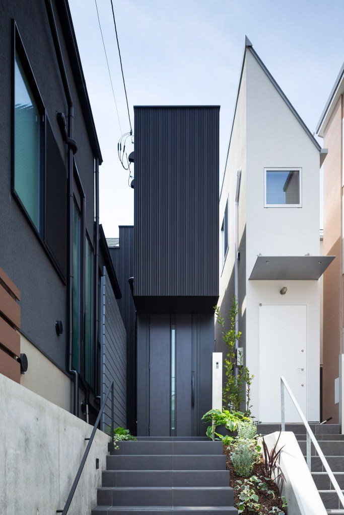
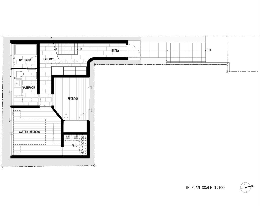
I have a fascination with “small” Japanese homes. Many, or perhaps most of them, would be illegal to build in a place like Toronto. This one here in Tokyo, called Jewel, is only 1.4m wide on its narrowest elevation. See above photo. Designed by Apollo Architects & Associates, the ~80m2 home was built on a “flagpole” site. Narrow approach. More site area in the back. Here is a plan of the ground floor (via Dezeen) to give you a better sense of what I’m talking about:
According to Dezeen, the client is a fan of minimal design and, in particular, the work of John Pawson. His work was a source of inspiration for the project. But if you read the article closely, you may notice that he is referred to as the “British architectural designer Pawson.” I learned last week, following this post, that John Pawson is not a licensed architect. Hence the carefully chosen language. I guess there’s hope for those of us who are not architects.
Witold Rybczynski’s recent blog post about architecture’s “curious business model” gets at one of the core challenges of new construction: “Every project is, in effect, a custom job; there are no real economies of scale.” There are also no reoccurring cash flows for the architect, Witold explains, unlike a writer who might earn ongoing royalties or a business owner whose wealth will grow as the business grows.
There are two items to discuss here: (1) The “curious business model” used in the practice of architecture and (2) the inefficiencies of construction.
The first one is not unique to architecture. You could say the same thing about the planning and real estate lawyers who also work on new buildings. But I take Witold’s point in that even a painter’s work could appreciate in value after it’s done, whereas there’s typically no mechanism for any of this to accrue (to the architect) in the world of architecture.
When I was young, I was told that there are two ways to make money. You can either trade your time for money or you can own assets that make you money. An example of the latter might be a farm where the tenant farmer pays you rent every month. You’re not trading your time by actually doing the farming, you just own the asset.
This may seem obvious, but it’s fundamental. And it’s one of the reasons why, when I was in architecture school, I admired the practices of people like Jonathan Segal out of San Diego. Jonathan is one of the pioneers of the “architect as developer” approach. He simply became his own client and started building his own projects.
Moving on to topic number two.
Everyone in the business of building new buildings is looking for repeatable methodologies. Many have thought: How do we make the construction of buildings more like the assembly of cars? How do we create a standardized kit of parts? And that has lead to longstanding efforts around prefabrication. Today, as you know, we are also looking at how 3D printing might make this easier/cheaper.
In some ways, that is happening. There are examples of prefabrication and panelization, and there are developers who are using this approach. (See H+ME Technology.) But for the most part, we still build on site and it’s still a messy process with lots of waste and inefficiencies. If there was a cheaper and more effective way to do it, the industry would certainly move in that direction. Eventually that will happen.
In the meantime, we will continue building our prototypes.
If you end up taking the time to read the articles, you’ll be reminded of a couple of things about the way cities work. One, the way we use buildings changes over time. Two, the kind of architecture we pursue is always a reflection of the socioeconomic milieu at that particular moment in time. And three, the way we perceive buildings also changes over time.
In the case of Amsterdam’s canal houses, their original function was live/work. They were residences, but they were also warehouses. Amsterdam’s maritime dominance meant that it was more profitable to store things, instead of just house people. (Sometimes as much as half of the house was dedicated to storage.) Trade patterns had moved from the Mediterranean up to the North Atlantic, and that worked out pretty well for the Dutch in the 17th century.
In the case of Berlin, their typical mid-rise “rental barracks” went from reviled to coveted as the buildings aged, elevators made the penthouses desirable, and people started to appreciate some of their idiosyncrasies. It’s an example of what I was getting at when I spoke to the CBC for this article about Toronto’s skyscraper boom. Some things, including buildings, take time. They need to settle in.
Candace Taylor published an article today in the WSJ about the late Zaha Hadid’s One Thousand Museum tower in downtown Miami. The title: “Zaha Hadid’s Miami Tower Is an Architectural Feat. Is It Designed to Sell?”
It’s an interesting case study, particularly for those of us in the industry. With only 84 units across 62 storeys, it is certainly “ultraluxury.” There’s also a helipad on the roof. Here is an excerpt from the article to give you a sense of the unit sizes:
Louis Birdman, one of the project’s developers, said prices, which range from just under $5 million to $25 million, are negotiable. Each floor has only one or two units, ranging in size from about 4,600 square feet to 10,400 square feet and each has at least four bedrooms. “Given what’s going on in the market now, I think all of us developers are competing for a similar buyer, so there’s obviously flexibility on price,” he said.
As you can probably glean from the above, the ultraluxury market has softened in Miami. But Candace is right: One Thousand Museum is an architectural masterpiece. If you’re in the market for a new four bedroom home in downtown Miami, now may be right time.
Designlines Magazine is out with its annual “Designer of the Year” issue and this year’s winner for best overall designer is Superkül — the award-winning architecture firm behind Junction House. Pictured above are Andrea D’Elia, Meg Graham and the team. (The JH project team spends a lot of time in the boardroom that you see in this picture.)
Other winners for this year include Omar Gandhi, Paolo Ferrari, and LGA Architectural Partners. They were awarded best restaurant, best product, and best public space, respectively. If you aren’t familiar with the work of these four firms, I would encourage you to check them all out. They are truly some of the best in the city. Congrats everyone.
If you’d like to buy a copy of Designlines, you can do that here. We will also make copies available at our temporary Junction House showroom, which is located at 2843 Dundas St W.
I think it’s time to make it official: Brutalism is fashionable again. Okay, kind of. According to this WSJ article, the appreciation for this style of architecture remains nowhere near universal, but the renaissance is certainly continuing. Some Brutalist structures are and have been torn down; while others are being repurposed.
One recent example is the Balfron Tower in East London (pictured above). Designed by the Hungarian-born architect Ernő Goldfinger and completed in the 1960s as social housing, the tower is currently undergoing a £40 million renovation that will convert it to market-rate housing. Apartments start at £365,000 (USD 472,054) for a 450 square foot one bedroom.
One notable feature are the “streets in the sky” that separate the building’s circulation (elevator core) from the actual suites. It’s a peculiar way to build and most never consider it today, but it’s very much a hallmark of the Brutalist movement. The idea was to express the building’s various functions — vertical circulation being one of them.