Daily insights for city builders, delivered every morning at 6 AM ET. I’m Brandon Donnelly — a Toronto-based real estate developer and founder of Globizen. I’ve been writing here since 2013.
Last month I wrote about an upcoming city building event in Toronto called called Engaging In-Between Spaces. It’s being hosted by a non-profit group called The Laneway Project and it’s going to be this city’s “first summit on laneways.”
While many people associate the potential of Toronto’s laneways with laneway housing, the focus of this event will be on laneways in a much broader context. Laneway housing will certainly be a part of it, but the event will also look at our laneways as public spaces, gathering spaces, and so on.
I’m going to be giving a short presentation that looks at Toronto’s laneways from a real estate development perspective, and so I hope that you’ll be able to attend. The event is only $10 and the money will help support the group’s mission of transforming our laneways into vibrant, safe, and people-friendly spaces.
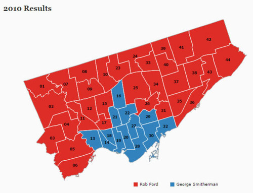
In 2010, Toronto voted for its new mayor, Rob Ford, like so:
It was basically the core of the city (old Toronto) versus all of the boroughs. And it was perfect ammunition for anyone who believed that Toronto’s amalgamation was a mistake. (I personally don’t think it was.)
Yesterday, Toronto did better.
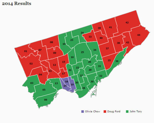
While we’re still a divided city — with Etobicoke and Scarborough largely remaining loyal to Ford Nation — we’re not quite as divided as we were 4 years ago:
However, there is one thing that Torontonians did largely agree on last night: the next mayor should be white and male. And this got the Guardian Cities out of the UK asking why one of the most multicultural cities on the planet (apparently we’re third behind Luxembourg City and Dubai), continues to elect middle-aged white guys.
Now, I’m not a fan of the article. And I take offence to the way Toronto is portrayed. But it did get me thinking. And I thought it would be interesting to see how some of Toronto’s demographic data overlays on top of these election maps.
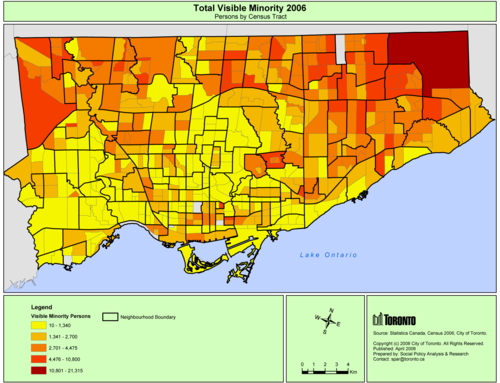
Looking at 2006 census data (2011 isn’t available in map form yet), here is a map showing the total number of visible minorities broken down by census tract. The darker the red the more visible minorities.
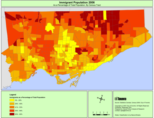
And here is a map showing immigrants as a percentage of the population. Again, the darker the red, the higher the percentage.
What should be apparent from these maps is that Ford Nation is actually, in some ways, immigrant and visible minority nation. In the above map, the darkest red areas indicate that immigrants represent anywhere from 65-80% of the population. That’s a significant number.
So why didn’t this group vote for the Hong Kong-born Olivia Chow? It’s because she wasn’t telling them the right story. Rob and Doug Ford, on the other hand, were.
About 8 months ago I publicly announced here on ATC who I would be supporting, and my position hasn’t changed. I was disappointed by the fact that he ended up backing away from his initial promise of a true downtown relief subway line (see blog post), but I nonetheless continue to support his candidacy.
In the words of Mike “Pinball” Clemons, he’s “the right man at the right time.” Click here if you can’t see the video below.
But I’m not here to try and sway your vote. That is ultimately your decision. However, I am here to encourage you to get out and vote. Regardless of who you might be supporting, I think it’s important that you get out and take a position. So I hope you do that today.
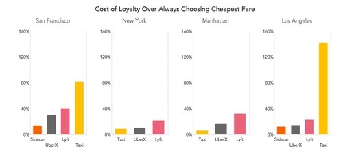
This morning I woke up to a post from venture capitalist Fred Wilson talking about the cost of loyalty when it comes to local transportation markets. More simply, it was a cost comparison between regular city taxis and ride sharing services such as a UberX, Lyft, and Sidecar in San Francisco, Los Angeles, and New York.
The way to understand this chart is to think about it as the answer to this question (from whatsthefare.com): If I were to take 1,000 rides over my lifetime with one individual service, how much more would I pay than if I compared prices and always picked the cheapest option?
What you should immediately see is that regular taxis are far more expensive in San Francisco and Los Angeles compared to all of the ride sharing services. In the words of Fred Wilson: “That is crazy. They are going to go out of business in those markets with that pricing.”
In my words: They are fucked.
I wonder where Toronto would place against these cities. My gut tells me that we would be closer to San Francisco than New York. And if that is the case, I think you can figure out what that means.
I thought this would be an interesting post given yesterday’s point about our cities being multi-modal. We urbanites have many more options at our disposal than we did only a few years ago. And if they’re cheaper and more convenient, we’re going to use them. I think that’s a good thing.
This afternoon I rode Toronto’s new streetcar for the first time on my way home from Chinatown. I had been meaning to do it for weeks now, but this was my first opportunity.
The experience was infinitely better than what you get today on our current streetcars. I felt like I was in a new city. The proof-of-payment system makes onboarding much faster and the 4 loading doors means you just get on the train where there’s the most room – instead of getting on at the front and fighting your way to the back.
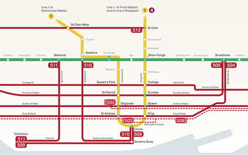
The other thing I liked is that they now have a map of our streetcar network within the train (see above image). Toronto never used to do this. For whatever reason, we didn’t like mixing subway lines with streetcar lines on the same map.
But why be so pedantic?
For one thing, our subway map looks pathetic without these additional streetcar lines on it. So for the sake of Torontonian morale, please fill it up with what you can.
But the other reason why I think it’s important to include them is that we shouldn’t be thinking about our cities just in terms of specific technologies (subway, streetcar, and so on). Our cities are now multi-modal. Which means we navigate them using many different means, from subways and streetcars to bikes and Uber cars. What people care about is getting from A to B in the most efficient and enjoyable way possible.
This may seem like a subtle distinction, but it’s an important one. And maybe, just maybe, these new maps will serve as an important reminder to us that there’s a lot of fixed rail in this city and that it could be far better optimized if we just tried a little harder.
Earlier this week I wrote a post about a new build home under construction at 37 Canerouth Drive in the west end of Toronto. As part of that post, I asked people what they thought the home would be valued at when it was completed. There were just under 10 responses (many thanks!) and I thought it was really fascinating to see the ranges.
A lot of you responded in the comment section of the post, but a bunch of the other estimates came in via Facebook, Twitter, and email. It isn’t a huge data set, but I’ve nonetheless consolidated the ones I could remember I received:
If you average these estimates, you come to a value of $3.3M. However, the clear outlier is the $8.5M. So let’s take that one out and see how the number changes. If you do that, you then get an average estimate of $2.5M. A pretty big swing.
Now, I don’t know offhand how accurate that number really is, but I’m fascinated by this idea of “the crowd” determining value. Particularly for markets such as housing where supply can be completely heterogeneous and there isn’t a lot of transaction volume to refer back to (compared to other types of markets).
Because my strong belief is that under the right circumstances and with enough data points, this number could end up being hugely accurate. And, it could also be more forward looking since it’s capturing current market sentiment as opposed to being based on historical transaction prices.
If you have any thoughts on this, I’d love to hear from you 🙂
I’m always on the lookout for great websites and communities dedicated to cities. And today, thanks to a friend of mine, I found a new one called City Observatory. It’s my new favorite site for city geeks.
I’m looking forward to digging into more of their articles, but I did already take a look at the first report they published, which is called: “The Young and Restless and the Nation’s Cities”. Click here to download the PDF.
What the report talks about is a demographic group that they refer to as “Young and Restless”, and which they define as being 25-34 years old and having a 4-year degree. And they focus on this group because they see it as critical to driving local economic development.
They’re the next generation who are going to start those companies and drive growth and innovation. And since the data shows that as people age, they become less willing to relocate (which intuitively makes sense), cities today are quickly realizing that they need to capture this group of smart people while they’re still restless (i.e. mobile).
So if this is important, which cities (in the US) are winning right now? Here are the top 10 cities via City Observatory:
Washington D.C. 8.1%
San Francisco 7.6%
Boston/Cambridge 7.6%
San Jose 7.5%
Denver 7.5%
Austin 7.0%
New York 6.6%
Minneapolis 6.6%
Raleigh 6.5%
Seattle 6.1%
The percentage represents the portion of the population that’s 25-34 years old and has a 4-year degree. I’ve just listed the cities here, but in reality they reference the entire metro areas.
Do any of the cities on this list surprise you? None are surprises for me. It’s more or less what I would have expected to see, except maybe for the absence of Chicago (it’s 12th according to this ranking).
In addition to technology, the conversation touches on a bunch of different topics such as why it’s beneficial to be an optimist and why change can be difficult for people to accept.
But they also hit on a number of broader economic shifts, such as the replacement of labor by machines, and the rise and decline of industrial production in the US. Here’s a snippet on that latter point:
You’ve described the middle class of the 20th century as a myth.
There are two middle classes. There’s the historical middle class—which is the bourgeoisie—starting in the, like, 1600s. This was the businesspeople and the traders, the merchants, the butcher, the baker, the general-store manager, the guy who was going off to China to go get silk and bring it back. Businesspeople.
But in the 1940s something really significant happened, which is we bombed the rest of the industrialized world. And so the industrial base of Germany was obliterated. Japan was reduced to rubble. The rest of Continental Europe was bombed. England was bombed. The industrial base of the world was bombed. The one major industrial country that wasn’t bombed was the United States. So the United States became the monopoly producer of industrial goods.
The army bombed the American middle class into existence?
It was an accident of history. We had a window of opportunity which we took full advantage of. We had this window from basically 1945 to 1966, 1968, in which we were basically running unopposed. In that window, all kinds of wonderful things happened. One of the things that happened was the rise of this new idea of the middle class, which there was no historical precedent for, which was college-level wages for high-school-level education. As long as there’s no competition, it’s all well and good. The minute the Japanese show up, the minute the Germans show up, it just all falls apart.
Click here for the full conversation. It’s an interesting read.
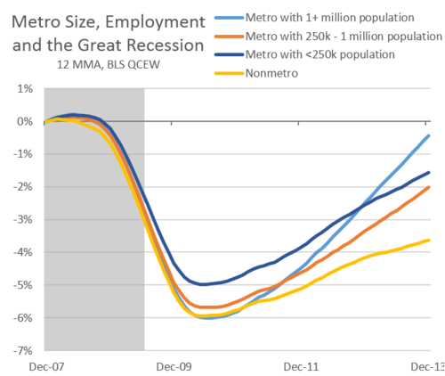
Josh Lehner of the Oregon Office of Economic Analysis published a study earlier this summer where he looked at employment growth according to city size across the US.
What he found since the Great Recession of 2008-2010 is that larger metros – with populations greater than 1 million people – have rebounded the fastest. They are shown in the light blue line below:
According to Josh:
This is at least partially due to the fact that all those good economic things — agglomeration effects, knowledge spillovers, clustering, etc — happen in certain locations, which are usually bigger cities.
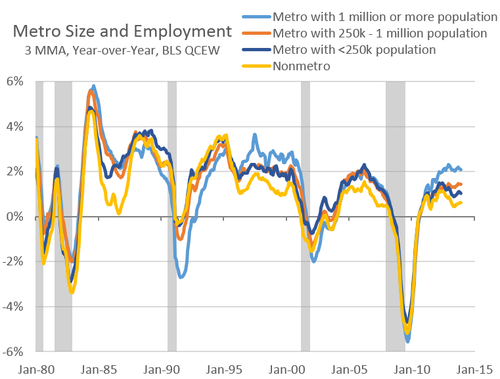
However, if you go back to the 1980s, you find that this trend isn’t consistent. Large metros outperformed in the late 90s. But they were more or less on par with smaller metros during the housing boom of the early 2000s and actually under performed in the early 90s recession.
One possible explanation for this – which Josh proposes – is that the recent housing boom acted as a sort of equalizer for smaller metros. It created stronger population growth outside of the bigger cities.
I buy that.
But then does that mean that going forward big cities will continue to outperform? Is this going to be more or less the new norm? Intuitively, I would think yes.
You can find Josh’s blog post, here. Richard Florida also wrote one for CityLab, here.
Poll: How much do you think this home is or will be worth? Respond in the comment section below. I’ll be giving away one free ATC t-shirt. (Comments)
A few weeks ago a good friend of mine – who is a builder – called me up and told me that I had to come and see a house under construction in Etobicoke (west end of Toronto). He told me that the owner was doing everything from geothermal to a car elevator, and that he was doing it all, not with the intent of ever being able to sell it, but because he just wanted to build something really cool.
I thought: Amazing. I need to see this.
So this past Saturday afternoon, I drove out to 37 Canerouth Drive in Etobicoke to take a look. Situated near Centennial Park, the house is at the end of an unassuming cul-de-sac filled with post-war bungalows that you could probably pickup for anywhere between $800,000 to $1M, fully renovated. This house, on the other hand, has had many multiples of that sunk into it.
But before I get into the house, let me start from the beginning.
The owner actually used to live next door on Canerouth Drive. He lived in a nice, newly renovated bungalow, but he wanted something else. Something cooler. Something he could create from scratch. Being a car collector, one of the driving forces behind a new build was to create a place for all his cars. At one point he had around 7 or 8 of them. So he had decided that it was time to do a knock-down and start again.
But before he could demolish his house, his neighbors – whose bungalow hadn’t been renovated, but which had a slightly bigger and better lot – said to him: “You’ve got to be crazy. Your place is fully renovated.”
Somehow that comment led to the two neighbors actually switching houses. (I think this is fascinating, because I wonder how many of these types of transactions would be possible under the right circumstances.) The neighbors got a newly renovated house, and he got a better lot to build his dream home. It was a huge win for the neighbors, but it also meant one less neighbor to oppose him at the Committee of Adjustment when he went in for his variances.
The biggest variance was apparently density. The house is almost 6,000 square feet. It has somewhere around 4 bedrooms, but also includes a few studio and study areas, a spa area, 2 walk-in closets the size of the bedroom in my condo, and even a “meditation hallway”. The master bedroom and main living areas are all on one floor so that as the couple ages the home remains functional. (There’s also an elevator just in case.)
Being at the end of a cul-de-sac, the lot is pie shaped and the architecture of the house mimics it. The front is concave and the rear is convex – opening up the main living areas and master bedroom to the ravine at the back (see above photo). The owner was absolutely firm in his belief that these curves were central to the architecture. Without them, the house simply wasn’t worth doing, he said.
The initial intent was to build a completely passive solar house, but he found that it was extremely difficult to do so within the confines of our building code. Still, the house contains a significant amount of thermal mass, which is one of the principles of passive solar design. The home uses precast hollow core slabs with 3" of poured concrete on top and in-floor radiant heating and cooling. All of the floors will be polished concrete – love it.
Here’s the main stairwell (check out the support stringers):
Here’s the view from the kitchen looking towards the living room and out to the backyard (the far wall will be outfitted with custom millwork for his pottery collection):
Here’s a shot of the through-fireplace that will connect the living room area to the main stairwell area shown above:
And here’s the meditation hallway:
The most over the top part of the house though, is probably the underground parking garage. This shouldn’t come as a surprise to you given that he’s passionate about cars and it was one of the main reasons he wanted a new house in the first place. At the front of the house (shown in the first image above) is a single car garage, which conceals a parking elevator he sourced from the US.
It looks like this from the basement:
And it leads into this below grade parking area:
There’s enough room for all of his cars and it’ll be fully equipped so that he can work and tinker on them.
But what stood out to me most from my visit – more so than the scale of this project or all the fancy bells and whistles – was his attention to detail and his passion for design. Here is a guy who is worrying about baseboard details and the design of the space down to the centimeter.
Here’s his door detail:
In fact, he gave me a number of examples where a couple of inches here and there were having a profound impact on the experience of the space and he forced the trades to change it. He even spoke about how the 3" concrete floor topping had changed his experience of the outside (for the better). These are subtleties that most people don’t even notice, or care about.
But he sure does.
Of course, in some ways, this is the difference between building for yourself and building strictly for profit. When it’s a passion project, you do things that you love, but that other people will tell you don’t make economic sense. But sometime it’s good to be crazy. I mean, what do those other people know?
So today, I thought we would play a little game on ATC where you try and guess what you think this home will be worth upon completion? Take a guess. There’s no wrong answer here. I’ll also randomly select somebody from the comments to receive a free ATC t-shirt.
I have a rough idea of the costs in my head, but I’d like to see what you come up with on your own first. I’ll also be forwarding this post to the owner, so make sure you respond in the comment section below as opposed to via email or on social media. I’m sure he’d love to see your numbers 🙂
To add one last piece to this story, I discovered midway through our tour that the owner of this house used to be my family’s veterinarian before he retired sometime in the mid 2000s. What a small world. He was an excellent veterinarian (my mom told me to tell him that), but that clearly wasn’t his only passion.