Daily insights for city builders, delivered every morning at 6 AM ET. I’m Brandon Donnelly — a Toronto-based real estate developer and founder of Globizen. I’ve been writing here since 2013.

  • Land use restrictions and upward mobility

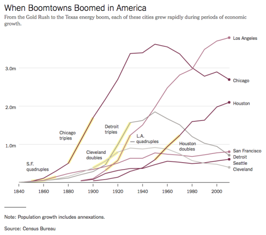
    Throughout US history, economic growth has typically spurred an “enormous reallocation of population.” Here is a graph from a recent New York Times article called: What Happened to the American Boomtown?
    The argument, here, is that restrictions on development have made it so that the most prosperous cities are actually the slowest growing cities in terms of population. Here is a chart, from the same article, comparing population growth to average annual pay:
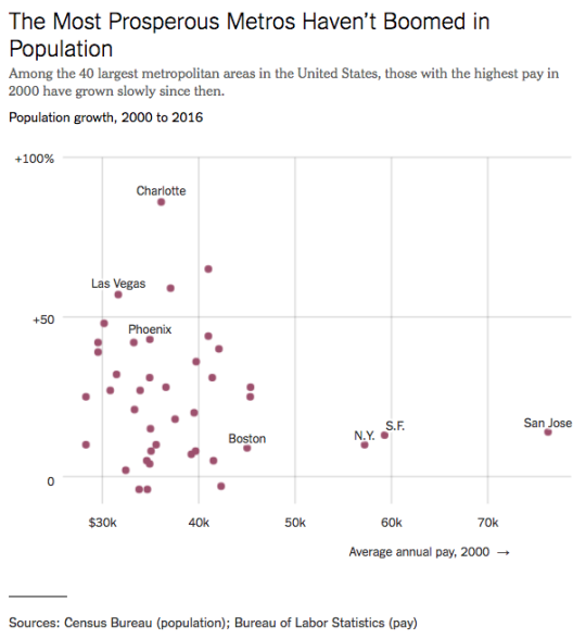
    And here is an excerpt:

    But these productive places aren’t growing as fast now as economists believe they should — and as they would if they didn’t impose so many obstacles on new development. Since the 1970s, land use restrictions have multiplied in coastal metros, making it harder to build in, say, San Jose, Calif., than in Phoenix. And the politics of development have become tense, too. In the Boston suburbs, the Bay Area, Brooklyn and Washington, people who already live there have balked at new housing for people who don’t.

    We often talk about the impact of land use restrictions on supply and overall housing affordability. But here is an argument that it could also be impacting upward mobility.

  • What cars can tell you about a neighborhood

    This is an interesting study from a team of AI researchers at Stanford. What they did was use car images taken directly from Google Street View (so images of cars parked on-street) to predict income levels, racial makeup, educational attainment, and voting patterns at the zip code and precinct level.

    Admittedly, it’s not a perfect survey, but when they compared their findings to actual or previously collected data (such as from the American Community Survey), it turns out that their study was actually remarkably accurate. Google Street View allowed them to survey 22 million cars, or about 8% of all cars in the US.

    Here are some of the things they found:

    –  Toyota and Honda vehicles are strongly associated with Asian neighborhoods.

    – Buick, Oldsmobile, and Chrysler vehicles are strongly associated with black neighborhoods.

    – Pickup trucks, Volkswagens and Aston Martins are strongly associated with white neighborhoods.

    Interestingly enough, the ratio of pickup trucks to sedans, alone, is a pretty reliable indicator of voting patterns. If a neighborhood has more pickup trucks than sedans, there’s an 82% chance it voted Republican in the last election.

    Perhaps this isn’t all that surprising given that car purchases are highly symbolic. But given that the American Community Survey costs $250 million a year to administer, this study is a good preview of what cheaper and more realtime data collection might look like.

  • Bright reddish-orange triangulated LED-lit fins

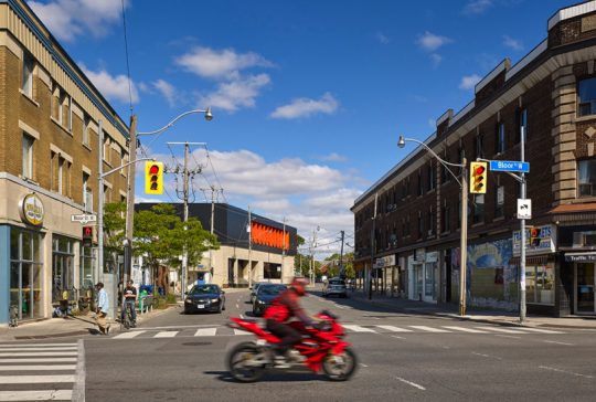
    superkül (architects) recently added a new project to their website, namely the renovation and addition to Proper TV’s headquarters at Bloor and Dovercourt here in Toronto.

    The original single-storey building dates back to the middle of the 20th century and used to house a Canada Post Office and distribution facility.

    But why send letters when you can instead send emails and instant message that are immediately tracked for the purposes of later bombarding you with ads for things you may want to buy? 

    The post office closed in 2013.

    The main facade along Dovercourt was constructed of limestone and that remains today. Here is photo of the building looking north on Dovercourt from Bloor:

    Notice how the road (Dovercourt) curves and the building becomes almost a view terminus.

    Here is the east elevation:

    And here is a close-up of the bright reddish-orange powdered coated triangulated fins that adorn the second floor:

    Apparently the fins are also lit up at night with programmable LEDs. I don’t have a picture of that to show you, but I am sure they look very cool. I’ll have to do a drive-by one night.

    All images from superkül.

  • The geography of innovation and equality of opportunity

    The Equality of Opportunity Project has a recent paper out called: Who Becomes an Inventor in America? The importance of Exposure to Innovation. Vox also has a summary of the findings, here.

    The overall goal of the project is to “use big data to identify new pathways to upward mobility.” And in this particular study, they discover that in America there are many “lost Einsteins” – people who have the ability, but not the opportunity.

    Not surprisingly, socioeconomic class, race, and gender play a significant role. Children from high-income families are 10x more likely to become inventors (measured in patents) as compared to children from low-income families.

    Geography, place, and environment also matter. Where and how a child grows up has a significant impact on future outcomes. If a child grows up in a city/network that exposes them to other inventors, it increases the likelihood that they too will invent. 

    Where a child grows up also has an impact on the types of inventions, even if the child move cities as an adult. For example, the study found that if a child grows up in Silicon Valley but moves to Boston as an adult, it is still more likely to author patents related to computers because that’s what it was exposed to as a child.

    These associations also impact in a gender-specific way. Women are more likely to invent in a particular technology if they grow up surrounded by similar female inventors. The presence of male inventors has no impact. This makes a powerful case for better gender diversity and strong role models.

    If you would like to read the full paper, click here.

  • Aerial photographs of LA and NY

    I like the built form aerial photography of Jeffrey Milstein. Here is one of Stuyvesant Town in New York City:

    It shows a symmetrical plan view that followed a particular dogma at the time.  But it’s also a view that few people or residents would ever see or appreciate.

    The above image is from his exhibition at the Bau-Xi Gallery here in Toronto (340 Dundas Street West). It runs until December 16, 2017.

    On January 25, 2018, the exhibition moves to the Benrubi Gallery in New York City (521 W. 26th Street). Check them out if you’re interested.

  • Federal court upholds decision that TREB’s housing sales data should be available online

    The Toronto Real Estate Board (Canada’s largest real estate board) and the Competition Bureau have been fighting for years over whether TREB’s housing market sales data, including realtor commissions, should be publicly available online.

    The Competition Bureau, as well as many forward thinking realtors, believe that gatekeeping historical sales data is stifling competition and innovation. It is. But TREB has been arguing – for a number of years I might add – that it is genuinely concerned about consumer privacy.

    Well on Friday the Federal Court of Appeal ruled that TREB cannot prevent its members from freely publishing data about what properties have sold for. This is a positive, albeit a small, step forward for open data and innovation.

    But perhaps not surprisingly, TREB has already said it would appeal the decision to the Supreme Court of Canada and apply for an order staying the release of the above data until this new appeal gets decided.

    So there’s still more fighting to take place. Nevertheless, I do have a few thoughts.

    The claim by TREB that they are deeply concerned about consumer privacy is nonsense. Call up any realtor in this city and they’ll tell you and send you whatever historical sales data you want. This is about maintaining an information asymmetry that forces more consumers to connect with agents.

    But as many sensible realtors have already explained publicly in the media, if gatekeeping information is such a critical component of the value that TREB members bring to clients – and the board is certainly clinging to it – then realtors and/or the industry have a serious problem on their hands. 

    Time to evolve.

    I would also argue that our current archaic setup distorts the market. There’s simply too much friction associated with accessing good sales records and so the result is greater opacity in the market. Say all you want about the efficacy of realtors, more friction = less engagement. Free the data and empower members to leverage and build on top of it.

    In my view, this is a positive step forward. But it still feels like a small one. I’m actually surprised by how long this status-quo battle has been going on. Hopefully it gets wrapped up soon so everyone can get on with what matters most: innovating.

    Photo by Fernando Reyes on Unsplash

  • What’s with all the black houses?

    Author and professor Witold Rybczynski recently asked: “What’s with all the black houses that have appeared in recent years?” Black brick. Black paint. Blackened Timber. Lots of black.

    Alongside his post was an image of a “backcountry hut” by Leckie Studio Architecture + Design. I am adding a picture of the interior for completeness, but he only posted a picture of its exterior.

    Witold makes a great point about shadows, but when I read the post this morning I immediately thought to myself: Wow. What a beautiful cabin and what a beautiful setting.

    I like how the lighter carve out at the corner contrasts against the black. And because of this carve out, I assumed that the interior would have similar and lighter tones of wood. It does.

    At the same time, I thought of Urban Capital’s River City complex here in Toronto, which also features “black” as a prominent architectural expression. I am a big fan of these projects.

    So I guess it goes to show, once again, that beauty is really in the eye of the beholder.

  • How’s your PTAL these days?

    image

    As I was going through the new London Plan yesterday I noticed a number of references to PTAL. I didn’t know what this was, so I obviously had to look it up.

    It stands for Public Transit Accessibility Level. It’s a methodology that was developed in London in the 90′s. And it’s a measure of access to public transit, or of the density of the public transport network at any given location.

    There are 6 levels, though two of the levels are further subdivided into 2 sub-levels for greater precision:

    • 1a and 1b
    • 2
    • 3
    • 4
    • 5
    • 6a and 6b

    1 is bad. 6 is good. 

    What’s captured in this measure are the walking times from a particular location to the nearest transit access points; the reliability of the available services; the number of services available; and the average wait times.

    Historically, this measure has helped to determine how much density could be built on a particular site, how much parking should be provided, and so on. 

    For example, in the new London Plan, PTAL 5 and 6, as well as Inner London PTAL 4, are expected to see development with no residential parking. Once you move to PTAL 3, the parking maximum moves up to 0.25 spaces per unit. 

    In the draft London Plan you’re also supposed to use the highest existing or planned PTAL. So if transit improvements are planned for the area, you factor those into the calculation.

    Seems quite rationale (though it’s probably not a perfect measure of access and connectivity).

    If you’d like to determine the PTAL for a particular address in Greater London, you can do that here. Unfortunately, I don’t have a calculator for you if you happen to live outside of London. But there is one simple check you can do.

    The PTAL methodology assumes an average walking speed of 4.8 kph. The maximum allowable walk time for buses is 8 minutes and the maximum walk time for subway and light rail is 12 minutes. These numbers translate into distances of 640m and 960m, respectively.

    How far do you have to walk to access good transit?

    Photo by Bruno Martins on Unsplash

  • New London Plan released today

    A draft version of the new London Plan was released today for public consultation. It is “the spatial development strategy for Greater London”. And you can download all 524 pages of it, here. A final copy of the Plan is expected to be published by fall 2019.

    Here is what mayor Sadiq Khan had to say about the Plan (quote from The Guardian):

    “I am using all of the powers at my disposal to tackle the housing crisis head on, removing ineffective constraints on homebuilders so we make the most of precious land in our capital.”

    And that tone comes through in the document. Here is an excerpt from the “optimising housing density” policy section:

    “For London to accommodate growth in an inclusive and responsible way every new development needs to make the most efficient use of land. This will mean developing at densities above those of the surrounding area on most sites. The design of the development must optimise housing density.” (Section 3.6.1)

    The Plan also contains a set of clear performance indicators. They cover things like the supply of new homes, the supply of affordable homes, modal share in the capital, and so on.

    The ambition is 66,000 net additional homes each year. And by 2041, the goal is that 80% of all trips in London will be by foot, cycle, or public transport. There simply isn’t road the capacity.

    Which is why the plan also specifies parking maximums, as opposed to parking minimums. The Plan wants the starting point for any development that is well-connected to transit – or to future transit – to be “car-free”.

    If you have a chance, the new London Plan is worth a scan. Maybe you don’t want to print it though.

    Photo by Rob Bye on Unsplash

  • Stockholm’s congestion charge reduced car traffic by 20%

    Stockholm has a congestion charge that is used to reduce traffic volumes in the center of the city. Toronto does not. We looked at it, actually fairly recently, but then we lost our nerve.

    Stockholm’s congestion charge was first implemented on a trial basis starting in January 2006. Trials and pilots have become a common way to actually create positive change. Otherwise the status quo bias may simply be too strong.

    When Stockholm started the trial back in 2006, public support was very low. Maybe 30%. But as soon as it was implemented, car trips dropped overnight by 20%. Once people saw the benefits, support grew – hitting around 70% by 2011.

    Here is a brief Street Films video with Stockholm’s Director of Transport, Jonas Eliasson, talking about their experience with congestion pricing. If you can’t see the video below, click here.

    [vimeo 244771087 w=640 h=360]