Daily insights for city builders, delivered every morning at 6 AM ET. I’m Brandon Donnelly — a Toronto-based real estate developer and founder of Globizen. I’ve been writing here since 2013.

Category: Architecture

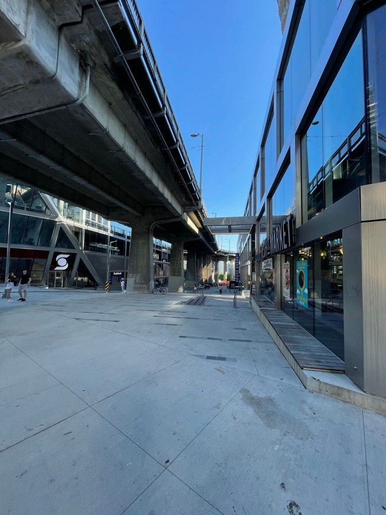
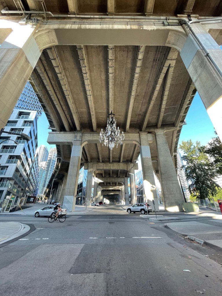
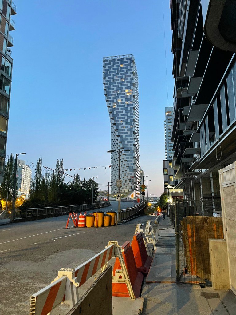
  • A walking tour of Vancouver House

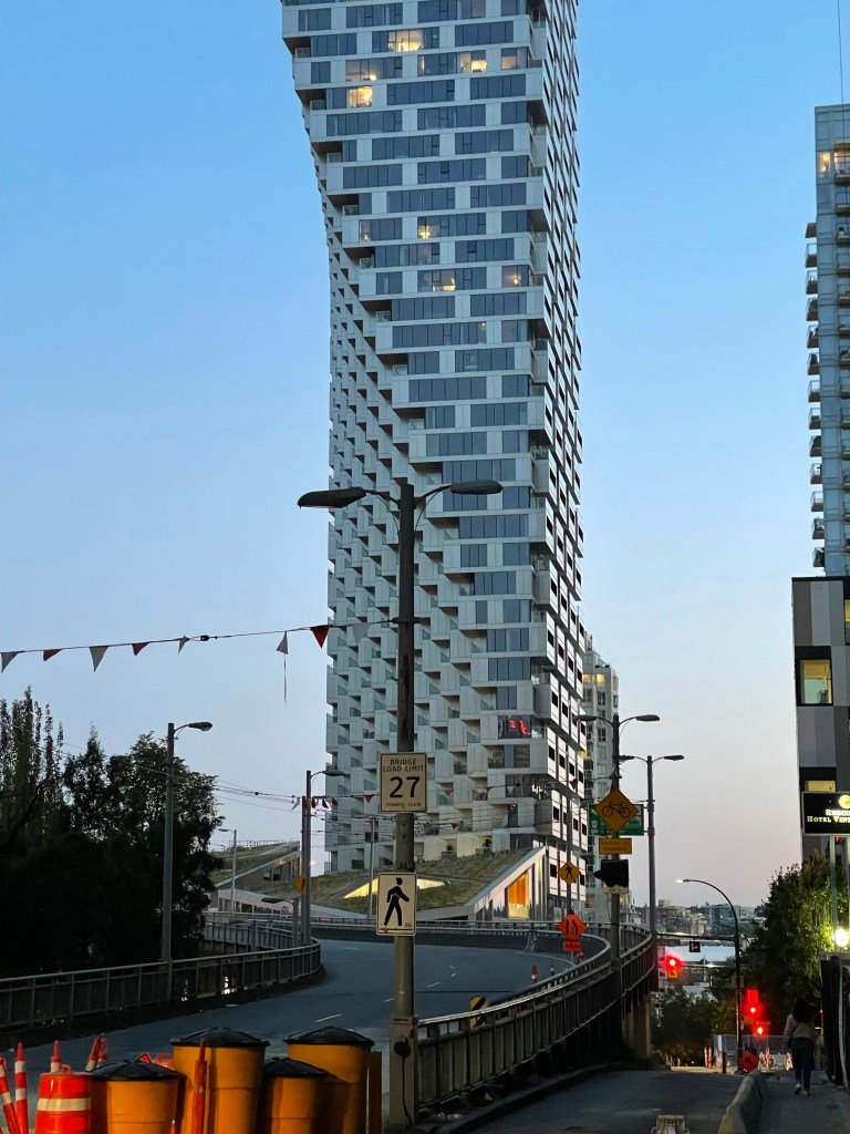
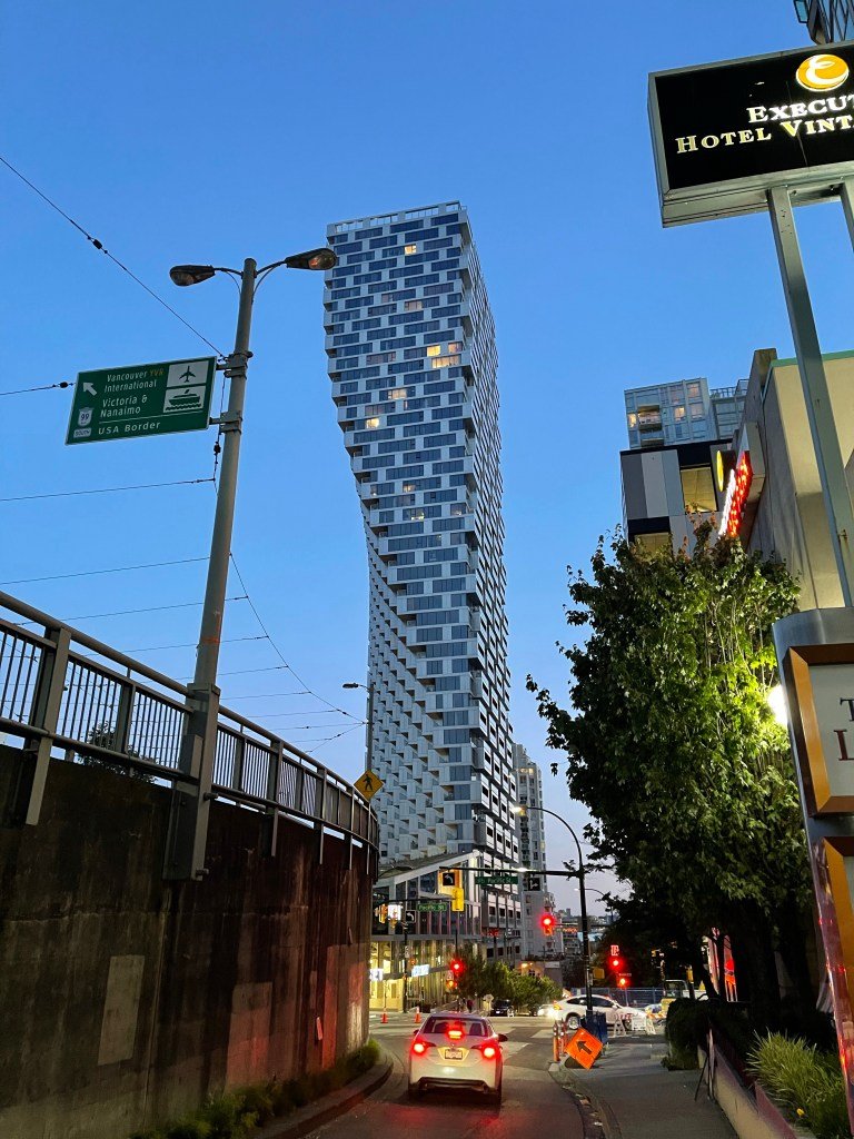
    Vancouver House is such a wonderful example of great city building. It’s an awkward site hugging the off ramps of the Granville Street bridge. It’s less than ideal.

    And yet Westbank (developer) and Bjarke Ingels Group (architect) have turned it into something remarkable. The tower is incredibly unique, though it is not form for the sake of form. It is a direct result of the site’s setback constraints.

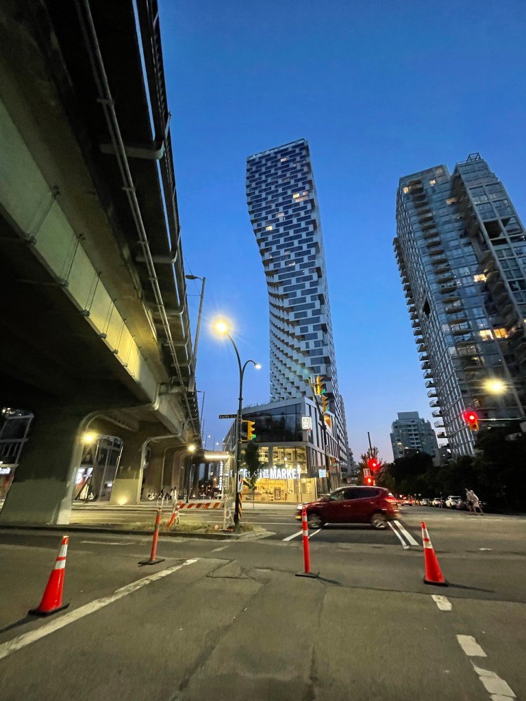
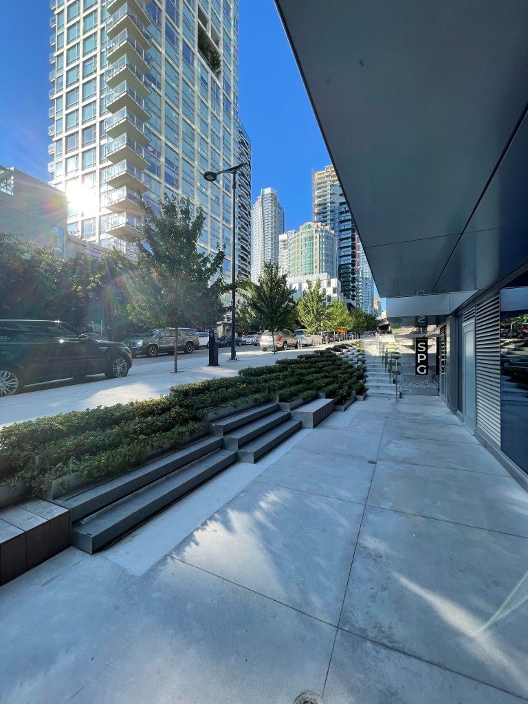
    But perhaps more importantly, the project manages to activate the ground plane and underneath the off ramps through its architecture, a mix of uses (retail and office) and a giant chandelier.

    So if you happen to find yourself in Vancouver, I would encourage you to visit the Beach District and do a walking tour of Vancouver House.

    There’s also a great Italian restaurant in the base of the tower (Autostrada Osteria) that you should try once you’ve finished your tour.

  • How buildings convey meaning

    Witold Rybczynski and I clearly do not have the same taste in architecture. But he raises an interesting point about the relationship between architecture and art in this recent post. Here’s an excerpt:

    In the name of renouncing the past—and denouncing anything that smacks of decoration—modernism has largely done away with art, the lonely Henry Moore stranded on a plaza, notwithstanding. The problem is that when you strip away figural and allegorical ornament, what is left are mute building materials, mechanical-looking details, and abstract space.

    There is a long-standing tradition of integrating art, and other ornament, into architecture. But modernism viewed this sort of decoration as being superfluous. It wasn’t functionally necessary and so why include it?

    This has led us to today where there is a joke that investing in public art means investing in some sort of add-on that sits outside of your building and that can be classified as art. Perhaps something by Henry Moore.

    The result, Witold argues, is that we have lost something critically important in our buildings: meaning.

    But is allegorical ornament really all that different from a freestanding art piece? Don’t both tell a story? And don’t they both get applied, in a way, to a building that could surely continue on without it?

    At the same time, what is meaningful art? Does it need to include bas-relief and/or figural representations? Or could it be a signed urinal on a pedestal in the lobby with an accompanying digital NFT?

    There’s no question that buildings need meaning. We all crave stories. But sometimes they communicate in different ways.

    Photo by David Vives on Unsplash

  • The 2021 Serpentine Pavilion

    Each year, the Serpentine Galleries in London commission a leading architect to design a new temporary summer pavilion in Kensington Gardens. The installation usually runs from June to October. Sometimes it then travels around the world, as was the case with Unzipped Toronto (Bjarke Ingels).

    Now in its 20th year, the Serpentine Pavilion is a tradition that started in 2000 with a building by architect Zaha Hadid. (There was no pavilion last summer because of COVID.) And as I understand it, the commission is usually awarded to an architect who has not yet completed a building in England.

    This year’s pavilion will open to the public on June 11. Designed by Sumayya Vally of Counterspace, the pavilion is intended to be a “puzzle of many different [historic] elements.” See video above. Vally also happens to be the youngest ever architect to be commissioned by the Serpentine Gallery.

    Architecture tends to take a long time. The Serpentine Pavilion happens much faster and happens every year (when there isn’t a pandemic). This strikes me as a very good thing for the world of architecture. I think we should do something similar — but of course better — here in Toronto.

  • Floor plan comments, and thoughts on inset bedrooms

    I came across the above floor plan over the weekend. I reshared it on Twitter and there was then a pretty good discussion about what people like and don’t like. I mean, who doesn’t like looking at floor plans?

    The suite is 790 square feet with 2 bedrooms and 1 bathroom. It rents, at least according to Bobby’s original tweet, at $2,600 per month. That’s $3.29 per square foot. I’m guessing that the apartment is in Philadelphia solely based on Bobby’s location.

    The divisive thing in this floor plan is the two inset bedrooms. Some people don’t like these. But designing a good floor plan is like working through a puzzle. You have all these constraints (some of which are just personal preference) and you have to find ways to work around them.

    When you’re working with a deep urban floor plate, you pretty much have no choice but to design floor plans with inset bedrooms. Otherwise, the suites get too big and they stop making economic sense. I have talked about this a few times before on the blog.

    So what you do is “bury” the bedroom(s) and keep the main living space as open as possible. In this case, the living/dining dimensions are about 17′ wide x 10′ deep. So a pretty good size, and certainly a very good width.

    An alternate solution might be to flip one of the bedrooms up towards the main glass (keeping the second one inset). But given that you only have 17 feet to work with here, something is going to have to give. So if you made the living room 9′ wide, you’d then only have somewhere around 8′ for your bedroom.

    Personally, I don’t mind inset bedrooms, especially if they allow for more generous living spaces. So I think that this is a fairly reasonable and functional suite layout. I would have absolutely lived in an apartment like this when I was going to school in Philadelphia. (Is this even the right location?)

    But if I were to make a few tweaks:

    I would compress the bedrooms slightly to enlarge the living space even more. (Though if the target market is student roommates, perhaps the idea is to allow for a desk in the bedroom.) I would then flip the closets to the partition wall between the two bedrooms to improve sound attenuation.

    I would also try and get the kitchen out of the hallway and into the main living/dining area. I don’t know where all the plumbing stacks sit (see, constraints), but perhaps it just slides up toward the glass. Another solution might be on the other side of the upper bedroom (where there is currently a closet).

    But what are your thoughts? Would you rent this apartment? Comments welcome below.

  • ONE DELISLE: Official launch video

    Last week was the official broker launch for One Delisle. In normal times, we would have packed the house and done a fun in-person event involving food, and probably some negronis. Instead, Lucas, Riz, and I did a livestream from the sales gallery at Yonge & St. Clair.

    That video is now available online (embedded above and here). You’ll have to get past our hair (Lucas and I are both in desperate need of a cut), but otherwise it’s pretty cool. Shoutout to Veronica for pulling everything together and making it awesome.

    If you’d like to schedule an appointment at the sales gallery, send a note to sales@onedelisle.com. Please also feel free to contact me directly (or copy me on the email to the sales team). If you’re interested, I would encourage you to act quickly as demand has been incredibly strong.

  • Home Tour: Concrete plinth house

    This is a really nice kitchen extension. In response to an “oppressively” low ceiling height, the architects — DGN Studio — lowered the existing ground floor by about 500mm. At the same time, they created a kind of “concrete tray” that fills the width of the Victorian home’s property and extends outward to create a sunken patio space off said kitchen. From the outside, this drop makes the house feel as if it’s sitting on a concrete plinth — hence the name. (A good photo of this can be found here.) It’s a simple move, but a good one. Sometimes you just have to play with the section. If you can’t see the above video, click here.

  • Ray: Architecturally-inspired homes at the intersection of art, culture, and community

    Back in 2008, Dasha Zhukova and Roman Abramovich hired starchitect Rem Koolhaas and founded a new contemporary art museum in Moscow called the Garage Museum. Supposedly this was the first philanthropic institution in Russia dedicated solely to contemporary art. (Here’s a short video in case you’re curious what it looks like.) After it opened, the founders apparently had a realization about the way people like to consume art. Yes, people like to look at art and ponder deep things. But it turns out that people also like just being around art and other art-like things. People started coming to the Garage Museum not only to view the various exhibitions, but also to just hang out.

    This insight is now being used to inform a new real estate development company, also by Dasha, called Ray. The mission of the company is to create “architecturally-inspired homes at the intersection of art, culture, and community.” Their first two projects are in Harlem and Fishtown, Philadelphia, but apparently they have something cooking in Miami as well. What Ray hopes to do is integrate art and culture in a more meaningful way through cultural programming, exhibitions in their buildings, artist studio spaces, and other creative ideas.

    There’s also an affordable housing angle. According to the WSJ, Ray’s Harlem project is a joint venture with L+M Development Partners. I don’t know any of the specifics of this deal, but I know L+M, because one of their founding partners, Ron Moelis, was a professor of mine in graduate school. L+M is focused on affordable and mixed-income housing and uses tools like the Low-Income Housing Tax Credit (LIHTC) to make these sorts of projects financially feasible. They aren’t, otherwise. I learned all about them in school and I always found it to be a great way to get the private sector building affordable housing.

    “Art and culture, community, and accessible pricing.”

  • It’s okay to put buildings close together

    This morning I came across this beautiful photo by @callicles of the 11th in Paris. After admiring it for a few moments, I then immediately tweeted it out with the above caption: “It’s okay to put buildings close together.” Because here’s the thing about this photo: It represents one of the great paradoxes of city building. When most people look at this photo, I suspect that they will find it beautiful. They will like the mid-rise architecture and they will like the quaint European-scaled streets. But despite its fairly universal appeal, very few cities are able to build this way today. It’s often not allowed. So instead what people do is travel to Europe in the summer, sit in cafes, admire the architecture and urban design, and then lament the fact that we don’t build cities like we used to.

    What is it that makes this intersection so inviting? Well, the buildings are tight up against each other. I’m guessing that the right-of-ways (ROWs) in this picture are maybe 6-9 m wide. There are no building setbacks or stepbacks to speak of, save and except for the penthouse floors which taper back slightly. And so all of the spaces in these buildings would likely have some sort of direct facing condition with their opposing neighbors (but partially mitigated by the fact that these aren’t all glass buildings). The ratio of ROW to building height is, I’m guessing, something like 1:4, which, at the end of the day, is a large part of the reason why these streets feel so intimate and inviting. The buildings frame the streets and public realm.

    What I just described breaks many of the guidelines that I suspect many of you in the industry are accustomed to following. In our world, the streets should be wider to allow for adequate fire and service vehicle access. The buildings should stepback to allow light to reach the sidewalks, to mitigate impacts on any surrounding single-family homes, and to provision for sky views. Here in Toronto, the midrise guidelines also stipulate that buildings should have a ROW to building height ratio that is closer to 1:1. Though to be fair this guidance is often rightly broken. But the truth remains, we generally don’t build like this anymore. Why is that?

    It’s not because we can’t do it. We certainly could. We are, for whatever reasons, choosing not to. Is it because we’re bad at understanding what we actually like and what makes for great cities? Is it because what we end up liking is a bit counterintuitive? My unproven and untested theory is that it is at least partially the result of an approach to planning that is defensive — instead of offensive — in nature. We plan around and bow completely to existing contexts. We plan to mitigate impacts. We plan to satisfy some very individualistic concerns about how cities and neighborhoods should be built. For better or for worse, we plan to piss off the least amount of people. Politics also play an outsized role.

    What is far less common to think about is how to plan offensively. The fact of the matter is that the Paris we all love today pissed off a lot of people when it was being constructed. The approach was top-down and hugely disruptive. It ignored and completely erased much of the city’s previous urban context. Artists at the time, and probably many others, despised the new regularity of Paris’ street wall buildings. They longed for the old hodgepodge of medieval blocks and the visual variety that they created. But today, it’s hard not to think of this offensive move as anything but visionary. Of course, there are also countless examples of top-down offenses turning out terribly bad for cities.

    Perhaps the right approach, then, is to simply start being more deliberate about introducing elements of planning offense. My friend David Wex of Urban Capital likes to remind me that Montreal is a city with grandeur and that Toronto, for the most part, is a city without it. So as I have argued before, over here, I think it’s time we rethink our approach. Instead of just worrying about things like shadow impacts and angular planes (defensive), we should also be asking ourselves offensive questions. How refreshing would it be to sit down in a project meeting and have someone ask: “Okay, but does this design contribute to the overall grandeur and beauty of our city?”

    And maybe once we take this new perspective, we’ll come to the conclusion that sometimes it’s okay to put buildings close together.

  • The Monocle Book of Homes

    Monocle has new book coming out called The Monocle Book of Homes. It’s a guide to 20 exceptional residences from around the world, spanning everywhere from Mexico and Australia to Finland and Lebanon. In addition to these home tours, the book is intended to serve as a kind of how-to guide for improving your own living space. There’s also a portion dedicated to inspiring neighborhoods and community-driven urban projects. I don’t have a copy of this book and so I can’t vouch for its life-enhancing abilities. But Monocle generally has good taste and always takes nice photos. So I think many of you will appreciate this book. It’s available for pre-order over here.

  • Culture, architecture, and hospitality in the Algarve

    The Addresses is a new hospitality brand that offers up beautifully designed custom houses for rent in the Algarve region of Portugal. Designed by Lisbon-based architects, atelier RUA, the company’s initial houses include a former fish warehouse that was renovated with both modern and traditional Portuguese touches.

    Alongside these retreats, the company (by way of a partnership with Studio Stories) also offers its guests curated “experiences.” This is all part of the company’s focus on culture, architecture, and hospitality.

    I am a big fan of these design-forward hospitality companies, which offer experiences that you could probably describe as existing somewhere between a traditional hotel and an Airbnb. Similar to the latter, they are decentralized and they are focused on authentic and local experiences.

    But they also come with a particular set of sensibilities — and perhaps some consistency — that you could argue starts to reflect your favorite hotel. Another more local example is Canadian-based Hinter, which I discovered and blogged about last fall.

    When I checked this past winter, Hinter’s houses were booked up several months in advance. This tells me that there’s more than a few people who are hungry for these sorts of travel experiences. At the same time, I think it speaks to the tremendous value that you can create with beautiful architecture and design.