Daily insights for city builders, delivered every morning at 6 AM ET. I’m Brandon Donnelly — a Toronto-based real estate developer and founder of Globizen. I’ve been writing here since 2013.
As a follow-up to yesterday’s post about infill housing and overall urban densities, let’s look at some basic math.
The City of Toronto has an estimated population of 3,025,647 (as of June 2023) and a land area of 630 square meters. That means that its average population density is about 4,803 people per km2. Obviously this number will be higher in some locations, and lower in others. But overall, this is the average.
Now let’s consider how many people we could actually fit within the existing boundaries of the city (city proper not the metro area) if we were to simply match the average population densities of some other global cities around the world.
Again, what this chart is saying is that if we took the same physical area (Toronto’s 630 square meters) and just increased the population density to that of, say, Paris, we would then have a total population of over 13 million people and we’d be housing an additional 10,011,573 humans on the same footprint.
I am not suggesting that this is exactly what should be done. (Though, you all know how much I love Paris.) What I’m suggesting is that calling a place “full” isn’t exactly accurate. How would you even measure that? What someone is really saying is that they are content with the status quo in terms of built form and density.
The work of John Snow is instrumental to the field of epidemiology. In the mid-19th century, during what was the third major outbreak of cholera, he created the following map showing the clusters of cholera cases in London’s Soho neighborhood. Stacked rectangles were used to indicate the number of cholera cases in a particular location. This was a major breakthrough for the fight against cholera because, at the time, it wasn’t clear what was causing it. According to Wikipedia, there were two main competing theories. There was the miasma theory, which posited that cholera was caused by bad particles in the air. And there was the germ theory, which posited that cholera could be passed along through food and/or water.
By mapping the clusters of cases, Snow discovered a concentration of incidents in around the intersection of Broad Street and Cambridge Street (now Lexington Street) where a water pump was located that drew water from the Thames. This led Snow to the conclusion that it was maybe a bad idea to offer up polluted river water as drinking water. And sure enough, when the pump was shut off and residents were directed to other nearby pumps, the incidences of cholera began to decline. The germ theory had proven to be true.
The first time I saw John Snow’s map was in architecture school. Perhaps many of you have seen it as well. It is often used to illustrate the potential of visual representations to not only tell a story, but to teach the creator what that story actually is. In hindsight, it may seem obvious that polluted river water is something that we maybe shouldn’t drink, but it wasn’t at the time. This map helped people understand that. Today, we have far more sophisticated tools available to us, but we still have a lot to learn and we’re doing that every day — particularly during a pandemic.
One other thing worth mentioning is that there are a few exceptions to Snow’s findings. Supposedly, many of the workers in a nearby brewery were able to completely avoid the cholera infection during the outbreak by only drinking their own brew. Some say it is because the brewery had its own water source, whereas others say it is because the brewing process — the water is boiled — kills the cholera bacteria. Either way, I think the moral of this story is pretty clear: when in doubt, choose beer over water.
But being the desert city that it is, its population consumes more water than its natural aquifers can support. Which is why there is something called the Central Arizona Project (CAP).
Approved in 1968, the CAP diverts water from the Colorado River into the state of Arizona. The system is 336 miles (or 541 km) and it runs from Lake Havasu to Tucson, via Phoenix.
Today, it is the single largest water source (and consumer of power) in Arizona, serving about 80% of the state’s population. This obviously makes it invaluable. It delivers on average about 1.5 million acre-feet of water per year. (Acre-foot = Acre of area x one foot in depth.)
The Toronto Star published an article today called: Midtowners battle the rise of the midrise. It’s about a group called The Density Creep Neighborhood Alliance, which was formed in order to fight a 4 storey stacked townhouse project that is currently going through the rezoning process.
Here’s a snippet from the article:
“I’m really concerned about my property value going down,” says Lisa Goodwin, 49, a stay-at-home mother of two who has lived in a four-bedroom dwelling on Keewatin Ave. for 19 years. “Right now all the houses are $1.1 to, say, $2.2 (million) but they’re looking at putting in places that are only $500,000.”
There’s so much I could say about this. But you all already know what I’m thinking. So I’ll end with this quote from the article:
“The simple fact of the matter is that the creation of a more sustainable, equitable, and affordable city requires the development of midrise and other more dense housing options along major roads, subways, and streetcar lines in already built up areas,” says Christopher De Sousa, director of the School of Urban Planning and Regional Planning at Ryerson University.
If you ask most people, they’ll tell you that real estate agents will never ever disappear.
Despite the internet, mobile phones, social networks, and companies (here in Canada) such as comFree and PropertyGuys, the bulk of the market still employs an agent when it comes time to buy and/or sell a home. This is true both in Canada and the United States. And it may always be true.
But there are lots of entrepreneurs and people in the real estate community experimenting with different models. OpenDoor and Open Listings are two new startups out of the US that I’ve been following closely.
At the same time, there is a certain fraction of the market that is willing to go at it alone. By some estimates this number could be as high as 25% in Canada. Of course, this is a hard number to measure accurately since there isn’t just one method of selling a home privately and many transactions likely go untracked.
But one thing that I’ve been wondering for awhile now is why the percentage of private home sales is seemingly so much higher in the province of Quebec. According to Wikipedia, this number might be greater than 50%. And a quick search on comFree (duProprio in Quebec) seems to suggest that this may indeed be the case.
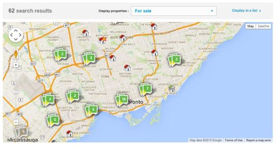
Here are the comFree search results for downtown Toronto. There are 62 properties.
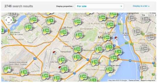
And here are the duProprio search results for downtown Montreal (notice I tried to maintain the same zoom level). There are 2,746 properties.
If anyone has any insights on this phenomenon, I would love to hear from you in the comment section below. I don’t know why this is the way it is.
When I was working on my startup Dirt last year, one of the things we spent a bit of time figuring out was how to classify buildings according to neighborhood. Now, at first blush, this may seem like a fairly easy thing to do. You simply locate the building, figure out which neighborhood it’s in, and then tag it accordingly. But neighborhood boundaries and definitions aren’t as clear cut as you might think.
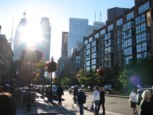
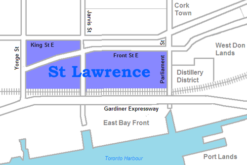
For example, a lot of you probably know that I live in the St. Lawrence Market neighborhood of Toronto. And indeed, if you look at this Wikipedia definition, I live in that area. But if you look at what they call it, it’s just: “St. Lawrence.” They also specify that it used to be called “St. Lawrence Ward”, but that today most people actually call it “the St. Lawrence Market.” So here you have an example of an evolving and changing name.
But then there’s the question of boundaries. According to Wikipedia’s definition, the north boundary is Front Street. This means that the North Market Building would be technically outside of the area and so would the Market Square condos. But I suspect that almost everyone would consider these two buildings to be part of the neighborhood. So where exactly is the north boundary? Is it King Street? Or maybe by Front Street they mean that all buildings on the north side of the street are included.
If you look at the city’s official neighborhood list (which is built from Statistics Canada Census Tracts) you’ll find a completely different boundary and name. According to this list, I live in the “Waterfront Communities–The Island” neighborhood. Obviously nobody, other than maybe somebody who deals with census data, would have any idea what this area is. But it’s how the city tracks its demographic data.
What this begins to show you is that neighborhood definitions and boundaries aren’t as black and white as they might initially seem. And it’s partially because cities themselves are always in flux. New neighborhoods emerge and old ones reinvent themselves. And as that happens, people start introducing new names and new terminologies.
When I was about 19 years old, people in Toronto used to say they were going out “on Richmond and Adelaide.” Since then, gentrification has pushed many of the bars and clubs out of that area. So people instead go out “on King West” or “on Ossington.” And as people begin to use those terms and identify with an area, new brands are created. Ask anybody who lives downtown and I bet they’ll tell you that King West has its own unique personality and even a type of person who typically lives there. This is an on the ground type of awareness though, which doesn’t get captured in census tracts.
The other reason neighborhood boundaries can be so fuzzy is because we – the real estate community – are constantly trying to manipulate them for our own benefit. I’m indifferent to the fact that this happens, but it is a reality. Think about how much the neighborhood of Yorkville has been stretched from its original roots north of Bloor Street. If a neighborhood has a good brand, agents and developers will naturally try and leverage it. Homeowners do it all the time too. Would you prefer to say that you live in Seaton Village or the Annex?
Ultimately, we (my Dirt cofounder and I) decided that neighborhood definitions and boundaries needed to be fluid. They needed to dynamically adjust with the market and come from as many people as possible on the ground. Because at the end of the day if the official documents say one thing, but the majority of city residents believe another, then that official boundary and definition are probably out of date. The crowd wins here.
We liked this approach because it was organic – just like cities.