Daily insights for city builders, delivered every morning at 6 AM ET. I’m Brandon Donnelly — a Toronto-based real estate developer and founder of Globizen. I’ve been writing here since 2013.

Tag: visualization

  • A mapping of development potential in Toronto

    I first met Monika Jaroszonek in 2017, right before she started RATIO.CITY. Since then she has developed some pretty incredible tools for the city building space.

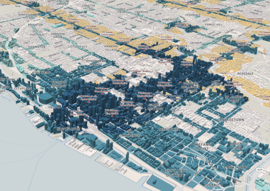
    Yesterday the company published this interactive visualization looking at development potential across the City of Toronto. The mapping looks for the following:

    The tool then ranks each development site – AAA, AA, A – according to how many of the above criteria it meets.

    It also flags land that it refers to as “Missed Opportunity.” These are lands located within 500m of a Major Transit Station, but that are designated as Neighbourhoods (considered stable) or Employment (whole other discussion).

    Based on this filter, about 5.6% of the City’s land is a “Missed Opportunity” and about 1.2% is AAA.

    When you look at the visualization, that is one of the first things you will probably notice; a lot of our transit infrastructure is currently underutilized as a result of land use policies.

    Image: RATIO.CITY

  • Transit Flow

    This is a map of the Bay Area Rapid Transit network:

    And this is an elegant visualization by Ray Luong of ridership levels over the course of one day: February 4, 2016. If you can’t see the embedded video below, click here.

    [youtube https://www.youtube.com/watch?v=owGgbAS7Wq8?rel=0&w=560&h=315]

    Note how the lines speed up as they go through the Transbay Tube connecting San Francisco and Oakland. That’s actually what happens. Within the 10 km-long tube, the trains reach ~130 km/h, which is more than twice as fast as the average speed throughout the rest of the network.

  • Mapping of global migration

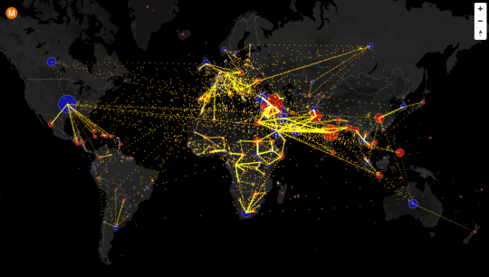
    Max Galka has created an incredible visualization of country-to-country net migration (from 2010 to 2015) on his blog, Metrocosm.

    Here’s a screenshot:

    image

    But you really need to view the full screen interactive version

    In that version, you can hover over a country to see the total net migration number (+/-) and you can click on a country to see where people are moving to and from. A blue circle indicates positive net migration (greater inflows) and a red circle indicates negative net migration (greater outflows).

    All of the data is from the United Nations Population Division. And though the numbers are estimates, it’s a fascinating look at global migration. For instance, look at the outflow from Syria.

    It would also be interesting to see these numbers on a per capita basis because some countries certainly punch above or below their weight in terms of migration. Off the top of my head, I’m thinking of Canada and Australia vis-à-vis the US.

  • Embracing 3D in the real estate industry

    I recently discovered a New York-based startup called Floored. What they do is create “interactive, online 3D models for real estate.” They take spaces that may or may not exist yet, and turn them into interactive experiences that can be accessed online from any browser.

    Here’s one they created for ClearRock Properties and Cushman & Wakefield, designed to show how two adjacent retail spaces would look if they were combined into one.

    There’s been a lot of talk over the years about how limiting 2D floors plans are for communicating space to potential tenants and purchasers. But in the same way that virtual reality has never really taken off, neither have 3D floor plans, interactive walkthroughs, and other more sophisticated tools. When people buy a new condo, for example, they still buy it based on a floor plan.

    However, as the technologies get better–and perhaps as BIM supersedes CAD as the dominant platform for architects and designers–I think we’ll see these 3D tools become standard in the industry.

    And one of the things that I think it will allow us to do is be much more iterative in the way we design and build spaces. Right now it’s almost impossible to test different iterations of a building in the same way that, for example, a web developer might test different websites. Construction is a pretty permanent act. But 3D could open up that possibility.