
Daily insights for city builders. Published since 2013 by Toronto-based real estate developer Brandon Donnelly.

Tag: virgil abloh

  • 3% approach

    The late fashion designer, Virgil Abloh, had a design rule for himself called the “3% approach.” Above is a slide from a presentation that he gave at Harvard back in 2013 where he listed it as item 3 of his “personal design language.” The idea behind this 3% rule is simple: you really only need to change something by 3% in order to create something new.

    Case in point:

    Given this, it should come as no surprise that Abloh had cited artist Marcel Duchamp as being a source of inspiration. (We’ve spoken about this before.) Duchamp is most famous for his “readymade” sculptures where he took existing objects — like urinals — and transformed them into art by signing them and curating them appropriately. This was obviously controversial, but it made Duchamp one of the most important artists of the 20th century.

    Now, 3% seems like an oddly precise number. I don’t know how, for instance, you quantify the amount of change on the above shoe. Is it surface area? In any event, that’s beside the point. What’s most fascinating for me about this approach is that it suggests that small changes are enough to, not just create novelty, but actually establish authorship. Meaning, the shoe on the right is no longer a Converse shoe. It is now an “OFF-WHITE” shoe. They authored it.

    Like the work of Duchamp, this was and is controversial. Lots of companies have sued Off-White for trademark infringement. We know, for example, where the above black stripes came from and we know that Off-White’s multi-directional arrow logo is borrowed from Glasgow Airport’s logo c.1960. But that’s clearly the point of readymade reworks. And it’s clearly enough for people to want to pay a lot more for the shoe on the right.

    Fascinating.

    Do you think that this 3% approach applies (or could apply) to other things outside of fashion, like architecture and buildings? I think so.

  • Pre-fall fashion and Le Corbusier in Firminy-Vert

    I’m not exactly sure what a “pre-fall” menswear collection is all about. But Louis Vuitton recently honored the late and great fashion designer Virgil Abloh by photographing one of them in and around Le Corbusier’s Firminy-Vert complex about an hour outside of Lyon, France.

    Abloh was apparently a huge fan of the work of architect Le Corbusier. And he tried to apply the same kind of utilitarian approach to fashion as Le Corbusier had done to cities, buildings, and housing.

    The Firminy-Vert complex is a series of buildings, one of which is the last of his “Housing Unit” designs (1965). Le Corbusier designed and built a number of these, with the most well known one being in the south of France in Marseille (1952).

    They were a utopian model for high-density housing, with “streets” instead of corridors and with schools and other social functions being housed high up and inside the building. They were intended to act as a kind of vertical city.

    To the untrained eye, they might resemble the kind of public housing that today goes unloved in many cities throughout the world. But for whatever reason, these particular renditions have largely stood the test of time.

    Maybe it’s because of their importance to the development of modernist architecture, or maybe it’s because most of them (if not all of them) are now UNESCO World Heritages sites.

    My take is that it shows you that architecture and built form alone can’t solve every problem. The same building in different places and different contexts, can and will perform very differently. In this particular case, in Firminy-Vert, the complex seems to be doing rather well. The perfect backdrop for a luxury pre-fall fashion collection.

  • OMA New York has just published its first book

    OMA NY — the New York office of OMA — has just published its first monograph. It’s called OMA NY: Search Term. For those of you who may be unfamiliar, Office for Metropolitan Architecture (OMA) is an architecture firm that was founded by Rem Koolhaas in Rotterdam in 1975.

    The firm is considered to be one of the most influential in the world because of their projects, the writing and thinking of Rem Koolhaas, and because of how many notable architects developed their craft under his tutelage.

    When I was in architecture school, OMA was a firm that people wanted to work at and I had friends who did. You weren’t paid very much from what I remember, but people put up with that because you wanted OMA on your resume and you wanted to learn things from Rem (apparently he’s a big fan of Raisin Bran in the morning).

    The New York office of OMA is run by Shohei Shigematsu and Jason Long who are both partners. The practice started out as an American outpost, but it has become more independent over the years and, from what I can gather, it now prides itself on having its own attitudes and views on architecture and urbanism.

    This monograph is about that. Twenty radical projects from the firm’s new guard. It also includes interviews from people like Virgil Abloh (Off-White). I don’t have a copy yet, but if you’re an architecture and urbanism person, you probably want this one on your bookshelf.

    Image: Rizzoli

  • “BRAND”

    image

    For a number of reasons, I am fascinated by the streetwear label, Off-White

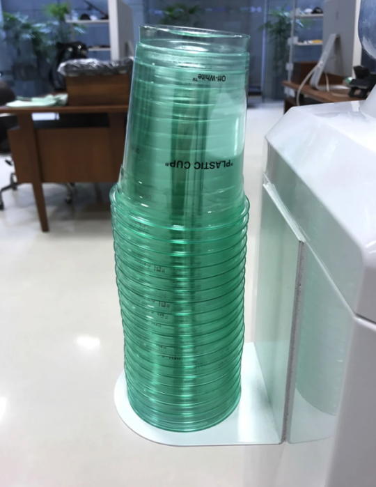
    It is one of the hottest labels in fashion, and yet there’s a part of me that doesn’t really get it. It’s mostly bold text, usually in quotations, on various apparel items. A set of Wellington boots might be plastered with “FOR RIDING.” A winter coat might be plastered with “DOWN JACKET.” And when they collaborate with Nike, the shoes might be tagged with “AIR.” Quotations included. Is that fashion?

    But then you hear Virgil Abloh – the founder of Off-White, who by the way was also trained as an architect before becoming creative director for Kanye West – talk about his brand and it starts to make more sense. The quotation marks are supposed to signal “ironic detachment and a comment on the idea of originality.” Okay, so a little more sense.

    Part of his inspiration comes from the work of Marcel Duchamp. In 1917, Duchamp shocked the art world with, Fountain. Some would consider this to be the most pivotal art piece of the 20th century. It was an off the shelf urinal that he simply signed, dated, and placed on a pedestal. Though initially rejected as art, it eventually redefined what art could be, shifting it from, “new physical creations to [the] moulding [of] ideas.”

    The corollary to this was that anything could be art, even something as utilitarian as the catch basin that you pee into. And this insight is something that Abloh has used to fuel his label. But he has taken it a step further. He has leveraged the ubiquity of these everyday-items-elevated-to-art as a way to elevate his own brand. Here’s a quote by Abloh from the Guardian:

    “The idea [that] an everyday object is art. Branding is generic and if I adopt the generic, then it becomes my branding, but it normally occurs in life.”

    In other words, he is co-opting generic and ubiquitous items – like, for instance, the patterning on caution tape – for his Off-White designs. And if you believe that a bit of brand equity is at least partially driven by brand ubiquity, well then you might start to see the value in this approach. He is simply assigning authorship to things that are already omnipresent.

    But, is that fashion? I guess that depends on whether you consider Duchamp’s Fountain to be art.

    Image: SSENSE