Daily insights for city builders, delivered every morning at 6 AM ET. I’m Brandon Donnelly — a Toronto-based real estate developer and founder of Globizen. I’ve been writing here since 2013.

Tag: urbanism

  • Bright reddish-orange triangulated LED-lit fins

    superkül (architects) recently added a new project to their website, namely the renovation and addition to Proper TV’s headquarters at Bloor and Dovercourt here in Toronto.

    The original single-storey building dates back to the middle of the 20th century and used to house a Canada Post Office and distribution facility.

    But why send letters when you can instead send emails and instant message that are immediately tracked for the purposes of later bombarding you with ads for things you may want to buy? 

    The post office closed in 2013.

    The main facade along Dovercourt was constructed of limestone and that remains today. Here is photo of the building looking north on Dovercourt from Bloor:
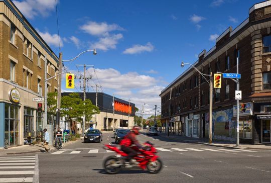
    Notice how the road (Dovercourt) curves and the building becomes almost a view terminus.

    Here is the east elevation:

    And here is a close-up of the bright reddish-orange powdered coated triangulated fins that adorn the second floor:

    Apparently the fins are also lit up at night with programmable LEDs. I don’t have a picture of that to show you, but I am sure they look very cool. I’ll have to do a drive-by one night.

    All images from superkül.

  • The geography of innovation and equality of opportunity

    The Equality of Opportunity Project has a recent paper out called: Who Becomes an Inventor in America? The importance of Exposure to Innovation. Vox also has a summary of the findings, here.

    The overall goal of the project is to “use big data to identify new pathways to upward mobility.” And in this particular study, they discover that in America there are many “lost Einsteins” – people who have the ability, but not the opportunity.

    Not surprisingly, socioeconomic class, race, and gender play a significant role. Children from high-income families are 10x more likely to become inventors (measured in patents) as compared to children from low-income families.

    Geography, place, and environment also matter. Where and how a child grows up has a significant impact on future outcomes. If a child grows up in a city/network that exposes them to other inventors, it increases the likelihood that they too will invent. 

    Where a child grows up also has an impact on the types of inventions, even if the child move cities as an adult. For example, the study found that if a child grows up in Silicon Valley but moves to Boston as an adult, it is still more likely to author patents related to computers because that’s what it was exposed to as a child.

    These associations also impact in a gender-specific way. Women are more likely to invent in a particular technology if they grow up surrounded by similar female inventors. The presence of male inventors has no impact. This makes a powerful case for better gender diversity and strong role models.

    If you would like to read the full paper, click here.

  • What’s with all the black houses?

    Author and professor Witold Rybczynski recently asked: “What’s with all the black houses that have appeared in recent years?” Black brick. Black paint. Blackened Timber. Lots of black.

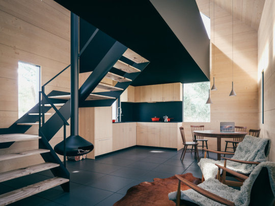
    Alongside his post was an image of a “backcountry hut” by Leckie Studio Architecture + Design. I am adding a picture of the interior for completeness, but he only posted a picture of its exterior.

    Witold makes a great point about shadows, but when I read the post this morning I immediately thought to myself: Wow. What a beautiful cabin and what a beautiful setting.

    I like how the lighter carve out at the corner contrasts against the black. And because of this carve out, I assumed that the interior would have similar and lighter tones of wood. It does.

    At the same time, I thought of Urban Capital’s River City complex here in Toronto, which also features “black” as a prominent architectural expression. I am a big fan of these projects.

    So I guess it goes to show, once again, that beauty is really in the eye of the beholder.

  • How’s your PTAL these days?

    image

    As I was going through the new London Plan yesterday I noticed a number of references to PTAL. I didn’t know what this was, so I obviously had to look it up.

    It stands for Public Transit Accessibility Level. It’s a methodology that was developed in London in the 90′s. And it’s a measure of access to public transit, or of the density of the public transport network at any given location.

    There are 6 levels, though two of the levels are further subdivided into 2 sub-levels for greater precision:

    • 1a and 1b
    • 2
    • 3
    • 4
    • 5
    • 6a and 6b

    1 is bad. 6 is good. 

    What’s captured in this measure are the walking times from a particular location to the nearest transit access points; the reliability of the available services; the number of services available; and the average wait times.

    Historically, this measure has helped to determine how much density could be built on a particular site, how much parking should be provided, and so on. 

    For example, in the new London Plan, PTAL 5 and 6, as well as Inner London PTAL 4, are expected to see development with no residential parking. Once you move to PTAL 3, the parking maximum moves up to 0.25 spaces per unit. 

    In the draft London Plan you’re also supposed to use the highest existing or planned PTAL. So if transit improvements are planned for the area, you factor those into the calculation.

    Seems quite rationale (though it’s probably not a perfect measure of access and connectivity).

    If you’d like to determine the PTAL for a particular address in Greater London, you can do that here. Unfortunately, I don’t have a calculator for you if you happen to live outside of London. But there is one simple check you can do.

    The PTAL methodology assumes an average walking speed of 4.8 kph. The maximum allowable walk time for buses is 8 minutes and the maximum walk time for subway and light rail is 12 minutes. These numbers translate into distances of 640m and 960m, respectively.

    How far do you have to walk to access good transit?

    Photo by Bruno Martins on Unsplash

  • New London Plan released today

    A draft version of the new London Plan was released today for public consultation. It is “the spatial development strategy for Greater London”. And you can download all 524 pages of it, here. A final copy of the Plan is expected to be published by fall 2019.

    Here is what mayor Sadiq Khan had to say about the Plan (quote from The Guardian):

    “I am using all of the powers at my disposal to tackle the housing crisis head on, removing ineffective constraints on homebuilders so we make the most of precious land in our capital.”

    And that tone comes through in the document. Here is an excerpt from the “optimising housing density” policy section:

    “For London to accommodate growth in an inclusive and responsible way every new development needs to make the most efficient use of land. This will mean developing at densities above those of the surrounding area on most sites. The design of the development must optimise housing density.” (Section 3.6.1)

    The Plan also contains a set of clear performance indicators. They cover things like the supply of new homes, the supply of affordable homes, modal share in the capital, and so on.

    The ambition is 66,000 net additional homes each year. And by 2041, the goal is that 80% of all trips in London will be by foot, cycle, or public transport. There simply isn’t road the capacity.

    Which is why the plan also specifies parking maximums, as opposed to parking minimums. The Plan wants the starting point for any development that is well-connected to transit – or to future transit – to be “car-free”.

    If you have a chance, the new London Plan is worth a scan. Maybe you don’t want to print it though.

    Photo by Rob Bye on Unsplash

  • Stockholm’s congestion charge reduced car traffic by 20%

    Stockholm has a congestion charge that is used to reduce traffic volumes in the center of the city. Toronto does not. We looked at it, actually fairly recently, but then we lost our nerve.

    Stockholm’s congestion charge was first implemented on a trial basis starting in January 2006. Trials and pilots have become a common way to actually create positive change. Otherwise the status quo bias may simply be too strong.

    When Stockholm started the trial back in 2006, public support was very low. Maybe 30%. But as soon as it was implemented, car trips dropped overnight by 20%. Once people saw the benefits, support grew – hitting around 70% by 2011.

    Here is a brief Street Films video with Stockholm’s Director of Transport, Jonas Eliasson, talking about their experience with congestion pricing. If you can’t see the video below, click here.

    [vimeo 244771087 w=640 h=360]

  • Manhattan real estate prices during the Great Depression

    image

    I was searching around trying to find data on long-term real estate prices and I came across a paper by Tom Nicholas and Anna Scherbina called, Real Estate Prices During the Roaring Twenties and the Great Depression.

    Here are some stats about Manhattan real estate (from the paper) that you all might find interesting:

    – In 1930, Manhattan housed 1.5% of the US population, but had approximately 4% of all US real estate wealth.

    – To construct their price indices the authors randomly collected 30 real estate transactions per month in Manhattan between 1920 and 1939. The mean price per square foot in 1929 was $6.91 (year of Black Tuesday). And the mean price per square foot in 1939 – 10 years later – was $2.29.

    – Buildings containing a store at grade tended to sell at higher prices. The authors speculate that this could be because a zoning change in 1916 made it difficult to open stores in “residential” areas.

    – Buildings with three, four and five storeys tended to sell at a discount. Six storeys or higher and the buildings generally had an elevator, which resulted in higher pricing.

    – Manhattan real estate prices reached their highest level in Q3-1929 before falling 67% by 1932. Prices remained more or less flat during the Great Depression.

    – If you bought a “typical property” in 1920, it would have retained only 56% of its value (in nominal dollars) by 1939. In fact, it took until 1960 for assessed property values in Manhattan to exceed their pre-Depression pricing.

    – An investment in the stock market index during this same time period, 1920-1939, would have outperformed real estate by a factor of 5.2x.

    Much of this probably seems hard to believe given the market today. Imagine waiting 40 years for the value of your property to come back.

    Photo by jesse orrico on Unsplash

  • Saks x Dim Mak

    Steve Aoki was in Toronto today for a collaboration with Saks Fifth Avenue – namely the launch of his fall/winter Dim Mak Collection

    The after party was at Junction House (the pre-development version). Here is a photo:

    I actually wasn’t there (because I’m fighting off some sort of cold), but a friend sent me this photo. 

    It’s such a great space for events and production. It used to be an artist studio, but they moved out because they outgrew the space.

    If you have a need for a large warehouse space, you can actually rent it by visiting here.

  • End of the automotive era

    Bob Lutz is a former vice chairman and head of product development at General Motors. Recently, he had this to say about the future of the auto industry. 

    Here are a couple of powerful snippets:

    It saddens me to say it, but we are approaching the end of the automotive era.

    The auto industry is on an accelerating change curve. For hundreds of years, the horse was the prime mover of humans and for the past 120 years it has been the automobile.

    Now we are approaching the end of the line for the automobile because travel will be in standardized modules.

    Everyone will have five years to get their car off the road or sell it for scrap or trade it on a module.

    Bob is 85 years old. This is somebody who spent his entire life in the auto industry telling us that the old model is now done. 

    It reinforces something that I wrote about here, where the “end of the automotive era” was pegged at around 2021. 

    And it is part of the mental model that I have started relying on today for decision making.

    Photo by Alessio Lin on Unsplash

  • Learning from King Street

    Toronto is now a week into the King Street Transit Pilot.

    It’s still early days and transit guru Steve Munro hasn’t yet published any before and after route performance. He will. But already the sentiment seems to be clear: This shit is working. There are many recounts of people’s commute times being more than cut in half. 

    As somebody who walks this stretch of King every day, this isn’t surprising to me. There has been a dramatic reduction in the number of cars on the street.

    What is perhaps surprising is that none of the surrounding streets seem to be any busier. I would like to see the data, but it feels as if most of the cars have simply disappeared. Are more people now taking transit? Has this been your impression?

    Of course, the pilot isn’t perfect. What is not working are the signs that tell drivers they can’t drive through most of the intersections (only turn right). The circular green lights confuse them or they simply don’t care. 

    There have been suggestions for better signals, such as this one:

    image

    And if the pilot in its current incarnation does stick, I am sure there will be many additional improvements like this one made. But even at this early stage, Toronto is calling the pilot a “transit miracle.”

    When City Council approved the pilot in the summer it had a preliminary cost estimate of $1.5 million. (Figure excludes the lost parking revenue associated with removing approximately 180 on-street parking spaces).

    This is a relatively minuscule amount considering it has had an immediate impact, basically overnight, on the commute times of the 65,000 or so people who use this line every day.

    And it feels even more minuscule when you consider that our Scarborough Subway extension is expected to cost $3.35+ billion to build and only service around 64,000 people a day when you look far into the future – 2031 to be exact.

    The lesson here on King Street should be that light rail and surface transit routes can move lots of people very efficiently and cost effectively when you empower them to do precisely that.