Daily insights for city builders, delivered every morning at 6 AM ET. I’m Brandon Donnelly — a Toronto-based real estate developer and founder of Globizen. I’ve been writing here since 2013.
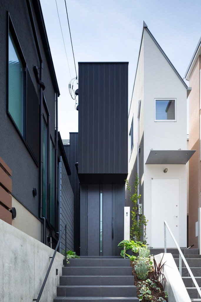
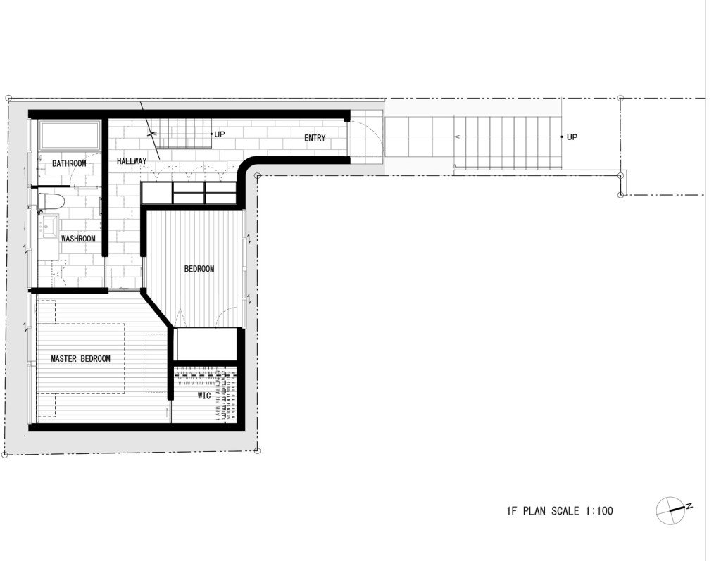
I have a fascination with “small” Japanese homes. Many, or perhaps most of them, would be illegal to build in a place like Toronto. This one here in Tokyo, called Jewel, is only 1.4m wide on its narrowest elevation. See above photo. Designed by Apollo Architects & Associates, the ~80m2 home was built on a “flagpole” site. Narrow approach. More site area in the back. Here is a plan of the ground floor (via Dezeen) to give you a better sense of what I’m talking about:
According to Dezeen, the client is a fan of minimal design and, in particular, the work of John Pawson. His work was a source of inspiration for the project. But if you read the article closely, you may notice that he is referred to as the “British architectural designer Pawson.” I learned last week, following this post, that John Pawson is not a licensed architect. Hence the carefully chosen language. I guess there’s hope for those of us who are not architects.
The North American rule of thumb is that young people — specifically people in their 20s — are the most likely to to live in an urban neighborhood. After that it’s all down hill and, broadly speaking, the percentages decline. But at some point, much later in life, the data suggests that there is a reversal and people start to return to urban neighborhoods, albeit not to the same extent. Part of the explanation for this is that as people age they start to look to more walkable neighborhoods where they don’t need to get a car to get around.
But in this recent NY Times article, Jed Kolko points out two interesting trends. One, the “urban boomer” appears to be on the decline in the US. In 1990, about 21.6% of Americans aged 54 to 72 lived in an urban neighborhood (categorized by density). As of 2018, this number had dropped to around 17.8%. And two, the age at which there is a reversal (and people start returning to denser neighborhoods) is also increasing. Perhaps because people are living longer.
Jed’s conclusion: American boomers, today, are actually less urban than previous generations.
Feargus O’Sullivan is doing a series in CityLab right now on the “home designs” that define four European cities: London, Berlin, Amsterdam, and Paris. The first one is on London’s classic “two-up, two-down” design, which refers to a two storey home with a living room and kitchen on the ground floor and two bedrooms on the second. It’s a simple design, but one that has supposedly endured.
O’Sullivan argues that for many, or perhaps most in Britain, this is what a “home” feels like. It’s grade-related and there are two floors. Indeed, only 14% of British people live in an apartment, compared to 57% in Germany (a majority). This percentage is much higher in London, with about 43% of people living in an apartment. But about 25% of the population still lives in some sort of attached house.
Home equals house. And for us North Americans, this is of course relatable. But the Germany example is a reminder that this is not necessarily universal. Attitudes toward housing are cultural. And cultures can and do change. I am seeing that happen right now in Toronto. Some of us are becoming less like the British and more like the Germans.
A few weeks ago, I tweeted that I was creating a simple email newsletter that would notify you of new planning/development applications (and updates) near where you live (in Toronto). About 100 people subscribed following that tweet and we then spent the following few weeks getting the service ready.
The first email was sent out today and, if you haven’t already, you can subscribe for free, here. The way it works is pretty simple. You enter your postal code. We draw a 1000m radius around that postal code (we’ll monitor this number going forward to see if it continues to make sense). And we then send you any new applications/updates that fall within that radius.
So depending on where you live, the first email you receive could contain a long list of projects. They’re all assumed to be new initially. But going forward, the list will become much shorter and you’ll only receive an email if/when there’s something new to report.
The ultimate goal is to come up with a better way to engage people around new development projects. This is a first step. Regardless, our guts tell us that many people would appreciate a quick way to see what is happening around them. If you have any initial thoughts, please leave a comment below or send me an email.
You can email subscribe for free by visiting unlyst.com.
I have stayed at two hotels over the last month where I did not need to interact with a human as part of the check in process. And in one of those two instances I didn’t even need to interact with a computer at the hotel.
My room key was issued to me through an app and I used that (and Bluetooth) to open my hotel room door (after the app, of course, notified me that my room was ready).
This is prediction #2 in Fred Wilson’s annual roundup of what is going to happen next in the world. Automation is reducing the costs associated with operating many businesses. Who is going to be the beneficiary of this consumer surplus?
The other prediction that should interest most of you — because the impacts would be widespread — is this one here regarding climate change:
The looming climate crisis will be to this century what the two world wars were to the previous one. It will require countries and institutions to re-allocate capital from other endeavors to fight against a warming planet. This is the decade we will begin to see this re-allocation of capital. We will see carbon taxed like the vice that it is in most countries around the world this decade, including in the US. We will see real estate values collapse in some of the most affected regions and we will see real estate values increase in regions that benefit from the warming climate. We will see massive capital investments made in protecting critical regions and infrastructure. We will see nuclear power make a resurgence around the world, particularly smaller reactors that are easier to build and safer to operate. We will see installed solar power worldwide go from ~650GW currently to over 20,000GW by the end of this decade. All of these things and many more will cause the capital markets to focus on and fund the climate issue to the detriment of many other sectors.
For the rest of Fred’s predictions, click here. These are always great reads.
Elon Musk recently posted this Twitter survey asking if we, the people, would like “super safe, Earthquake-proof tunnels under [our] cities to solve traffic.” It was leading in that the “no” response was, “No, I like traffic.” And it was initially vague in that it wasn’t clear how these tunnels would be used. Though, most of us could probably guess. Elon later added in the thread that these road tunnels would be for zero emission vehicles only and they would be limited to EVs (from all auto companies, not just Tesla). Finally, Elon stated that these tunnels are not intended to replace other solutions, such as light rail, rather to supplement them.
At the time of writing this post, nearly 1.5 million people had responded to the survey and about 67% of them said “definitely” to Earthquake-proof tunnels. Elon’s reaction: “Stop whining, subway Stalinists, the people have spoken.” Notwithstanding the majority, this is a divisive topic and the reactions are mixed. City planner Brent Toderian responded by saying that this “solution” would merely result in more cars, more driving, and more emissions. Steve Jurvetson, on the other hand, argued that this would be the cheapest way to add lanes and prepare for the inevitable EV-only future. (Steve sits on Tesla’s board and recently launched a venture fund that, among other things, invests in sustainable mobility.)
The crux of this divide is a view about how cities should work. And it often becomes like dogma. Is it optimal for us to all be driving around in individual vehicles — EV or not? Will autonomous vehicles actually help solve the traffic problem? Or is building on the backbone of mass transit the only way to properly design a big and efficient city? Whether it’s lip service or not, Elon seems to acknowledge that both cars and transit are important, and that both can work together to supplement each other.
What is clear to me is that cities, at the scale of say Tokyo, wouldn’t function nearly as efficiently if it weren’t for their extensive fixed rail networks. At the same time, there are many cities (or portions of cities) that do not have the prerequisite population and employment densities to support this same level of transit investment. And that has created a strong pull away from transit (and active transport such as cycling) toward private vehicles. Sprawling cities signal to people that they should probably be driving. This is one of the reasons why land use should never be separated from mobility discussions.
How autonomous vehicles change all of this remains to be seen. Though I do think it will make cars less private and more public transit-like. Studies show that most of us are pretty good at coming up with incremental improvements to the things we already know and understand. i.e. This is how I would make this car better. But we’re far worse at coming up with and predicting tectonic shifts in the landscape. And autonomy is probably one of those shifts. But as long as our built form remains heterogeneous, I am inclined to believe that a mixture of mobility solutions will be needed. Maybe that means car tunnels. Or maybe it doesn’t.
This past fall, Goldman Sachs published an important report about “making cities resilient to climate change.” In it, they remind us that the scientific consensus is that the world has already warmed from the pre-industrial era (and will likely continue to do so) and that a great many of us live near water (and will likely be impacted going forward).
About 40% of the world’s population lives within 100 kilometers of a coast, and about 10% of the world’s population lives in a coastal settlement that is less than 10m above sea level. Above is a list of some of those cities, along with their average elevation in meters. The cities with single digit elevations include Bangkok, Miami, Alexandria, and Amsterdam.
Goldman’s prediction is that this need for “urban adaption” could lead to one of the largest infrastructure build-outs in history. And that cities all around the world should already be thinking about how they will finance and equitably execute on greater resilience (assuming they aren’t already).
Click here to download a full copy of the report. The diagrams showing the average change in global mean surface temperatures against the pre-industrial period are something you should all look at it. The 2015-2019 change is pictured above.
Last week, SHARE NOW — which was previously known as Car2Go — announced that it will be exiting the North American market entirely come February 29, 2020, and that it will also cease operations in London, Brussels, and Florence. A couple of reasons were cited, including the “volatile state of the global mobility landscape,” but that really translates into low adoption:
Further, despite our best efforts and investments in Brussels, London and Florence over the years, we are unable to continue operations in a manner that’s sustainable for our business due to low adoption rates.
Moving forward, SHARE NOW will focus on the remaining 18 European cities. We, along with our shareholders, believe these markets show the clearest potential for profitable growth and mobility innovation.
There was a period of time when I used to use Car2Go here in Toronto. My network did as well. But that quickly stopped with the rise of Uber and Lyft. I mean, why bother finding a Car2Go and then parking it, when there’s a much lower friction option? I would imagine that’s how most people feel. (Maybe there’s a care share advantage for longer trips.)
At the same time, companies such as Uber and Lyft have, as you know, not performed well as public companies. The market is nervous about their path to profitability. In my view, they’re largely an undifferentiated offering right now, and it’s pretty easy to switch across them. So yeah, I guess the global mobility landscape is pretty volatile.
The Nib’s recent comic about Jane Jacobs vs. The Power Brokers (i.e. Robert Moses) is a good little overview of her lessons and legacy. But I don’t understand the claim that developers co-opted her ideals in order to exploit and gentrify urban neighborhoods. According to the comic, gentrification is always a top-down affair by developers, and never a spontaneous emergence as a result of other humans and/or industry wanting to be in a particular place.
I can think of many neighborhoods that have seen investment from groups other than traditional developers, including from individual homeowners. Take, for example, Cabbagetown in Toronto. There was never a top-down developer moment. It was individuals who saw beauty (and also opportunity) at a time when others were scared of the area. Is that acceptable? Perhaps more importantly, did these people wear black suits?
The other missing piece is the fact that desirable urban neighborhoods are, today, in incredibly short supply. During the reign of Robert Moses, Jane Jacobs had a view of cities that was in opposition to the planning zeitgeist of the time. But over time, she went from controversial to enlightened, and alongside this we saw a return to cities.
Combined with strict land use policies, this rising demand for Jacobian-style neighborhoods has meant that many/most dense urban centers operate with a perpetual housing supply deficit. There’s not enough cool urban housing to go around. Add in the current low interest rate environment, and you then have even more money searching for that perfect home in the West Village. That tends to do things to prices.
I was recently having a debate with one of our architecture partners about the interrelationship between architecture, interiors, and branding. This came up because, in New York City, you almost need a name brand architect attached to your project in order to sell luxury condos.
But this raises an interesting set of questions: How much value is driven by the quality of the architecture versus the architect’s brand? (Though, presumably you need the former in order to build the latter.) And how much of the value is actually just driven by the finishes (interiors) and the branding that you layer on after?
This latter scenario is a depressing thought for architects. It is architecture as a kind of “empty vessel.” One that just gets dressed up for today’s Instagrammable moments. And I am sure that you can think of some examples of this. Not everything can be capital A architecture.
But what is clear is that the most successful design-driven projects don’t think in this way. They are thoughtful and deliberate about each component, and they all work together to strengthen each other. Marketing, after all, is about telling the right story. It is always helpful when you actually have one to tell.